
Written by Murat Yüksel✏️
In this era of rapid development, design standards can pose a serious issue for developers. In this article, we’ll explore whether there is an easy, automatic way to convert Figma designs into Next.js code. Then, we'll cover a fast method to convert Figma to Next.js using Tailwind CSS. Let’s get started!
Jump ahead:
- What is Figma?
- What is Next.js?
- Is there an easy way to convert from Figma to Next.js?
- How to convert Figma to Next.js code using Tailwind CSS
What is Figma?
Figma is a cloud-based design and prototyping tool that allows you to create designs for websites and mobile apps. Figma is a collaborative tool that allows you to work with your team in real time, offering features like vector editing, real-time design collaboration, sharing, prototyping, plugins, and more.
Nowadays, remote work is a serious thing. Let's say you're on a virtual call with your team members, including the project manager, the designer, and you, the developer. With Figma, you can all look at and make changes to the Figma file in real time, thereby simplifying the process.
What is Next.js?
Next.js is a React framework that allows you to build server-side rendered and static web applications. When I was just dealing with frontend development and had no knowledge of backend development, I didn't quite understand the hype for Next.js. After all, most of the terminology used in Next.js is on a more holistic level.
The real difference between Next.js and React is that to build a full-stack application, you don’t need to wrap up a server using any other server-side language, like Ruby, Python, or Node.js.
Next.js supports a technology called serverless functions, which basically allow you to write a whole application without leaving your main folder. In this article, we won’t cover server-side rendering and all the other cool features that Next.js offers, but I felt the need to mention it so we understand the basics of Next.js.
Next.js also supports different types of hooks, like getStaticProps and getServerSideProps, which allow you to fetch data on the server side to help with SEO. Apart from that, Next.js comes with built-in routing, automatic code splitting, and many other features that make it a great tool for building web applications.
Is there an easy way to convert from Figma to Next.js?
There are some tools that can automatically turn your designs into code, like Locofy.ai, anima, and CopyCat. But, they do have a price. I found one free option, a Figma plugin called Figma to Reactjs, however, it's not very effective in my opinion. And, as you can probably guess from the name, it doesn't support Next.js.
I'll demonstrate the main problem I've found with it by using a concrete example. If you take a very basic input field with some simple styling and convert it using the plugin mentioned above, you'll get a result very similar to the following:
const  Group1000001930: React.VFC = () => {
return (
   <div className="group-1-0-0-0-0-0-1-9-3-0">
     <div className="rectangle-4-4-3-2" />
    <p className="text-1">Your Name</p>
    </div>
  )
}
.group-1-0-0-0-0-0-1-9-3-0 {
  height: 50px;
 width: 370px;
}
.rectangle-4-4-3-2 {
  border-radius: 5px;
  height: 50px;
  width: 370px;
background-color: #ffffff;
  border: 1px solid #f0f0f0;
}
.text-1 {
  text-align: left;
  vertical-align: top;
  font-size: 15px;
  font-family: Inter;
line-height: 20%;
  color: #637381;
}
Let's overlook the fact that this code is very optimized for TypeScript. The code looks nice, and it gives the correct color, height, and width. It might work if we took small components and wrapped them by hand, but since we're talking about Next.js, we have a serious problem with class names.
In Next.js, CSS files work a bit differently than React. Instead of having separate CSS files as usual, Next.js uses a modular approach. Therefore, you'd use files with names like Home.module.css. Whenever you want to use the styling in those files, you have to import and use them in the following manner:
import styles from "../styles/Home.module.css";
<div className={styles.groupOne}>
  <div className={styles.divOne} />
  <p className={styles.paraOne}>Your Name</p>
</div>;
In the code above, we assume that the groupOne, divOne, and paraOne classes are the classes defined in the Home.module.css file. I'm not even talking about the imported names, like .group-1-0-0-0-0-0-1-9-3-0. To use them as imported from the plugin, we'd need to change each one of them by hand. Honestly, I don't see much of a point in working like this.
Let's consider another option. In a more traditional sense, I'm a developer, I develop stuff, and I know how to read a design and convert it to code. If I want to do I good job and satisfy my clients, I don't need a tool to do that for me. But, trying to style everything using only CSS would take a lot of time. Therefore, I'll use another type of tool, the Tailwind CSS framework.
How to convert Figma to Next.js code using Tailwind CSS
Let's consider the following scenario. I have a client who presents me with a Figma file and wants a pixel-perfect version of it in Next.js. The deadline is quite soon, so I'll have to work quickly. For a variety of reasons, I can't use any paid tools, so I'll be have to code it myself.
In this scenario, the first thing I'll do is decide what stack to use. As you probably know, sometimes, clients have a specific stack in mind. They might want you to convert the Figma file into Next.js code using a particular UI framework, like Bootstrap, styled-components, MUI, or Tailwind CSS.
If they don't have a requirement for the UI framework, then I'd review the project thoroughly and decide which framework would be the best in this case. If the design is repetitive and startup-style, I'd choose Bootstrap. If the project is an enterprise level application with a lot of functionality, like modals, popovers, etc. I choose MUI. If there are many repetitive components in the design, I go with styled-components. And, finally, if there are many unique pieces in the design, I choose Tailwind CSS.
But, this is just my two cents. Everyone has their own stack and preferences. For the sake of this tutorial, I'll go with Tailwind CSS because it is easy to write and understand and quick to code.
I have the following Figma design: 
I've already decided on my tech stack, so it's time to actually code it. Before you begin tinkering with Figma’s features, you should have a mental model of how to turn this design into code.
I'm a big fan of Flexbox. When I look at this image, I see two components that are positioned via the flex-direction row. I'll name the left one Contact.js and the right one Form.js. Then, I'll open my Next.js application, and in my src folder, I'll create a components folder and add the aforementioned files into it.
To start with, I'll import them into my index.js file as follows:
import React from "react";
import Contact from "@/components/Contact";
import Form from "@/components/Form";
const index = () => {
  return (
    <div className="flex  flex-col md:flex-row bg-[#FFFFFF]">
      <div className="w-full ">
        <Contact />
      </div>
      <div className="w-full ">
        <Form />
      </div>
    </div>
  );
};
export default index;
Then, I'll go to Contact.js and start tinkering with it. On this page, up to elements with icons, we have elements positioned as column, which is the default behavior.
When we come to the elements with icons, like Our Location, Phone Number, and Email Address, I see another Flexbox command. Each of these elements can be divided into two components, with their parents given a flex-direction row. The left element is the icon, and the right element is a collection of texts that are positioned with the flex-direction column. Or, you can leave them as is because the default behavior is to position the elements as columns.
So far, I don't even need to use Figma's features. I have my layout in my mind, which means that when I start to code, I'll code faster and with more confidence. But, now, I need some extra knowledge to achieve pixel-perfect, or near pixel-perfect code. I say near, because as a developer, we might have to go above and beyond what the designer has given in the design file.
Due to Figma's restrictions, I'll only be able to see the dimensions as concretely as possible, while in the real world, I'd deal with extra-small and extra-large screen sizes. Therefore, I must think in terms of relativity and responsiveness, which isn't provided in this design.
I’ll have to consider that this page cannot be shown as is on a mobile device. Remember, our initial idea was that the whole page would consist of two components that are positioned with a flex-direction row, but, in the case of a mobile device, they'll be positioned as a flex-direction column. Anyway, back to Figma.
I want to start with the first text I see on the page, Contact Us. To code it as perfectly as possible, I need to know the exact HEX code of the color, its size, font weight, and line height, if possible. I double click on that element, and as soon as I do that, Figma shows me the element's properties on the right side of the screen: 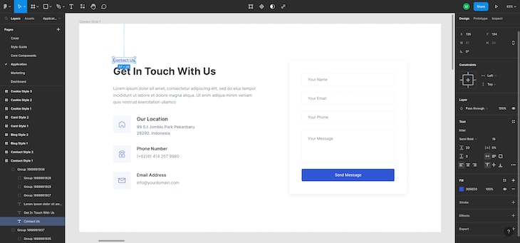
Around the bottom, under the Fill section, I see that the color is #3056D3. On top of the Fill section is the Text section. When I look there, I see that the font name is Inter. Under it, it says the font weight is Semi Bold. Right next to it, I see the number 16, which means that the font size is 16px. Under Semi Bold, I see the number 20, meaning that the line height is 20px.
I could click on any of these sections, change them as I wish, and the new style would be shown on the Figma file. To see things in a more code-friendly way, I can also click on the Inspect section at the very top of the right section. Check out the image below: 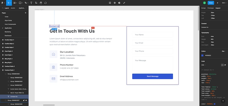 Now, I’ll extrapolate these into my code. Then, I go to my
 Contact.js file and add it as follows:
import React from "react";
const Contact = () => {
return (
<div>
<h5 className="text-[#3056D3] font-semibold text-[16px] leading-5">
Contact Us
</h5>
</div>
);
};
export default Contact;
The code above is the domain of Tailwind CSS. It’s not very practical to try to memorize all of these commands, so I keep the Tailwind CSS docs open when I develop. To search for a specific command, I only need to press CTRL + K, and I'll see suggestions on what I'm looking for in the documentation.
I created an h5 element that takes Tailwind CSS classes. I add the color I've taken from Figma as text [#3056D3], specify that its font is semi-bold, the text itself is 16px, and the line height is 20px by writing leading-5. I see all of these commands in the documentation as follows: 
Now, I go back to the design and see that I need some margins. In Figma, there's a way to see the distance between elements in px. To do so, you need to double click one of the elements and hover the cursor on another, which will show the distance between the two elements in pixels:
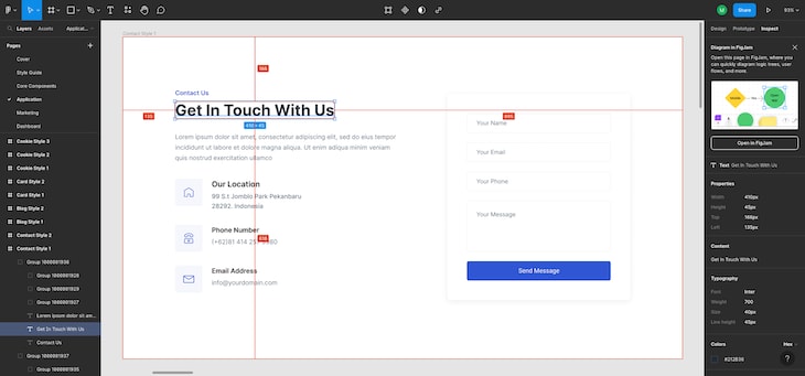 But, there's a problem here. I can't rely on pixels alone because I have to take into account that there will be different screen sizes. In this case, I try to understand the relation between elements, and again, I create a mental model of it and add the styles myself.
I see that padding for the left and right is a bit smaller than the padding for the top and bottom. I use this model to write my code. I also follow the same process for the next elements, which I've done for Contact Us. I check their colors, sizes, line heights, etc., trying my best to make it pixel-perfect:
import React from "react";
const Contact = () => {
  return (
    <div className="h-full p-10 lg:px-28 lg:py-32 ">
    <h5 className="text-[#3056D3] font-semibold text-[16px] leading-5 mb-2">
        Contact Us
      </h5>
      <h1 className="text-[#212B36] font-bold text-[40px] leading-10 mb-7">
        Get In Touch With Us
      </h1>
      <p className="text-[#637381] text-[16px] leading-7">
        Lorem ipsum dolor sit amet consectetur, adipisicing elit. Sequi numquam
        sapiente quod culpa qui minus itaque nesciunt cupiditate saepe
        praesentium? Exercitationem natus optio debitis quos recusandae
        assumenda? Aperiam, accusantium id.
      </p>
    </div>
  );
};
export default Contact;
Below is the result so far: 
I added an additional border to have a better picture of the development process. Once I'm finished, I’ll delete that border.
Now, I need to add the parts with icons. As I mentioned before, I've modeled them as Flexboxes. But, before styling them, I need the icons. To get them, I double click on the icon I wish to download, and then I choose the export section at the very bottom of the right side. I can export the icon in whatever form I want, like .png, .svg, etc. I'll choose .png: 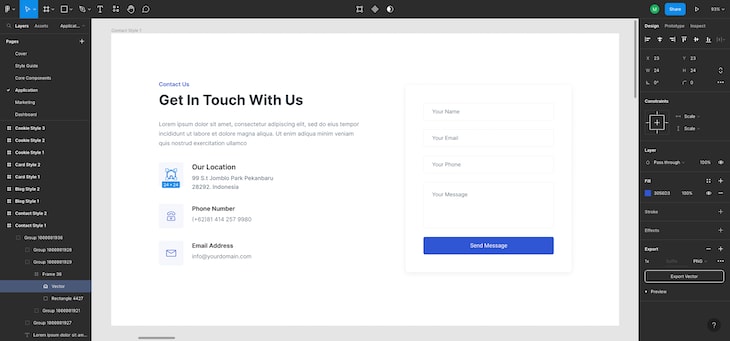
Now that I've downloaded the icon, I can code the element. But, since there are three elements that are pretty much the same as each other, it might be better if I created a separate component and used props to write them. Therefore, I won't repeat myself, per the DRY principles.
Collection component
Create a new file, call it Collection.js, and populate it with the following code:
import Image from "next/image";
import React from "react";
const Collection = ({ icon, title, para }) => {
  return (
    <div className="flex flex-row my-12">
      <div className="bg-[#3056d30d] w-20 h-20  mr-7 flex justify-center items-center">
        <Image width="24" height="24" src={icon} alt="" />
      </div>
    <div className="w-full">
       <h2 className="font-semibold text-[20px] leading-5 mb-2">{title}</h2>
        <p className="text-[#637381] text-[16px] leading-7 w-56">{para}</p>
      </div>
    </div>
  );
};
export default Collection;
My idea is to map this component in my Contact.js file. Therefore, I’ve de-structured props at the top in ({ icon, title, para }). I de-structure the props coming from the parent Contact.js file so that I don't have to use the props keyword each time I use them.
So far so good, but how did I write the styles, and how did I get them from the Figma file? As usual, I clicked the elements, looked for their values, and thought about how it would fit into the page. Nothing new here. But, as I was doing that, I encountered a problem.
You see, the icons are positioned onto a different background than the general background of the app. I want to select it, but when I look for it, I see something that might not be as easy to implement in Tailwind CSS. Check out the image below:  Do you see the problem? The background is given as a
 rgba color background: rgba(48, 86, 211, 0.05);.
So, I need to deal with opacity. But, when I want to do it with Tailwind CSS, I encounter a few problems. Remember, we’re using Tailwind CSS to be as fast as possible. If I give the opacity as suggested, the child element of the background element, which is the icon element, will be affected by it too. I definitely don't want that.
I'll either have to change my Flexbox approach and do away with the z-index, or I'll have to think of something else. I choose the latter option and decide to convert the RGBA color to a HEX color. You can find some tools on Google for this purpose. The HEX color that is the equal of this specific RGBA color is #3056d30d. When I use it, everything works as expected.
There's one more thing to mention here, the Image tag. As you can see, it's imported from "next/image". In Next.js, instead of using the classical HTML <img> tag, we use Next.js’s own Image tag. We need to give it a height and width.
In my Contact.js file, I import the icons that I've saved in the assets folder, which I've also created. Create an array of objects called data and map the Collection component while passing the relevant props:
import React from "react";
import Collection from "./Collection";
import house from "@/assets/house.png";
import email from "@/assets/email.png";
import phone from "@/assets/phone.png";
const Contact = () => {
  const data = [
    {
      title: "Our Location",
      para: "99 S.t Jomblo Park Pekanbaru 28292\. Indonesia",
      icon: house,
    },
    { title: "Phone Number", para: "(+62)81 414 257 9980", icon: phone },
    { title: "Email Address", para: "info@yourdomain.com", icon: email },
  ];
  return (
    <div className=" h-full   p-10 lg:px-28 lg:py-32    ">
      <h5 className="text-[#3056D3] font-semibold text-[16px] leading-5 mb-2">
        Contact Us
      </h5>
    <h1 className="text-[#212B36] font-bold text-[40px] lg:text-[35px] leading-10 mb-7">
       Get In Touch With Us
      </h1>
      <p className="text-[#637381] text-[16px] leading-7">
        Lorem ipsum dolor sit amet consectetur, adipisicing elit. Sequi numquam
        sapiente quod culpa qui minus itaque nesciunt cupiditate saepe
        praesentium? Exercitationem natus optio debitis quos recusandae
        assumenda? Aperiam, accusantium id.
      </p>
      {data.map((item, index) => (
        <Collection
          key={index}
          title={item.title}
          para={item.para}
          icon={item.icon}
        />
      ))}
    </div>
  );
};
export default Contact;
Form component
Now, I'll need to populate the Form.js file. I’ll use the methods I've demonstrated so far to see what I need, for example, what color, how should I deal with the dimensions, etc:
import React from "react";
const Form = () => {
return (
<div className=" h-full p-10 lg:px-28 lg:py-32 ">
<div className="bg-[#FFFFFF] drop-shadow-lg h-full w-full p-10">
<input
type="text"
placeholder="Your Name "
className=" border border-[#F0F0F0] w-full h-[50px] rounded-lg p-5 mb-5"
/>{" "}
<input
type="text"
placeholder="Your Email "
className=" border border-[#F0F0F0] w-full h-[50px] rounded-lg p-5 mb-5"
/>{" "}
<input
type="text"
placeholder="Your Phone "
className=" border border-[#F0F0F0] w-full h-[50px] rounded-lg p-5 mb-5"
/>
<textarea
name=""
id=""
cols="30"
rows="10"
placeholder="Your Message"
className=" border border-[#F0F0F0] w-full rounded-lg p-5 mb-5"
></textarea>
<button className="bg-[#3056D3] w-full h-[50px] rounded-lg p-5 mb-5 flex justify-center items-center">
<p className="text-white leading-5">Send Message</p>
</button>
</div>
</div>
);
};
export default Form;
Now, my application should look like the following image: 
Conclusion
In this article, we learned how to convert Figma designs into Next.js code by using Tailwind CSS. I demonstrated how you can use a mental model to create a sleek design without needing a paid tool. I also talked about the Figma to Reactjs plugin, but I decided to write my own code at the end for a better result.
I hope you enjoyed reading this article and learned something from it. Keep calm and keep coding!
LogRocket: Full visibility into production Next.js apps
Debugging Next applications can be difficult, especially when users experience issues that are hard to reproduce. If you’re interested in monitoring and tracking Redux state, automatically surfacing JavaScript errors, and tracking slow network requests and component load time, try LogRocket.

LogRocket is like a DVR for web and mobile apps, recording literally everything that happens on your Next app. Instead of guessing why problems happen, you can aggregate and report on what state your application was in when an issue occurred. LogRocket also monitors your app's performance, reporting with metrics like client CPU load, client memory usage, and more.
The LogRocket Redux middleware package adds an extra layer of visibility into your user sessions. LogRocket logs all actions and state from your Redux stores.
Modernize how you debug your Next.js apps — start monitoring for free.


Top comments (1)
I am learning NextJS for 3 days. Today when I went to read the next lesson in the documentaion. The documentaion has completely changed