
Written by Nefe James✏️
Forms are an integral part of the web and a key interface that people use to input data for different purposes like reporting issues, contacting businesses, or making payments online. Select forms are one type of form component we see online. We can use them to display a dropdown list of options that users can choose from. The select element is a great way to provide multiple options to users while preserving the space on a page.
In this article, we will explore Vue Select, a select component library built for Vue.js applications. We will learn what it is, its features, how it works, and how to integrate it into a Vue.js application.
Jump ahead:
What is Vue Select?
Vue Select is a feature-packed select dropdown component built for Vue.js applications. It is designed with accessibility and developer experience in mind, allowing us to add customizations to fit our unique use cases and needs. Vue Select is a supercharged and extensible select component with the functionalities that Vue.js provides.
It is a very lightweight library, weighing 20kB in total, with 5kB coming from the CSS files and 15kB from the JavaScript files. It also has zero dependencies, which makes it a great select library to use in cases where we are concerned about the speed and performance of applications.
Features of Vue Select
Vue Select is packed with the following great features and functionalities, such as:
- Filtering/searching: Vue Select’s search functionality allows us to filter through the list of dropdown options. This is a helpful feature that gives users a more pleasant experience
- Pagination: Instead of users having to scroll through dropdown with a long list of options, we can use Vue Select to paginate the options
- Supports AJAX: We can perform data fetches on the select component to dynamically load the dropdown options and render them on the component
- Supports server-side rendering: It is compatible with server-side rendering and client-side rendering
- Select single or multiple options: Depending on our use cases, we can configure Vue Select to allow users to choose one or more options from the dropdown
- Customizable with slots and SCSS variables: We can customize the appearance and behavior of the select component
Getting started with Vue Select
To get started with Vue Select, let’s create a new application. Run the command below:
npm init vue@latest
The command triggers the Vue CLI, which we use to configure the application to fit our needs. As shown below:  Run the commands below in sequence to install the dependencies and initiate the dev server:
cd <project-name>
npm install
npm run dev
Then, run the command below to install Vue Select:
# for Vue 3
npm install vue-select
yarn add vue-select@beta

# for Vue 2
yarn add vue-select
Now, register Vue Select and import the CSS style sheet in the main.js file, as shown below:
import { createApp } from "vue";
import App from "./App.vue";
import vSelect from "vue-select";
import "vue-select/dist/vue-select.css";

const app = createApp(App);
app.component("v-select", vSelect);
app.mount("#app");
With that, we have successfully integrated Vue Select.
Using Vue Select in a Vue.js application
Let’s see how Vue Select works in practice to understand it better. We start by defining the list of options we want to display in the dropdown. In this scenario, we want to render a dropdown with some countries to choose from. Use the code below:
data() {
  return {
    books: [
      { country: "Spain" },
      { country: "France" },
      { country: "Ghana" },
      { country: "Nigeria" },
      { country: "Brazil" },
      { country: "Ecuador" },
    ],
  };
},
Next, we take the array of countries and pass it into the v-select component we registered earlier, like so:
<template>
  <div class="container">
    <form>
      <v-select :options="countries" label="country"></v-select>
    </form>
  </div>
</template>

<script>
export default {
  data() {
    return {
      countries: [...]//the array of countries]
    };
  },
};
</script>
The v-select component has an options prop through, and we pass the countries we want to render in the dropdown to this prop. Note that the value of v-select's label prop and the property name for each country object must match for the dropdown to work properly.
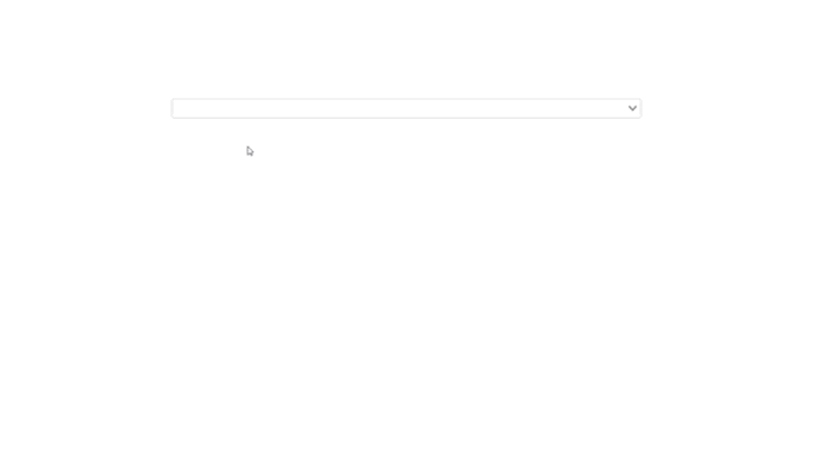
That is, if the label's value is "country", then the name of the object we want to display on the dropdown must also be "country". With that, we have a dropdown of countries to choose from, as shown below:
See the Pen Countries without images by Emadamerho Nefe (@nefejames) on CodePen.
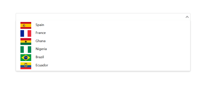
Customizing the appearance of the dropdown options
Say we want the dropdown list to contain the names and images of the countries. We can change the default appearance of the dropdown options. Here’s how that works:
<template>
  <div class="container">
    <form>
      <v-select :options="countries" label="country">
        <template #option="option">
          <span><img :src="option.image" />{{ option.country }}</span>
        </template>
      </v-select>
    </form>
  </div>
</template>
<script>
export default {
  data() {
    return {
      countries: [
        { country: "Spain",
          image: "https://flagsworld.org/img/cflags/spain-flag.png",
        },
        { country: "France",
          image: "https://flagsworld.org/img/cflags/France-flag.png",
        },
        ...
      ],
    };
  },
};
</script>
We made some changes to the previous code to render the country’s image and name in the dropdown. We updated the v-select component and added some children components to it. We used the #option, which is a shorthand for v-slot, to access the country’s name and image. Then we pass the name and image to the span and img elements for rendering. Here’s what that looks like:
See the Pen Countries with images by Emadamerho Nefe (@nefejames) on CodePen.
Selecting multiple options
The v-select component only allows us to choose one option from the dropdown by default. However, we can configure it to support multiple values via its multiple Boolean prop, like so:
<template>
  <div class="container">
    <form>
      <v-select multiple :options="countries" label="country">
        <template #option="option">
          <span><img :src="option.image" />{{ option.country }}</span>
        </template>
      </v-select>
    </form>
  </div>
</template>
Vue Select automatically converts the multiple options to tags for us. Also, we can see from the GIF below that it ensures no one can select the same option twice, meaning we don’t have to handle that ourselves.
See the Pen Multiple Options by Emadamerho Nefe (@nefejames) on CodePen.
Applying custom styles
We can customize the styling and appearance of the select dropdown to fit our branding needs and requirements.
<template>
  <div class="container">
    <form>
      <v-select
        class="new-styles"
        placeholder="Choose some countries"
        multiple
        :options="countries"
        label="country"
      >
        <template #option="option">
          <span><img :src="option.image" />{{ option.country }}</span>
        </template>
      </v-select>
    </form>
  </div>
</template>

<style lang="scss">
.new-styles .vs__search::placeholder,
.new-styles .vs__dropdown-toggle,
.new-styles .vs__dropdown-menu {
  background: #dfe5fb;
  border: none;
  color: #394066;
  text-transform: lowercase;
  font-variant: small-caps;
}

.new-styles .vs__clear,
.new-styles .vs__open-indicator {
  fill: #394066;
}
</style>
v-select provides some classes that start with the vs__ prefix. Here, we target those classes and change their styles using the new-styles class we added. We also added a placeholder text to the dropdown through the placeholder prop.
See the Pen Custom styles by Emadamerho Nefe (@nefejames) on CodePen.
With that, the dropdown has a new look. 
Conclusion
In this article, we explored the Vue Select library and how it worked. We learned how to integrate it into a Vue.js application and looked into its features and available customizations.
Experience your Vue apps exactly how a user does
Debugging Vue.js applications can be difficult, especially when there are dozens, if not hundreds of mutations during a user session. If you’re interested in monitoring and tracking Vue mutations for all of your users in production, try LogRocket.
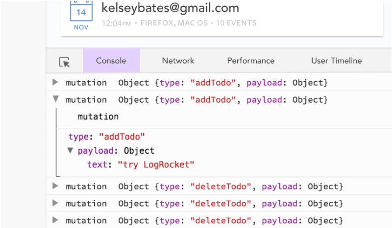
LogRocket is like a DVR for web and mobile apps, recording literally everything that happens in your Vue apps including network requests, JavaScript errors, performance problems, and much more. Instead of guessing why problems happen, you can aggregate and report on what state your application was in when an issue occurred.
The LogRocket Vuex plugin logs Vuex mutations to the LogRocket console, giving you context around what led to an error, and what state the application was in when an issue occurred.
Modernize how you debug your Vue apps - Start monitoring for free.

Top comments (1)
Great Share!