
Written by Rahul Chhodde✏️
Design patterns are reliable solutions to common problems software developers face when building software systems. They’re not specific to any programming language or framework but serve as general tools for solving problems.
In frontend development, design patterns can provide reusable solutions to recurring problems in building UIs and web apps. In this article, we will explore some popular design patterns used in Vue.js and provide clear examples to illustrate their practical applications.
Jump ahead:
- Why use design patterns in Vue.js?
- Categories of design patterns
- Builder pattern
- Adapter pattern
- Provider pattern
- Container pattern
- Composable pattern
- State management pattern
- Middleware pattern
- Error handling pattern
To get the most out of this guide, it’s best if you have an intermediate understanding of JavaScript and some basic familiarity with Vue.
Why use design patterns in Vue.js?
As you may already know, Vue is a component-based framework, and the concept of components is a design pattern in itself. Components serve as self-contained units of code that can be reused across an application, promoting modularity and maintainability.
In addition to its component-based structure, Vue leverages the concept of reactive data binding. This means that changes to data within a component are automatically reflected in the user interface, resulting in more concise and readable code.
Furthermore, Vue offers support for custom directives, which can be attached as JavaScript functions to HTML elements to add custom functionality. This flexibility also allows you to implement various other design patterns, including the observer pattern, the state management pattern, and more.
Before we delve into the specifics of these design patterns, let’s evaluate and explore areas where they’re most needed and can potentially yield the greatest improvements in general.
Design patterns in Vue can:
- Offer a structured approach to solving problems: When you face familiar problems, applying the appropriate pattern reduces the likelihood of errors, eliminating the need for custom solutions
- Enhance code reusability: Instead of reinventing the wheel, you can apply these patterns to decouple various system components. This helps simplify the process of modifying and extending the system in the future
- Improve communication: Establishing a common vocabulary through design patterns creates a shared language with other developers that can simplify collaboration and make it easier to understand each other‘s codebases
- Promote uniform coding practices: Following established design patterns helps ensure that your codebase maintains a consistent style and structure, even when multiple developers contribute to a project
- Improve scalability: Design patterns simplify distribution and management, which can help manage complexity and ensure adaptability as your project grows and requirements change
- Enhance maintenance: Code structured with design patterns is often more maintainable. You can refer to established patterns when addressing issues or making changes, avoiding the need to create custom, complex, ad-hoc solutions that can be difficult to understand and maintain
- Elevate code quality: Enforcing or encouraging best practices through design patterns — like encapsulation, abstraction, and polymorphism — results in code that is more readable, maintainable, and extensible
- Serve as a form of built-in documentation: Using design patterns means that anyone reviewing your code can recognize the patterns you use. This allows them to gain insights into your system’s architecture and behavior, even if there’s limited accompanying documentation
These benefits can save developers significant time and effort, highlighting the critical role of design patterns in software engineering and development. Let's move on to some advanced patterns that you can use in Vue to solve different problems.
Categories of design patterns
Design patterns in programming primarily revolve around objects and their interactions within a software system. They’re divided into three main categories based on how they deal with objects:
- Creational patterns deal with how we instantiate objects. They ensure that a system is independent of specific classes and objects in the system, making the process of creating objects more flexible and efficient
- Structural patterns focus on how we can combine objects and classes to form larger structures that are still flexible and efficient. These patterns, along with behavioral patterns, help simplify the system’s structure and make it more understandable
- Behavioral patterns are concerned with how objects communicate, interact, and work with each other to complete tasks or achieve different behaviors and goals, making the system more flexible and understandable
In the upcoming sections, we will explore some advanced design patterns from each of the categories discussed above and how you can utilize them to improve the structure and effectiveness of your Vue applications.
Builder pattern
The builder pattern is a creational design pattern. You can use it to construct complex objects step-by-step in a more readable and maintainable manner.
This pattern separates an object’s construction from its representation. As a result, you can create various configurations of it while maintaining consistency in the construction process.
For instance, in Vue, you can apply the builder pattern to dynamically create form elements using a FormBuilder class. This is particularly useful when dealing with forms that have numerous fields and require a streamlined approach to create them.
Here is a simplified example of how you can implement a basic builder pattern in Vue to create and configure an object for different form fields with the help of a builder class:
// FormBuilder.js
class FormBuilder {
  constructor() {
    this.formFields = [];
  }
  addTextField(name, label, placeholder = '') {
    this.formFields.push({
      type: 'text',
      name,
      label,
      placeholder,
    });
    return this; // Return the builder instance for method chaining
  }
  addNumberField(...) {
    // Add a number field
  }
  addSelectField(...) {
    // Add a select field
  }
  build() {
    return this.formFields;
  }
}
export default FormBuilder;
Following the builder pattern, we usually append the suffix Builder to our builder classes, as we did with the FormBuilder class in the code above.
The FormBuilder class provides methods for adding different attributes to the form fields, each with its respective properties such as name, label, and options. The build method returns an array of form field definitions, which we can then use to generate the form in a Vue component.
Now, let’s apply the FormBuilder class by importing it into a Vue component, which we’ll name Form.vue. We’ll utilize the methods of the builder class to add different form fields to an initially empty object — in this case, formFields — in a chained manner:
<!-- Form.vue -->
<script>
import FormBuilder from './helpers/FormBuilder';

export default {
  data() {
    return {
      formFields: [],
      formData: {}, // Add a data property to store the form data
    };
  },
  created() {
    /*
     * Use the FormBuilder class and its methods
     * to construct the `formFields` object array
     * with different form fields.
     */
    this.formFields = new FormBuilder()
      .addTextField('name', 'Name')
      .addNumberField(...)
      .addSelectField(...)
      .build();
  },
  methods: {
    handleSubmit() {
      // Log the form data when the form is submitted
      console.log(this.formData);
    },
  },
};
</script>
At the end of this chain, we use the build() method to return the populated formFields object. We can then use this object in the template section of our Form.vue component. Here’s some sample code to demonstrate that implementation:
<template>
  <form>
    <div class="input-row" v-for="(field, index) in formFields" :key="index">
      <label :for="field.name">{{ field.label }}</label>
      <!--
        Use the `input` tag if it's
        a text or a number input.
      -->
      <div class="input-field">
        <input
          v-if="field.type === 'text' || field.type === 'number'"
          :name="field.name"
          :type="field.type"
          :id="field.name"
        />
        <!--
          Use the `select` tag and loop through
          its options if it's a select input.
        -->
        <select v-else :name="field.name" :id="field.name">
          <option
            v-for="(option, optIndex) in field.options"
            :key="optIndex"
            :value="option.value"
          >
            {{ option.label }}
          </option>
        </select>
      </div>
    </div>
    <div class="input-row">
      <button type="submit">Submit</button>
    </div>
  </form>
</template>
That’s all there is to it! You can incorporate additional field methods and options into the FormBuilder class as required. Below is a working demonstration of the same concept, decorated with some fancy CSS styles:  You can interact with the demo directly on StackBlitz.
Adapter pattern
The adapter pattern is a structural design pattern that is often used to make two incompatible interfaces work together. This pattern is useful when you need to integrate with external libraries or APIs that have different interfaces.
For example, imagine you have an external API that provides random user data in a different format than your Vue component expects. You can use the adapter pattern to transform the data so your component can use it.
To accomplish that, you would create an adapter class that takes the external data and transforms it into the expected format for your component. The adapter would have a dedicated method — generally called adapt — that performs the transformation:
// UserAdapter.js
class UserAdapter {
  constructor(externalUserData) {
    this.externalUserData = externalUserData;
  }
  adapt() {
    /*
     * Adapt the external user data to match
     * the component's expected format.
     *
     * Considering the structure of the expected
     * response, grab the right object array
     * (`results`) and its only value.
     *
     * @link https://randomuser.me/api/
     */
    const userData = this.externalUserData.results[0];
    return {
      name: `${userData.name.first} ${userData.name.last}`,
      email: userData.email,
      gender: userData.gender,
      location: `${userData.location.city}, ${userData.location.country}`,
      displayPic: userData.picture.large,
    };
  }
}
export default UserAdapter;
We can now include the name, email, gender, and other properties returned by the adapt method from the UserAdapter class in our component’s markup, as shown in the below code:
<template>
  <div v-if="user">
    <h1>{{ name }}</h1>
    <p>{{ location }}</p>
    <p>{{ email }}</p>
  </div>
</template>
The user object in the above code will be created in the script section of our component, where we can import the UserAdapter class and use its capabilities to assemble the data for our component:
<script>
import UserAdapter from './UserAdapter';

export default {
  data() {
    return {
      userAdapter: null,
      user: null
    };
  },
  created() {
    /*
     * Get user data from an external API
     * with a different format.
     */
    async created() {
      try {
        // Make an API call
        const response = await fetch('...');
        if (!response.ok) {
          throw new Error('Failed to fetch external user data');
        }
        const externalUserData = await response.json();

        /*
         * Create an adapter to convert external weather data
         * to the format expected by the component.
         */
        this.userAdapter = new UserAdapter(externalUserData);

        // Adapt the data to the component's expected format
        this.user = this.userAdapter.adapt();
      } catch (error) {
        console.error('Error fetching external user data:', error);
        this.errorMessage = 'Failed to load user data. Please try again later.';
      }
    },
  }
};
</script>
In the example above, I'm fetching some dummy user data using a free API. You can later replace it with your own API call as needed. Here's what a quick implementation of the code shared above could look like:  You can fork this example on StackBlitz to customize and experiment with it.
Provider pattern
The provider pattern is a creational design pattern that allows you to provide data or functionality from a parent component to its descendant without the need for explicit prop drilling. It uses the inbuilt provide and inject methods in Vue to simplify the task of injecting dependencies.
In the example below, we show how to implement the provider pattern in Vue by creating a provider component ParentComponent.vue and a child component Quote.vue. When using this pattern, it’s common to postfix such components with Provider and an indication of the type of data they provide.
QuoteProvider injects data from itself into child components. Within this component, we define a title variable, initially set with a default value. Additionally, we introduce changeTitle function to allow for later modification of this title.
To facilitate sharing this title variable with child components, we utilize Vue’s provide function.
See the code below:
<!-- ParentComponent.vue -->
<template>
  <div>
    <ChildComponent />
    <button @click="changeTitle">Inject a new title</button>
  </div>
</template>
<script>
import { ref, provide } from 'vue'; // Import the 'provide' function
import ChildComponent from './ChildComponent.vue';

export default {
  components: {
    ChildComponent,
  },
  setup() {
    const title = ref(
      'A string sent to `ChildComponent.vue` from `ParentComponent.vue`'
    );

    function changeTitle() {
      title.value = 'Another string called from `ParentComponent.vue` in `ChildComponent.vue`';
    }

    // Provide the title to ChildComponent outside the setup function
    provide('title', title);

    return {
      title,
      changeTitle,
    };
  },
};
</script>
Quote.vue — the child component for this example — employs the inject function to access the title variable provided by its parent QuoteProvider. This enables the child component to display the title without the need for explicit prop passing or direct communication with the parent:
<template>
  <div>
    <h2>{{ providedTitle }}</h2>
  </div>
</template>
<script>
import { inject } from 'vue';

export default {
  setup() {
    // Inject the provided title from the parent component
    const providedTitle = inject('title');

    return {
      providedTitle,
    };
  },
};
</script>
When implementing the QuoteProvider, clicking the button responsible for changing the title triggers the changeTitle function to update the title value. The child component automatically reflects this change, establishing it as a reactive and efficient method to share data between components.
The provider pattern is especially useful in Vue when dealing with deeply nested components that need access to the same data or functionality provided by a higher-level ancestor. Here’s an example of this design pattern in action:  You can check out the live demo on StackBlitz to fork or interact with it.
Container pattern
The container pattern is a creational design pattern that focuses on creating and managing objects. It is often used to manage the creation and lifetime of objects, especially when there are complex dependencies between these objects.
This pattern abstracts the process of object creation and hides the details of how objects are instantiated and wired together. It helps enforce the separation of concerns, a SOLID principle that promotes better maintainability, testability, and flexibility in your code.
Let’s demonstrate how to use the container pattern by creating presentation components that are responsible for rendering the UI and displaying data. They receive data and events from their parent container component but don’t directly manipulate the data themselves.
The TaskList component we set up below is responsible for displaying a list of tasks and their completion status. It carries a tasks array as a prop and emits an event when a task is completed:
<template>
  <ul>
    <li v-for="(task, index) in tasks" :key="index">
      <input type="checkbox" v-model="task.completed" @change="completeTask(index)" />
      {{ task.text }}
    </li>
  </ul>
</template>

<script>
export default {
  props: ['tasks'],
  methods: {
    completeTask(index) {
      this.$emit('completeTask', index);
    },
  },
};
</script>
Similarly, we can create a TaskForm component that displays an input field for adding tasks and emits an event when a new task should be added:
<template>
  <div>
    <input
      class="add-task-input"
      v-model="task"
      @keyup.enter="addTask"
      placeholder="Add a task"
    />
  </div>
</template>
<script>
export default {
  data() {
    return {
      task: '',
    };
  },
  methods: {
    addTask() {
      if (this.task.trim() === '') return;
      this.$emit('addTask', this.task);
      this.task = '';
    },
  },
};
</script>
Now our taskContainer component manages the application state and contains the business logic. This component will interact with data and methods related to that data:
<template>
  <div>
    <h1>Task List</h1>
    <TaskForm @addTask="addTask" />
    <TaskList :tasks="tasks" @completeTask="completeTask" />
  </div>
</template>

<script>
import TaskForm from './TaskForm.vue';
import TaskList from './TaskList.vue';
export default {
  components: {
    TaskForm,
    TaskList,
  },
  data() {
    return {
      tasks: [],
    };
  },
  methods: {
    addTask(task) {
      this.tasks.push({ text: task, completed: false });
    },
    completeTask(index) {
      this.$emit('completeTask', index, !this.tasks[index].completed);
    },
  },
};
</script>
In the code snippet above, taskContainer manages the tasks array and provides the following two methods for adding tasks and marking them as completed:
-
addTaskgets invoked when theTaskFormcomponent emits theaddTaskevent. It takes thetaskas a parameter and then delegates the task addition to thetaskContainerby callingtaskContainer.addTask(task) -
completeTaskis called when theTaskListcomponent emits thecompleteTaskevent, along with anindexparameter. It delegates the task completion to thetaskContainerby invokingtaskContainer.completeTask(index)
Additionally, taskContainer is responsible for monitoring changes in the tasks array and updating the presentation component TaskList when the data changes.
Now, we can simply import our container component into a parent component and see the app in action: 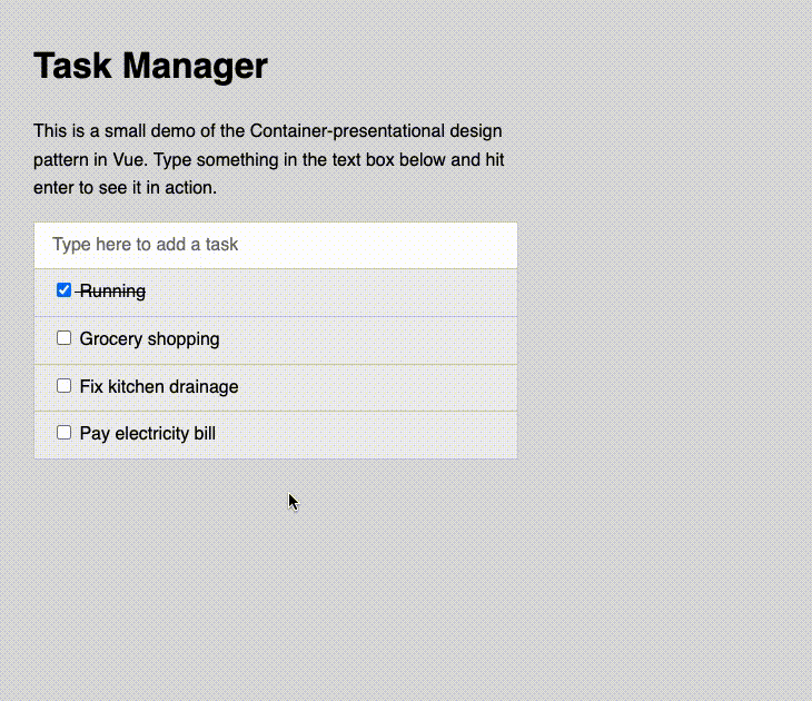 Note that the app simply adds tasks through an input box for now to demonstrate the container-presentational pattern. You may use the StackBlitz demo to improve this app and add more features and utilities to experiment with it further.
Composable pattern
The composable pattern is a behavioral design pattern that promotes creating small, functional, reusable, and interchangeable building blocks, often referred to as composables. Composables are highly modular by design — you can combine them to create more complex and customized functionality.
The pattern is particularly prevalent in functional programming paradigms, but you can also apply it in object-oriented programming and other paradigms.
Let’s consider an example of a Vue application with various user settings, including preferences for themes, languages, and notifications. Instead of developing a single, monolithic component tightly coupled to handle all these settings, you can employ the composable pattern to break down this functionality into manageable pieces.
First, we’ll create a module that defines and exports functions and reactive properties associated with user preferences.
With Vue’s ref, you can establish reactive properties for aspects like theming, language selection, turning notifications on and off, and similar settings. By defining the getter and setter functions for these properties, you make them accessible for other parts of the application.
See the code below:
// userPreferences.js
import { ref } from 'vue';

const theme = ref('light');
const language = ref('english');
const notifications = ref(true);

// Getter for theme
const getTheme = () => theme.value;

// Setter for theme
const setTheme = (newTheme) => {
  theme.value = newTheme;
};

// Getter for language
const getLanguage = () => language.value;

// Setter for language
const setLanguage = (newLanguage) => {
  language.value = newLanguage;
};

// Getter for notifications
const getNotificationsEnabled = () => notifications.value;

// Setter for notifications
const setNotificationsEnabled = (enabled) => {
  notifications.value = enabled;
};

export {
  getTheme,
  setTheme,
  getLanguage,
  setLanguage,
  getNotificationsEnabled,
  setNotificationsEnabled,
};
Now, we can proceed to define composable functions to manage the settings separately.
For instance, let’s create a file named themeSelector.js to define useThemeSelection composable function, which encapsulates the logic for handling the selected theme. It utilizes Vue’s computed property to create a reactive property called selectedTheme.
Within selectedTheme, we define get and set methods that leverage the functions from the user preferences module we discussed earlier to both retrieve and update the selected theme. This separation of concerns allows for more modular and maintainable code. See below:
// themeSelector.js
import { computed } from 'vue';
import { getTheme, setTheme } from '../utils/userPreferences';

export function useThemeSelection() {
  const selectedTheme = computed({
    get: () => getTheme(),
    set: (newTheme) => setTheme(newTheme),
  });
  return {
    selectedTheme,
  };
}
Likewise, we can set up composables for all other preferences. These composables can be employed within Vue components responsible for rendering related UI options.
In this case, we have a select dropdown containing theme choices. It utilizes the useThemeSelection composable to handle the selected theme. When there’s a change in the theme dropdown selection, it invokes the handleChange method to update the selected theme:
<template>
  <div>
    <label for="theme-switch">Theme</label>
    <select id="theme-switch" @change="handleChange" v-model="selectedTheme">
      <option value="light">Light</option>
      <option value="dark">Dark</option>
    </select>
  </div>
</template>
<script>
import { defineComponent } from 'vue';
import { useThemeSelection } from '../composables/themeSelector';

export default defineComponent({
  setup() {
    const { selectedTheme } = useThemeSelection();
    const handleChange = (event) => {
      const newTheme = event.target.value;
      selectedTheme.value = newTheme; // Set the new theme
    };
    return {
      selectedTheme,
      handleChange,
    };
  },
});
</script>
Now, in a parent component, we can import the ThemeSelector component and utilize the useThemeSelection composable:
<template>
  <div class="settings">
    <div class="settings-row">
      <ThemeSelector />
      <div :class="selectedTheme">
        Here's how the {{ selectedTheme }} theme looks like.
      </div>
    </div>
  </div>
</template>

<script>
import { defineComponent } from 'vue';
import { useThemeSelection } from './composables/themeSelector';
import ThemeSelector from './components/ThemeSelector';

export default defineComponent({
  setup() {
    const { selectedTheme } = useThemeSelection();

    return {
      selectedTheme,
    };
  },
  components: {
    ThemeSelector
  },
});
</script>

<style>
.light {
  background-color: #fff;
  color: #000;
}
.dark {
  background-color: #000;
  color: #fff;
}
</style>
As shown in the above code, we have the ThemeSelector component and some text content with a class based on the selected theme. The selectedTheme is passed down to the ThemeSelector component for synchronization.
We also have some styles at the end for the light and dark themes.
Let’s see how it looks: 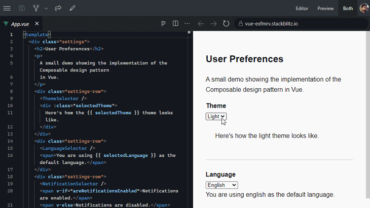 You can interact with the demo directly on StackBlitz.
It’s important to recognize that the composable design pattern is closely associated with the Composition API, one of Vue’s two APIs for component creation.
The Composition API was introduced in Vue 3 to offer enhanced flexibility and reusability when structuring and distributing component logic. It empowers you to craft composable functions that can be effortlessly reused and combined to build complex component behaviors.
Observer pattern
The observer pattern is a behavioral design pattern that you can use to create loosely coupled systems that are easy to maintain and extend. It’s especially useful in applications where you need to notify multiple objects of state changes in a single object.
This pattern is also known as the observable pattern. It allows an object to notify its dependents, or observers, of any state changes. The subject, or observable, maintains a list of its observers and calls their update methods whenever its state changes.
In the context of Vue, the observer pattern is used to manage reactivity and handle dynamic updates in the UI. Let’s see an example that shows a notification every time a checkbox is checked or unchecked.
We’ll start by creating the notification component. Let’s structure the notification and provide it with a base CSS class for basic presentation.
Also, we’ll use the :class directive to dynamically add the active CSS class to the notification element based on the presence of the message data property. This data property acts as the body of our notification, which we will discuss further in a moment.
The active CSS class may contain the visibility directions for the notification element, which can help create a nice animated look and feel for the notification element.
<template>
  <div class="notification" :class="{ active: message }">
    {{ message }}
  </div>
</template>
Next, in the script section, we use the data method to define some data properties of our notification component.
As mentioned before, this method has a message data property that stores the notification message. It also has a timerId for the timeout functions that enable users to auto-hide notifications:
<script>
const NOTIFICATION_DURATION = 3000;

export default {
  data() {
    return {
      message: null,
      timerId: null,
    };
  },
  methods: {
    showNotification(message) {
      this.message = message;
      if (this.timerId) {
        clearTimeout(this.timerId);
      }
      this.timerId = setTimeout(() => {
        this.hideNotification();
      }, NOTIFICATION_DURATION);
    },
    hideNotification() {
      this.message = null;
      this.timerId = null;
    },
  },
};
</script>
The notification component, acting as the observer in this case, carries two methods:
-
showNotificationdisplays the notification. It sets themessagedata property to the provided message, clears any existing timer if any, and starts a new timer to call thehideNotificationmethod after three seconds -
hideNotificationhides the notification. It sets themessagetonull, effectively hiding the notification message, and clears the time by settingtimerIdtonull
Let’s now consume the notification component in a parent component and establish the logic for it to work. I’m using the App.vue file to do that, but you may create a separate component if you want.
The parent component includes an input checkbox element, which binds its state to the isChecked data property with the help of the v-model directive. When the checkbox is checked or unchecked, ischecked will reflect its state:
<template>
  <label>
    <input
      type="checkbox"
      v-model="isChecked"
      @change="toggleNotification"
    />
    <span>Show notification</span>
  </label>

  <Notification ref="notification" />
</template>
At last, we referenced the Notification component with notification. This allows the parent, or subject, component to refer to the Notification component when assigning logic in the script section later on. Next, in the script section of the parent component, let’s import the Notification component and register it in the components property:
<script>
import Notification from './Notification.vue';

export default {
  components: {
    Notification,
  },
  data() {
    return {
      isChecked: false,
    };
  },
  methods: {
    showNotification() {
      const message = this.isChecked
        ? 'Checkbox is checked!'
        : 'Checkbox is unchecked!';
      this.$refs.notification.showNotification(message);
    },
    toggleNotification() {
      this.showNotification();
    },
  },
};
</script>
You can see our observer pattern demo below or interact with it on CodePen:
See the Pen Observer Design Pattern In Vue.js by Rahul C (@_rahul) on CodePen.
State management pattern
The state management design pattern facilitates the efficient sharing of application state across components while maintaining a clear separation between domain representation and state management. It also falls under the behavioral category.
In Vue, the Vuex framework is a widely adopted solution that also promotes the use of this pattern. Let’s delve into Vuex to illustrate how to implement this design pattern. Note that Vuex is not included by default in Vue, so you must install it as an additional dependency to use it in your Vue app.
Let’s start by creating a Vuex store by defending its structure in the cartStore.js file. This file essentially serves as the central hub for managing the shopping cart’s data and actions:
// cartStore.js
import { createStore } from 'vuex';

const cartStore = createStore({
  state: {
    cartItems: [],
  },
  getters: {
    cartTotal(state) {
      return state.cartItems.reduce((total, item)
        => total + item.price * item.quantity, 0);
    },
  },
  mutations: {
    addToCart(state, product) {
      const existingItem = state.cartItems.find((item)
        => item.id === product.id);
      if (existingItem) {
        existingItem.quantity++;
      } else {
        state.cartItems.push({
          ...product,
          quantity: 1
        });
      }
    },
    removeFromCart(state, productId) {
      const index = state.cartItems.findIndex((item)
        => item.id === productId);
      if (index !== -1) {
        state.cartItems.splice(index, 1);
      }
    },
    clearCart(state) {
      state.cartItems = [];
    },
  },
  actions: {
    addToCart({
      commit
    }, product) {
      commit('addToCart', product);
    },
    removeFromCart({
      commit
    }, productId) {
      commit('removeFromCart', productId);
    },
    clearCart({
      commit
    }) {
      commit('clearCart');
    },
  },
});

export default cartStore;
In the code above, the store structure is created using the createStore function from Vuex. It includes four main sections:
-
state— Initializes the initial state of the store, which is an empty array calledcartItems. This array represents the items in the shopping cart -
getters— Functions that compute and return derived values based on the state. In this example, there's acartTotalgetter that calculates the total cost of the items in the shopping cart -
mutations— Define how the state can be modified. There are mutations likeaddToCart,removeFromCart, andclearCartwhich handle different aspects of modifying the shopping cart state -
actions— Functions that perform asynchronous operations or complex logic. They typically commit mutations to update the state. In this case, we use actions likeaddToCart,removeFromCart, andclearCartto interact with the mutations
In the app’s entry point — usually the main.js file — we’ll import the store and register it with Vue using the store option. This makes the store available to all components in your application:
import { createApp } from 'vue';
import App from './App.vue';
import cartStore from './store/cartStore';

createApp(App)
  .use(cartStore) // Using the cartStore
  .mount('#app');
To use the store in your components, import it and use the $store property to access its state, mutations, actions, or getters. Components can read data from the state and commit mutations or dispatch actions to update the state:
<!-- Cart.vue -->
<template>
  <h1>Shopping Cart</h1>
  <div v-if="cartItems.length === 0">Your cart is empty.</div>
  <div class="cart-items" v-else>
    <div v-for="item in cartItems" :key="item.id" class="cart-item-listing">
      <p>{{ item.name }} - ${{ item.price }} (Quantity: {{ item.quantity }})</p>
      <button @click="removeFromCart(item.id)">Remove from Cart</button>
    </div>
    <div class="cart-total">
      <p>Total: ${{ cartTotal }}</p>
      <button @click="clearCart">Clear Cart</button>
    </div>
  </div>
</template>

<script>
import { createStore } from 'vuex';

export default {
  data() {
    return {
      cartItems: [],
    };
  },
  computed: {
    cartTotal() {
      return this.cartItems.reduce(
        (total, item) => total + item.price * item.quantity,
        0
      );
    },
  },
  methods: {
    addToCart(product) {
      const existingItem = this.cartItems.find(
        (item) => item.id === product.id
      );
      if (existingItem) {
        existingItem.quantity++;
      } else {
        this.cartItems.push({
          ...product,
          quantity: 1
        });
      }
    },
    removeFromCart(productId) {
      const index = this.cartItems.findIndex((item) => item.id === productId);
      if (index !== -1) {
        this.cartItems.splice(index, 1);
      }
    },
    clearCart() {
      this.cartItems = [];
    },
  },
  mounted() {
    // You can simulate adding items to the cart on component mount
    this.addToCart({
      id: 1,
      name: 'Photo frame',
      price: 10
    });
    this.addToCart({
      id: 2,
      name: 'Backpack',
      price: 20
    });
  },
};
</script>
The methods and properties like cartItems, cartTotal, removeFromCart, and clearCart defined in Cart.vue interact with the Vuex store to update the shopping cart’s state.
Vue’s reactivity ensures that any changes made to the state through mutations or actions will automatically trigger updates in components that depend on that data. This is a key advantage of using Vuex.
Here’s our finished demo in action:  You can interact with this demo directly on StackBlitz.
Middleware pattern
The middleware design pattern is a behavioral design pattern used to manage requests and responses in a systematic and extensible way. It does so by inserting processing steps or filters between the sender and receiver.
If you are acquainted with Express.js, you are probably already familiar with the middleware pattern, as Express relies heavily on it.
In the context of Vue, you can leverage this pattern through the Vue Router, which is the official routing library for Vue. The Vue Router provides a means to implement middleware-like functionality for route navigation, enabling you to incorporate custom behavior before or after navigating to specific routes.
Let’s dive into this pattern by demonstrating how to perform authentication checks before navigating to protected routes. We’ll utilize the Vue Router to set up navigation for different paths and complement it with straightforward middleware to execute authentication checks. To start, let’s create a Vue Router instance using the createRouter method. We’ll configure the router to use the browser’s createWebHistory API for history mode and define an array of route objects within the routes property.
Each route object contains a path property and specifies a corresponding Vue component to render when that route is accessed:
const router = createRouter({
  history: createWebHistory(),
  routes: [{
      path: '/',
      component: Home
    },
    {
      path: '/dashboard',
      component: Dashboard,
      meta: {
        requiresAuth: true
      }
    },
    {
      path: '/login',
      component: Login
    },
  ],
});

router.beforeEach((to, from, next) => {
  if (to.matched.some((record) => record.meta.requiresAuth)) {
    /*
     * Check if the user is authenticated, you can implement
     * your authentication logic here.
     */
    if (!isAuthenticated) {
      // If not authenticated, redirect to the login page
      next({
        path: '/login',
        query: {
          redirect: to.fullPath
        },
      });
    } else {
      // If authenticated, proceed to the route
      next();
    }
  } else {
    // If the route does not require authentication, proceed
    next();
  }
});

export default router;
One of the routes, /dashboard, has a meta property with the key requiresAuth set to true. This property indicates that accessing this particular route requires authentication.
We use the router.beforeEach function to define a global navigation guard, which is executed before every route navigation. Within this guard, we check whether the user is authenticated by using the authentication logic provided by our middleware:
- If the route being accessed has a
metaproperty withrequireAuthset to true, the code checks whether the user is authenticated usingisAuthenticated- If the user is authenticated, we call the
next()method, allowing the route navigation to proceed as usual - If the user is not authenticated, we call the
next('login')method, which redirects the user to the login route
- If the user is authenticated, we call the
- If the route being accessed does not have the
requireAuthmeta property or if the user is authenticated, the code simply callsnext(), enabling the route navigation to continue without any interruption
Our actual authentication logic resides in our middleware implementation, which may appear as follows:
// authMiddleware.js
const checkIfUserIsAuthenticated = () => {
  /*
   * Replace this with your actual authentication logic.
   * For demonstration purposes, assume the user is authenticated
   * if a token exists in localStorage.
   */
  const token = localStorage.getItem('authToken');
  return !!token; // Convert to a boolean
};

const isAuthenticated = checkIfUserIsAuthenticated();

// A token in local storage is set here for demo purpose
const login = () => localStorage.setItem('authToken', 'your_auth_token');

// Clear the auth token from the storage
const logout = () => localStorage.removeItem('authToken');

export {
  isAuthenticated,
  login,
  logout
};
In this demonstration, I’m allowing users to access protected pages by simply clicking on a login button, which then sets an authToken key to the browser’s local storage. This is for the sake of simplicity — in a real-world application, you would implement your actual authentication logic in this particular file.
Now, setting up the main component is relatively straightforward. However, it’s crucial to ensure that you register the router in the app’s entry point file, as shown below:
// main.js
const { createApp } = require('vue');
import App from './App';
import router from './router';

createApp(App)
  .use(router) // Register the router with the app
  .mount('#app');
Below is how our implementation of the middleware pattern in a Vue app should look:  You can also see the live demo on StackBlitz. Remember, the authentication logic here is simplified for demonstration purposes, and the primary focus is on understanding the middleware pattern.
Error handling pattern
Error handling design patterns and practices help developers manage and respond to errors effectively. These patterns are mostly behavioral in nature and aim to ensure that applications can gracefully handle unexpected situations, provide meaningful feedback to users, and facilitate debugging and testing.
In Vue, error handling primarily revolves around handling errors related to components, routing, network requests, and the application’s runtime. Let’s go over some common situations now.
try...catch blocks
If you have some code in your app that may potentially generate errors, it is best to encapsulate it within a try...catch block to promptly address any issues that may arise:
<script>
export default {
  methods: {
    fetchData() {
      try {
        // Code that may throw an error
        // ...
      } catch (error) {
        // Handle the error here
        console.error(`Error: ${error}`);
      }
    },
  },
};
</script>
This approach helps you handle errors quickly and is particularly useful for managing operations like API calls.
Error boundaries
Error boundary components are a powerful feature to help you handle and gracefully recover from errors that occur during the rendering of a component’s tree. They’re similar in concept to JavaScript’s try...catch blocks, but are specifically applied to Vue components.
To create an error boundary component in Vue, you need to define a component with a special lifecycle hook called errorCaptured . This hook is called whenever an error occurs in the component’s subtree or in any of its child components:
<template>
  <div>
    <slot></slot>
  </div>
</template>

<script>
export default {
  name: 'ErrorBoundary',
  errorCaptured(err, vm, info) {
    // Handle the error
    console.log(err)
  }
}
</script>
To use this error boundary component, simply wrap the component that you want to protect from errors in the error boundary component:
<template>
  <div>
    <ErrorBoundary>
      <MyComponent />
    </ErrorBoundary>
  </div>
</template>

<script>
import MyComponent from './MyComponent.vue'

export default {
  name: 'App',
  components: {
    ErrorBoundary,
    MyComponent
  }
}
</script>
If an error occurs in the MyComponent component, the ErrorBoundary component’s errorCaptured hook will be called. You can then handle the error in the errorCaptured hook — for example, by logging the error to the console or displaying an appropriate error or warning message to the user.
Handling router errors
Using navigation guards with the Vue router can serve as an effective approach to prevent router errors in specific scenarios, such as user authentication, as we‘ve previously explored in the Middleware pattern.
Additionally, Vue Router provides its own error handling mechanism — the onError method, which allows you to establish a global error handler for effectively managing and handling errors that occur during navigation via Vue Router:
router.onError((err) => {
  console.error("Router error:", err);
});
The err parameter, as shown above, contains information regarding the error that occurred during routing. This parameter typically provides insights into the reasons behind the routing failure, such as failed navigation or a missing route.
Within the error handler function, you have the flexibility to log the error using console.error or implement any other necessary error handling logic.
Global error handling
Setting up global error handling helps enhance error catching and makes error messages more intuitive and informative. You can achieve this by setting up global error handling at the entry point of your Vue application:
// main.js
import { createApp } from 'vue';

const app = createApp({});

// Global error handler
app.config.errorHandler = (error, instance, info) => {
  console.error("Global Error:", error);
  console.log("Vue Instance:", instance);
  console.log("Error Info:", info);
};

// Mount the Vue app to the HTML element with the id "app"
app.mount("#app");
This approach allows for better error presentation, logging the Vue instance where the error occurred, and providing additional information about the error.
Conclusion
Design patterns are invaluable tools for creating well-structured, maintainable, and scalable applications. In this tutorial, as we explored various design patterns within the context of Vue, we encountered solutions tailored to specific challenges and requirements in Vue development.
It’s important to note that design patterns, like many aspects of software development, can be the subject of debate and differing opinions. Some developers may have strong preferences for certain patterns over others, leading to discussions about their appropriate usage in specific scenarios.
But generally speaking, understanding and applying design patterns in your Vue projects can help you write cleaner, more modular code that is easier to maintain and scale. Whether you’re a beginner or an experienced Vue developer, mastering these patterns will significantly improve your development skills.
Experience your Vue apps exactly how a user does
Debugging Vue.js applications can be difficult, especially when there are dozens, if not hundreds of mutations during a user session. If you’re interested in monitoring and tracking Vue mutations for all of your users in production, try LogRocket.
LogRocket is like a DVR for web and mobile apps, recording literally everything that happens in your Vue apps including network requests, JavaScript errors, performance problems, and much more. Instead of guessing why problems happen, you can aggregate and report on what state your application was in when an issue occurred.
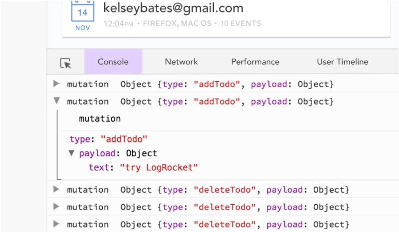
The LogRocket Vuex plugin logs Vuex mutations to the LogRocket console, giving you context around what led to an error, and what state the application was in when an issue occurred.
Modernize how you debug your Vue apps - Start monitoring for free.


Top comments (1)
Great! 👏🏻 thank you for your introducing these design patterns which are much inspiration for me to optimizing my Vue applications.