
Written by Nilanth Sriram✏️
Animation provides a compelling user experience for modern web apps, bringing them to life and avoiding that dreaded flat look. But, of course, adding animations can be a difficult and time-consuming task, and if your app has multiple components, it gets worse!
In this article, we‘re going to be taking a look at how you can add animation to React components with a single line of code using the AutoAnimate library.
Let’s get straight into it.
Jump ahead:
- What is AutoAnimate?
- Why not use other animation libraries?
- Alert message using React Transition Group
- Alert message using AutoAnimate
- How does it work?
- Quick setup and usage
- Animate a dynamic
Formcomponent - Animate a user comment component
- Customize the animation duration
- Enable and disable animations
What is AutoAnimate?
AutoAnimate is an open-source animation utility library with zero configuration that adds smooth transitions to React components while also being very lightweight (2.3KB).
Why not use other animation libraries?
Most animation libraries require more configuration, and some require changing the existing component structure to apply animations.
AutoAnimate, however, requires only a single line of code to animate components and does not require changing any existing components. It also offers the benefit of being straightforward to integrate with an existing code base.
AutoAnimate makes for a smooth experience when an element changes in the DOM. I would like to compare AutoAnimate with React Transition Group, which is a simple transition library for component entering and exiting, but with some additional configurations.
Let’s create an alert message with React Transition Group and AutoAnimate so you can see the difference between the libraries for yourself.
Alert message using React Transition Group
The following component shows how to add animation using React Transition Group.
App.jsx
import React, { useState, useRef } from 'react';
import { createRoot } from 'react-dom/client';
import { Container, Button, Alert } from 'react-bootstrap';
import { CSSTransition } from 'react-transition-group';

import 'bootstrap/dist/css/bootstrap.min.css';
import './styles.css';

function Example() {
  const [showButton, setShowButton] = useState(true);
  const [showMessage, setShowMessage] = useState(false);
  const nodeRef = useRef(null);

  return (
    <Container style={{ paddingTop: '2rem' }}>
      {showButton && (
        <Button
          onClick={() => setShowMessage(true)}
          size="lg"
        >
          Show Message
        </Button>
      )}
      <CSSTransition
        in={showMessage}
        nodeRef={nodeRef}
        timeout={300}
        classNames="alert"
        unmountOnExit
        onExited={() => setShowButton(true)}
      >
        <Alert
          ref={nodeRef}
          variant="primary"
          dismissible
          onClose={() => setShowMessage(false)}
        >
          <Alert.Heading>
            Animated alert message
          </Alert.Heading>
          <p>
            This alert message is being transitioned in and
            out of the DOM.
          </p>
          <Button
            variant="primary"
            onClick={() => setShowMessage(false)}
          >
            Close
          </Button>
        </Alert>
      </CSSTransition>
    </Container>
  );
}
const container = document.getElementById('root');
const root = createRoot(container);
root.render(<Example />);
Add the following styles to add the transition:
//styles.css
.alert-enter {
  opacity: 0;
  transform: scale(0.9);
}
.alert-enter-active {
  opacity: 1;
  transform: translateX(0);
  transition: opacity 300ms, transform 300ms;
}
.alert-exit {
  opacity: 1;
}
.alert-exit-active {
  opacity: 0;
  transform: scale(0.9);
  transition: opacity 300ms, transform 300ms;
}
The above code will produce the following output: 
To add this transition, we have added a few lines of CSS and passed a few props to the CSS transition component.
Now, let’s reproduce the same animation using AutoAnimate with zero configuration.
N.B., you can find the above demo here at CodeSandbox
Alert message using AutoAnimate
The following component shows you how to add an animation using AutoAnimate.
//App.jsx

import React, { useState, useRef } from 'react';
import { createRoot } from 'react-dom/client';
import { Container, Button, Alert } from 'react-bootstrap';
import { useAutoAnimate } from '@formkit/auto-animate/react';

import 'bootstrap/dist/css/bootstrap.min.css';

function Example() {
//Auto Animate
  const [parent] = useAutoAnimate(/* optional config */);

  const [showButton, setShowButton] = useState(true);
  const [showMessage, setShowMessage] = useState(false);
  const nodeRef = useRef(null);

  return (
    <Container style={{ paddingTop: '2rem' }}>
      {showButton && (
        <Button
          onClick={() => setShowMessage(true)}
          size="lg"
        >
          Show Message
        </Button>
      )}
      <div ref={parent}>
        {showMessage && (
          <Alert
            ref={nodeRef}
            variant="primary"
            dismissible
            onClose={() => setShowMessage(false)}
          >
            <Alert.Heading>
              Animated alert message
            </Alert.Heading>
            <p>
              This alert message is being transitioned in
              and out of the DOM.
            </p>
            <Button
              variant="primary"
              onClick={() => setShowMessage(false)}
            >
              Close
            </Button>
          </Alert>
        )}
      </div>
    </Container>
  );
}
const container = document.getElementById('root');
const root = createRoot(container);
root.render(<Example />);
Here, we have used the same code that we used for React Transition Group. We have included the AutoAnimate library and added the useAutoAnimate hook ref to the Alert parent element (<div>).
That's all we need to do! It’s not necessary for us to add the CSS or transition duration. Let’s see the output here: 
We can see here that we’ve created the same animation with zero configuration — this is how AutoAnimate differs from other libraries!
N.B., you can find the above demo here at CodeSandbox
How does it work?
AutoAnimate is a single-function utility that accepts a parent element of the component which needs to be animated. The animation is then applied to the immediate child elements of the parent element.
AutoAnimate triggers the animations when the following events occur:
- A child element is inserted into the DOM
- A child element is removed from the DOM
- A child element is moved in the DOM
Quick setup and usage
Now, let’s set up AutoAnimate for use in your projects.
Install AutoAnimate using the following command: yarn add @formkit/auto-animate
Import the useAutoAnimate hooks into the component which you want to animate, as shown here:
import { useAutoAnimate } from '@formkit/auto-animate/react
To animate a component, we need to add the reference returned by the useAutoAnimate hook to the parent element, as seen here:
//App.jsx

import { useState } from 'react'
import { useAutoAnimate } from '@formkit/auto-animate/react'

const App = function () {
  const [items, setItems] = useState([0, 1, 2])
  const [parent] = useAutoAnimate()
  const add = () => setItems([...items, items.length])
  return
  <>
  <ul ref={parent}>
    {items.map(
      item => <li key={item}>{ item }</li>
    )}
  </ul>
  <button onClick={add}>Add number</button>
  </>
}

export default App
Here, we have passed the reference of the parent element <ul> to useAutoAnimate. When clicking the Add Number button, the newly added list will be animated.
Next, we will take a look at some more examples.
Animate a dynamic Form component
Most apps have dynamic input Form components. Now, we will create a dynamic component, so add the following code:
N.B., I have used the Ant Design
Formfor the sake of simplicity for this walkthrough
//DynamicForm.jsx

import { MinusCircleOutlined, PlusOutlined } from '@ant-design/icons';
import { Button, Form, Input, Space } from 'antd';
import React from 'react';

const DynamicForm = () => {
    return (
            <Form name="dynamic_form_nest_item" autoComplete="off" >
                <Form.List name="users">
                    {(fields, { add, remove }) => (
                        <div>
                            {fields.map(({ key, name, ...restField }) => (
                                <Space
                                    key={key}
                                    style={{
                                        display: 'flex',
                                        marginBottom: 8,
                                    }}
                                    align="baseline"
                                >
                                    <Form.Item
                                        {...restField}
                                        name={[name, 'first']}
                                        rules={[
                                            {
                                                required: true,
                                                message: 'Missing first name',
                                            },
                                        ]}
                                    >
                                        <Input placeholder="First Name" />
                                    </Form.Item>
                                    <Form.Item
                                        {...restField}
                                        name={[name, 'last']}
                                        rules={[
                                            {
                                                required: true,
                                                message: 'Missing last name',
                                            },
                                        ]}
                                    >
                                        <Input placeholder="Last Name" />
                                    </Form.Item>
                                    <MinusCircleOutlined
                                      onClick={() => remove(name)}
                                      />
                                </Space>
                            ))}
                            <Form.Item>
                                <Button
                                    type="dashed"
                                    onClick={() => add()}
                                    block
                                    icon={<PlusOutlined/>
                                    }>
                                    Add field
                                </Button>
                            </Form.Item>
                        </div>
                    )}
                </Form.List>
            </Form>
    );
};

export default DynamicForm;
Now, we will see the following output when we run the component. When we click on Add field, the inputs are added in a fraction of a second; it feels like bad UX to me! 
Let’s animate the form with AutoAnimate using a single line. Import the AutoAnimate library using the code in the DynamicForm component:
import { useAutoAnimate } from '@formkit/auto-animate/react'
Next, add the useAutoAnimate hook, as demonstrated here:
const [parent] = useAutoAnimate(/* optional config */)
Then, pass the reference for the parent element <div>, as below:
<div ref={parent}>
Now, run the code again; you can see the magic of AutoAnimate in action! 
Animate a user comment component
Another use case is to auto-animate the Comments component of an application.
Here, we are developing a Comments component, which is used to add comments to a post. If a new comment is added, it is displayed at the top of a list.
//Comments.jsx
import {Avatar, Button, Comment, Form, Input,} from 'antd';
import React, {useState} from 'react';
import {useAutoAnimate} from '@formkit/auto-animate/react'
const {TextArea} = Input;

const Editor = ({onChange, onSubmit, submitting, value}) => (
    <>
        <Form.Item>
            <TextArea rows={4} onChange={onChange} value={value}/>
        </Form.Item>
        <Form.Item>
            <Button
                htmlType="submit"
                loading={submitting}
                onClick={onSubmit}
                type="primary"
                >
            Add Comment
            </Button>
        </Form.Item>
    </>
);

const Comments = () => {
    const [comments, setComments] = useState([]);
    const [submitting, setSubmitting] = useState(false);
    const [value, setValue] = useState('');
    const [parent] = useAutoAnimate()
    const handleSubmit = () => {
        if (!value) return;
        setSubmitting(true);
        setTimeout(() => {
            setSubmitting(false);
            setValue('');
            setComments([
                ...comments,
                {
                    author: 'Han Solo',
                    avatar: 'https://joeschmoe.io/api/v1/random',
                    content: <p>{value}</p>,
                },
            ]);
        }, 500);
    };

    const handleChange = (e) => {
        setValue(e.target.value);
    };

    return (
        <>
            <ul ref={parent}>
                {comments.map((comment) => (
                        <Comment
                            key={comment.content}
                            author={comment.author}
                            avatar={
                                    <Avatar
                                      src="https://joeschmoe.io/api/v1/random"
                                      alt="Han Solo"
                                    />
                                    }
                            content={
                                <p>
                                    {comment.content}
                                </p>
                            }
                        />
                    )
                )}
            </ul>
            <Comment
                avatar={
                  <Avatar src="https://joeschmoe.io/api/v1/random" alt="Han Solo"/>
                }
                content={
                    <Editor
                        onChange={handleChange}
                        onSubmit={handleSubmit}
                        submitting={submitting}
                        value={value}
                    />
                }
            />
        </>
    );
};

export default Comments;
In the above example, we have a comment input. When the user types a comment and clicks Add Comment, the entered comment is appended at the top with an animation. To animate the list, we have added an AutoAnimate hook reference to the <ul> element.
Now, we will see the following output when we run the component: 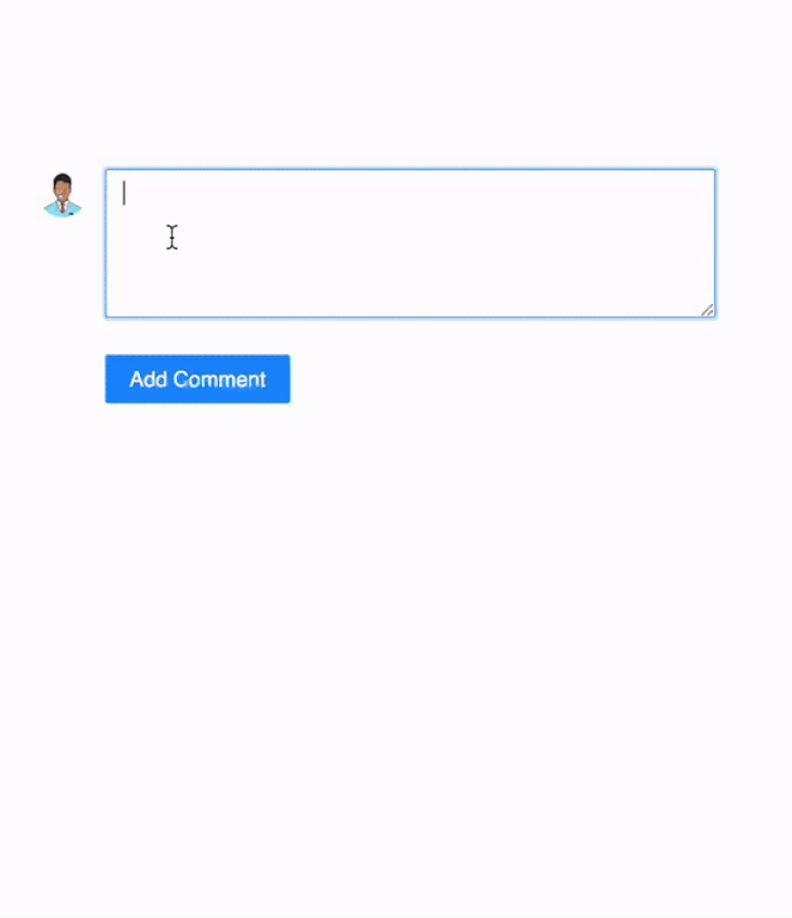
Customize the animation duration
We can customize the transition time by passing the duration props to useAutoAnimate. Let's see this in action with a dynamic card as an example.
In this example, we made the transition 500ms long, so when the user clicks Add Task, a new card is inserted and all other cards are moved after 500ms.
//DynamicComponents.jsx

import React, {useState} from "react";
import {Avatar, Button, Card, Col, Form, Input, Row} from 'antd';
import {useAutoAnimate} from "@formkit/auto-animate/react";

const {Meta} = Card;

export default function DynamicComponents() {

    const [comments, setComments] = useState([]);
    const [parent] = useAutoAnimate({duration: 500});

    const handleSubmit = (values) => {
        if (!values) return;
        setComments((prev) => [{content: values.content}, ...prev]);
    };

    return (
        <>
            <Form
                name="basic"
                onFinish={handleSubmit}
                autoComplete="off"
            >
                <Form.Item
                    name="content"
                >
                   <Input/>
                </Form.Item>
                <Form.Item>
                    <Button htmlType="submit" type="primary">
                        Add Task
                    </Button>
                </Form.Item>
            </Form>
            <Row gutter={[16, 24]} ref={parent}>
                {comments.map((comment) => (
                    <Col span={6} key={comment.content}>
                        <Card
                            style={{
                                width: 100,
                            }}
                            cover={
                                <img
                                    alt="example"
                                    src="https://gw.alipayobjects.com/zos/rmsportal/JiqGstEfoWAOHiTxclqi.png"
                                />
                            }
                        >
                            <Meta
                                avatar={
                                <Avatar src="https://joeschmoe.io/api/v1/random"/>
                                  }
                                description={comment.content}
                            />
                        </Card>
                    </Col>
                ))
                }
            </Row>
        </>
    );
}
Now, we will see the following output when we run the component: 
Enable and disable animations
Sometimes, we are required to disable an animation and use it later. To handle these cases, the AutoAnimate hook useAutoAnimate returns the Enable and Disable functions, which can be used to enable and disable an animation.
We can see this in the following code block:
//DynamicCards.jsx

import React, {useState} from "react";
import {Avatar, Button, Card, Col, Form, Input, Row} from 'antd';
import {useAutoAnimate} from "@formkit/auto-animate/react";

const {Meta} = Card;

export default function DynamicCards() {
    const [comments, setComments] = useState([]);
    const [parent, enable] = useAutoAnimate({duration: 500});
    const [isEnabled, setIsEnabled] = useState(true)

    const handleSubmit = (values) => {
        if (!values) return;
        setComments((prev) => [{content: values.content}, ...prev]);
    };

    function toggle () {
        enable(!isEnabled)
        setIsEnabled(!isEnabled)
    }

    return (
        <>
            <Form
                name="basic"
                onFinish={handleSubmit}
                autoComplete="off"
            >
                <Form.Item
                    name="content"
                >
                    <Input/>
                </Form.Item>
                <Form.Item>
                    <Button htmlType="submit" type="primary">
                        Add Task
                    </Button>
                </Form.Item>
                <Form.Item>
                    <Button onClick={toggle} type="primary">
                        { isEnabled ? "🚫 Disable" : "✅ Enable" } animations
                    </Button>
                </Form.Item>
            </Form>
            <Row gutter={[16, 24]} ref={parent}>
                {comments.map((comment) => (
                    <Col span={6} key={comment.content}>
                        <Card
                            style={{
                                width: 100,
                            }}
                            cover={
                                <img
                                    alt="example"
                                    src="https://gw.alipayobjects.com/zos/rmsportal/JiqGstEfoWAOHiTxclqi.png"
                                />
                            }
                        >
                            <Meta
                                avatar={
                                  <Avatar
                                  src="https://joeschmoe.io/api/v1/random"/>}
                                  description={comment.content}
                            />
                        </Card>
                    </Col>
                ))
                }
            </Row>
        </>
    );
}
Here, we have used our previous example by adding enable and disable options to it. Animation is controlled by the enable boolean prop passed to the useAutoAnimate hook.
Now, we will see the following output when we run the component: 
AutoAnimate is a zero-config utility that also provides an option to customize the default animation keyframes and use custom animations. However, AutoAnimate’s default animation offerings will typically be enough for most components in my experience.
N.B., note: You can find the complete code of this tutorial in this CodeSandbox
Conclusion
AutoAnimate makes animation very simple with its zero-config approach, ease of use, and speedy implementation — it helps devs efficiently provide smooth user experiences in their projects.
In addition to the examples we’ve looked at today with React, AutoAnimate also supports Vue, Angular, and Svelte. You can find examples of other JavaScript frameworks in the official docs.
Let me know of your own experiences using AutoAnimate in the comments below and thanks for reading!
Cut through the noise of traditional React error reporting with LogRocket
LogRocket is a React analytics solution that shields you from the hundreds of false-positive errors alerts to just a few truly important items. LogRocket tells you the most impactful bugs and UX issues actually impacting users in your React applications.

LogRocket automatically aggregates client side errors, React error boundaries, Redux state, slow component load times, JS exceptions, frontend performance metrics, and user interactions. Then LogRocket uses machine learning to notify you of the most impactful problems affecting the most users and provides the context you need to fix it.
Focus on the React bugs that matter — try LogRocket today.


Top comments (1)
Does it work in combination with @mui/material? The hook usage looks more handy than MUIs transitions