
Written by Piyush Sinha✏️
As a frontend developer, I often need to work with images. And sometimes it gets tricky when an image is scaled and positioned differently across the application. For example, an ecommerce website might require a larger version of an image on the product page and a zoomed-in version of the same image when displaying a list of products.
Before Chrome 104, my go-to solution to crop/zoom an image was to apply it as background-image in a div and then adjust the background-position and background-size properties. Here's an example:
<div id="cropped"></div>
#cropped {
  width: 500px;
  aspect-ratio: 3/2;
  background-image: url("https://images.unsplash.com/photo-1611604548018-d56bbd85d681?ixlib=rb-4.0.3&ixid=MnwxMjA3fDB8MHxwaG90by1wYWdlfHx8fGVufDB8fHx8&auto=format&fit=crop&w=2070&q=80");
  background-size: 1250px;
  background-position: 66% 67%;
  background-repeat: no-repeat;
}

It works fine, but let's just say this solution to crop/zoom images leaves something to be desired. It's not exactly what you'd call tidy. Also, this won’t work with just an <img/> tag. There are other workarounds, but none of them is as simple and clean as object-view-box.
In this article, we’ll cover:
- What is the
object-view-boxproperty? - Possible distortion
- Why should we welcome this update?
- When to use
object-view-box?
What is the object-view-box property?
The release of Chrome 104 introduced a native approach to zoom or pan within the content of an element. The CSS object-view-box property makes this possible by specifying a view box over an element and enabling us to adjust the positioning and scaling to meet our specific needs.
In simple words, just like a camera lens can be adjusted to zoom in or out or pan across the view outside, the object-view-box property allows us to zoom in on specific parts of an element or pan around to display different parts of the element.
How to use object-view-box?
To specify a view box over an element, object-view-box the inset() function to control the four edges.
inset() is a shorthand way to specify values for the element's top, right, bottom, and left properties, in that order. It follows the same syntax as the padding and margin properties, which allows it to accept from one to four values:
- 1 value: Applies to all four edges
- 2 values: The first value applies to the top and bottom edges and the second one to left and right edges
- 3 values: The first value applies to the top edge, the second one to left, and right edges and the third one to the bottom edge
- 4 values: Applies to the top, right, bottom, and left edges respectively
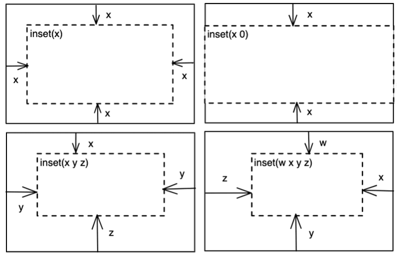
These values can be expressed using any valid CSS length unit, such as pixels (px), ems (em), rems (rem), and percentages (%), among others.
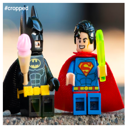
Let's apply this property to the same image above and try to achieve the same result:
<img id="cropped" src="https://images.unsplash.com/photo-1611604548018-d56bbd85d681?ixlib=rb-4.0.3&ixid=MnwxMjA3fDB8MHxwaG90by1wYWdlfHx8fGVufDB8fHx8&auto=format&fit=crop&w=2070&q=80" alt="toys">
#cropped {
  width: 500px;
  object-view-box: inset(40% 20% 20% 40%);
}
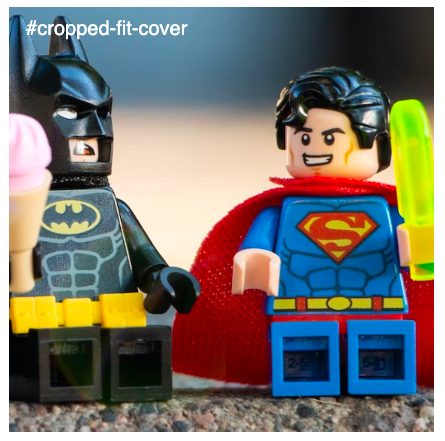
Possible distortion
If the cropped version of the image is a square, the image will appear distorted, i.e., stretched or squeezed:
#cropped {
  aspect-ratio: 1;
  width: 500px;
  object-view-box: inset(40% 20% 20% 40%);
}
Here, we can use the help of the object-fit property, which defines how an element should be resized to fit its container. The property can be set with one of these values: fill, contain, cover, none, or scale-down.
For our scenario, we can use cover, which resizes the image to fit the aspect-ratio of the container and if the image’s aspect-ratio doesn’t match the container’s, then it will be clipped to fit:
#cropped-fit-cover {
  aspect-ratio: 1;
  width: 500px;
  object-fit: cover;
  object-view-box: inset(40% 20% 20% 40%);
}
Isn't this a convenient way to crop/zoom an image? It only requires one property and is easy to visualize. No additional properties or elements are needed, unlike workarounds.
Why should we welcome this update?
Using the object-view-box property is a native solution; the browser does the hard work, and the developers get a clean solution.
There are popular workarounds among devs, like using an HTML element — e.g., <div/> — and applying CSS properties to achieve a cropped image. But that’s still just a workaround, an unconventional solution to overcome the limitation of the browser.
With this update, the browser has worked on that limitation and offers a built-in solution.
There is a concern that, to make this work, you need to know the exact dimension of the original container and the new container. But isn’t that a prerequisite to crop an image? To determine how much to crop, we’ll always need that information.
So, how will this work when the container is resized (change in the viewport)?
As the object-view-box uses inset() to draw a view-box over an image, cropping always happens on the intrinsic size (original width and height) of the image. To make it responsive, we can use this property along with media queries and crop accordingly.
When to use object-view-box?
The ability to crop/zoom an image can come in handy in many cases:
- When an image needs to be scaled and positioned differently throughout an application
- Interactive feature where users can zoom in and pan over an image, commonly found on e-commerce websites
- In smaller viewports, images often get cropped. With this property and media queries, we can control which part of an image stays in view
Conclusion
There have been workarounds to cropping and zooming images in past, but I welcome this native and convenient solution. Also, please keep in mind that this is an experimental release, and therefore, it may not be widely supported across all browsers. Visit caniuse.com for up-to-date browser support tables.
Is your frontend hogging your users' CPU?
As web frontends get increasingly complex, resource-greedy features demand more and more from the browser. If you’re interested in monitoring and tracking client-side CPU usage, memory usage, and more for all of your users in production, try LogRocket.

LogRocket is like a DVR for web apps, recording everything that happens in your web app or site. Instead of guessing why problems happen, you can aggregate and report on key frontend performance metrics, replay user sessions along with application state, log network requests, and automatically surface all errors.
Modernize how you debug web apps — Start monitoring for free.

Oldest comments (1)
Сongratulations 🥳! Your article hit the top posts for the week - dev.to/fruntend/top-10-posts-for-f...
Keep it up 👍