
Originally posted on a11ywithlindsey.com.
Hey friends! Today we'll be creating custom keyboard accessible radio buttons! This blog post is a follow-up post from my accessible checkboxes post.
We'll go over:
- The markup
- Creating a pseudo-element on the label in CSS
- Add "selected" styling in CSS
- Add focus styling
Starting out
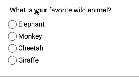
I decided to create a simple group of radio buttons asking what your favorite animal is
<fieldset>
  <legend>What is your favorite Wild Animal?</legend>
  <div class="radio-wrapper">
    <input type="radio" name="animal" id="elephant" />
    <label for="elephant">Elephant</label>
  </div>
  <div class="radio-wrapper">
    <input type="radio" name="animal" id="monkey" />
    <label for="monkey">Monkey</label>
  </div>
  <div class="radio-wrapper">
    <input type="radio" name="animal" id="cheetah" />
    <label for="cheetah">Cheetah</label>
  </div>
  <div class="radio-wrapper">
    <input type="radio" name="animal" id="giraffe" />
    <label for="giraffe">Giraffe</label>
  </div>
</fieldset>
The fieldset groups all the radio buttons together logically. The radios inputs are all options to the question in the legend. Also, remember to associate those form labels with the radio buttons!

I'm going to add some straightforward CSS to clean it up a bit.
@import url('https://fonts.googleapis.com/css?family=Roboto&display=swap');

* {
  font-family: 'Roboto', sans-serif;
}

fieldset {
  border: none;
}
I didn’t do anything much here; I added a font and took away the border from the fieldset.

Now let's get to the fun part! Styling these radio buttons!
Creating a pseudo-element on the label
First thing I am going to do is add a ::before pseudo-element on the label element. I'm going to start with something basic first.
$muted-red: #db3846;

input[type='radio'] {
  + label {
    position: relative;
    cursor: pointer;
    margin-left: 20px; /* This will be adjusted */

    &::before {
      content: '';
      position: absolute;
      left: -22px; /* This will be adjusted */
      width: 20px;
      height: 20px;
      background: $muted-red;
    }
  }
}
The radio buttons won't look like anything much right now. We only want to see the radio buttons to ensure we are replicating the HTML functionality.

I'm going to add a teensy amount of margin on the .radio-wrapper.
$muted-red: #db3846;

+ .radio-wrapper {
+ margin: 0.5rem 0;
+ }

input[type='radio'] {
  + label {
    position: relative;
    cursor: pointer;
    margin-left: 20px; /* This will be adjusted */

    &::before {
      content: '';
      position: absolute;
      left: -24px; /* This will be adjusted */
      width: 18px;
      height: 18px;
      background: $muted-red;
    }
  }
}

Now let's remove that background color and round out the edges.
input[type='radio'] {
  + label {
    position: relative;
    cursor: pointer;
    margin-left: 20px; /* This will be adjusted */

    &::before {
      content: '';
      position: absolute;
      left: -24px; /* This will be adjusted */
+     border-radius: 50%;
+     border: 1px solid #6f686a;
      width: 18px;
      height: 18px;
+     background: transparent;
    }
  }
}
As a note, I am going to leave the standard radio buttons for debugging purposes.

Add :checked styling in CSS
If you've read my post on keyboard accessible checkboxes you know about the :checked pseudo-class. First, we need to put add an ::after pseudo-element on the label.
input[type='radio'] {
  + label {
    position: relative;
    cursor: pointer;
    margin-left: 20px; /* This will be adjusted */

    &::before {
      content: '';
      position: absolute;
      left: -24px; /* This will be adjusted */
      border-radius: 50%;
      border: 1px solid #6f686a;
      width: 18px;
      height: 18px;
      background: transparent;
    }

+   &::after {
+     content: '';
+     position: absolute;
+     left: -20px;
+     top: 4px;
+     border-radius: 50%;
+     width: 12px;
+     height: 12px;
+     background: $muted-red;
+   }
  }
}
Now, this is what that looks like:

Now we have the styling in place. Let's only add the background of the ::after pseudo-element when the radio input is :checked.
input[type='radio'] {
  + label {
    &::after {
      content: '';
      position: absolute;
      left: -20px;
      top: 4px;
      border-radius: 50%;
      width: 12px;
      height: 12px;
    }
  }

+ &:checked {
+   + label::after {
+     background: $muted-red;
+   }
+ }
}
So now if I select a radio button, it'll have a background color!

If you notice, though, there is no focus styling. Let's focus on that next (see what I did there)
Add focus styling
If I were to hide the radio button, you would have no idea if I focused on it.

input[type='radio'] {
  &:focus {
    + label::before {
      box-shadow: 0 0px 8px $muted-red;
    }
  }
}
I decided to add a similar muted red for the focus styling.

To finish up, I will:
- remove the
opacityfrom the radio button itself (the input) - remove the
margin-leftfrom the label!
input[type='radio'] {
  opacity: 0;

  + label {
    position: relative;
    cursor: pointer;
  }
}
And Voilà!
Conclusion
When we make custom radio buttons, we have to make sure we account for the following:
- Creating proper HTML structure with associated form labels!
- Using pseudo-elements to create the custom-styled element
- Accounting for the
:checkedpseudo-class - Ensuring you can focus on the new radio button
- Use
opacity: 0to hide the radio button
If you want to play around with it, here is the finished CodePen!
Stay in touch! If you liked this article:
- Let me know on Twitter and share this article with your friends! Also, feel free to tweet me any follow up questions or thoughts.
- Support me on patreon! If you like my work, consider making a $1 monthly pledge. You’ll be able to vote on future blog posts if you make a \$5 pledge or higher! I also do a monthly Ask Me Anything Session for all Patrons!
- Be the first to learn about my posts for more accessibility funsies!
Cheers! Have a great week!

Top comments (11)
Is there a reason you went for wrapping each input-label combo in a div rather than using the label element?
Rather than
Or is it a simple case of either will do but you went with the div? 🙂
One reason to do it this way is that explicit labels (input+label combo) have better support with assistive tech. Implicit labels (label wrapping an input) don't work with Dragon Naturally Speaking.
a11ysupport.io/tech/html/label_ele...
I would take a look at the responses to this. I prefer explicit association but others put their reasons in.
Because I wanted to.
Cool, thanks 🙂
Was just checking there wasn't some reason I wasn't aware of 🙂
haha It's how I prefer to write my inputs.
I love the suggestions to keep the native radio buttons visible while you're working on a custom replacement and to use the
:checkedpseudo-class to style selected radio buttons. It's really easy to make custom radio buttons that are accidentally out of sync with the native controls.Quite similar to mine HTML State.
Behold the HTML State
Anton Korzunov ・ May 21 ・ 5 min read
And there is one moment I would like to change in your example - please don't use
position:absoluteto position "radio" visuals - it's not scalable.Let's try to do the same, but with
position:staticThanks for this! I'm curious about
opacity: 0instead ofdisplay: nonefor the original radio button. Is this because screen readers are still using the original/hidden radio button?That's correct! I would check out @scottohara 's post about why: scottohara.me/blog/2017/04/14/incl...
Using this for some radio buttons right now, thank you for the helpful guide!