Stack ranking is natural human behavior
I have a buddy from high school named Murph. His real name is Ben Felt but every legit teenage crew in Pitsford, New York in the 90s needed a Murph so Ben took one for the team.
He’s a quant. Like Taylor Mason from the show Billions.
It would have been easy to predict Murph would end up as a big shot on Wall Street. For starters, he got a perfect 1600 score on his SATs and was accepted early admission to Yale.
There was also his unique approach to fantasy football. I’ve been playing with the same group of guys since 1999. We started in my Mom’s basement.
When it came time for draft day, the regular nerds in our group like me would bring fantasy football magazines with last year’s stats and analyst opinions.
Murph brought his computer. He wrote a program that organized his draft board based on each player’s predicted performance correlated to his personal skill preferences. This is years before Daryl Morey founded Sloan Conference. Murph was ahead of his time.
People naturally want to quantify objects by ranking them in lists of best to worst, most expensive to least expensive, most important to least important. We do this throughout our personal and professional lives. Often subconsciously before we even realize we’re doing it.
Sometimes it makes sense to rank objects by performance. Like ranking athletes in your fantasy league. Murph won our league multiple times using his ranking algo.
Sometimes it even makes sense to rank real people by performance. Like on a sales team where there is a relatively direct link between the contribution of a sales rep and the outcomes (e.g. new customer, revenue) they deliver.
When it comes to members of your dev team, it does not make sense to rank them using personal performance statistics.
Looking for team-based data to accelerate delivery? We automate the process.
Try LinearB for Free
Running a data-driven team does not mean stack ranking developers
A software development team is less like a sales team and more like a band. Everyone is highly dependent on one another to deliver a great result. If one person is off, it throws everyone off. And, like in a band, there are often unsung heroes (like the bass player or drummer) who make it possible for other stars (like the lead singer) to shine.
The contributions of your most selfless team members may not show up if you just look at lines of code, number of commits or personal story point velocity.
The other big reason not to stack rank your devs is that they just don’t like it. Unlike sales people, your engineers did not sign up to work in a hyper competitive environment.
So why does stack ranking still happen? Some would say bad managers are the culprit. That’s probably true sometimes. Many bad managers want control and pitting teammates against each other in competition is certainly one way to get it.
Most of the time the reason is more nuanced. I believe most managers have good intentions and want their people to succeed. But they get caught in the “data-driven trap.”
I hear it from engineering leaders every day… “My CEO wants me to be more data-driven” or “Our company is rolling out a metrics initiative.” Pressure to become data-driven can lead to arbitrary use of data to show the boss metrics are being used. “Let’s use data to make better decisions” gets confused as “let’s use data for performance management.”
When this misconception occurs, one of two things happens. Performance stack ranking metrics are implemented and it damages the team culture. Or the manager knows performance management is bad and avoids using metrics all together. Both are bad outcomes for the team.
You can run a highly data and metrics-driven dev organization with absolutely zero performance management statistics.
Data-driven engineering leadership anti-patterns
To avoid the “data-driven trap”, watch out for these 5 anti-patterns:
Not knowing your “why”
Without the “why”, the metrics themselves can become the outcome everyone cares about instead of being an indicator of the actual outcome you are trying to achieve like faster innovation, more predictable delivery dates, happier customers, etc.
Only measuring individual stats
As leaders we preach that we’re all working together as a band (team) to make beautiful music. What we measure shows what matters to us. If we track tons of individual metrics, we’re showing our people that individual stats matter more than team accomplishments. To get around this, I’ve actually seen some engineering leaders maintain secret dashboards with individual performance data. Their rationale is that it’s helpful for management as long as its existence does not get out. Everything always comes out eventually so I don’t recommend this. Plus, if you’re measuring something you don’t want your team to know about, that’s a good indicator you’re measuring the wrong thing.
Focusing on just 1 or 2 metrics
I can’t tell you how many dev leads I meet that look only at velocity to determine the success of an iteration. Even if you think velocity is a useful indicator (I don’t), there is no silver bullet. Without a balanced approach to measuring each area of your team and process, it’s easy to lose sight of the big picture. For example, if you just focus on data that measures your delivery speed, you could encourage behavior that has a negative effect on quality.
Thinking your new hammer (data) works for every nail (problem)
When we first start experiencing how powerful data can be as a tool to quantify trends and diagnose problems, it’s really exciting. And this is precisely when we need to be careful. We can’t forget to seek out input from our people too. Reports and dashboards are at their best when they prompt penetrating questions and point us in the right direction. We can’t get lazy and base decisions exclusively on the numbers.
Just using metrics that are easily available
“Let’s use velocity to measure team performance. We get it from our project management system automatically.” Pulling the data you really need can be an initial large lift but the benefit overtime will pay back 100x. And it’s actually worse to force the wrong metrics than to use none at all.
14 ways to use data in your daily dev team practices without being a performance tyrant
Forget about individual performance management stats. There are many other ways to incorporate data into your team’s day to day routine that will have a positive impact on delivery efficiency, quality and predictability and actually improve your culture, not hurt it.
So what should we measure?
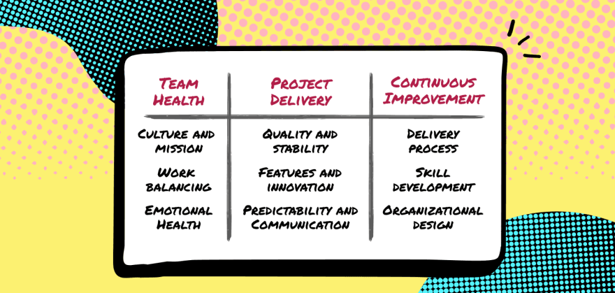
When I was a team lead, I answered that question for myself by taking a step back and looking at my personal leadership responsibility areas. After analyzing all of my important jobs, I found that they fit into three pillars.
These pillars became my “why”. So instead of starting with metrics and looking for a place to apply them, I looked for data that would help me understand and improve these areas.
Here’s 14 ways we use data to run our team on a day-to-day basis at LinearB.
How we use data to accelerate project delivery
Project delivery is highly complicated because of the number of things happening in parallel. Even if your team is only 6-8 people. Technology, time constraints, priority shifts, developers, business stakeholders, customers… The only way to see across all of these dimensions is with data. Better yet, visual representations of data help distill complex things into manageable views and show you where to look and how to invest your time.
1. Pull request throughput
My friend Chris Downard, the VP of Engineering at GigSmart, put it well.
“Knowing what to measure starts with aligning your team around what’s important to the business. In most companies, they want the dev team to deliver new value. So I care about metrics that are proxies for value delivery. I lean on merge requests because it helps me see throughput for work related to new features and bug fixes.”
We use our PR throughput dashboard the exact same way on our team. We like to see that the ratio of PRs opened to PRs merged stays in the 90-95% range otherwise we know we have a bottleneck in review.
2. Stuck pull requests
We look for A) PRs that have not been picked up for review, B) PRs that have abnormally high back and forth interaction and C) PRs with long review time. Then we alert the team to these in Slack so we can start a conversation about how to help and click through to the PR directly in Git.
We implemented this in March when work-from-home started and it’s become a critical part of our delivery process. Our devs love it because it’s one less thing they need to remember and they can jump in and help teammates more easily.
3. PRs merged without review
Our team is great about reviews but occasionally things slip. Flagging large PRs that have been merged without review has helped us catch a lot of mistakes before customers found them.
4. High risk branches
About 15 months ago we analyzed all of our bugs and found a connection between bugs and large branches with a high rate of immediate rework (more than 30%). So now we look for those branches proactively and use our Slack alerts to get another set of eyes on them for review.
Want to see your team’s high risk branches and PRs merged without review?
Sign-up for LinearB free to see them now.
5. Days remaining to open work ratio
We work in two week iterations. Once we’re about a week in, there’s a general equation our leads use to figure out if we’re on track to deliver the iteration: WIP + to-do ÷ days remaining = almost everything you need to know about whether or not you are going to finish on time.
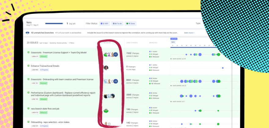
Our dev team uses a board that shows our Github activity on a timeline with the Jira issue it’s connected to so it’s easy to quickly see the equation for individual features as well as across the entire iteration.
How we use data to help maintain team health
When it comes to reading the mental and emotional state of people, nothing can replace good old fashion face-to-face interaction. But now that we’re limited to seeing each other over Zoom, we’re using data-powered signals more than before to help with team health. It’s harder to get inspiration, confide in a friend and ask for help when we’re remote so we’re looking at leading indicators that can predict developer burnout and asking about them in 1:1s.
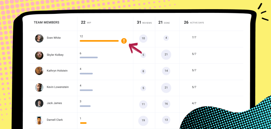
6. WIP load
Looking at work in progress is the first step to ensuring our people are not overloaded. We’ve written an algo that highlights when WIP is too high for an individual. We can then balance across the team as needed.
7. Active days
Active days seems similar but I find it signals a slightly different issue. If someone is working every weekend, they might be headed for burnout. And that can happen even if they aren’t overloaded with WIP.
8. Bug WIP load
We also look specifically at the amount of WIP related to bugs and support tickets each person is working on. It does not feel good to be a bug fixer drone. If you’re working on too many bugs and support escalations, you end up on an island disconnected from the cool stuff the rest of the team is working on.
You can see in this view of our bugboard, Yishai might have been assigned too many bugs. Now that I see this, we’ll make sure things are spread more evenly going forward.
9. Focus factor (context switching)
Even when a team member has a healthy WIP, they can still be affected by what I call the “focus factor”. If you’re working on several different types of stories in a two week sprint your focus can be spread too thin. It stops you from going deep into customer pain points and ideal user experience. You can also find yourself not making good progress on anything – a sinking feeling when there are items on your plate but you’re getting pulled in too many directions. This “thin” feeling takes you away from your coding “why” which makes work less fun.
Devboards of the future correlate your Git activity and project issues on a single screen.
Get the free LinearB Devboard today.
10. Activity stream
When a team member does not seem to be making progress on a task for a few days, it is sometimes a sign of a problem. It could be a shadow project that was dropped in their lap after the iteration started. It could be personal. It could be a technical blocker. It could be they are just grinding away on a problem looking for a solution. Sometimes engineers are stubborn 🙂 And being remote, it’s tougher to ask for help. Regardless of what the issue is, I find getting a new perspective in a 1:1 can make all of the difference.
11. Review responsiveness
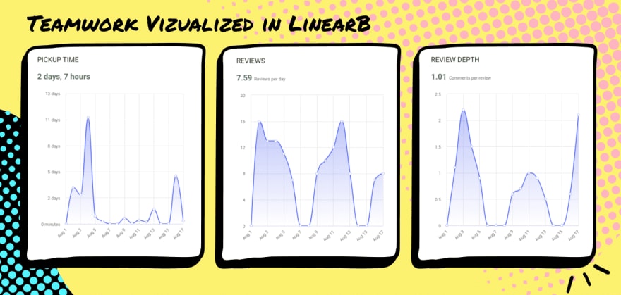
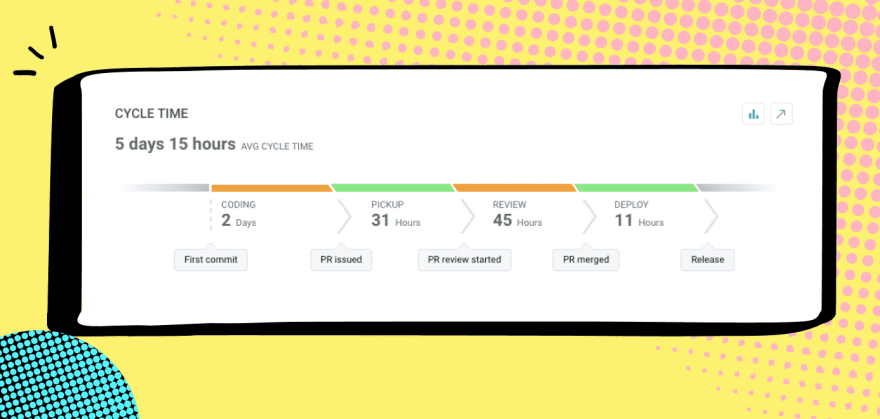
I find that our average PR “pick-up time” and our “review depth” are a great proxy for something we care about a lot: teamwork. When our team is connected to one another and thinking about how to help each other, new PRs get picked up in hours and every PR gets multiple comments. When we first started working from home in March, our Cycle Time went up in large part because our average PR pick-up time went up. And our review depth went down. In addition to the personal disruption everyone was feeling, there was an element of out of sight out of mind.
Right now the numbers below are not where we like to be. This happens every August when our developers in Tel Aviv are out for vacation.
How we use data to continuously improve
It’s hard to improve without putting a stake in the ground – a goal for your team to rally around – and you can’t put a stake in the ground without benchmarks.
I like to immerse the team with the data and metrics we care about. It helps keep improvement top of mind – something we think about everyday instead of just every 2-3 weeks in our retro.
Daily stand-up, bug triage… These meetings are now the only times we’re all together so they are our best chance to share insight across the whole team. So we have a rule that we need to bring data into every one of these ceremonies (in addition to retro, of course).
Chris and his team at GigSmart do the same thing.
12. Investment profile
We break our Cycle Time into phases which makes it really easy to see areas we need to invest in training or automation. Last year, for example, our average deployment time was too high which led us to invest in several non-functional projects to bring it down. We actually share Cycle Time in our weekly executive meeting because we’ve taught our business leaders that it’s one of the key ways to quantify engineering team efficiency.
13. Deployment Frequency
We believe that a top indicator of a healthy development process is high deployment frequency. Lots of releases means smaller releases which is a good way to quantify our iterative mindset.
14. Investment profile
Over the years I’ve found that undocumented shadow work (e.g. iteration churn, production issues) and other so called “super important” last minute randomizations are the #1 killer of a successful iteration. So one thing I often ask in the stand-up and retro is…
“Do you know the most important thing you can do to help deliver the iteration? If so, did you spend most of your time on it? If not, what pulled you away?”
Our investment profile report helps us see what we’re really working on and leads to great questions and learning we can apply to current and future iterations.
How do I get all of this data?
When I was VP Engineering at CloudLock, we cobbled together data from a lot of different tools we used in our stack. Github has some built-in analytics. Pull Panda has some cool Slack alerts for PR activity.
But we needed more than what our tools offered out of the box so one of our data engineers spent hours at the end of every iteration pulling data and building reports. It was manual and painful and limited. We were only able to get basic reports like iteration churn (how much work came in after the iteration started) and actual versus expected (% of expected work completed).
To help the community, we made a free tool for dev teams that provides devboards (what we like to call dashboards for dev teams), reports and alerts across all three pillars I talked about: project delivery, team health and continuous improvement. In case you don’t have a data engineer who has an extra 4 hours a week to pull these for you 🙂
All of the screens we use to run our dev team (that you saw above) are included. Plus more cool stuff. Check it out and let me know if it helps your team.










Top comments (1)
Great article!
I am wondering about Focus Factor. The article mentions "several different types of stories". Could you elaborate a bit on what this means by giving an example.
PS: I think point 12 should have the header "Cycle time" rather than "investment profile" (which is point 14)