The ability to communicate technical software and architecture can be challenging. As a solutions architect, I am quite familiar with the difficulties involved with conveying technical software design ideas to both technical people (developers) and non-technical people including project managers, business analysts, or product owners.
I have discovered that technical people generally stop listening as soon as they think they understand what your are describing and begin to problem solve. "Squirrel", "Shiny Object" ... how many times have you witnessed it? You can never get a complete idea across due to this facet of most developers who have to be quick thinkers (I was like this early in my career). It is not their fault, it is just human nature and part of the job.
Non-technical people may never fully understand what you are describing especially if you assume that they understand some of the technical underpinnings for frameworks, 3rd party software, or even architectural patterns. In those cases you will likely never fully convey your awesome technical software solution which can address their business problem. Instead, you may create a state of confusion and sometimes skepticism will develop instead of trust. When that occurs you will have additional challenges throughout the project as you will likely have to describe each technical choice made during the project in elaborate detail. It can cause a great deal of wasted time.
I have come to find the best way to communicate technical ideas is to make use of diagrams backed by documentation. Representing complicated technical ideas in a diagram is a challenge, but keep reading and you will be amazed at some simple things you can do to improve your diagrams.
Information technology (IT) professions are in their infancy at only about 50 years old (computer science became a program of study around the year 1960). Other professions, like mechanical engineering and medicine, have been around for hundreds if not thousands of years. The IT community should consider "standing on the shoulders of giants" and leverage what others have already learned as opposed to rediscovering it for ourselves.
Let us take a look at how some of these more established professional domains communicate technical subject matter and learn from them. Here are two examples from domains other than information technology.
Here you see a description of the F-35 fighter jet, formerly known as the Joint Strike Fighter.
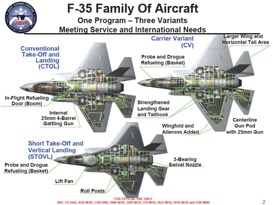
Different diagrams and descriptions can serve different audiences, each with different needs, but this diagram can be followed by most people.
The next diagram shows very technical information about the human heart. Doctors use this diagram to diagnose and interpret potential health risks. But they can use this same diagram to communicate with their patient who most likely does not have any medical training.

Getting the right information to the right stakeholders is crucial and you can see that very technical ideas can be conveyed in a simple, non-intimidating manner.
Now let's look at a typical software architecture diagram ...

We are pretty good at capturing technical information and communicating with developers and other architects. We have established standard languages and tools for that level of communication, but those standards and tools are not always fit for non-techies who many times are the people that make important decisions which impact the architecture (like where to invest money).
We fail to describe the relevant information and leave out the rest. We fail to speak a language that they can understand. We fail to put them in a position where they have just enough information in order to make good decisions and investments which ultimately helps the team get the job done.
Creating Effective Architecture Diagrams
The goal should be to keep the diagrams simple and easy to understand how things relate. Let discussions and other documents provide deep level detail.
Did you know that your choices for color, shape, lines, etc. convey subconscious meanings that may make the difference as to whether people trust the diagram or even pay attention to it at all. Did you take art classes when you became a software architect? Are you aware of art psychology?
Why Understand Art Psychology?
Art psychology is the perception, cognition and characteristics of art. Different people have different reactions to the same piece of art and different interpretations. For example ... what do you see in the picture to the below?

Did you see a saxophone player or a woman's face? Look again and try to see the interpretation that you did not see the first time.
It is important to get at least a basic understanding of art psychology so that you don't spend a lot of time creating your diagrams and then have them misinterpreted or ignored.
Pre-attentive Processing
Your initial interpretation of the image above is driven by a concept called pre-attentive processing which is the subconscious accumulation of information from the environment. All available information is pre-attentively processed. Then, the brain filters and processes what is important. Our eyes and brains are wired to perceive basic visual attributes of objects without any conscious effort, extremely fast and in parallel.
There are several aspects of pre-attentive processing that you should consider when creating your diagrams as shown in the picture below:

You will notice that you only have to glance at each grid of nine squares and be able to see which block or set of blocks is different. The lesson is: we should use these attributes (size, shape, line width, orientation, position, markings, enclosures, and color) explicitly to put focus on things that are most important in the diagram and worth our attention. This takes some practice and attention because many of us like things to be orderly and symmetrical.
You can find many other examples on the internet if you search for pre-attentive processing.
Color Theory
You probably noticed that color is one of the pre-attentive facets of a diagram, but you should also be aware that which color you choose plays a significant role. There is an field of study called color theory that centers around the emotions and feelings people experience when looking at certain colors. Take a look at the following chart to see how the color you choose can impact the emotions conveyed by your diagrams.

Have you ever noticed that most company logos are blue? Can you guess why? If you want to learn more about color theory you can search the internet for color-theory where you can find all kinds of information about contrasting colors or how groups of colors can also cause different responses.
Imagery
You've heard it a thousand times "a picture is worth a thousand words" and it couldn't be more true. Although it might seem sloppy, perhaps even childish to include icons and images in our documents, the effectiveness of pictures beats words in many cases. We are after all going for communicative effect with our diagrams.
Take a look at the following picture ...

On the left side of the picture are typical symbols used on our architecture diagrams (boxes, arrows, and words). On the right are images to convey the same ideas.
Which is easier to process? I rest my case.
Examples of effective architecture diagrams
There are many other concepts that can be applied to your diagrams and I leave that as a task for you. Once you get started looking deeper into the concepts mentioned in this article you will find yourself in a much bigger world of communicating with art. Applying just some of the concepts will help you improve your technical architecture by leaps and bounds.
Here is an example of what good architecture diagram looks like.
Cisco Systems architecture for wireless integration


Top comments (0)