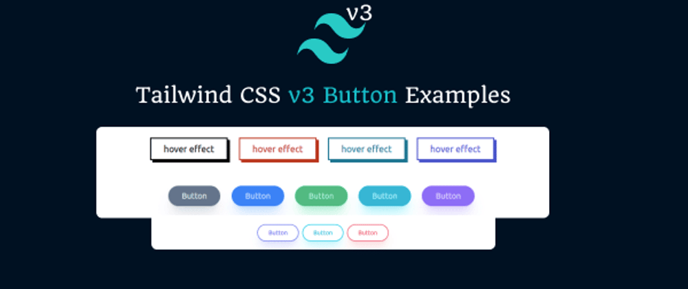
In this section we will create tailwind css 3 button, tailwind v3 light button, button with icon, create beautiful tailwind button styles, tailwind v3 glow button example with Tailwind CSS version 3. Before we start you need to install or setup tailwind v3 project, you can check below article.
How to install & setup Tailwind CSS v3
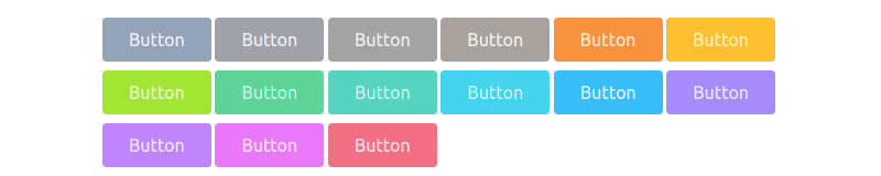
Example 1
tailwind v3 simple button with every new tailwind v3 color
<button class="px-6 py-2 rounded bg-slate-400 hover:bg-slate-500 text-slate-100">Button</button>
<button class="px-6 py-2 rounded bg-zinc-400 hover:bg-zinc-500 text-zinc-100">Button</button>
<button class="px-6 py-2 rounded bg-neutral-400 hover:bg-neutral-500 text-neutral-100">Button</button>
<button class="px-6 py-2 rounded bg-stone-400 hover:bg-stone-500 text-stone-100">Button</button>
<button class="px-6 py-2 text-orange-100 bg-orange-400 rounded hover:bg-orange-500">Button</button>
<button class="px-6 py-2 rounded bg-amber-400 hover:bg-amber-500 text-amber-100">Button</button>
<button class="px-6 py-2 rounded bg-lime-400 hover:bg-lime-500 text-lime-100">Button</button>
<button class="px-6 py-2 rounded bg-emerald-400 hover:bg-emerald-500 text-emerald-100">Button</button>
<button class="px-6 py-2 text-teal-100 bg-teal-400 rounded hover:bg-teal-500">Button</button>
<button class="px-6 py-2 rounded bg-cyan-400 hover:bg-cyan-500 text-cyan-100">Button</button>
<button class="px-6 py-2 rounded bg-sky-400 hover:bg-sky-500 text-sky-100">Button</button>
<button class="px-6 py-2 rounded bg-violet-400 hover:bg-violet-500 text-violet-100">Button</button>
<button class="px-6 py-2 text-purple-100 bg-purple-400 rounded hover:bg-purple-500">Button</button>
<button class="px-6 py-2 rounded bg-fuchsia-400 hover:bg-fuchsia-500 text-fuchsia-100">Button</button>
<button class="px-6 py-2 rounded bg-rose-400 hover:bg-rose-500 text-rose-100">Button</button>
Example 2
tailwind v3 light button
<button class="px-6 py-2 text-sm rounded shadow bg-slate-100 hover:bg-slate-200 text-slate-500">Button</button>
<button class="px-6 py-2 text-sm text-orange-500 bg-orange-100 rounded shadow hover:bg-orange-200">Button</button>
<button class="px-6 py-2 text-sm rounded shadow bg-emerald-100 hover:bg-emerald-200 text-emerald-500">Button</button>
<button class="px-6 py-2 text-sm rounded shadow bg-cyan-100 hover:bg-cyan-200 text-cyan-500">Button</button>
<button class="px-6 py-2 text-sm rounded shadow bg-violet-100 hover:bg-violet-200 text-violet-500">Button</button>
<button class="px-6 py-2 text-sm rounded shadow bg-rose-100 hover:bg-rose-200 text-rose-500">Button</button>

Example 3
tailwind v3 button with icon
<div class="flex">
  <button type="button"
    class="inline-flex items-center px-6 py-2 text-sm font-medium text-center rounded text-rose-100 bg-rose-500 hover:bg-rose-600">
    Read more
    <svg xmlns="http://www.w3.org/2000/svg" class="w-6 h-6 ml-2 mt-0.5" fill="none" viewBox="0 0 24 24"
      stroke="currentColor">
      <path stroke-linecap="round" stroke-linejoin="round" stroke-width="2" d="M17 8l4 4m0 0l-4 4m4-4H3" />
    </svg>
  </button>
  <button type="button"
    class="inline-flex items-center px-6 py-2 text-sm text-center rounded text-cyan-500 bg-cyan-100 hover:bg-cyan-200">
    Read more
    <svg xmlns="http://www.w3.org/2000/svg" class="w-6 h-6 ml-2 mt-0.5" fill="none" viewBox="0 0 24 24"
      stroke="currentColor">
      <path stroke-linecap="round" stroke-linejoin="round" stroke-width="2" d="M17 8l4 4m0 0l-4 4m4-4H3" />
    </svg>
  </button>
  <button class="inline-flex items-center px-6 py-2 text-sm text-green-100 bg-green-600 rounded hover:bg-green-700">
    <svg xmlns="http://www.w3.org/2000/svg" class="w-5 h-5 mr-2 text-white" fill="none" viewBox="0 0 24 24"
      stroke="currentColor">
      <path stroke-linecap="round" stroke-linejoin="round" stroke-width="2"
        d="M3 3h2l.4 2M7 13h10l4-8H5.4M7 13L5.4 5M7 13l-2.293 2.293c-.63.63-.184 1.707.707 1.707H17m0 0a2 2 0 100 4 2 2 0 000-4zm-8 2a2 2 0 11-4 0 2 2 0 014 0z" />
    </svg>
    <span>Buy Now</span>
  </button>
</div>

Example 4
tailwind v3 glow button with rounded, transition-colors, duration, shadow etc.
<button class="px-6 py-2 text-sm transition-colors duration-300 rounded rounded-full shadow-xl bg-slate-500 hover:bg-slate-600 text-slate-100 shadow-slate-400">Button</button>
<button class="px-6 py-2 text-sm text-blue-100 transition-colors duration-300 bg-blue-500 rounded-full shadow-xl hover:bg-blue-600 shadow-blue-400">Button</button>
<button class="px-6 py-2 text-sm transition-colors duration-300 rounded rounded-full shadow-xl text-emerald-100 bg-emerald-500 hover:bg-emerald-600 shadow-emerald-400">Button</button>
<button class="px-6 py-2 text-sm transition-colors duration-300 rounded rounded-full shadow-xl text-cyan-100 bg-cyan-500 hover:bg-cyan-600 shadow-cyan-400">Button</button>
<button class="px-6 py-2 text-sm transition-colors duration-300 rounded rounded-full shadow-xl text-violet-100 bg-violet-500 hover:bg-violet-600 shadow-violet-400">Button</button>

tailwind v3 shadow color button with perfect color shadow.(recommended)
<button class="px-6 py-2 text-sm transition-colors duration-300 rounded rounded-full shadow-xl bg-slate-500 hover:bg-slate-600 text-slate-100 shadow-slate-400/30">Button</button>
<button class="px-6 py-2 text-sm text-blue-100 transition-colors duration-300 bg-blue-500 rounded-full shadow-xl hover:bg-blue-600 shadow-blue-400/30">Button</button>
<button class="px-6 py-2 text-sm transition-colors duration-300 rounded rounded-full shadow-xl text-emerald-100 bg-emerald-500 hover:bg-emerald-600 shadow-emerald-400/30">Button</button>
<button class="px-6 py-2 text-sm transition-colors duration-300 rounded rounded-full shadow-xl text-cyan-100 bg-cyan-500 hover:bg-cyan-600 shadow-cyan-400/30">Button</button>
<button class="px-6 py-2 text-sm transition-colors duration-300 rounded rounded-full shadow-xl text-violet-100 bg-violet-500 hover:bg-violet-600 shadow-violet-400/30">Button</button>

tailwind v3 outline button with shadow glow color
<button class="px-6 py-2 text-sm text-indigo-500 transition-colors duration-300 border-2 border-indigo-400 rounded-full shadow-xl shadow-indigo-300/30 hover:bg-indigo-500 hover:text-indigo-100">Button</button>
<button class="px-6 py-2 text-sm transition-colors duration-300 border-2 rounded-full shadow-xl text-cyan-500 border-cyan-400 shadow-cyan-300/30 hover:bg-cyan-500 hover:text-cyan-100">Button</button>
<button class="px-6 py-2 text-sm transition-colors duration-300 border-2 rounded-full shadow-xl text-rose-500 border-rose-400 shadow-rose-300/30 hover:bg-rose-500 hover:text-rose-100">Button</button>

Example 5
tailwind css v3 button with hover effect with group hover, transform, transition, group-hover:-translate etc.
<button class="relative px-6 py-2 group">
    <span class="absolute inset-0 w-full h-full transition duration-300 ease-out transform translate-x-1 translate-y-1 bg-black group-hover:-translate-x-0 group-hover:-translate-y-0"></span>
    <span class="absolute inset-0 w-full h-full bg-white border-2 border-black group-hover:bg-black"></span>
    <span class="relative text-black group-hover:text-white"> hover effect</span>
</button>
<button class="relative px-6 py-2 group">
    <span class="absolute inset-0 w-full h-full transition duration-300 ease-out transform translate-x-1 translate-y-1 bg-red-700 group-hover:-translate-x-0 group-hover:-translate-y-0"></span>
    <span class="absolute inset-0 w-full h-full bg-white border-2 border-red-700 group-hover:bg-red-700"></span>
    <span class="relative text-red-700 group-hover:text-red-100"> hover effect </span>
</button>
<button class="relative px-6 py-2 group">
    <span class="absolute inset-0 w-full h-full transition duration-300 ease-out transform translate-x-1 translate-y-1 bg-cyan-700 group-hover:-translate-x-0 group-hover:-translate-y-0"></span>
    <span class="absolute inset-0 w-full h-full bg-white border-2 border-cyan-700 group-hover:bg-cyan-700"></span>
    <span class="relative text-cyan-700 group-hover:text-cyan-100"> hover effect</span>
</button>
<button class="relative px-6 py-2 group">
    <span class="absolute inset-0 w-full h-full transition duration-200 ease-out transform translate-x-1 translate-y-1 bg-indigo-700 group-hover:-translate-x-0 group-hover:-translate-y-0"></span>
    <span class="absolute inset-0 w-full h-full bg-white border-2 border-indigo-700 group-hover:bg-indigo-700"></span>
    <span class="relative text-indigo-700 group-hover:text-indigo-100"> hover effect </span>
</button>


Top comments (0)