The Shadow DOM is great for insulating your Web Components from global style rules, but what do you do if you want to share common styling between components? One approach is to duplicate style rules across components but that can be inefficient and a maintenance headache - surely there's another way?
The problem
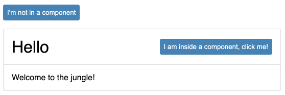
Let's take a simplified Card component containing a button, and place it on a page also containing a button:
class MyCard extends HTMLElement {
  constructor() {
    super();

    this.attachShadow({ mode: 'open' });
  }

  connectedCallback() {
    // these should be sanitized!
    const title = this.getAttribute('my-title');
    const content = this.getAttribute('my-content');

    this.shadowRoot.innerHTML = `
      <style>
        :host {
          display: flex;
          flex-direction: column;
          border: 1px solid #ddd;
          border-radius: 0.2rem;
        }

        #title {
          display: flex;
          align-items: center;
          justify-content: space-between;
          padding: 1rem;
          font-size: 2rem;
          border-bottom: 1px solid #ddd;
        }

        #content {
          padding: 1rem;
        }
      </style>

      <div id="title">
        ${title}
        <button>I am inside a component, click me!</button>
      </div>

      <div id="content">${content}</div>
      `;
  }
}

customElements.define('my-card', MyCard);
<p>
  <button>I'm not in a component</button>
</p>

<my-card my-title="Hello" my-content="Welcome to the jungle!"></my-card>
which gives us:
The challenge then is how to style the button so that it looks the same both inside and outside of your component. Let's use the following CSS to style your button:
button {
  border: 0;
  padding: 0.5rem;
  border-radius: 0.2rem;
  background-color: steelblue;
  color: white;
}
Where do you put these styles so they apply to the outer page and inside your component?
The wrong way
The wrong way is to add those styles to your page's stylesheet:
<link rel="stylesheet" href="/button.css" />
<!-- button.css contains the buttons styles above -->
AND in the style block inside your component's Shadow DOM:
<style>
  button {
    /* button styles here */
  }

  /* your component specific styles go here*/
</style>
As you may have spotted, this has several limitations:
- Duplication - if you want to change your button styling, you have to update it in your stylesheet and in every component that contains a button.
- Wasted bytes - the browser has to download the same CSS for the outer page and for every component.
- Not dynamic - if you want to update the styling dynamically then you are out of luck.
A better way
Luckily <link> tags are valid inside the Shadow DOM as well as in your outer page, so you can use the link from the outer page:
<link rel="stylesheet" href="/button.css" />
<!-- button.css contains the buttons styles above -->
and re-use it in your component's Shadow DOM:
...
this.shadowRoot.innerHTML = `
  <link rel="stylesheet" href="/button.css" />
  <style>
    /* your component specific styles go here */
  </style>
  ...
`;
...
In this way you:
- Avoid duplication - you only have to write your styles once, inside the stylesheet.
- No wasted bytes - as long as the stylesheet is sent with sensible caching headers, only the first time the stylesheet is encountered will it need to be downloaded. Subsequent requests for the stylesheet will come straight from the cache.
Note that if you only include the
<link>in your components, and not in the outer page, you risk the dreaded flash of unstyled content (FOUC). This is because<link>tags in the ShadowDOM are not render blocking - in other words the browser will display the content of your Shadow DOM before the styles have been downloaded and parsed. By adding the<link>to your outer page (where it is render blocking) this will force the browser to download the styles before it attempts to display any content. Then when the browser encounters the<link>again inside your component it will already have been cached and ready to apply immediately.
Dynamic styles
But one issue remains with this better approach - if you want to dynamically update the styling of your button there still isn't once place where you can change the style and have it update the style of all your buttons.
Both the outer page and each of your components are using a copy of the same stylesheet, not a single instance, so changing a style in one instance of the stylesheet won't be replicated in all the other instances.
Now this may well not be an issue if you don't need this functionality, in which case crack open the champagne and put your dancing shoes on - you're all set. But if you do, you have a 2 further options:
- CSS Custom Properties (CSS variables) - CSS custom properties defined on the outer document are available automatically inside your Shadow DOM. So you could define some custom properties in your document, and refer to them in your button's styles. Updating the properties in JavaScript would then apply them to all your button instances. This works but does mean you have to add lots of custom properties if you want to control all aspects of styling, and you still can't add new styles this way.
- Constructable Stylesheets - Constructable Stylesheets are a proposal to address the exact issue of reusing the same stylesheet across documents and Shadow roots, and providing a simpler way to add and update styles in a stylesheet. Unfortunately they have only been implemented in Chrome (with only tepid support from other browsers) so they may not be a viable option, although a polyfill is available. Find out more in the Google developer docs.
Wrap-up
Using the same <link> tag both in your outer document and inside your component's Shadow DOM is currently the best way to share styles across your components without code duplication, while CSS custom properties provide a well supported, albeit somewhat limited, way of dynamically updating shared styles. Constructable Stylesheets promise a better approach to re-using and dynamically updating styles but with limited support at this time.


Top comments (0)