React is an extensively preferred frontend UI library used in nearly 50 million projects every month. Backed by Facebook, React has had its dominance in the web development space for over nine years and has several notable customers (ranging from startups to Fortune 500 companies).
Simplicity and flexibility are the two primary reasons that contribute to React’s growing popularity.
Front-end defines the success of any online business since it brings considerable improvement in web performance. It takes only 0.05 seconds for an average user to have an opinion of a business/product by looking at their website. Undoubtedly, it is necessary to have a good UI layout, design, and overall experience on the web.
As per npmjs, React garners close to 15,353,836 weekly downloads, whereas VueJS, its nearest competitor, has 3,334,067 weekly downloads. Also, Angular has only 2,918,034 weekly downloads.
As a React developer, you will usually be working on styling your React application. Being a freelancer, I have made that mistake, and I still regret it! I do not want any front-end developer to commit the same mistakes.
In this detailed tutorial on CSS in React, we will walk you through the various methodologies through which you can style the React application with CSS.
So, let’s get started!
Are you using Playwright for automation testing? Run your Playwright test scripts instantly on 50+ browser/OS combinations using the LambdaTest cloud. Sign up for free!
Getting started with application development using React
To create a React application, the first thing you need is NodeJS, a runtime for JavaScript.
You can download the latest stable version of NodeJS from their official website and install it like a regular application.
Once NodeJS is installed, run the below command on the terminal to know the version of NodeJS:
node - -v
- After installing NodeJS, run the following command on the terminal.
npx create-react-app your_app_name
It will create a React app on which we will work during this blog on CSS in React.
- Now that you are ready with the React application, the next step is editing the App.js file. At any moment, you can see the results on the browser by running the following command on the terminal:
npm start
Shown below is the folder structure, which is pretty self-explanatory!
node_modules (Folder): Constitutes the dependencies for React. It is a huge folder with over 1500 subfolders and 15000 files. The overall size is close to 170 MB.
Public (Folder): This is where index.html is located. It is the most important folder since the React framework will insert the corresponding React code in index.html. It is a good practice to store assets like images, videos, and logos in the Public folder.
src: This is where the core React logic resides. You could start editing the React application by making changes to App.js.
package.json: When working on JavaScript projects, package.json is one of the most important files. It has a list of all the dependencies that we would require in the project.
FileName — package. json
    {
      "name": "my-project",      //name of the project
      "version": "0.1.0",           // version of the project
      "private": true,                //Public when you upload your project to npm
      "dependencies": {          //dependencies used in your project
        "@typeform/embed": "^1.36.0",
        "@typeform/embed-react": "^1.17.0",
        "bootstrap": "^5.1.3",
        "cra-template": "1.2.0",
        "framer-motion": "^6.5.1",
        "hamburger-react": "^2.5.0",
        "react": "^18.2.0",
        "react-bootstrap": "^2.4.0",
        "react-dom": "^18.2.0",
        "react-icons": "^4.4.0",
        "react-scripts": "5.0.1",
        "react-select": "^5.4.0",
        "react-slick": "^0.29.0",
        "slick-carousel": "^1.8.1"
      },
      //contains the script for running,building,testing etc
      "scripts": {
        "start": "react-scripts start",
        "build": "react-scripts build",
        "test": "react-scripts test",
        "eject": "react-scripts eject"
      },
      "eslintConfig": {
        "extends": [
          "react-app",
          "react-app/jest"
        ]
      },
      "browserslist": {
        "production": [
          ">0.2%",
          "not dead",
          "not op_mini all"
        ],
        "development": [
          "last 1 chrome version",
          "last 1 firefox version",
          "last 1 safari version"
        ]
      },
      "devDependencies": {    //dependencies that we only need during the development
        "autoprefixer": "^10.4.7",
        "postcss": "^8.4.14",
        "tailwindcss": "^3.1.4"
      }
    }
package.json is the heart of the NodeJS file. It contains all the important pieces of information about the project. This JSON file consists of the following:
Project name.
Project dependencies.
Project version.
Project description.
Project License.
Versions of different packages used in the project.
Scripts to run the file, and more.
- When you install a new package or dependency via
npm install, the node package manager will install the latest stable version. Run the following command on the terminal if you want to install a specific package version:
npm install dependencyname@1.3.4
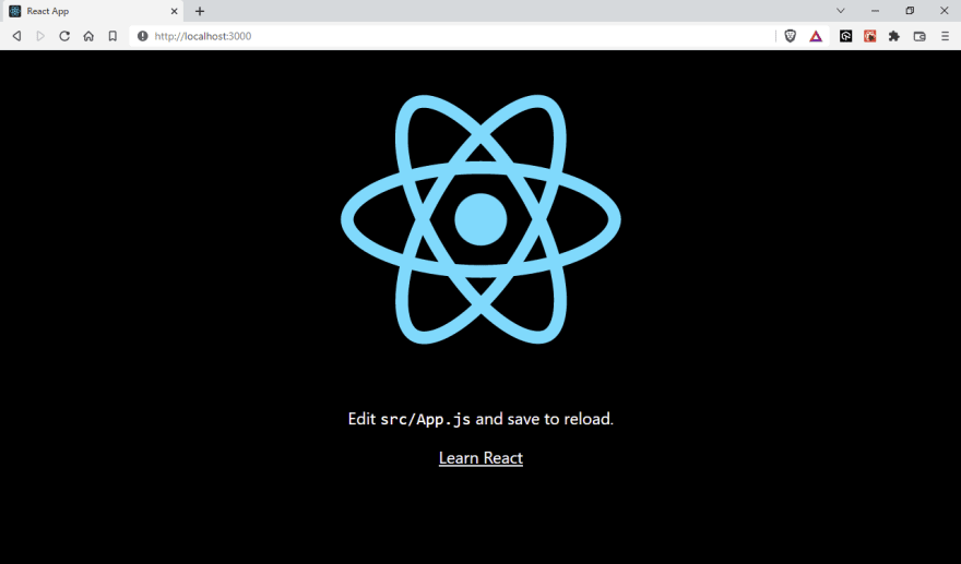
- The status of the React application can be monitored by visiting http://localhost:3000 in the web browser. The default port for React is 3000. Under certain circumstances (e.g., port already in use), you might want to change the port.
You can achieve this by changing the start script in package.json:
As a result of all this, the website will appear as below:
A comprehensive End to End Testing tutorial that covers what E2E Testing is, its importance, benefits, and how to perform it with real-time examples.
Introduction to CSS
You may have already read a lot about CSS, which stands for Cascading Style Sheets. Without styling, your website would appear like a pale, dull B&W movie that none of us would enjoy watching in today’s times 🙂
A good design can make your business/product look professional and can transform interactions into relationships. It is one of the major drivers of growth and retention. See how an ultimate mobile experience can drive 73% of e-commerce sales.
Can you just imagine your favorite e-commerce shop without any CSS?
Without CSS:
With CSS:
The possibilities with CSS are endless, and with your design skills, you can create wonders for your website — the ideal vehicle to drive experience and sales. Before proceeding to the next section of this CSS in React tutorial, check our CSS cheat sheet tutorial.
Advantages of CSS
So far, we have touched upon the fundamental aspects of CSS. Let’s deep dive into some of the integral benefits offered by CSS:
So far, we have touched upon the fundamental aspects of CSS. Let’s deep dive into some of the integral benefits offered by CSS:
With CSS, you can make a good and better visual appearance for text and images on your website.
You can manage the website’s overall layout and flow without compromising even a single bit on the friendliness and usability of the website.
By using CSS, you can apply consistent styling across multiple devices to improve the user experience. It ensures that your website is responsive and displays similar behavior on different devices.
Now we have an overall idea about why CSS and the advantages of using CSS, it’s time we look into how to leverage CSS skills in React applications.
Get a Complete End to End Testing(E2E Testing) Tutorial: Comprehensive Guide With Examples and Best Practices!
Introduction to React
React is one of the most used front-end libraries that can be used to create simple landing pages as well as complex enterprise websites.
React (a component-based library) makes it easy to create UI components for every separate section. The website under development makes separate reusable components for each section like header, footer, sidebar, and more.
Community is one of the strong points of the React framework. Having said that, React is not an all-in-one solution; for instance — there is no in-built page routing feature in React.
There are thousands of libraries to support the React ecosystem, like react-router-dom for page routing, **react-redux **for state management, and more.
React, with its huge ecosystem, makes it a wholesome solution for web application development.
How to style and write CSS in React?
Styling is one of the most important aspects of the React application. Having worked on several React applications, I can vouch that most of the time goes into designing the application.
There are five distinct ways in which you can style and write CSS in React:
Inline styles in React
Reusable variables
Using external StyleSheet
CSS Modules
CSS-in-JS
Let’s deep dive into each of these in more detail:
Inline Styles in React
Inline CSS is the widely preferred but less recommended way to style your website. This is not just in the case of React. Even with raw HTML, writing inline CSS makes it difficult to edit in the future.
Inline styling is the best way to try different CSS properties. One key point to remember is that inline styles have got more priority, and they will overwrite any other styles given to them in any manner.
Writing Inline CSS in React and plain HTML has a small difference. In HTML, you will write your style using the style attribute followed by = and then CSS properties enclosed by double quotes or single quotes. In React, we will use double curly braces {{ }} instead of quotes “ ”.
HTML
    <div style='background:blue;color:white'>
              React was created by Jordan Walke in 2013
        </div>
React
          <div style={{background:blue,color:white}}>
              React is now maintained by Facebook
         </div>
A comprehensive UI testing tutorial that covers what UI Testing is, its importance, benefits, and how to perform it with real-time examples.
When to use Inline Styling?
Inline styling is ideal when we are creating a simple website and when you are the only one working on that project. Simply put, inline styling is an absolute no-no for projects involving large distributed teams. Inline CSS in React is preferred when you are testing a particular style.
In short, inline CSS is best suited for learners but not for implementing real-world web projects.
Here is why you should not use inline CSS in React:
Inline CSS cannot be reused, i.e., you must write the same CSS code repeatedly for the same styles.
Inline CSS does not provide browser cache advantages.
Some vital CSS properties like pseudo-codes, pseudo-classes, media queries, etc., are not allowed to be used in inline styles.
Writing Inline CSS in React is not wrong, but adding CSS rules to every HTML element is time-consuming and makes your HTML structure messy.
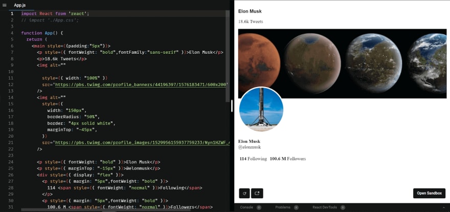
Inline CSS Example
FileName — App.jsx
    import React from 'react';
    function App() {
     return (
          <main style={{padding:"5px"}}>
          <p style={{ fontWeight: "bold",fontFamily:"sans-serif" }}>
    Elon Musk </p>
          <p>18.6k Tweets</p>
          <img alt=""
            style={{ width: "100%" }}
            src='https://pbs.twimg.com/profile_banners/44196397/1576183471/600x200'
          />
          <img alt=""
           style={{
              width: "150px",
              borderRadius: "50%",
              border: "4px solid white",
              marginTop: "-45px",
            }}
            src='https://pbs.twimg.com/profile_images/1529956155937759233/Nyn1HZWF_400x400.jpg'
          />
          <p style={{ fontWeight: "bold" }}>Elon Musk</p>
          <p style={{ marginTop: "-15px" }}>@elonmusk</p>
          <div style={{ display: "flex" }}>
            <p style={{ margin: "5px",fontWeight: "bold" }}>
              114 <span style={{ fontWeight: "normal" }}>Following</span>
            </p>
            <p style={{ margin: "5px",fontWeight: "bold" }}>
              100.6 M <span style={{ fontWeight: "normal" }}>Followers</span>
            </p>
          </div>
        </main>
      );
    }
    export default App;
Output:
Run Appium mobile testing of native and web apps. Improve your app quality with instant access to real devices on LambdaTest. Register now for free!
Reusable variables
Replicating the same code is not a good idea in the programming world. That’s the same case in CSS too.
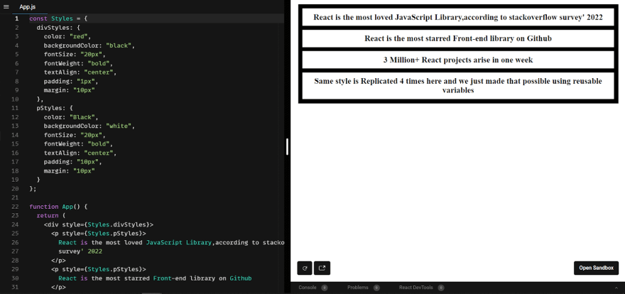
Here, you could use object variables instead of writing the same code repeatedly for a similar UI component. All you have to do is create the object variable to store a particular style and use the variable names, not the style itself. This variable now has predefined styles, and you can use it as often as you want.
The example below shows that the same divStyles is used for two different div elements.
    const Styles = {
      divStyles: {
        color: "red",
        backgroundColor: "black",
        fontSize: "20px",
        fontWeight: "bold",
        textAlign: "center",
        padding: "1px",
        margin: "10px",
      },
      pStyles: {
        color: "Black",
        backgroundColor: "white",
        fontSize: "20px",
        fontWeight: "bold",
        textAlign: "center",
        padding: "10px",
        margin: "10px",
      },
    };

    function App() {
      return (
        <div style={Styles.divStyles}>
          <p style={Styles.pStyles}>
            React is the most loved JavaScript Library, according to StackOverflow
            survey' 2022
          </p>
          <p style={Styles.pStyles}>
            React is the most starred Front-end library on Github
          </p>
          <p style={Styles.pStyles}>3 Million+ React projects arise in one week </p>
        </div>
      );
    }

    export default App;
When adding style to a website, one of the major goals should be to use the same CSS class multiple times for similar elements. While implementing CSS in React, we use the object variables to achieve multiple styling in one go.
The advantage here is that we will reduce many redundant lines of code, thereby improving the code’s maintainability, reliability, and readability.
Output:
From the syntax, you might have noticed that inline CSS in React is still being used, owing to which we cannot use pseudo-classes, pseudo-elements, etc.
One thing to note is that if there are two or more kinds of styling (Inline + External) to the same element, Inline CSS in React will have a higher preference over the other ones.
External CSS
This is one of the preferred ways of writing CSS in React. Instead of writing the CSS code inside HTML (i.e., Inline CSS), we separate the CSS part into a separate file which is simply imported into the React component.
The advantage of external stylesheets is that we get complete control over the CSS properties (e.g., pseudo-selectors), which is impossible with inline CSS in React.
Here all we have to do is create a filename with a .css extension and import it into the React file.
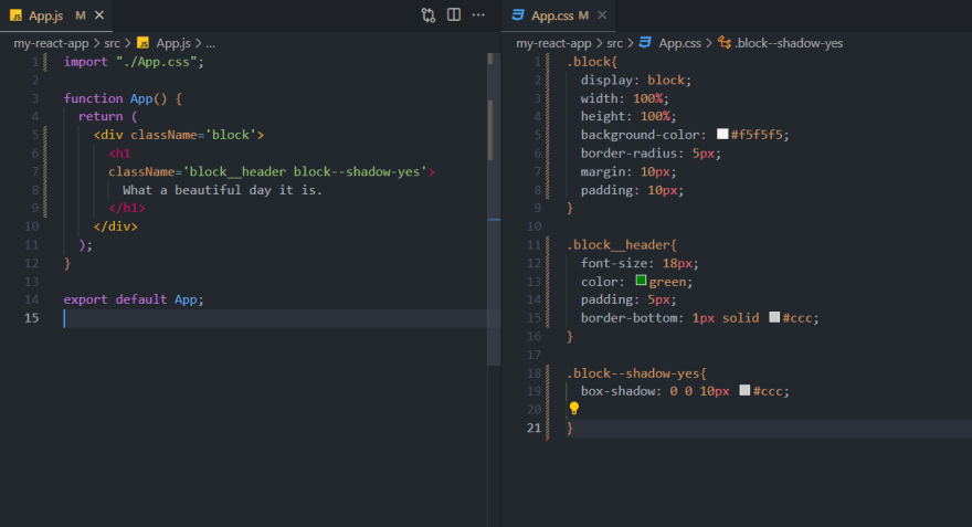
Now we can give className and id to point which styles should point to which element. It is important to note that the class attribute is used in HTML, whereas className is used in React.
className: Used to style two or more elements with the same CSS in React. Different elements can have the same className
Id: Used to style a particular element. Different elements cannot have the same IDs, id’s are unique.
One thing that we should focus on is the naming convention for classes and IDs. There is a good chance that if we are writing complex web UI, we may unknowingly create multiple className with the same name.
A naming convention called BEM is the answer to the problem listed above!
Test your Puppeteer Testing scripts online. Deploy a quality build faster by running automated checks across over 3000+ browsers and OS combinations with the LambdaTest cloud. Try for free!
Naming Convention — BEM
BEM stands for Block Element Modifier. Using proper naming conventions will prepare you for the changes in the design of the website
- Block Block Refers to a standalone entity. Think of Block as a container that has several children.
- Element Parts of a block that have no standalone meaning. Any element is semantically tied to its block.
- Modifier They are the flags on blocks or elements. Use them to change appearance, behavior, or state.
BEM is one of the most commonly used naming conventions. You can name it according to your logic.
CSS Modules
A CSS Module is a CSS file with a .module.css extension in which all class names and animation names are scoped locally by default. There is no global CSS. CSS Modules let you write styles in CSS files but consume them as JavaScript objects for additional processing and safety.
One huge advantage of the CSS modules is that you would not witness any className conflicts. The CSS properties we target are converted into unique class names during compilation.
CSS Modules In React Application
While working with CSS in React, you can use CSS Modules by creating a [name].module.css file and import it into the specific React Component file.
FileName — App.js
    import Styles from "./App.module.css";

    export default function App() {
      return (
        <div className={Styles.block}>
          <h2>
            React is a free and open-source front-end JavaScript library for
            building user interfaces based on UI components. It is maintained by
            Meta and a community of individual developers and companies
          </h2>
        </div>
      );
    }
App.module.CSS
    block {
      display: "block";
      width: 70vw;
      font-family: sans-serif;
      max-width: fit-content;
      background-color: black;
      border-radius: 5px;
      color: white;
      font-size: 24px;
      text-align: center;
      margin: auto;
      margin-top: 10px;
      padding: 5px;
    }
Output:
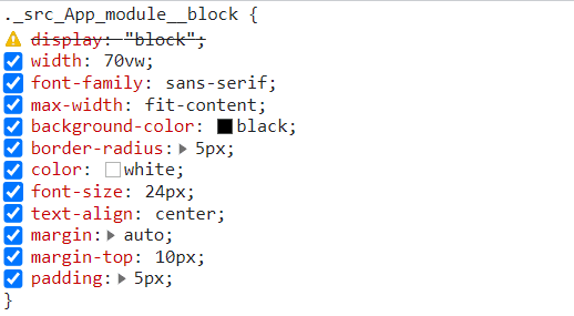
Here, you can see we have our App.js file and App.module.css file. Though this seems normal, the fun starts when you check it in the browser.
As you can see, we didn’t specify a class name in the CSS. Here our class name is .._src_App_module__block which is further transformed into a Unique Identifier. This will remove any chances of name collision in the React App.
CSS Modules are a great way to make CSS have local scope; everything is done during the compilation. Deciding good class names will be a thing of the past with CSS modules 🙂
In this XCUITest tutorial, learn about XCUITest framework and its benefits for mobile automation testing. Take a look at how XCUITest works and see how to use it to test your mobile applications.
CSS-in-JS
JSX would sound familiar in case you already know React. JSX looks like HTML, but it is not. Unlike HTML, it comes with the full power of JavaScript. Along similar lines, CSS in JS comes with some extra features to CSS.
CSS-in-JS is one of the approaches to write CSS, which tries to eliminate some of the blockers with plain CSS, such as scoping, portability, and dynamic functionality.
A well-designed CSS-in-JS library will group all its CSS properties and the dependencies associated with it. All style logic is now separate and reusable.
The common features of all CSS-in-JS libraries are:
Scoped CSS — You may have noticed that there will be unique names for classes when you use this kind of library. This makes it easy to handle name collisions. Since there is no concept of global styles, it does not accidentally impact any unintended element.
No inline styles — The most popular CSS-in-JS libraries are not using inline styles, due to which there is full control over all the CSS properties.
Logic separation — The layout and design/UI logic are separated, making the code easier to read and format.
Let’s now look into some popular CSS-in-JS libraries:
Styled JSX
Styled JSX is a very small library built and maintained by the NextJS team. It allows you to write encapsulated and scoped CSS in React to style your component(s).
- Run the below-mentioned command to install styled JSX:
npm install --save styled-jsx
- Post that, add styled-jsx/babel to plugins in your babel configuration:
   {
      "plugins": ["styled-jsx/babel"]
    }
- Now you can start using styled jsx in your React application.
Look at an example where styled jsx is used for styling the React application:
   import "./styles.css";

    export default function App() {
      return (
        <div className='App'>
          <h1>
            Hello World
            <style jsx>
              {`
                h1 {
                  color: whitesmoke;
                  background: black;
                }
                .App {
                  background: orange;
                }
                h2 {
                  color: white;
                }
                img {
                  border-radius: 50%;
                  width: 250px;
                  height: 250px;
                  object-fit: contain;
                }
                img:hover {
                  object-fit: cover;
                }
              `}
            </style>
          </h1>
          <h2>Wondering what’s even more challenging than choosing a JavaScript framework? You guessed it: choosing a CSS-in-JS solution. Why? Because there are more than 40 libraries out there, each of them offers a unique set of features.</h2>
          <img
            alt=''
            src=https://cdn.statically.io/img/austingil.com/f=auto%2Cq=70/wp-content/uploads/JavaScript-Blog-Cover.png'
          />
        </div>
      );
    }
Output:
styled-component
Styled-components is a library built for React and React Native. It allows you to use component-level styles in your application. What this means is that you can create styles for particular UI components. styled-components is a mixture of JavaScript and CSS i.e. CSS-in-JS
Let’s now look at start working with styled-components:
FileName : App.js
   import "./styles.css";
    import styled from "styled-components";

    const Button = styled.a`
      /* This renders the buttons above... Edit me! */
      display: inline-block;
      border-radius: 3px;
      padding: 1rem;
      margin: 0.5rem 1rem;
      width: 11rem;
      background: black;
      text-decoration: none;
      font-size: 18px;
      color: white;
      border: 2px solid white;

      &:hover{
        color:brown;
        background:yellow;
      }
    `;
    const P = styled.p`
      font-weight: bold;
      font-size: 18px;
      text-align: center;
      color: purple;

    `;
    export default function App() {
      return (
        <div>
          <P>As a Developer, which one do you use the most?</P>
          <Button
            href="https://github.com/styled-components/styled-components"
            target="_blank"
            rel="noopener"
            primary
          >
            GitHub
          </Button>

          <Button href="/docs">Documentation</Button>
          <Button href="/docs">Twitter</Button>
        </div>
      );
    }
Output:
These two are the most common CSS-in-JS libraries. Several other CSS-in-JS libraries like JSS, Emotion, Styletron, etc., allow you to write component-level CSS using JavaScript.
Test your website or web app online for iOS browser compatibility. Perform seamless cross browser testing on the latest iPhone tester. Try for free!
Top CSS Frameworks
Styling is not just restricted to writing raw CSS. You can also use various frontend CSS libraries like Tailwind CSS, Bulma, Ant Design, etc. Using the best CSS frameworks and libraries is now quite popular since it is developer friendly and reduces the development time by a huge margin.
Some of the best CSS frameworks are:
Tailwind CSS
Tailwind CSS is one of the most extensively-used CSS frameworks. It is a utility-first framework with nearly 13 million monthly downloads. It gives you flexibility and freedom to choose your website’s design.
Tailwind CSS has several advantages, namely that it can be customized to meet individual needs. Tailwind CSS comes with its default configuration, but you can override those. Tailwind’s utilities and components are easily customizable.
Tailwind uses a mobile-first breakpoint system which means you can specify prefixed utilities like sm: md: lg: that only take effect at the specific breakpoint and above.
FileName — App.js
    export default function App() {
      return (

    <div
    class="relative flex min-h-screen flex-col justify-center overflow-hidden bg-gray-50 py-6 sm:py-12">

        <img
        src="/img/beams.jpg"
        alt=""
        className="absolute top-1/2 left-1/2 max-w-none -translate-x-1/2 -translate-y-1/2" width="1308" />
        <div
        className="relative bg-white w-fit m-auto p-2 shadow-2xl shadow-red-300">
            <img
            src="https://cdnb.artstation.com/p/assets/images/images/043/120/123/large/wizix-nakamoto-master-full.jpg?1636383169"
            className="w-64 h-64 rounded-full"/>
            <p className="text-2xl text-center font-bold">Satoshi Nakamoto</p>
            <p className="text-xl text-center font-semibold">I found bitcoin</p>
        </div>
        </div>

      );
    }
Output:
Even though we are using Inline styles here, it is pretty neat and easy to manage. Tailwind CSS gives us class names for a particular style. When using Tailwind CSS, everything is under your ( read developer’s) control. You can also use pseudo-classes and pseudo-selectors with Tailwind CSS.
React Bootstrap
React-Bootstrap replaces Bootstrap JavaScript. React-Bootstrap is one of the best React component libraries that provides Bootstrap components as React components. Each component has been built from scratch as a true React component.
It is one of the best solutions and the most used UI library for React. More than 1.3 million weekly downloads are there for React-Bootstrap.
For JavaScript web applications, React dominates, while Bootstrap dominates CSS web frameworks, powering millions of websites worldwide.
React Bootstrap includes several components you can use without having to create them from scratch, such as navbars, buttons, forms, cards, etc.
FileName — App.js
    import React, { Component } from "react";

    //react bootstrap components
    import CardDeck from "react-bootstrap/CardDeck";
    import Card from "react-bootstrap/Card";
    import Container from "react-bootstrap/Container";
    import Row from "react-bootstrap/Row";

    //scss
    import style from "./styles.module.scss";

    //data for post
    import data from "./data.json";

    export default class DefaultPost extends Component {
      render() {
        return (
          <>
            <Container fluid={true}>
              <Row>
                <CardDeck className=' no-gutters '>
                  {data.map((postData) => {
                    console.log(postData);
                    return (
                     <Card key={postData.id}>
                       <Card.Img variant='top' src={postData.image} />
                        <Card.Body>
                          <Card.Title className={style.tile}>
                          {postData.title}
                          </Card.Title>

                         <Card.Text className={style.para}>
                          {postData.body}
                          </Card.Text>
                        </Card.Body>
                      </Card>
                    );
                  })}
                </CardDeck>
              </Row>
            </Container>
          </>
        );
      }
    }
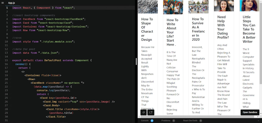
Output:
Material UI
Instead of you building a new UI component, Material UI creates an individual component that can be tweaked to achieve the desired UI output.
A Material-UI component only injects the styles it needs to display and is self-supporting. They don’t rely on any global style-sheets concept. Material UI can also be used with other frameworks like Angular and vue.js to help you ship the new UI features faster and make them responsive and adaptive.
In Material UI, user interfaces are based on high-quality digital experiences that provide a high-quality digital experience while developing front-end graphics. It is based on Google’s Material Design.
With over 79,900 plus stars on GitHub, Material UI is one of the top User Interface libraries for React.
FileName — App.tsx
    import * as React from "react";
    import Container from "@mui/material/Container";
    import Typography from "@mui/material/Typography";
    import Box from "@mui/material/Box";
    import Link from "@mui/material/Link";
    import Stack from '@mui/material/Stack';
    import Rating from '@mui/material/Rating';
    import CircularProgress from '@mui/material/CircularProgress';
    import Card from '@mui/material/Card';
    import CardActions from '@mui/material/CardActions';
    import CardContent from '@mui/material/CardContent';
    import CardMedia from '@mui/material/CardMedia';
    import Button from '@mui/material/Button';


    function Copyright() {
     return (
       <Typography variant="body2" color="text.secondary" align="center">
         {"Copyright © "}
         <Link color="inherit" href="https://lambdatest.com/">
           Your Website
         </Link>{" "}
         {new Date().getFullYear()}.
       </Typography>
     );
    }

    export default function App() {
     const [value, setValue] = React.useState<number | null>(2);

     return (
       <Container maxWidth="sm">
         <Box sx={{ my: 4 }}>
           <Typography variant="h4" component="h1" gutterBottom>
             Material UI{" "}
           </Typography>

           <Typography variant="h4" component="h1" gutterBottom>
             The React UI library you always wanted{" "}
           </Typography>

           <Card sx={{ maxWidth: 345 }}>
         <CardMedia
           component="img"
           height="140"
           image="https://mui.com/static/images/cards/contemplative-reptile.jpg"
           alt="green iguana"
         />
         <CardContent>
           <Typography gutterBottom variant="h5" component="div">
             Lizard
           </Typography>
           <Typography variant="body2" color="text.secondary">
             Lizards are a widespread group of squamate reptiles, with over 6,000
             species, ranging across all continents except Antarctica
           </Typography>
         </CardContent>
         <CardActions>
           <Button size="small">Share</Button>
           <Button size="small">Learn More</Button>
         </CardActions>
       </Card>

           <Stack sx={{ color: 'grey.500',marginTop:"12px" }} spacing={2} direction="row">
         <CircularProgress color="secondary" />
         <CircularProgress color="success" />
         <CircularProgress color="inherit" />
       </Stack>
           <Box
         sx={{
           '& > legend': { mt: 2 },
         }}
       >
         <Typography component="legend">Give us 5 star</Typography>
         <Rating
           name="simple-controlled"
           value={value}
           onChange={(event, newValue) => {
             setValue(newValue);
           }}
         />
       </Box>

           {/* <ProTip /> */}
           <Copyright />
         </Box>
       </Container>
     );
    }
Output:
There are many more UI components and CSS libraries that work well with React.
As per my experience working with global clients, I can confidently mention that there is no single best solution. The choice depends on the project and the developer’s ease with the framework. You have to decide how to style and write CSS in React!!
A complete WebDriver tutorial that covers what Webdriver is, its features, architecture and best practices.
Using LT Browser to test CSS in React
To test our project, we should use tools that make it easier to see what the pages look like and test accessibility and usability of the website or web app.
LambdaTest’s cloud-based cross browser testing helps you deliver hassle-free, user-friendly, and responsive web experiences across all browsers, operating systems, and real devices. It enables you to perform web testing on an online browser farm of 3000+ real browsers and operating systems.
You can also Subscribe to the LambdaTest YouTube Channel and stay updated with the latest tutorials around automated browser testing, Selenium automation, Cypress automation, CI/CD, and more.
LambdaTest provides a comprehensive solution with its mobile-friendly testing tool to perform responsive testing of your website. LT Browser comes loaded with 50+ pre-installed mobile-friendly viewports, and advanced developer tools for testing react application’s responsiveness.
Wrapping It Up!
Congratulations on reaching this far! You’re a fantastic reader!!
In this detailed blog on CSS in React, we looked at how we can make our application look beautiful and pretty. Not only did we experiment with styling CSS in React, but we also discussed various best practices to implement.
Now you know how to style your application in the most effective & efficient way.
Happy Styling!











Top comments (0)