
Mobile has changed the way we work. It touches every aspect of life. For most people, the first thing they look at when they wake up is the mobile screen, and the last thing they see before going to bed is the mobile screen. Mobile is not just a gadget or device anymore; it has become a lifestyle in this digital world. So it would be a massive loss for any online business to underestimate mobile devices and only design webpages for desktop or big-screen devices.
Further, if you go through some statistics and surveys of mobile device usage, on average, people spend 3 hours and 15 minutes daily on mobile and check their mobile 58 times daily. Which shows how much users or your future clients interact with mobile devices. Therefore, the business must adopt a mobile first design approach.
What is Mobile First Design?
The mobile first design concept came into the limelight in 2010 when Eric Schmidt, CEO of Google, announced at a conference that the company would adopt design practices focusing more on mobile users.
According to his quote:
“What’s really important right now is to get the mobile architecture right. Mobile will ultimately be the way you provision most of your services. The way I like to put it is, the answer should always be mobile first.”
The reasoning behind the statement was quite simple: Small screens have limited space. So when you design for them, you choose crucial elements that your users need most while ignoring fluff.
As you expand your design for bigger screens like desktops or laptops, you can provide your users with advanced elements that will make the life of such a power user easier.
In other words, the mobile first design is a web development strategy that considers the mobile user’s needs first. It creates a better digital experience for these users by starting the design process from small screens instead of the other way around.
So instead of creating a desktop website and forcing it to fit into a mobile phone later, you can start with a small screen. Also, let me assure you, it’s much easier to scale up to big sizes than scaling down from big to small ones ensuring that your user’s experience is seamless across devices.
Selenium WebdriverIO is Javascript based test automation framework built over nodeJs. Learn with this guide how to use webdriverIO to perform web automation testing.
Why is Mobile First Web Design important?
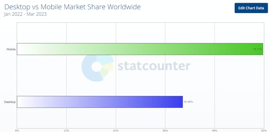
As per one survey of the GlobalStats, mobile internet use has surpassed desktop internet use. Currently, 60% of people get access to the internet via mobile devices, which is 20% more than desktops. Therefore, consumers are more inclined to shop and return to firms with mobile-friendly websites.
Here are some prominent reasons to give mobile first web design:
Because Google’s algorithm favors mobile-friendly websites, focusing on mobile first design has many advantages, such as improving product discoverability on SERPs, which is critical for any business success.
Mobile first web design has been an effective method for businesses seeking to reach more clients and improve their online presence.
Since 2012, as per the survey by Canalys, smartphone sales have surpassed personal computer sales, implying that more customers are accessing the internet via mobile devices, making mobile first design critical for user experiences.
Businesses now spend more on smartphone advertising than TV commercials, making mobile friendly websites critical for reaching customers. The most popular approach for companies to reach consumers is through social media-sponsored adverts with attractive animations, underlining the necessity of mobile first web design.
In this tutorial, learn what is Regression testing, its importance, types, and how to perform it.
How is Mobile First Design different from Responsive Design?
Most people think that mobile first design and responsive design are the same things. However, they are similar but have a big difference.
While both concepts aim to make your website accessible on all devices, responsive web design is the reactive approach, as mentioned above. That means that webmasters first create a website and then work on making it mobile-compatible.
To go into technical details, in a responsive web development approach, all design decisions, starting from big decisions like grid type to important stuff like font size, white spaces, forms, buttons, accordions, media elements, cards, carousels, navigation, etc., everything is first created keeping desktop in mind. Developers then work step by step in shrinking, refactoring, and rearranging this design to fit the small screen.
So rather than just being reactive by designing websites that move fluidly to fit devices like in the case of responsive design, in the mobile first design strategy, the development team makes all these design decisions first for mobile size, then move their way up for desktop sizes.
Dozens of new phones keep on releasing every year, and just because your website looks good on one device doesn’t mean it will look good on others too. To ensure your website is well-optimized for mobile, it’s important to perform responsive testing.
LT Browser 2.0 is a dev-friendly browser by LambdaTest to check mobile view of websites. It provides 53+ pre-installed device viewports for mobile, tablet, desktop, and laptop to test the mobile responsiveness of web applications.
You can enter the URL like a local browser, select multiple devices at a time, and view your web application in just a few seconds.
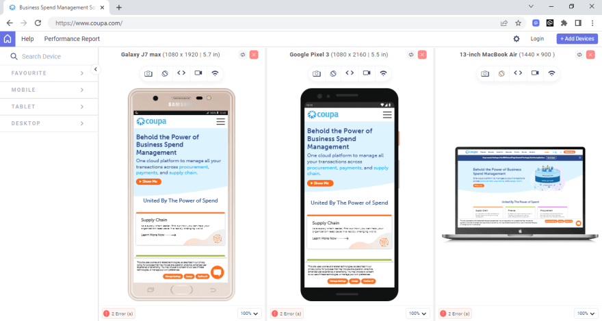
Whether it’s an iPhone, iPad, Samsung, or even a MacBook, you get all the resolutions in the LT Browser 2.0.
In this tutorial on Agile testing, let’s deep dive into the history of Agile testing, its advantages, disadvantages, methods, quadrants, and best practices.
Content is the key to a Mobile First Design Strategy
When designing for mobile devices focusing on the user experience, it is critical to recognize the importance of content. To accomplish this, designers should take a content-first approach, providing users with only the necessary information and avoiding including any redundant information that could potentially detract from the mobile experience by causing clutter and distractions.
The mobile first design strategy is subject to certain constraints, such as screen size and available bandwidth. These constraints can drive designers to make poor decisions when prioritizing design elements.
To overcome these constraints, designers must eliminate all non-essential elements and concentrate on the design’s key components. It is important to note that just because an element is deemed extraneous does not necessarily imply that it is entirely unnecessary; instead, it means that the element is not critical to the mobile design.
As the content is context-dependent, it is common to see several website design elements removed from the mobile version while remaining in the desktop version. A mobile user’s needs are typically different from those of a desktop user.
Here are some key steps to make your website more content-friendly:
Determine the primary goal of the web application and the key content required to achieve that goal. Concentrate on the essential elements the user will require to achieve their objectives and eliminate any non-essential elements.
Conduct user research to learn about your target audience’s needs, preferences, and behaviors. This will allow you to tailor the content to their specific needs and provide them with a more personalized experience.
Create a content strategy that aligns with your business goals and user requirements. This includes developing a content hierarchy, determining the tone and voice of the content, and defining the content creation and maintenance process.
Create a web application wireframe or prototype to visualize the content hierarchy and user flow. This will aid in identifying any content gaps or areas where the user may become confused or lost.
Make use of responsive design principles to ensure your content is accessible and readable on all devices, including mobile devices.
Based on user feedback and analytics, continuously evaluate and optimize the content. This will assist you in keeping the content relevant and engaging for your target audience.
Read our comprehensive article on the website design checklist that you should follow in 2023.
Do you use a Mac and want to run the test in Internet Explorer? This article explores how to test Internet Explorer for Mac.
Key Principles for Mobile First Design
Mobile first design philosophy recognizes that mobile devices are the primary source of internet access for most users and that a mobile-friendly design is essential for providing a seamless user experience. Here are some key concepts that will help designers to create mobile first web designs, give users a seamless experience, and stay relevant in today’s mobile first digital landscape.
Prioritize user’s needs
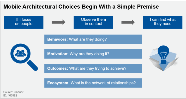
Generally, many organizations’ application leaders have picked a mobile first design before defining use cases — this is the other way around. Application leaders must adjust their perspective from gathering requirements to studying usage patterns in a “design thinking” approach (as shown in the figure below). Requirements do not identify tasks for innovation and productivity. To find the user stories that compose an app’s functions are best determined by evaluating a varied collection of work practices for patterns in how employees interact, access content, collaborate, and produce content.
Clear visual hierarchy of mobile content
The arrangement of design elements in a way that prioritizes their relevance and guides the viewer’s eye through the design is known as a visual hierarchy. This is accomplished by altering the design elements’ size, color, contrast, proximity, and other visual features to establish a clear hierarchy. And in mobile first web design, it has significant importance.
Here are some principles that can leverage the visual hierarchy of content:
Use sizing to get users’ focus on essential elements of web pages. You can simply increase the size of some elements to get users’ focus. However, too many significant elements can congest your webpage, which is not good practice.
Use color and contrast to increase the importance of any particular element. Color with higher contrast creates a sense of uniqueness and grabs users’ attention.
The appropriate typeface pairing can offer your website individuality and draw attention to specific sections. Typefaces of varying widths and weights can also increase hierarchy and highlight more essential text parts.
Use whitespace to navigate users. The negative distance between elements in a design is referred to as whitespace. It can be used to gather or separate elements to emphasize their significance.
Keep your web design simple
Simple web design improves content clarity and is easier to navigate. Therefore it’s best practice to keep the content necessary for users so they don’t get distracted by extra elements.
Mobile devices have small screen sizes, and users frequently browse the internet while on the go, so they have less time to interact with the design. A straightforward design that focuses on the main content and functionality helps to ensure that consumers can locate what they are looking for fast and effortlessly.
Here are some methods to simplify web design:
Concentrate on the web page’s content and make sure it is properly presented.
Simplify navigation by using an easy-to-use and precise navigation system.
Adopt a limited color palette to ensure the design is visually appealing without overpowering the consumer.
Implement a clear and legible typeface to ensure the text is easily read on tiny displays.
Utilize responsive images and videos that adjust to the size of the device’s screen.
Effective CTAs
Call-To-Action (CTA) should be created to stand out and contrast with the background and other elements on the page. This helps to guarantee that they are immediately visible and capture the user’s attention. Furthermore, it is critical to employ a consistent layout for CTAs throughout the website, ensuring they look and perform the same way on all pages.
Here is some point to improve the effectiveness of CTAs:
Text CTA should be intriguing, with terms that compel the user to act.
CTA should be built to contrast with the background and other items on the page.
Put the CTA on the page in a visible and strategic location, such as above the fold or at the end of a section.
Experiment with several CTA options, such as text, color, positioning, and design components.
Website loading speed
As per one survey from Skilled, 79% of visitors will not return to a website to buy if the loading performance is poor. Website loading speed plays a significant role in overall website performance. Not just users but Google also promotes that website more, which loads faster. Here are some areas you can work on to improve website loading speed:
Big images can slow down the loading speed of a webpage. Designers can use image optimization technologies to compress images or reduce their resolution to reduce their size.
Designers can speed up the loading time of a webpage by minimizing the amount of HTTP requests. One method combines many CSS and JavaScript files into a single file.
Minifying code removes extraneous characters from CSS, HTML, and JavaScript files, such as spaces and line breaks. This decreases the file size and speeds up the web page’s loading time.
In this Ad hoc testing tutorial, let’s deep dive into what Ad hoc testing is, its advantages, disadvantages, types, characteristics, and their best practices.
Development phases of Mobile First Design
If you choose a mobile first design strategy, you should consider whether you will eventually migrate to a comprehensive desktop platform. This information will tremendously aid you in developing and implementing design strategies.
If your organization utilizes the DevOps methodology, you know the importance of early and frequent monitoring. But, if your business is not yet DevOps-enabled and you intend to design and develop your applications using a mobile first strategy, early monitoring can help to streamline the deployment process for both mobile and desktop versions of your platform.
Here are the steps of mobile first design development:
- List out content
Create a spreadsheet that includes all the elements you want in your website. To begin, it is recommended that you construct a spreadsheet to list all the content items you intend to include in your design. After compiling this list, you will have a clear perspective of all the content that needs to be included in the design.
The goal of this phase is to prevent leaving out any essential aspects and to verify that your design is complete and covers all relevant content. Furthermore, having a detailed content list lets you prioritize and dedicate resources to the most crucial design aspects. Overall, inventorying your material is a vital phase in the design process that can assist you in creating a well-organized and successful design.
This step will also help in managing the visual hierarchy of content. You can prioritize the items in the content inventory spreadsheet and decide how to highlight the most significant ones.
2. Begin with the tiniest breakpoints and work your way up
For a mobile first design strategy, create a wireframe for the smallest breakpoint, such as mobile displays, and then scale it up for higher breakpoints, such as tablets and desktops, to begin your design process. This technique aims to guarantee that your design works well on tiny devices first and then adjusts it for larger screens.
Here is how you can apply this method:
Start by creating a wireframe for the smallest breakpoint, which is often mobile displays. Your wireframe should cover your design’s main aspects, including content, pictures, and navigation.
Once you are done with a well designed mobile wireframe, leverage this practice for larger breakpoints by increasing size.
When you increase the screen size, watch for the quantity of white space on the screen. You should strive to expand the design until there is too much white space, indicating it is ready for the next breakpoint.
Once you find out the next breakpoint, You should pause and begin adjusting the design for the next breakpoint.
The advantage of this method is that it assures that your design is optimized for smaller screens, which are becoming increasingly crucial in today’s mobile device era. It also helps you create a scalable and adaptive design, saving you time and effort in the long run. Overall, designing with minor breakpoints and scaling up is a successful strategy for building a responsive and adaptive design.
3. Make elements thumb-friendly
The next step of the mobile first design strategy is website thumb-friendliness. Clickable components like hyperlinks, buttons, and icons should be large enough to be readily tapped with a thumb (sometimes fingers!). Because thumbs are significantly more enormous than pixel-precise mouse cursors, users may mistakenly tap on the wrong element if the clickable elements are too small. The minimum recommendation is a clickable element should be at least 44 pixels in height and width.
To increase the size of touch targets, ensure that clickable items are not too close together. Also, to make buttons and other interactive components simpler to tap, slightly increase them. Finally, you should leave enough space around all interactive elements to avoid accidental tapping.
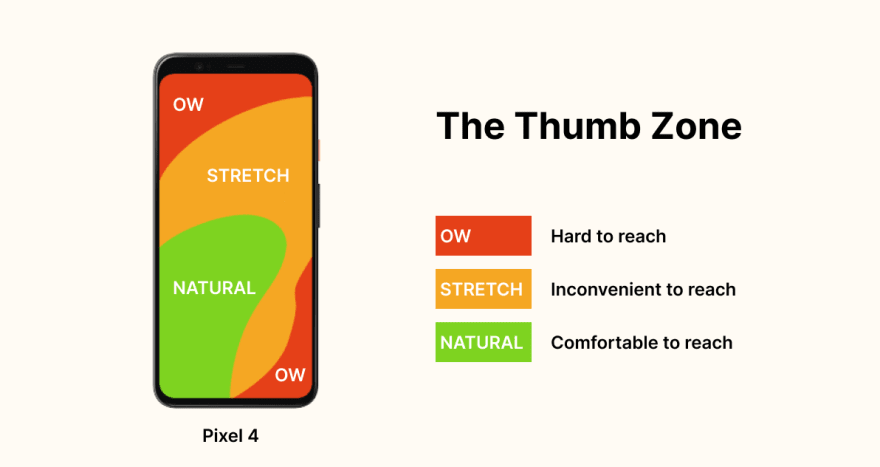
Another point that should be kept in mind is the “thumb zone.” Physically, users do not have easy access to the whole screen; it has a zone that is easy to reach, and some are harder to get. So ensure your CTA comes in the “easy thumb zone” to increase overall CTR. Here is the illustration for understanding the thumb zone in mobile devices.
4. Avoid relying on hover
For the mobile first design strategy, mouseover and CSS hover effects should be avoided because they are not supported on mobile devices. Hover and mouseover effects are interactive design components that change as the mouse is moved over them, and they are often employed in desktop interfaces.
Instead, for a mobile first web design, concentrate on creating intuitive and simple-to-use interfaces that use touch-based actions like tapping, swiping, and pinching. You can also include interactive design components built expressly for mobile devices, such as buttons and menus.
5. Design the interface like a mobile application
Instead of a typical desktop website, consider creating the UI as a mobile app. Off-canvas navigation, expandable widgets, AJAX calls, and other interactive elements are all things that mobile users are accustomed to having more control over.
Off-screen navigation: A navigation menu concealed off-screen until the user presses a button to display it is called off-canvas navigation. This navigation style is popular in mobile apps because it allows users to access the navigation menu without taking up too much screen space.
Expandable widgets: Widgets, such as an accordion menu, are interactive features allowing users to expand or compress content. This widget type is often used in mobile interfaces to save space and allow users to get information quickly without scrolling through a long page.
AJAX calls: Asynchronous server requests allow users to interact with the interface without reloading the entire page. This type of interaction is frequently utilized in mobile devices to give a more fluid and responsive user experience.
By incorporating these features into mobile interface design, you can provide consumers with a more engaging and dynamic experience. Furthermore, building mobile interfaces such as apps can make it easier for consumers to explore and quickly access the required information.
6. Avoid bigger visuals
For the mobile first design, you should avoid utilizing large graphics that do not display well on small devices, such as landscape photos or complicated graphics. You should instead cater to mobile consumers by using graphics that are readable and clear on portable screens.
Because mobile devices have smaller screens than desktop computers, massive visuals can take up too much space and make navigating the UI difficult. Furthermore, huge images can take longer to load, slowing the interface and frustrating users.
Furthermore, Consider the context in which the photographs will also be used. For example, if you’re creating an interface for a news website, you should utilize graphics related to the content and assist the user in understanding the material. Similarly, when building an interface for an eCommerce website, utilize images that highlight the products and help the consumer purchase.
7. Test on a real device before deployment
The most crucial step for a mobile first design approach is to test it on a real device before release to ensure it is user-friendly and functioning well on different devices. Testing your mobile interface on a real device will help you evaluate its performance. You can test how quickly sites load, how easy it is to navigate the interface, and whether text and pictures are readable on a small screen. You can also see if the interface responds effectively to touch inputs and if there are any problems with buttons or links.
Testing on an actual device might also assist you in identifying flaws that may be hidden on a desktop computer. For example, you may discover that the font size on a mobile device is too small or that the buttons are too close together and difficult to tap.
If you are looking for a real device cloud, LambdaTest could be the best option to test your website or native mobile application on a real device cloud, eliminating the need for in-house Android and iOS device labs.
Perform browser automation testing on the most powerful cloud infrastructure. Leverage LambdaTest automation testing for faster, reliable and scalable experience on cloud.
Wrapping Up!
We are well aware that mobile devices are currently dominating the market. Therefore, a mobile first design strategy is not an option but a priority. In 2023, businesses that wish to improve their online presence and give an optimal user experience to their audience must prioritize mobile first web design.
In this highly competitive and continuously evolving digital market, businesses must stay caught up. For any business, user experience is of utmost importance. With a mobile first design strategy, you make your website easy to access for your users and use, ultimately resulting in higher engagement, better conversion rate, and increased customer satisfaction. Hence, prioritize mobile first design if you want to stay ahead of the digital curve. Good luck with your mobile first web design journey!

Top comments (0)