![Cover image for 7 Best Practices For Responsive Websites [With Examples]](https://media2.dev.to/dynamic/image/width=1000,height=420,fit=cover,gravity=auto,format=auto/https%3A%2F%2Fdev-to-uploads.s3.amazonaws.com%2Fuploads%2Farticles%2Fatoebu7axjjulvmg6uq2.jpg)
7 Best Practices For Responsive Websites [With Examples]

A responsive website is one that can adapt to any device or browser, having any specific resolution without causing any breakage in layout or horizontal scrolling. Thus, it helps create seamless user experiences across all devices and operating systems. For web designers, responsive web design should be standard practice. According to a GoodFirms survey, 73.1 percent of users will leave a website with a non-responsive design. Creating top-notch user experiences entails creating a consistent experience that fits their needs regardless of the device they’re using.
Audi launched a website in late 2001 that was the first to adjust its layout based on the browser viewport. By 2008, terms like elastic, fluid, and liquid had been devised to describe such layouts. By 2009, CSS media queries were being used to create adaptive layouts. However, it was 2011 when the term responsive web design was coined.
In this post, we are going to discuss seven best practices for designing responsive websites, along with 20 responsive websites examples.
So, let’s begin.
7 best practices for designing responsive websites
Before starting with the best practices, let’s get to know what responsive websites are. Responsive websites are sites that render perfectly on a variety of devices with varying screen resolutions. They are responsive because they fit well on all resolutions without any distortion in the UI or horizontal scrolling.
Let’s get to know some of the best practices a developer should keep in mind while working on a responsive website.
1. Prioritize your target
Nowadays, all websites are meant to be cross-browser compatible and work properly on all devices. Let’s assume you are going to design your website’s prototype. Now, designing it for a desktop is quite easy. You have a lot of areas to play with, and you can break down all the content into multiple sections and arrange them as per your convenience.
The challenge comes with building mobile-friendly websites. Since you don’t have much real estate to work on, placing the contents becomes tricky, and you have to rely on hamburger menus, collapsible tabs, etc. So, how to make the design procedure free from complexities? The answer is — Prioritize!
Get a list of your or your client’s target devices. For instance, if you are designing a shopping app, it must be a mobile-first web design. However, if you are developing applications like Notion or Sheet, desktops should be the priority along with mobiles because users like to work on those apps from their computers.
Once you are done with the first step, prioritize your elements. For example, if you are designing for mobile, decide what you want to show on your home screen and what to hide. Then, arrange the carousel, CTA, site logo, hamburger as per your priority and design.
2. Easy to find CTA
Most websites have a call-to-action or CTA where they want their users to click. The purpose of a CTA can be to buy a product, schedule an appointment, subscribe to newsletters, or simply sign up.
Now, your target would be to make the design a CTA in a way so that it’s easily discoverable. Not only that, it should be subtle enough so that the user discovers it naturally and doesn’t feel that it is focused forcefully.
Placing a CTA is quite easier when designing your site for a desktop since you will have a lot of areas to play with. However, on a tablet or mobile, you have to consider the placement carefully. It should be large enough to be clickable but not so large that it overshadows other important elements. For example, if the CTA is for sign-up, you can place it inside the hamburger menu. If it’s to purchase a product, you can use a logo instead of text. Try to make the design consistent on both desktop and mobile so that users don’t find it hard.
3. Using SVG and responsive images
Designing logos and images for your site can be hectic. You would want to have a high-resolution image for your site that doesn’t pixelate how much the user zooms in. However, those images come at a cost. You guessed it right! Huge loading time. For SEO purposes, your site should have a loading time of fewer than 2 seconds. You can use a smaller image of less resolution, but that will pixelate once the viewer zooms in. So, what’s the solution?
The answer is scalable vector graphics or, as we commonly call them — SVG images.
Instead of pixels, they are composed of mathematical equations where lines and curves create graphic shapes in XML format. These images are scalable and supported in almost all major browsers. No matter how much you zoom in, they will never pixelate. You can edit them easily using Sketch or Adobe Illustrator. You can also alter their colors with CSS or JS. They have a very small size. You can create a banner image that takes up just a few KBs. And the best feature — since they are defined in XML, descriptions and keywords can be recognized easily by search engines, hence SEO friendly.
4. Dimension of clickable areas
Based on the nature of your website, you may have multiple buttons, menus, or other clickable areas. During responsive web design, an important question arises — how big should I make my buttons?
Designing buttons and menus for desktops is quite simple. Because on the desktop, we use a mouse for clicking. And, the size of a pointer is very small. But, no matter how small the button is, we can click it easily.
However, we need to ensure that the buttons are large enough to tap them with our fingers for mobiles and tablets. Not only that, if there are multiple buttons or links, like in a navigation menu, there must be sufficient space between them. So that the user doesn’t accidentally tap a button that is closer to the button they desire to tap.
Research on button spacing and sizing found that users faced the lowest accuracy on less than 42 pixels. Buttons that are larger than 72 pixels also had quite a low accuracy. The most preferred button size was found to be 60 pixels. And the optimum range of button sizes lies between 42 and 72 pixels.
5. Use of lightweight frameworks
When it comes to responsive web design, the framework that always comes to our mind is Bootstrap. Developers love using Bootstrap because of its huge collection of grids, carousels, buttons, and other responsive elements. But there is a huge problem that comes with Bootstrap — size.
With such a heavy framework, the loading time of a site increases. And as we have discussed earlier, a site that takes time to load has a huge impact on SEO. So, what’s the solution?
Well, there are a huge number of lightweight CSS frameworks that help us with responsive web design. Check the design of your website, and you can select the one that suits your needs. For example, if your site relies totally on grids, you can use Simplegrid. You can also use Skeleton, Foundation, or Google’s very own Material UI.
In short, you no longer need to have a single heavy framework to make your website responsive. However, before selecting any framework, make sure that it is cross browser compatible. For example, you wouldn’t want your site to break for a user using Safari on a Macbook or an older version of Internet Explorer on Windows.
6. Mobile-first approach
The Mobile-first approach means designing the site for mobile-first and then scaling your way up to tablets and desktops. But why is it important?
It’s practical to design for mobile first since usability concerns are more for mobile websites.
Scaling down from desktop design to mobile is difficult. But it’s easier to scale up because once you get a larger screen, it’s less complicated to place your elements.
A mobile-first design approach helps us decide what elements are functionally and visually necessary for your page. Since mobiles have a small screen space, as a design, you will find yourself asking –
Do I need this feature?
How do I design something minimalistic which I can later scale up for desktop?
Is a certain animation I’m about to use worth the loading time?
7. Cross browser testing
The seventh most important practice after you have developed your responsive website is to perform cross browser testing. Gone are the days when a website was meant to be opened only on the PC and any particular browser. Nowadays, people mostly rely on a wider range of devices and browsers to surf the internet.
Did you ever wonder how one of your potential users would feel if they found some glitch or horizontal scrolling on your site after they have opened it on their mobile? They won’t give a second thought before switching to your competitor’s site. Therefore, you need to work on the following things.
Make sure your website renders correctly across all the devices and browsers of different resolutions. While developing, ensure that you haven’t used any framework or library known to cause bugs in certain browsers.
Prioritize cross browser testing. It is hectic to maintain a physical device lab and set up a test environment in your office. It will be better if you rely on a cross browser testing tool like LambdaTest. With LambdaTest, you can test your website seamlessly across 2000+ browser-OS combinations running on the cloud with just a few clicks.
20 best examples of responsive websites
Now that we have gone through some of the best practices designers and developers need to follow while creating responsive websites, let’s check out some popular examples.
1. Adobe
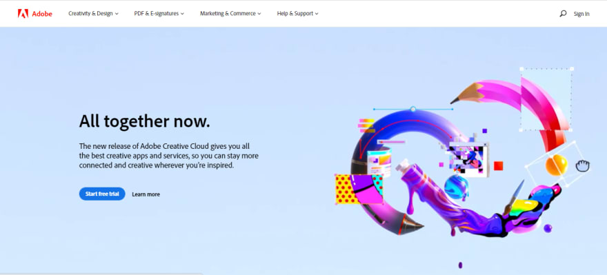
Apart from being responsive, the best thing we found about Adobe is its unique approach to responsive imagery. For example, if you inspect the banner image of Adobe’s site, you will find several .jpg image sources.

What does this mean? Each of these JPGs represents a banner image that is to be shown in different screen sizes. Large devices use a large-sized image while small devices load a small image, resulting in a faster loading time.
2. Salesforce
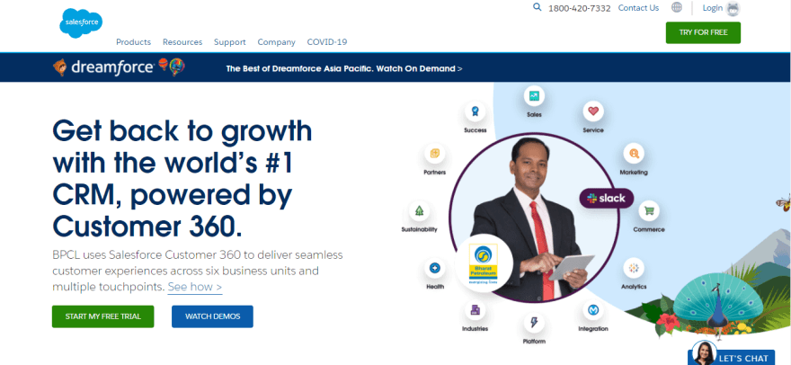
Salesforce is a popular cloud-based application that offers customer relationship management services. They have found a neat and clean way to place their CTAs on all devices. First of all, they have made the placement of their “TRY FOR FREE” CTA consistent for all devices, just on the navigation bar. The only difference is that, with different breakpoints, the button changes its color. They have also placed additional CTAs for calling or chatting with their support, which gets converted into icons on a small screen.
Also, if you click on a CTA, rather than redirecting to a different page with a small, you will find a form sliding out from the right-hand side in mobile. Thus, keeping site audiences on the same page. The user doesn’t have to wait for a different page to load. This can be a beneficial feature if a user has a bandwidth or speed issue.
3. Netflix

Being one of the React JS pioneers, the OTT giant Netflix has successfully deployed a responsive site that offers a unique experience no matter what platform or browser the audience is using. The homepage has a product description on all devices, a logo on the top, and two CTAs, one for logging in and another for signing up. Instead of using a banner, they have used a nicely designed background image that scales itself as per the device viewed. Thus, using all the space available for displaying the necessary information.
4. Shopify
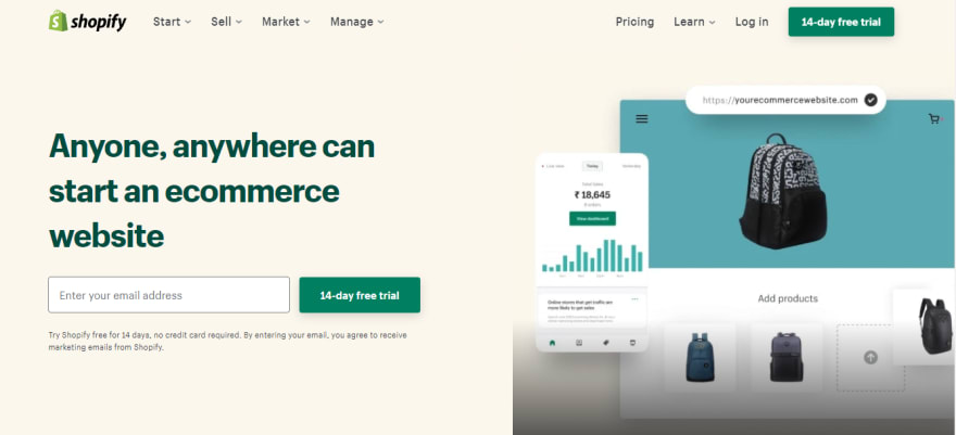
Shopify is a popular platform where you can create your customized e-commerce platform. They have successfully managed to impress their audience with a rich and immersive, responsive website. In the menu bar of Shopify, you will find two sets of options. The group on the left-hand side focuses on basic operations like navigation, browsing their offers, and purchasing.
The group on the right-hand side deals with login, registration, learning more about pricing, and having a CTA for starting a trial. Just like GitHub, Shopify also has a site description that is focused on as the primary content. It also has a form for starting a free trial apart from the CTA in the menu bar. In tablet and mobile, these options are removed to keep the screen clutter-free.
Now perform live interactive Shopify testing of your Shopify websites on LambdaTest.
5. ESPN
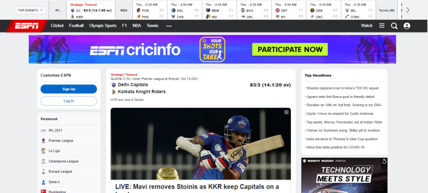
In 2015, ESPN completely revamped its site. They launched a responsive site that offered a lot of news features different from the site they had since 2009. The new site has a clean and modern UI. The functionality is consistent and offers an engaging UX across all devices and browsers. Developed from a mobile-first approach, the site is scalable and has large responsive images and videos and third-party social media integration. From any device, users can view live updates of their favorite sports.
6. HubSpot
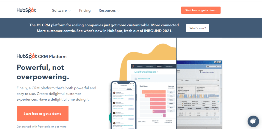
With clean fonts, icons, and banner images, Hubspot has developed a responsive site that loads remarkably fast no matter what device you are using. The unique feature of their site is how they have used minimalistic content to create a rich and immersive UI. The desktop version has a few items in the menu and two CTAs for signing up. The homepage has the “Start free” CTA taking up the full-screen width in the mobile version. They have also placed another CTA in the hamburger menu so that the user can easily find it when they need it.
7. LambdaTest
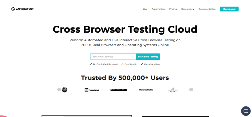
LambdaTest has also developed a responsive site that works well across different devices and browsers as a popular platform for cross-browser testing. Developers have used responsive elements like hamburger menus, SVG logos, clean fonts, and color combinations to create a site that loads fast and offers a visually aesthetic user experience.
8. Popular Science
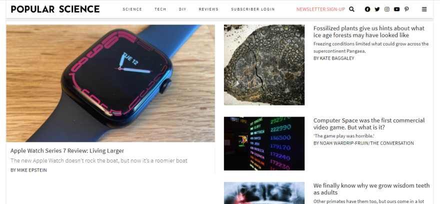
Irrespective of the device that you are on, Popular Science gives you a memorable user experience. As expected, the primary focus is on content, along with clean typography and responsive images. The information is presented so that you can scale down all of the site’s content on a wide range of devices. It’s worth noting how they have used simple and sleek font families, icons, and colors that look attractive and don’t present a huge load on the site.
9. IGN

A popular platform for gaming and other media-related information, IGN offers a responsive site with flexible grids that expand from 2 to 4 columns. The grids mostly have the latest news showcased with responsive images and brief descriptions. In addition, the desktop version has a CTA for login, which is stacked inside the hamburger menu in mobile and tablet view.
10. IMDB
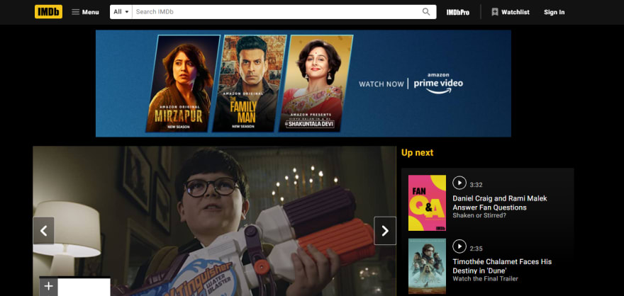
IMDB’s website has a dynamic layout with a carousel and several columns that rearrange according to the device on which the site is accessed. While shifting from desktop to tablet and mobile, their content shrinks, finally including a login CTA, the logo, hamburger menu, and a search icon replacing the large search bar visible on the desktop. They also shine in using responsive images, which shrink and fit accordingly on different devices.
11. Dropbox
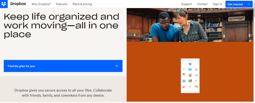
Initially, Dropbox was meant to be used only on desktops. But with time, they have adapted their site and did a great job scaling down their site to work well on small devices. In the desktop version, you will be amazed by a sleek design with images and grids that complement each other. Not only that, it’s interesting to see how some images and texts change or become hidden while switching to mobile. They have done a pretty good job in prioritizing elements as per the device used.
12. GitHub

GitHub shows what is important to show to the user when it comes to conversion goals. When you land on their page, the first thing that you will find is what they are offering. Next to the description, you will find a form for signing up. There is also a CTA for signing up in the menu bar, making the UI neater and compact. Thus, the user will have ample scope to sign up if they are distracted by the additional content on the page when they are viewing it at a higher resolution.
13. CSS Tricks
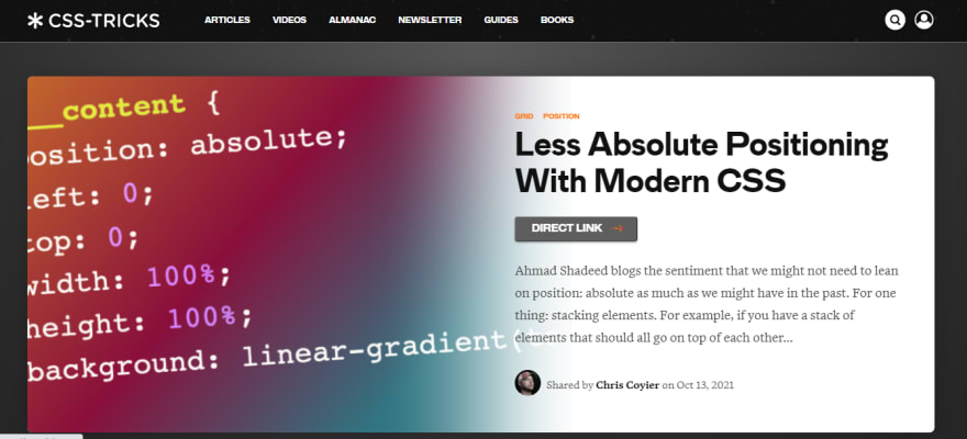
CSS Tricks is a popular learning platform where you can learn about all the latest guidelines and tricks to learn about CSS. Their site is an excellent example of how a planned blog-related website can be designed responsively. Breaking out from the conventional approach, the website now has blog previews in cards having border radius. They also have swipeable cards containing popular articles of the current month. However, they didn’t use a hamburger menu and have rearranged the navigation bar in the form of a slider for smaller devices.
14. W3 Schools
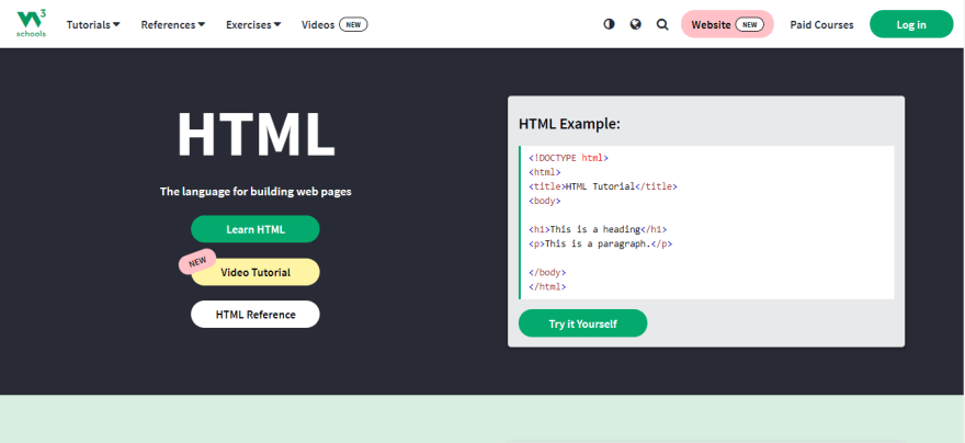
W3Schools is a popular website where you can learn web development fundamentals as well as other programming languages. When they went responsive, they first changed the logo to a clean and compact image that presents itself beautifully on all devices. Instead of the hamburger menu, they used a collapsible dropdown in small devices along with the login CTA in the header section. The banner images were kept the same. However, the demo of their in-page code editor was removed in mobile to make the UI clutter-free for small devices.
15. Starbucks
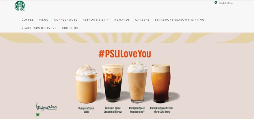
If you want to see an eye-catching and simple responsive design, you should check out Starbucks. They have done a great job without using parallax effects in static and colorful images of their latest product. They have also taken a unique approach to their content hierarchy while scaling down for smaller devices. For example, content that describes their product is on the left or right-hand side of the image on the desktop. While on mobile, the same content is placid below the image.
16. Airbnb
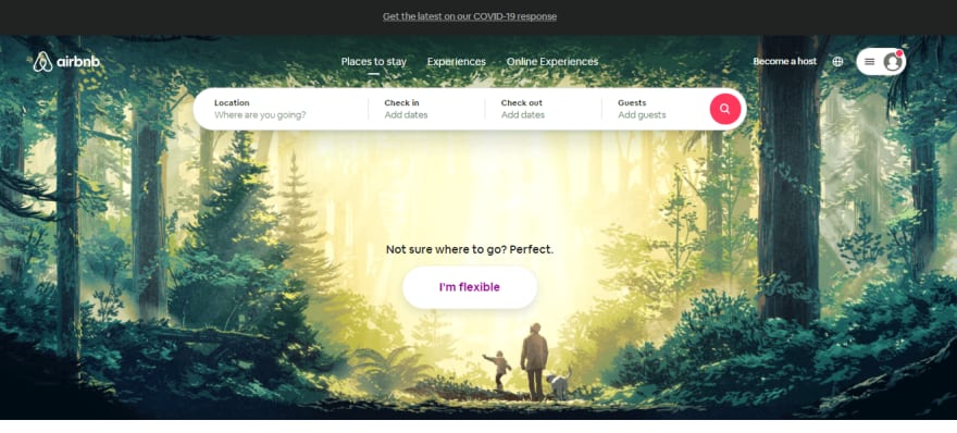
Although Airbnb has native applications and a huge count of their traffic comes from desktops, they still went responsive. This is because they have tons of users signing up every day. Now, you can’t expect a user to install a mobile app directly on day one. Before that, you need to impress them with a rich and immersive user experience. Airbnb did just that. Their mobile and tablet view has a nice clean banner image, few swipeable cards for choosing destinations, a basic search bar, and some clean icons. In the desktop view, apart from all the elements in mobile, they also have a form for advanced search.
17. BBC News
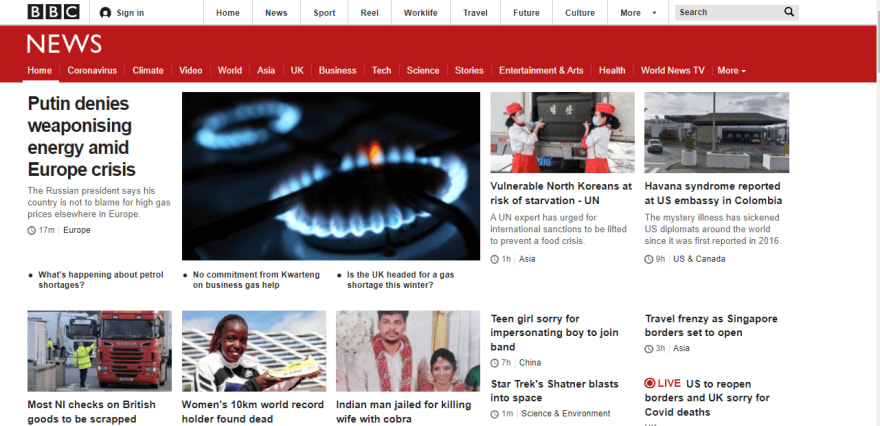
BBC News, designed with a mobile-first approach, scales to meet the characteristics of different devices neatly. We can call it a fantastic example of progressive enhancement. The markup shows a single responsive image for a headline story. Developers have also implemented conditional loading. This means capable devices can load highly optimized images for referencing other stories. Apart from being responsive, the site is quite fast as well.
18. Disney
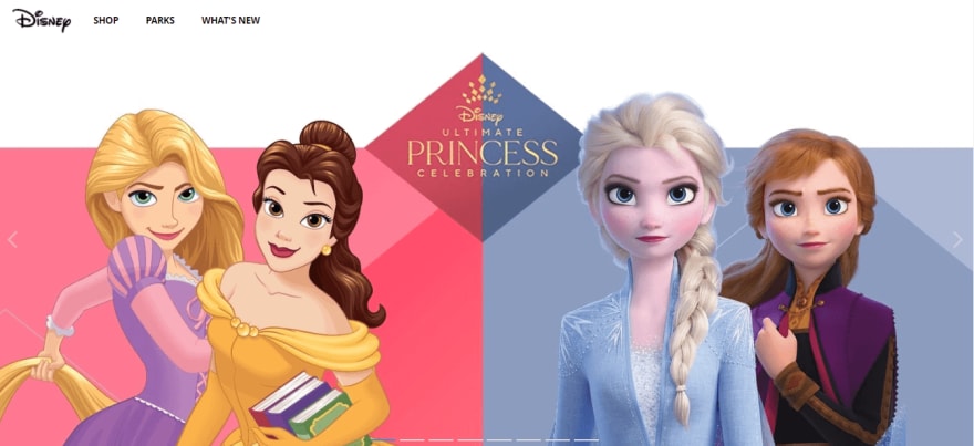
Disney’s site was well known for its media complexity. When it went responsive, the site showcased clean highlights from Disney television’s rich imagery and movies that you can view inline. They have also implemented Ajax, resulting in subtle page transitions. For touch-friendly devices, Disney also has off-canvas page push and gesture-driven carousels on small screens. Another thing worth mentioning is the clean navigation bar with a few items that smoothly converts into a hamburger menu on small devices.
19. ICICI Bank
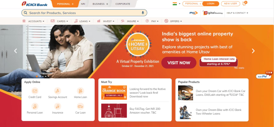
One of the leading financial services, ICICI Bank did a great job in creating a responsive website that not only has a clean and satisfying UX but is also quite fast. The site understands the requirements of a user and displays content based on how the user behaves on the site. The desktop site has a huge carousel with multiple banner images and product cards from which you can find the service you need. The mobile UI has some forms, CTAs, and swipeable cards. Moreover, the mobile version also has a CTA for redirecting the user to the play store to install ICICI Bank’s mobile application.
20. Slack
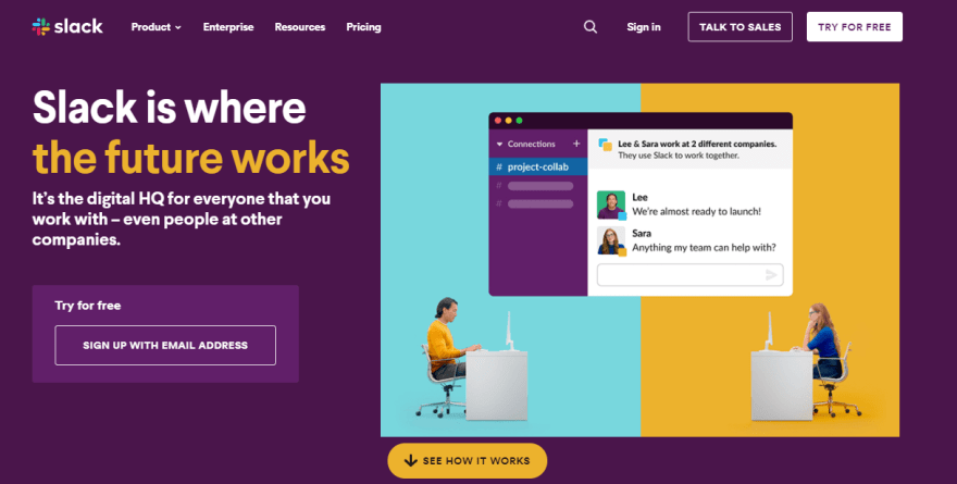
lack is a popular web, and mobile application meant for communicating between teams. What’s interesting about their site is how they have grouped the menu options into a hamburger for mobile. We can also see how they have reduced the count of CTA to only one “Try for Free ” option on mobile. Instead of two CTAs, the mobile and tablet view has a large CTA that takes up the screen’s full width.
Performing Responsiveness Test Of Websites
Responsive web design is a sophisticated type of web technology. As many devices are available in the market, developers need to ensure their website and web apps are rendering correctly on different viewports (e.g., mobile, tablets, and desktop) before releasing them to the general public. Therefore, it is recommended to use a responsive testing tool to perform the responsiveness test of the website.
To help with responsive testing, LT Browser — a mobile friendly checker tool, enables you to run responsiveness tests of websites and web apps across pre-installed device viewports for mobile, tablets, desktops, and laptops.
LT Browser has out-of-the-box features such as developer tools, Google Lighthouse performance reports, hot reloading, and network throttling to provide a realistic picture of the website’s capabilities. You can also use the LT Browser to see how your website performs under throttling network conditions. To learn more about how to test a website under different network conditions, read How to Test a Website Under Different Network Conditions.
To get started with LT Browser, refer to the below LT Browser tutorial.
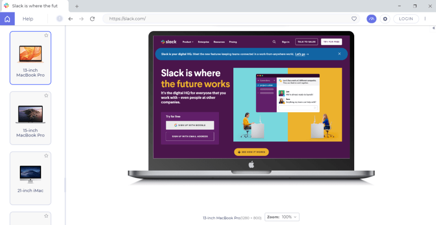
Using LT Browser, let’s perform a responsiveness test of the Slack website on mobile, tablet, and desktop.
Mobile And Tablet View

Desktop View
Summing It Up!
There are a lot of different elements that go into responsive website design. Before starting, make sure that you have an in-depth understanding of HTML and CSS to avoid mistakes. No matter which framework you use, if you understand the basic building blocks, the learning curve will be much smoother, and in no time, you will be able to develop a full-scale responsive website for yourself or your client.
Once you have developed your website, don’t forget to run a responsiveness test. We hope you will find this blog useful in learning the best practices one should follow while creating a responsive website.

Top comments (0)