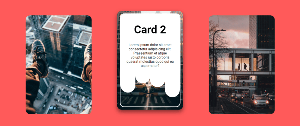
Demo
I suggest you to see the result in new full view window. click on the top right most button for new window view. Yeah its not responsive but you can make it :)
Video tutorial -
Let's code -
Now Let's start coding we will make this with only css so make two files index.html and style.css and write basic html structure code in index.html and also link css file.
Inside <body> make a <div> with class name of .card and inside of that make an <img /> give it a class .card-img then make another <div> with class .content and inside of that make four <span> this will be our absolute positioned background for our content. Now at last make an h1 give it a class .title and type anything you want inside h1 and also create p with a class .info and type your content.
Like this -
<div class="card">
    <img src="img1.jpg" class="card-img" alt="">
    <div class="content">
         <span></span>
         <span></span>
         <span></span>
         <span></span>
         <h1 class="title">card 1</h1>
         <p class="info">Lorem ipsum dolor sit amet consectetur, adipisicing elit. Ut quaerat similique, cupiditate ex placeat error ducimus fugiat. Quam, explicabo asperiores!</p>
    </div>
</div>
Now you can copy this element thrice to make three card and make sure you change each image src.
Now lets write some css. Open style.css file and type these styles.
*{
    margin: 0;
    padding: 0;
    box-sizing: border-box;
}

body{
    width: 100%;
    height: 100vh;
    display: flex;
    justify-content: space-evenly;
    align-items: center;
    background-color: #ff5a5a;
}

.card{
    width: 300px;
    height: 450px;
    border-radius: 20px;
    display: flex;
    justify-content: center;
    align-items: center;
    position: relative;
    overflow: hidden;
    transition: 1s;
}

.card-img{
    position: absolute;
    height: 100%;
    min-width: 100%;
    top: 50%;
    left: 50%;
    transition: 1s;
    transform: translate(-50%, -50%);
}

.card:hover{
    transform: translateY(-20px);
    box-shadow: 0 10px 20px rgba(0, 0, 0, 0.5);
}

.card:hover .card-img{
    height: 110%;
}
Now till now we styled our card and set its image in center and a little bit of hover effect like zoom the image when hovering card and lifting card up with a box shadow. It's easy to understand CSS.
Now type this
.content{
    width: 92%;
    height: 95%;
    overflow: hidden;
    border-radius: 20px;
    border: 3px solid #fff;
    font-family: roboto, sans-serif;
    text-align: center;
    padding: 40px 20px;
    position: relative;
    transition: .5s;
    opacity: 0;
}

.card:hover .content{
    opacity: 1;
}

.title{
    position: relative;
    text-transform: capitalize;
    font-size: 50px;
    margin-bottom: 30px;
    z-index: 2;
    opacity: 0;
    transition: .5s;

}

.info{
    position: relative;
    z-index: 2;
    opacity: 0;
    transition: .5s;
}
And after writing this code we also styled out .content of .card element we styled all of our .title and p by now.
Now let's make this whole effect done.
Code this
.content span{
    position: absolute;
    width: 25%;
    height: 0;
    border-bottom-left-radius: 50px;
    border-bottom-right-radius: 50px;
    background: #fff;
    top: 0;
    left: 0;
    z-index: 1;
    transition: 1s;
}

.content span:nth-child(2){
    left: 25%;
}

.content span:nth-child(3){
    left: 50%;
}

.content span:nth-child(4){
    left: 75%;
}

.card:hover .content span:nth-child(1){
    height: 85%;
    transition-delay: .5s;
}

.card:hover .content span:nth-child(2){
    height: 75%;
    transition-delay: 1s;
}

.card:hover .content span:nth-child(3){
    height: 79%;
    transition-delay: 1.5s;
}

.card:hover .content span:nth-child(4){
    height: 90%;
    transition-delay: 2s;
}
In this we select our each <span> element of .content and styling them with width 25% (as we have 4 spans 4/100% = 25%) and setting its height equal to 0 and then we are adding hovering effect in which we are selecting each span and giving its height different from each others and also adding transition-delay.
So by this our effect is done just this final touch.
add this also
.card:hover .title,
.card:hover .info{
    opacity: 1;
    transition-delay: 3s;
}
so we are done, now these line setting out h1 and p element opacity: 1 with some transition-delay.
So I hope you like this effect and understood each and everything. If you find any mistake I made in this feel free to tell me in comments.


Top comments (0)