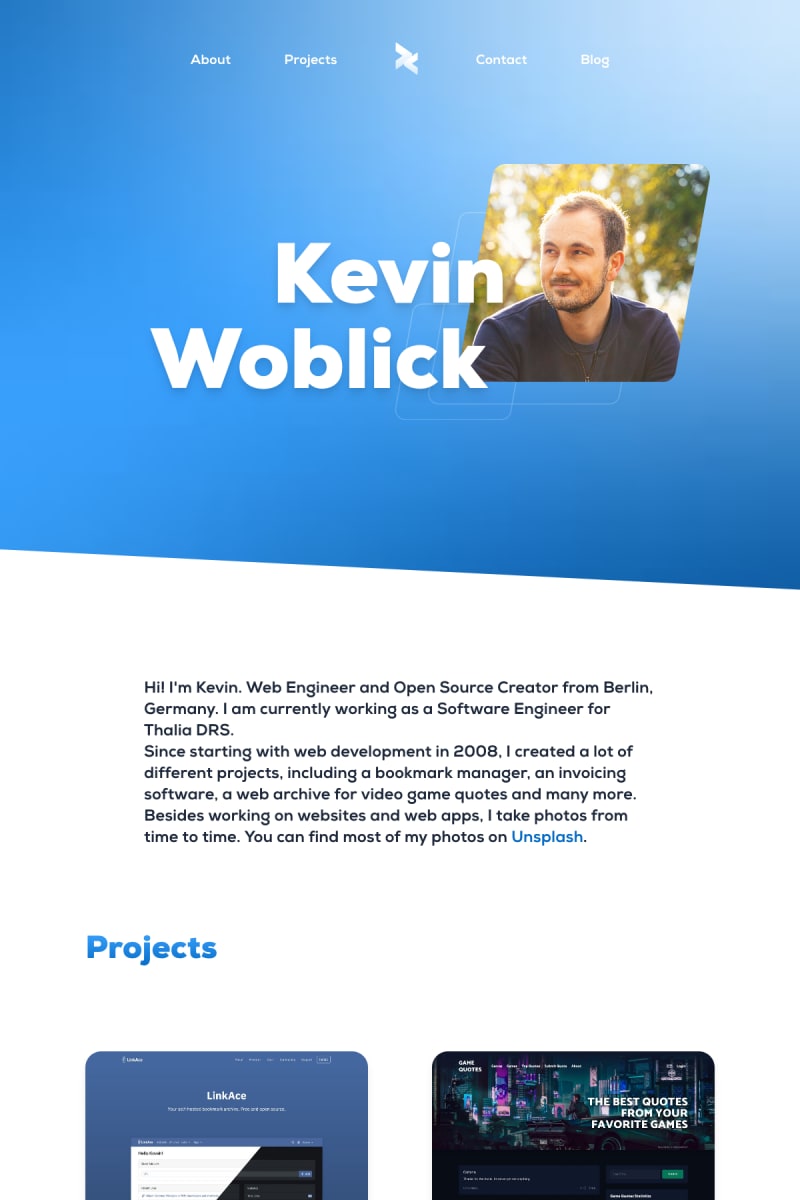
My old portfolio at Kovah.de has not received any big updates for years. The design was basically the same. I had fancy browser mockups which contained full screenshots of the websites I made. A few weeks ago I decided that it was about time to relaunch my website together with a new logo.
The new Logo
The logo represents my primary profession as being a Web Developer: the lower/greater signs (< and >) are used in HTML, so I wanted them to be the main part of my logo. I tried various other shapes, variations and also colors. But in the end, I found this new logo the most beautiful thing I've created.
The font used for the logotype and the website is called Nexa, which I bought years ago.
The new Website
The new website was built many years ago and the basic layout, the colors and the overall design didn't change much in the past years. The new version comes with fresher colors, modern soft gradients and bold typography.
While the previous version was built with Hugo as the static site generator, I decided to give Eleventy a chance as I am not that satisfied with Hugo. Instead of writing CSS on my own, 99% of the site is built with Tailwind CSS. Only a few effects are custom styles.
There is not a single line of Javascript.
Performance-wise, I am really satisfied with the results, which is not a miracle if you keep in mind that the site is HTML and CSS with some images and a custom font. In fact, images and the fonts are responsible for 90% of the size of the site. However, fonts contain only a small subset of all available characters in the Latin charset. Images are delivered as jpg, webp and avif so the browser can pick the most suitable format.
Googles Lighthouse testifies the performance with a solid 100. 🥳
If you have any questions, feel free to ask!


Top comments (2)
Very nice, looks great! Doesn't the repeating classes annoy you? cfr your projects are all exactly the same, still you'll need to edit all of them if you decide to make a change (except if you're using a framework that loops over them ofcourse)
Thank you for the feedback!
Actually, all projects (the big cards and small ones) are included via a template like this:
{% include content/project-card, projectTitle: 'LinkAce', imageSrc: 'src/assets/images/projects/linkace.jpg', imageAlt: 'LinkAce screenshot', ...%}. Inside the template, the project card is filled with the information. So I only have 1 place to edit the classes.