Design isn't something that stays the same forever. Old trends go, new trends replace them. It's constantly evolving.
A relatively new trend on the web is Glassmorphism. You can imagine it as taking a glass panel and putting it in front of a background. Give the glass a little bit of colour and a blur effect which result in the background changing completely when you're looking through the glass piece. Now add the information that you want to transmit to your user on top and voilà, you've got yourself a pretty looking glassmorphism UI.
Is it all about pretty looking? Or is there more to it? Let's find out.
1) Minimalist design 🐁
Minimalist design took over a while ago. We don't stuff the websites full of information anymore, instead we build in more white space, add more margin and sprinkle in some padding. This way the user doesn't feel attacked or pressured with information which could be very overwhelming.
Glassmorphism gives you the possibility to do the same by spreading your information on a glass pane, leaving more space in between to see through the glass into an interesting background.
2) Focus user's attention 🔎
By spreading your information on the glass pane, it would differentiate itself from your other content. So it can easily catch user's attention.
The information on the glass pane would stand out even more because of the blur the background receives. The text, images or icons look even more sharpen and clear on a blurred background that's why they would be more attractive for the user than on a plain background.
3) Wow effect ✨
Although we talked about some interesting points before which help you provide the information to the user in the best possible way, "pretty looking" could also bring its value to the table. Would a simple circle attract your attention? Probably not, but what about a circle that slowly fades away? Probably yes...
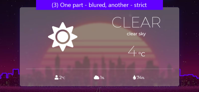
That's why geometric forms are very beloved by glassmorphism enthusiasts. They are very strict but when you put them behind a glass pane they fade away. You can often see a part of a triangle behind the glass pane and a part stretching out of it. This gives the whole thing an antithesis of strict and lenient which gives it this Wow effect ✨.
How to create a glassmorphism design?
I could share a code snippet right here of the CSS. But there are plenty of websites which help you generate a glassmorphism design which suits you the best. Here are some resources:
▶ Glassmorphism CSS Generator
▶ CSS Masks & Glassmorphism Generator


Top comments (1)
Here's an upcoming glassmorphism CSS UI library to check out, if you're interested.