
As a developer, you probably want to find ways to get more done with less code. That's where a frontend framework like Tailwind CSS comes in.
In this article, we'll dive into how Tailwind CSS can simplify your web design and development process. We'll show you how to get started with Tailwind, check out some real-life examples, and even create custom styles and plugins.
Let's get started!
How to Get Started With Using Tailwind CSS
Before installing Tailwind CSS and integrating it into your project, make sure that:
You have Node.js installed on your computer to make use of the Node package manager (npm) in the terminal.
Your project is all set up with your files created.
This is what our project structure looks like at the moment:
-Tailwind-tutorial
    -public
        -index.html
        -styles.css
    -src
        -styles.css
Next, start up a terminal for your project and run the following commands:
npm install -D tailwindcss
The above command will install the Tailwind CSS framework as a dependency. Next, generate your tailwind.config.js file by running the command below:
npm install -D tailwindcss
The tailwind.config.js file will be empty when created, so we’ve to add some lines of code:
module.exports = {
  content: ["./src/**/*.{html,js}", "./public/*.html"],
  theme: {
    extend: {},
  },
  plugins: [],
};
The file paths provided in the content array will enable Tailwind to purge/remove any unused styles during build time.
The next thing to do is to add the “@tailwind” directives to your CSS file in the src folder — this is where Tailwind generates all of its predefined utility styles for you:
@tailwind base;
@tailwind components;
@tailwind utilities;
The last thing to do is to start the build process by running this command in your terminal:
npx tailwindcss -i ./src/styles.css -o ./public/styles.css --watch
In the code above, we’re telling Tailwind that our input file is the stylesheet in the src folder and that whatever styles we’ve used have to be built into the output file in the public folder. --watch allows Tailwind to watch your file for changes for an automatic build process; omitting it means we’ve to run that script every time we want to build our code and see the desired output.
Using Tailwind CSS
Now that we’ve installed and set up Tailwind CSS for our project, let’s see some examples to understand its application fully.
Flexbox Example
To use flex in Tailwind CSS, you need to add a class of flex and then the direction of the flex items:
    <div class="flex flex-row">
      <button> Button 1 </button>
      <button> Button 2 </button>
      <button> Button 3 </button>
    </div>
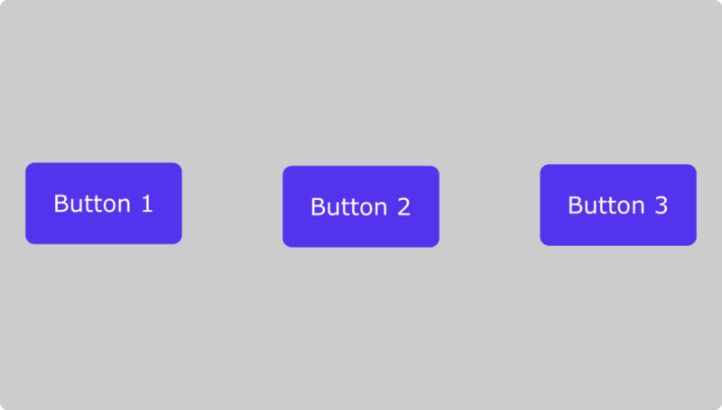
Using flex-row-reverse will reverse the order in which the buttons appear.
flex-col stacks them above each other. Here is an example:
    <div class="flex flex-col">
      <button> Button 1 </button>
      <button> Button 2 </button>
      <button> Button 3 </button>
    </div>
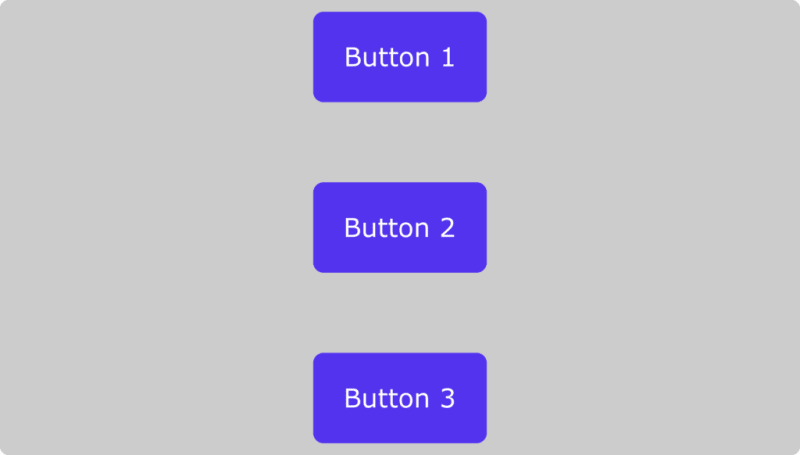
Just like the previous example, flex-col-reverse reverses the order.
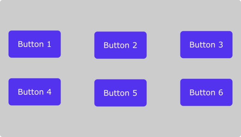
Grid Example
When specifying columns and rows in the grid system, we take a different approach by passing in a number that will determine how the elements will occupy available space:
<div class="grid grid-cols-3">
      <button> Button 1 </button>
      <button> Button 2 </button>
      <button> Button 3 </button>
      <button> Button 4 </button>
      <button> Button 5 </button>
      <button> Button 6 </button>
    </div>
Colors
Tailwind comes with a lot of predefined colors. Each color has a set of different variations, with the lightest variation being 50 and the darkest being 900.
Here is a picture of multiple colors and their HTML hex codes to illustrate this
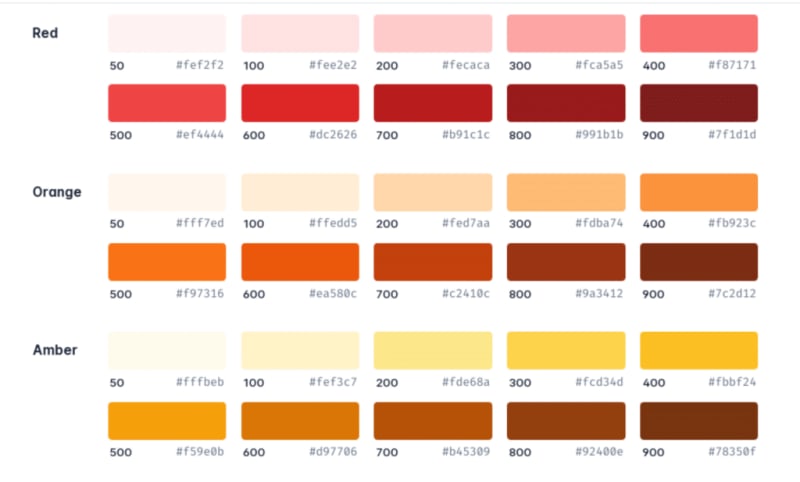
Customizing colors from Tailwind’s default palette. (Image source)
We’ll give an example of how you can do this using the red color above to give a button element a background color:
<button class="bg-red-50">Click me</button>
<button class="bg-red-100">Click me</button>
<button class="bg-red-200">Click me</button>
<button class="bg-red-300">Click me</button>
<button class="bg-red-400">Click me</button>
<button class="bg-red-500">Click me</button>
<button class="bg-red-600">Click me</button>
<button class="bg-red-700">Click me</button>
<button class="bg-red-800">Click me</button>
<button class="bg-red-900">Click me</button>
This syntax is the same for all colors in Tailwind except for black and white, which are written the same way but without the use of numbers: bg-black and bg-white.
To add text color, you use the class text-{color}:
<p class="text-yellow-600">Hello World</p>
Padding
Tailwind already has a design system that would help you keep a consistent scale across your designs. All you have to know is the syntax for applying each utility.
The following are utilities for adding padding to your elements:
pdenotes padding across the whole element.pydenotes padding padding-top and padding-bottom.pxdenotes padding-left and padding-right.ptdenotes padding-top.prdenotes padding-right.pbdenotes padding-bottom.pldenotes padding-left
To apply them to your elements, you’d have to use the appropriate numbers provided by Tailwind — a bit similar to the numbers that represented color variants in the last section. Here’s what we mean:
<button class="p-0">Click me</button>
<button class="pt-1">Click me</button>
<button class="pr-2">Click me</button>
<button class="pb-3">Click me</button>
<button class="pl-4">Click me</button>
Margin
The predefined utilities for padding and margin are very similar. You have to replace the p with an m:
mmymxmtmrmbml
How to Create a Tailwind CSS Plugin
Even though Tailwind CSS has loads of utilities and design systems already built for you, it’s still possible that you may have a particular functionality that you would like to add to extend what Tailwind can be used for. Tailwind CSS allows us to do this by creating a plugin.
Let’s get our hands dirty by creating a plugin that adds the aqua color and a rotate utility that rotates an element 150º on the X-axis. We’ll make these utilities in the tailwind.config.js file using a little bit of JavaScript.
const plugin = require("tailwindcss/plugin");

module.exports = {
  content: ["./src/**/*.{html,js}", "./public/*.html"],
  theme: {
    extend: {},
  },
  plugins: [
    plugin(function ({ addUtilities }) {
      const myUtilities = {
        ".bg-aqua": { background: "aqua" },
        ".rotate-150deg": {
          transform: "rotateX(150deg)",
        },
      };
      addUtilities(myUtilities);
    }),
  ],

};
Now, let’s break this down. The first thing we did was to import Tailwind’s plugin function:
const plugin = require("tailwindcss/plugin");
Then we went on to create our plugins in the plugins array:
  plugins: [
    plugin(function ({ addUtilities }) {
      const newUtilities = {
        ".bg-aqua": { background: "aqua" },
        ".rotate-150deg": {
          transform: "rotateX(150deg)",
        },
      };
      addUtilities(newUtilities);
    }),
  ],
You might have to rerun the build script after making your plugin.
Now that the plugins have are ready, we can test them:
<button class="bg-aqua rotate-150deg">Click me</button>
If you did everything right, you should have a button with an aqua color with the text rotated to 150º on the X-axis.
Summary
Frameworks can be a lifesaver for streamlining your work. They make creating attractive, professional websites a breeze and keep your design consistent. Tailwind CSS offers many helpful CSS classes to upgrade your web design game.
You now have a good basic understanding of how Tailwind works. However, to become a pro at using this utility-focused framework, you'll need to keep practicing and brush up on your CSS skills if needed.
Read more here: https://kinsta.com/topic/web-development-tools/

Top comments (0)