A custom 404 page has become a hallmark of well-polished websites. It allows expressing the creative brand of the site. Sometimes it shows a neat trick and easter eggs.
404 Page Basics
Take dev.to 404 page as an example. It is an incredibly simple page that shows the glitching gif logo of the dev.to brand. It does not offer anything extra, except a link back home.
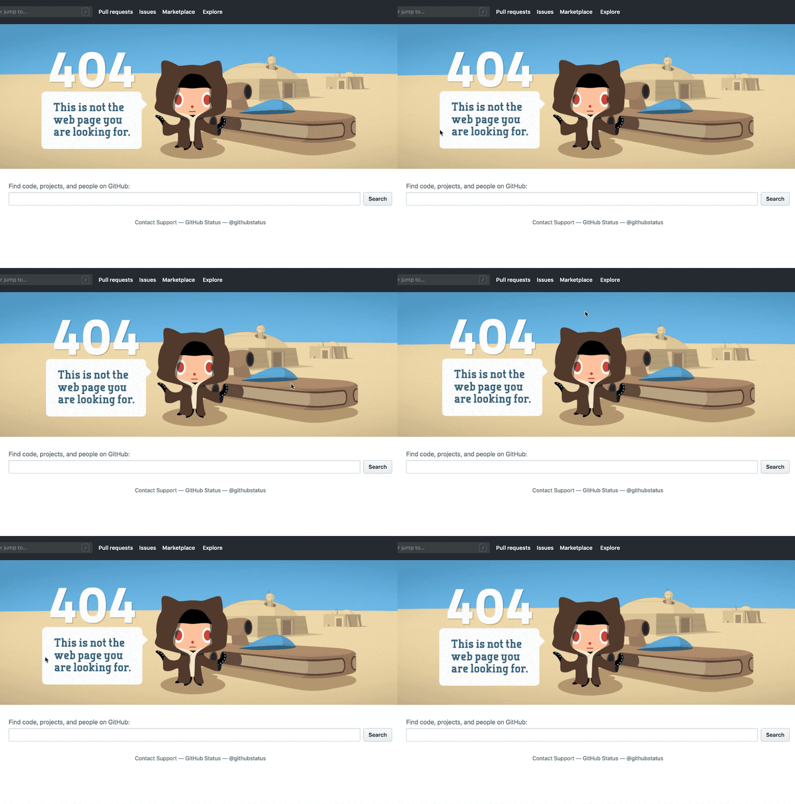
GitHub takes things a step future with their 404 pages. They use Star Wars as a pop culture reference to relate to the inner geek in me. GitHub goes a step further than most sites by tracking the users' mouse movement to create a parallax effect. I remember that this brought me a moment of joy when I found this page.
Suggestions Useful 404 Pages
There is much debate about what makes a useful 404 page. Dev.to does not provide many methods to recover, while GitHub by contract shows the full header and footer of the website and a second search bar.
In general, it's hard to say anything negative about giving help to users landing on a 404 page so they can recover. Bad 404 pages can cause users to leave the site altogether. A useful 404 page conveys to the user you care in helping them find the relevant information. It could also mean saving a customer or creating a new conversion.
- Show consistent navigation so users can self recover.
- Provide a secondary search to encourage users to find the content they seek.
- Make suggestions based on the users' search history, current trending content, or just what you want to feature.
- Provide links to any monitoring or status pages in case the 404 page shown was by some other error.
- Show your brand and messaging off some. Delight.
The State of Default 404 Pages on Now
Zeit launched the second version of the Now platform (Now v2) without custom 404 pages. This forces customers to use the built-in default 404 pages. While the design is sharp and works great to fit the Zeit brand, it offers the user no assistance. It is also very opinioned and stands out against most brands. In short, you should replace it.
Replacing the Default 404 Page
The first thing we need is a new 404 page. I used Gridsome, which had me create a 404.vue in the src/pages folder. Now when I build the project, a 404.html file is created in the /dist folder.
Zeit uses a now.json file to customize the build process. Most users need this file so they can specify how the site is built, and customize the routing experience.
The typically static site deployed on Now looks something like this -
{
  "version": 2,
  "builds": [{ "src": "package.json", "use": "@now/static-build" }]
}
Now uses this JSON file to create a static build based on the output of npm run build in your package.json file. If you deployed with just this configuration, you would get the default Now v2 404 pages.
To setup custom 404 pages, we have to add routes.
Adding Routes
{
  "version": 2,
  "builds": [{ "src": "package.json", "use": "@now/static-build" }],
  "routes": [
    { "src": "/(.*)", "dest": "/$1" },
    { "handle": "filesystem" },
    { "src": "/.*", "status": 404, "dest": "/404" }
  ]
}
The first line in the routes array, says that any traffic that enters should look for content within the destination directory. Routing can be a little confusing in Now v2. By default, the /dist folder that gets created after running npm run build with most static site generators, is treated as the root of your output.
The {"handle": "filesystem"} line tells Now to expose the filesystem as available routes. If you had three HTML files - A.html, B.html and C.html in your /dist folder, each of these would be mapped and available automatically.
At this point, going to /404 on your site shows you the custom 404 page, but going to /not-a-real-page does not. We have mapped the file system to make it available, but we have not told our routes to catch anything that has fallen through. So users won't see the show the 404 page when it's needed.
The last line captures anything that was not found by the filesystem and sends the request to the 404.html page correctly. It also sends the correct status of 404 to the users' browser.
Final Results
I decided to leave things clean and minimalistic for the launch of my site. I left the header and footer on the page. I then spruced it up with an excellent illustration from unDraw.io
Let me know what you think in the comments.
Originally published on Khrome.dev


Top comments (0)