
In this article, you will learn how to create an amazing 3D image slideshow on the web using just HTML, CSS and JavaScript which you can use in your personal websites to render images beautifully.
HTML
In our HTML file, we will primarily have a container div that encloses three other divs that will mark the three rotating sections of our image. A cube class is assigned to each of these divs which will behave as independent cubes rotated along a common axis (Like a Rubix cube but cut only along one side). The face class will depict the regions of the cube where the image is held.
<!DOCTYPE html>
<html lang="en">
<head>
    <meta charset="UTF-8">
    <meta name="viewport" content="width=device-width, initial-scale=1.0">
    <meta http-equiv="X-UA-Compatible" content="ie=edge">
    <link rel="stylesheet" href="https://use.fontawesome.com/releases/v5.3.1/css/all.css" integrity="sha384-mzrmE5qonljUremFsqc01SB46JvROS7bZs3IO2EmfFsd15uHvIt+Y8vEf7N7fWAU" crossorigin="anonymous">
    <link rel="stylesheet" href="style.css">
    <title>Cube</title>
</head>
<body>

    <div class="container">
        <div class="viewport">
            <div class="control left-arrow"><i class="fas fa-arrow-left"></i></div>
            <div class="cube cube-1">
                <div class="face front"></div>
                <div class="face back"></div>
                <div class="face top"></div>
                <div class="face bottom"></div>
                <div class="face left"></div>
                <div class="face right"></div>
            </div>
            <div class="cube cube-2">
                <div class="face front"></div>
                <div class="face back"></div>
                <div class="face top"></div>
                <div class="face bottom"></div>
                <div class="face left"></div>
                <div class="face right"></div>
            </div>
            <div class="cube cube-3">
                <div class="face front"></div>
                <div class="face back"></div>
                <div class="face top"></div>
                <div class="face bottom"></div>
                <div class="face left"></div>
                <div class="face right"></div>
            </div>
            <div class="control right-arrow"><i class="fas fa-arrow-right"></i></div>
            <div class="control play-pause"><i class="fas fa-play"></i></div>
        </div>
    </div>

    <script src="app.js"></script>
</body>
</html>
CSS
We will provide our basic styles to the body, background and the viewport. Here is where the high-tech CSS wizard skills come into picture along with some amount of maths. The CSS file is provided below and I think it is pretty much self-explanatory. Create a folder called img and save some images in it with the name used in the CSS file.
* {
    margin: 0;
    padding: 0;
}

.container {
    width: 100%;
    height: 100vh;
    background: linear-gradient(rgba(0, 0, 0, .6), rgba(0, 0, 0, .8)), url(images/bg.jpg) no-repeat;
    background-size: cover;
}

.viewport {
    height: 21vw;
    width: 42vw;
    top: 50%;
    left: 50%;
    position: absolute;
    transform: translate(-50%, -50%);
    perspective: 1300px;
}

.viewport::after {
    width: 120%;
    height: 20%;
    top: 140%;
    left: -10%;
    content: '';
    position: absolute;
    background-color: #000;
    z-index: -1;
    filter: blur(50px);
}

.cube {
    width: 100%;
    height: 33.3333333%;
    transform-style: preserve-3d;
    position: relative;
}

.cube-1 {
    transition: transform .4s;
}

.cube-2 {
    z-index: 10;
    transition: transform .4s .2s;
}

.cube-3 {
    transition: transform .4s .4s;
}

.face {
    width: 100%;
    height: 100%;
    position: absolute;
}

.front {
    transform: translateZ(21vw);
}

.cube-1 .front {
    background: url(images/slide-img-1.jpg) no-repeat 50% 0;
    background-size: cover;
}

.cube-2 .front {
    background: url(images/slide-img-1.jpg) no-repeat 50% -7vw;
    background-size: cover;
}

.cube-3 .front {
    background: url(images/slide-img-1.jpg) no-repeat 50% -14vw;
    background-size: cover;
}

.back {
    transform: translateZ(-21vw) rotateY(180deg);
}

.cube-1 .back {
    background: url(images/slide-img-2.jpg) no-repeat 50% 0;
    background-size: cover;
}

.cube-2 .back {
    background: url(images/slide-img-2.jpg) no-repeat 50% -7vw;
    background-size: cover;
}

.cube-3 .back {
    background: url(images/slide-img-2.jpg) no-repeat 50% -14vw;
    background-size: cover;
}

.left {
    transform: translateX(-21vw) rotateY(-90deg);
}


.cube-1 .left {
    background: url(images/slide-img-3.jpg) no-repeat 50% 0;
    background-size: cover;
}

.cube-2 .left {
    background: url(images/slide-img-3.jpg) no-repeat 50% -7vw;
    background-size: cover;
}

.cube-3 .left {
    background: url(images/slide-img-3.jpg) no-repeat 50% -14vw;
    background-size: cover;
}

.right {
    transform: translateX(21vw) rotateY(90deg);
}


.cube-1 .right {
    background: url(images/slide-img-4.jpg) no-repeat 50% 0;
    background-size: cover;
}

.cube-2 .right {
    background: url(images/slide-img-4.jpg) no-repeat 50% -7vw;
    background-size: cover;
}

.cube-3 .right {
    background: url(images/slide-img-4.jpg) no-repeat 50% -14vw;
    background-size: cover;
}

.top {
    height: 42vw;
    background-color: #111;
    transform: translateY(-21vw) rotateX(90deg);
}

.bottom {
    height: 42vw;
    background-color: #111;
    transform: translateY(-14vw) rotateX(-90deg);
}

.control {
    width: 40px;
    height: 40px;
    align-items: center;
    color: #fff;
    position: absolute;
    border-radius: 100%;
    transform: translate(-50%, -50%);
    border: 1px solid #fff;
    background-color: rgba(59, 52, 50, .7);
    display: flex;
    justify-content: center;
    cursor: pointer;
    z-index: 100;
    transition: background-color .3s;
}

.control:hover {
    background-color: rgba(42, 38, 36, .8);
}

.control i {
    pointer-events: none;
}

.left-arrow {
    top: 50%;
    left: -35%;
}

.right-arrow {
    top: 50%;
    left: 135%;
}

.play-pause {
    top: 140%;
    left: 120%;
}
JavaScript
The javascript part of this project will handle the initiation of the rotation and the little play and pause button in the bottom of the page that is responsible for automating the slide show after a set amount of time interval.
const rotate = () => {
  const cubes = document.querySelectorAll(".cube");

  Array.from(cubes).forEach(
    (cube) => (cube.style.transform = `rotateY(${x}deg)`)
  );
};

const changePlayPause = () => {
  const i = document.querySelector(".play-pause i");
  const cls = i.classList[1];
  if (cls === "fa-play") {
    i.classList.remove("fa-play");
    i.classList.add("fa-pause");
  } else {
    i.classList.remove("fa-pause");
    i.classList.add("fa-play");
  }
};

let x = 0;
let bool = false;
let interval;

const playPause = () => {
  if (!bool) {
    interval = setInterval(() => {
      x -= 90;
      rotate();
    }, 3000);
    changePlayPause();
    bool = true;
  } else {
    clearInterval(interval);
    changePlayPause();
    bool = false;
  }
};

document.querySelector(".left-arrow").addEventListener("click", () => {
  x += 90;
  rotate();
  if (bool) {
    playPause();
  }
});

document.querySelector(".left-arrow").addEventListener("mouseover", () => {
  x += 25;
  rotate();
});

document.querySelector(".left-arrow").addEventListener("mouseout", () => {
  x -= 25;
  rotate();
});

document.querySelector(".right-arrow").addEventListener("click", () => {
  x -= 90;
  rotate();
  if (bool) {
    playPause();
  }
});

document.querySelector(".right-arrow").addEventListener("mouseover", () => {
  x -= 25;
  rotate();
});

document.querySelector(".right-arrow").addEventListener("mouseout", () => {
  x += 25;
  rotate();
});

document.querySelector(".play-pause").addEventListener("click", () => {
  playPause();
});
Result
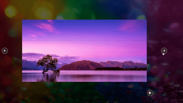
By now, I know you are all wondering, "What could these enormous and gigantic set of code possibly do?". Please have a look at the gif provided below to get a clear cut idea of how all these codes work together.
Thank you for reading this article. The entire project is available on GitHub. For any queries feel free to contact me on my LinkedIn.
Thank You!


Top comments (5)
It's great kudos
Thank you!
Thank you very much, bro... This tutorial is awesome... :)
Thank you!
Thank You!