Having data stored in a database is practically a given for today’s businesses. Customer information, order history, product pricing, IoT sensor data, and much more is being recorded for future use. However, just having the data stored isn’t enough to form a competitive market advantage. We must be able to analyze the data as well. There are many options to do so and in a variety of ways. If you have data that needs to be visually analyzed in MongoDB, MongoDB Charts is a terrific option.
Prior to MongoDB Charts, there were really three ways to visualize your MongoDB Data.
- Leverage the MongoDB Business Intelligence (BI) Connector in conjunction with third-party BI tools,
- Perform Extract-Transform-Load (ETL) operations and leverage third-party tools, or
- Write custom code and use charting libraries such as D3.js or Bokeh.
MongoDB Charts Benefits
MongoDB Charts, currently in Beta, provides an easy way to visualize your data living in MongoDB. You don’t need to move your data to a different repository, write your own code, or purchase third-party tools. MongoDB Charts knows and understands the richness of the Document Data Model and allows for easy data visualization.
Further, MongoDB Charts allows for a secure way to create and share visualization dashboards with everyone, or just targeted team members. Similarly, the data source being used behind the scenes can be shared securely as well. For example, data for the Sales Department doesn’t have to be made available to Marketing unless needed. Very powerful and follows MongoDB’s design of security being a top priority.
After downloading the MongoDB Charts Docker image and following the installation instructions, we’re able to connect to a data source stored in MongoDB Atlas and start making visualization dashboards. Once connected to the MongoDB Charts server, there are three steps we need to take:
- Add a data source
- Create a dashboard
- Create our charts
Analyzing Airbnb Data with MongoDB Charts
I have set up a database with some Airbnb data from various cities. We’ll be exploring the dataset from Seattle, WA here, but feel free to explore others on your own. We need to get the connection string from the Atlas Cluster that has our data and connect to it in Charts.
Add a Data Source
With our MongoDB Charts server running on localhost:80, we can log in and head to the Data Sources tab. We use the URI from Atlas (mongodb+srv://airbnbdemo:airbnb@airbnb-rgl39.mongodb.net/test?retryWrites=true) and select Connect. We’re next asked which data source we want to use from that cluster, I’ll select the seattleListingAndReviews from the airbnb database for this example. For permissions, I just want to keep everything private so I’ll accept the defaults and select Publish Data Source. Once published I can add an alias to the data source. I’ll call it Airbnb Seattle.
Note: The URI above contains a sample URI. You should connect to your own Atlas Cluster and use an authorized username and password.
Create a Dashboard
Next up is to create an actual dashboard to house our visualizations. In the Dashboards section choose New Dashboard and give it a name and description, like Ken’s Airbnb Dashboard. This will take me to where I can add charts to my dashboard.
Create a Chart
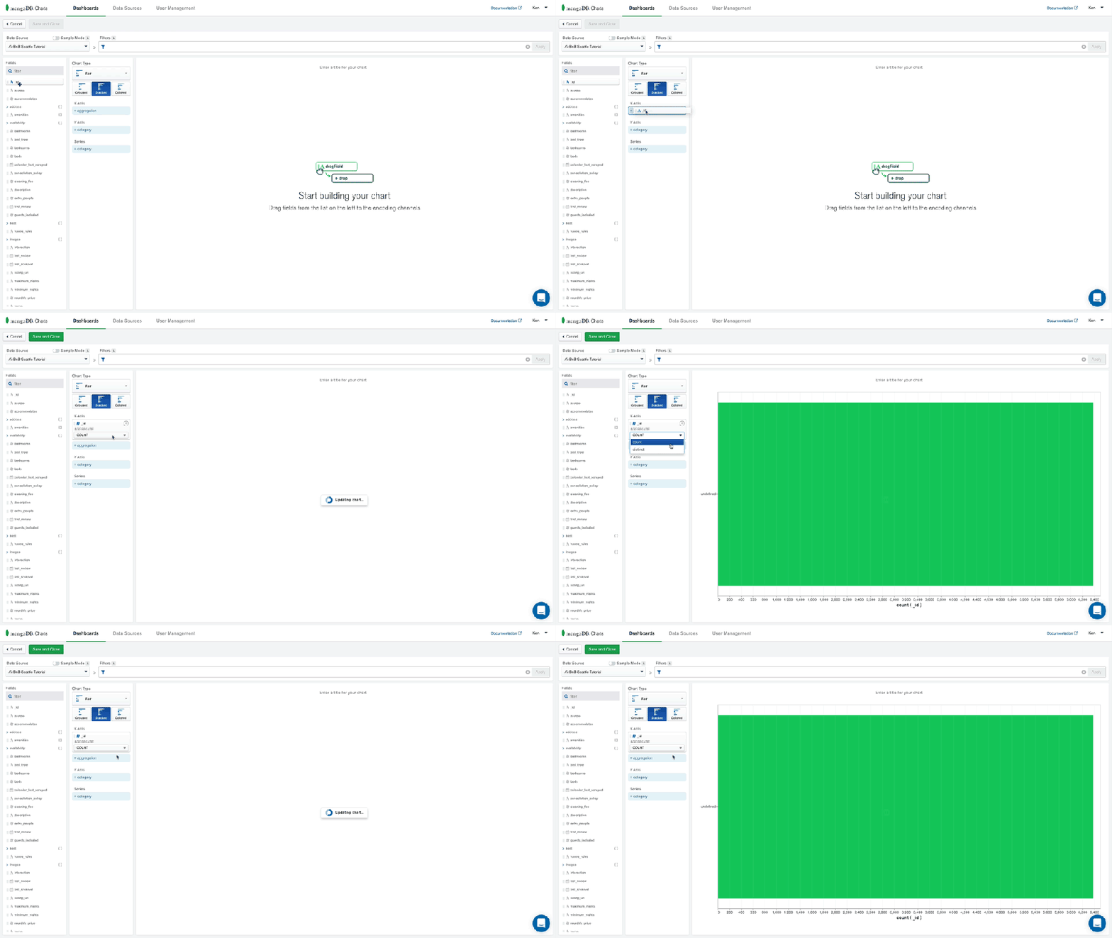
After clicking on the Add Chart button we can start building our visualization. We’ll want to choose the Airbnb Seattle data source from the drop-down. MongoDB Charts automatically determines which fields are available for exploration. For this exercise, I’d like to see which neighborhoods in Seattle have the most Airbnb properties and split them by property type. We’ll use the Stacked Bar chart for the type.
-
- For the X-Axis then, we’ll want the
idfield, aggregated by count.
- For the X-Axis then, we’ll want the

-
- Along the Y-Axis we’ll look at the address and the suburb. Notice that
addressis a subdocument here and that MongoDB Charts natively knows how to handle this type of data. I’d like to sort thesuburbby aggregated value, in descending order, and limit our results to the top 20 suburbs.
- Along the Y-Axis we’ll look at the address and the suburb. Notice that

-
- Let’s add the
property_typefield as our series
- Let’s add the

Now we can name our chart, Properties by Location and save it. We’re then taken back to our dashboard where we can add other visualizations for further exploration.
Have a look at this short video to see some other visualizations being created from this same data source.
Conclusion
MongoDB Charts is an excellent new tool to visually explore your data. It has some great features for specific use cases, such as:
- Ad hoc analysis of your data
- Natively understands the benefits of the Document Data Model
- Collaboration on projects is easy with user-based sharing and permissions
- It’s intuitive enough for non-developers to use allowing for self-service data analysis
MongoDB Charts is the fastest way to build visualizations over your MongoDB data. I’d encourage you to download it and try it out today. Let me know what visualizations you come up with from the Airbnb dataset. I always enjoy seeing how people explore their data.
This post was first published on the MongoDB blog.
The post Visualizing Your Data With MongoDB Charts appeared first on Blog of Ken W. Alger.


Top comments (0)