Introduction
I began telling stories with data in 2008 when I was working for a Japanese electronic manufacturing company. I was in marketing back then and as an technical analyst, I had to cleanse, calculate, and maintain a lot of data in excel. I think most of you reading this have been there, done that: compiling a report for the management who wants to get insights quickly and while not drowning in numbers. They need to be plain and simple graphics; sometimes also called dashboards. This is a skill that any analyst and data scientist should have. This article is going to be a series and split in several postings.
Pie charts and why not to use them
A bad example first to get the picture
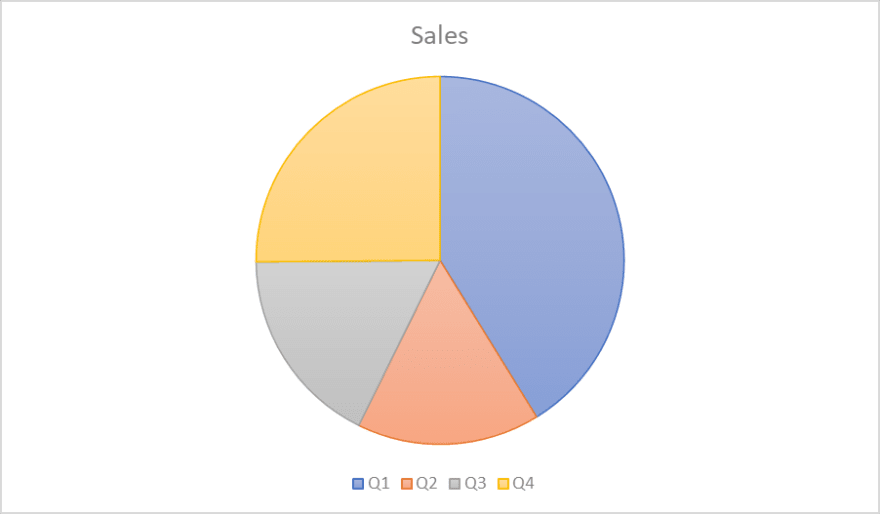
Nice pie-chart – or is it? Well, lets go through this pie chart:
Title
Yes, it does have a title! It’s clear that this chart is meant to tell something about sales. But fails to tell what figures are actually shown. Is it Revenue? Profit?
Legend
Yes, it does have a legend, but what about the year? If we don’t know which year we are looking at. The year’s quarter don’t really help either if we know if one or more of them haven’t passed yet because it could be either last year’s quarterly figure or it could be a projection.
Numbers
There are no numbers so there is no way to tell how exactly those quarters are split.
Pie chart
The pie chart is always the wrong choice. You may have realized by now that it is hard to tell which sales were better, in Q2 or Q3? Humans are not good when it comes to comparing areas and especially not when it comes to pie shaped areas. I will go into this in the next chapter.
How to improve this graph
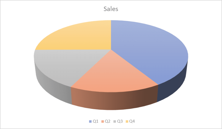
Did I mention that pie charts are bad? It’s not just because human brains are not good at comparing areas but they are wasting of space, too. This chart could have been worse if I had picked a 3-dimensional chart which are even worse, for any chart. That is because if you choose to pick a 3-dimensional chart, you tend to bring in perspectives which makes reading even harder. Below you see the exact
same chart in 3-dimensional chart as before and you’ll notice that Q4 actually
seems quite the same like Q2 and Q3:
Probably you’ve already noticed that displaying Q1..Q4 is a bit dull because you can't compare them to their counterparts from earlier years. In other words, pie charts are incredibly bad in comparing other values. Let’s compare the chart above with a pillar chart:

As you can see, although this pillar chart has the exact same size as the other two charts before, the pillar chart contains much more information. You can see the previous year, the budget and you can also see the quarters that are still in future by representing no values.
Donut or ring chart which are essentially exactly the same as pie charts
plus having a hole in them and perform as bad as the normal pie charts do. Another similar concepts are cockpit charts. They have an arrow in it to point a certain value, sometimes they also have a background colorization from green to yellow to red; but they perform even worse than pie charts because they
display just one single value with no comparison. Oftentimes it is not even clear what the colors are referring or comparing to.
As we can see, pie charts are wasting space for information and on top
of that, they are not easy to read. Readability is what I will cover in
the next chapter which I intend to publish next week.
Edit 24.09.2020: After I've written this and estimated how much more I'd want to write about this topic, I've decided to write a book about about it! So please stay tuned. I don't have all details yet, but as soon as I can, I will write this on dev.to.

Top comments (0)