Introduction
Building select elements is one of the most important factors when working on web applications. There is a lot that goes into building select elements and that includes focus on the user interface and experience. Some properties such as One has to consider features such as on-focus, styling select elements, fetching data from a remote source and the list goes on. A library solving this is React-select.
What is react-select?
Jed Watson created a project called react-select. There were several limitations with version one of react-select, which gave birth to v2. In this article, We’ll be looking at building select components with React-select and Fauna.
Installation and basic usage of react-select
Prerequisites
- Yarn/npm installed
- create react app CLI tool installed
- A basic understanding of React JS
Installing react-select
For this tutorial, we will use the create-react-app CLI tool provided by Facebook, run the command below on your terminal to create a React application:
$ yarn create react-app react
After that is done, we’ll install the react-select and fauna package from npm:
$ yarn add react-select
Next, let’s create our Fauna database, to do this, first create an account on Fauna, and after that navigate to your Fauna dashboard here and create a database, it should look similar to the image below
Next, let’s create our Fauna database, to do this, first create an account on Fauna, and after that navigate to your Fauna dashboard here and create a database, it should look similar to the image below

Next, we will create our contacts and phone_number collections, you will find this after we create our database similar to the image below:

Post this, let’s create indexes for our contacts, to do this click on the index tab on the side bar and fill in with the details below

To complete our database, click on the Security tab and click to reveal your Fauna access keys, copy it and add it to your applications .env file.
Building Our React Select Component
Let’s navigate back to our React application, inside our App.js and import our packages below
    import React from 'react';
    import Select from 'react-select';
In the code block above, we imported our react-select and also create a functional App omponent, let’s create our values as options below
    const options = [
      { value: 'blues', label: 'Blues' },
      { value: 'rock', label: 'Rock' },
      { value: 'jazz', label: 'Jazz' },
      { value: 'orchestra' label: 'Orchestra' }
    ];

    const App = () = {
       return (
        <div className="wrapper">
    ```


With those two packages imported, we will be able to have access to the react-select ( <Select />) and also extend the `React.Component` class.
//App.js

//Import React and Select

const options = [
  { value: 'blues', label: 'Blues' },
  { value: 'rock', label: 'Rock' },
  { value: 'jazz', label: 'Jazz' },
  { value: 'orchestra' label: 'Orchestra' }
];

class App extends React.Component {
  render(){
    return (
      <Select options = {options} />
    );
  }
}

export default App;
Our application should look like the image below if done correctly,
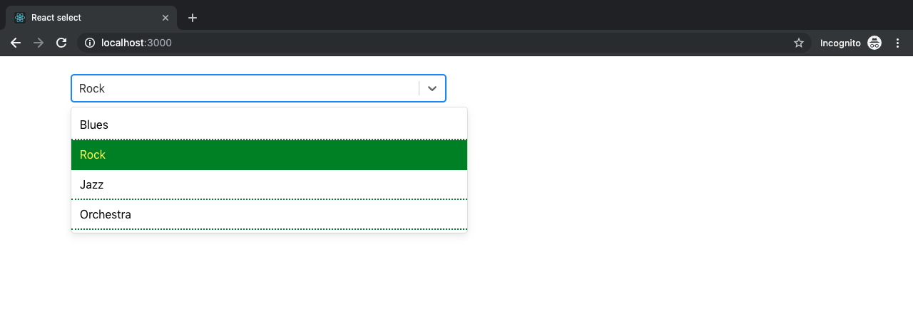
In the image above we were able to set the background of a selected option to green and change the text color to yellow. This was made possible by extending its default styling by spreading it into the provided variable `…provided`
## Custom components
Under styles and states, we discussed two custom components (option and control) which we used to extend the select styling. In this section, we’ll take a look at another custom component called the `Custom SingleValue` . This custom component does what our regular select component does but we’re going to add a little bit of finesse. In our `App.js` file, we’ll import the `React` and `Select` packages from `react` and `react-select` respectively like so:
//App.js
import React, { type ElementConfig } from 'react';
import Select, { components } from 'react-select';
...
By the time we are done, we have a finished product that looks something like this:

In the code block below, we define our custom component `SingleValue` as a method which extends the base component in the `react-select` package. In our App class, we have a couple of props and functions which contribute to the functionality (as shown in the image above) such as:
handleChange: This method is triggered by a state manager prop called the `onChange` . This method is responsible for storing the value of the selected option in our state object called `selectedOption`
styles: In this prop, we extend the style modifier method `singleValue` where we modify the styling already accessible to us by default by spreading default styles into the base object. The line responsible for adding a background color to each selected option is the `background: this.state.selectedOption.value` where we get the current option selected from the state and use it to update the background
components: In the component prop we pass in the SingleValue component, the primary function of the component is to display in the input for a single select.
options: The options prop that we all know by now is how we pass in our array object of select items which in this case are colors like so.
className: In this prop is where we add our bootstrap styling to position our select component away from the top margin as well as centralize our select component nicely.
//App.js
const SingleValue = ({ children, ...props }) => (
{children}
);
 class App extends React.Component {
   state = {};
   state = {
     selectedOption: null,
   }
   handleChange = (selectedOption) => {
     this.setState({ selectedOption });
   }
   render() {
     return (
       <Select
           className="mt-4 col-md-6 col-offset-4"
           onChange={this.handleChange}
           styles={{ singleValue: (base) => ({ ...base, padding: 5, borderRadius: 5, background: this.state.selectedOption.value, color: 'white', display: 'flex' }) }}
           components={{ SingleValue }}
           options={colourOptions}
         />
     );
   }
 }
 export default App;
## Concluding our Application

To conclude our application, we will create an `.env` file and inside it we will add our Fauna access keys, by doing this newly created select component will come from our Fauna database collections.

## Conclusion
In this post, we have learned some common use cases for reac-selec component, how to get started and. There are a plethora of functionalities built into the react-select package, some of which will fit your needs, some of which you’ll need to customize to fit your use case. Here’s a link to the official documentation to get your hands dirty. We also added our component to Fauna, loading the components and selector from our Fauna database.

Written in connection with the Write with Fauna Program.


Top comments (0)