The original article was written by SoftFormance https://www.softformance.com/blog/elements-of-the-user-experience/
When you visit any website, be it to purchase something or to read some information, you make a number of decisions. All of them constitute your user experience of the website you are using. Depending on how easy you make the decisions and how smooth the process is, your user experience may be pleasant or not.
Did you know that 88% of online customers say they wouldn’t return to a website after having a bad user experience? That is why a goal of any UX project is to make one’s experience as positive as possible and ensure that the person will come back and will use the website or an app again.
Therefore, the task of a UX designer is to help users make a set of decisions at the right time of using a website and make this process easy and functional.
That is the reason why the 5 elements of UX design exist. They function as a guide for designers that helps them create designs with flawless user experience.
These user experience elements include strategy, scope, structure, skeleton, and surface, and in this article, I will talk about them in detail and discuss why UX design is important and what are its best practices.
If you have been thinking about creating your own product, you need to know about the UX part. So keep on reading. You will learn how to make the experience of using your product as positive as possible, increase user loyalty, and ensure that your product is successful on the market.
What is UXD and why is it important
Would you use an application that brings no real value to you? Probably not. You would easily search for other options that are useful, functional, and pleasant to use.
That is where UX design comes into the picture. With so many alternative options, people stick with those that offer them a better user experience. We all want to have a positive experience when purchasing something, reading the news, or posting our photos online.
If using a product becomes a challenge, why would you keep using it, right?
Thus, UX design has become a critical part of our lives as it is built into everything we interact with.
The term was created by Donald Norman, Apple’s VP of the Advanced Technology Group, who said:
“I invented the term because I thought human interface and usability were too narrow. I wanted to cover all aspects of the person’s experience with the system including industrial design, graphics, the interface, the physical interaction, and the manual.”
We have talked about UX design in detail in this article, but let’s summarize what UX design is again.
Firstly, UX design is a process, not just a step in the process. It begins with brainstorming ideas and results in having a tangible product.
Secondly, UX design is about studying user experience. Designers study users’ experience and all the actions users can make while interacting with the product, enhancing user experience, satisfying their needs, and making sure that the product has real value.
UX design is also about knowing one’s users, understanding how they act, what they need, love, hate, what they see as valuable, and what is appropriate for them.
It is also important to remember that UX design is a problem-solving process. Designers identify the problems that need to be solved, set priorities, what impact the product will have, and what value it will deliver.
Now it is clear what UX design is, but let’s also talk about what it’s not.
What UX design is not
UX design often gets confused with UI design, but it’s important to remember that UID is a part of UXD, not vice versa. UID is about the visual part; it includes mood boarding, design concept, style guide development, and final design. Thus, it is a part of the user experience because if it’s not appropriate, no one will continue using the product.
User experience design is also not only about technology. It’s not only about mobile apps and websites but about any product that is being used by people. It can include anything people use in their daily lives, such as pens, microwaves, drawers, etc. Everything people contact with has some aspects of UX design built into it.
Even though UX has the word “user” in it, it is not only about users. Each organization has certain business goals that are to be met, so they can’t always do only what is best for the users. It is essential to consider both the users’ needs and your business goal when designing a product.
Finally, UX design is not only about usability. Even if the product is usable, there is still a possibility that people won’t use it. The reason is that it is also important to consider other aspects such as whether it is relevant, if it solves users’ issues, whether there are alternatives on the market, etc.
Now, let’s talk about the elements of user experience.
The five elements of UX
The elements of the user experience are dependent on each other, and there are five of them. Each level builds on the level before it, and they start with an abstract level toward a concrete one (from bottom to top).
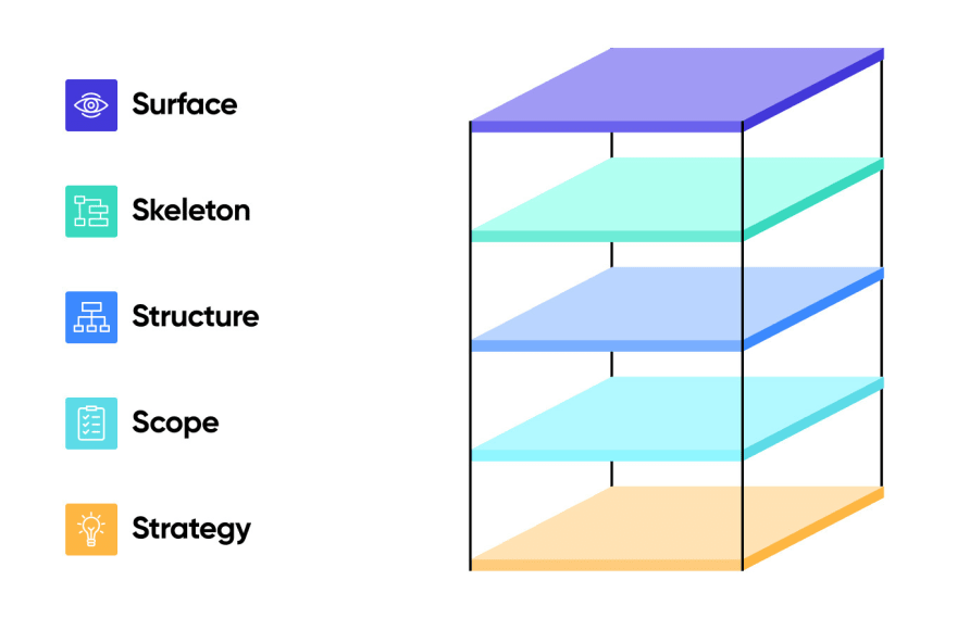
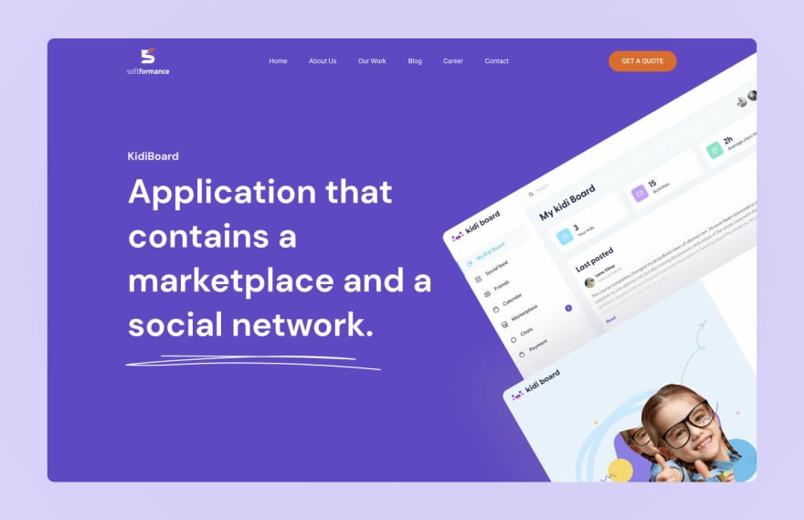
Let’s talk about each layer and apply it to one of our recent projects, KidiBoard – an application for parents that contains both a marketplace and a social network.

The first layer is strategy. Before creating any product, it is essential to come up with the idea and the reason why you are doing this.
Think about why you create the product, who you are doing it for, why people want to use it, and what issues will it solve. The goal is to define both your business objectives and user needs.
Here are some of the key questions to answer during this phase:
What should this product accomplish for the business?
How does this product fit with the company’s business strategy?
Why do customers use a product like this one?
What do customers complain about most often?
To do this, business owners usually go through Strategic Research Process. It involves interviewing users and stakeholders as well as market research to analyze current competing products and companies.
According to “The Elements of the User Experience” by Jesse James Garrett, the first layer consists of User Needs and Site Objectives.
User Needs are externally derived goals for the site, identified through user research, ethno/techno/psychographics, etc. Site Objectives include business, creative, or other internally derived goals for the site.
When we were working on the UX of KidiBiard, our goal was to understand the key needs of parents and make a user-friendly interface with a lot of useful features.
Scope
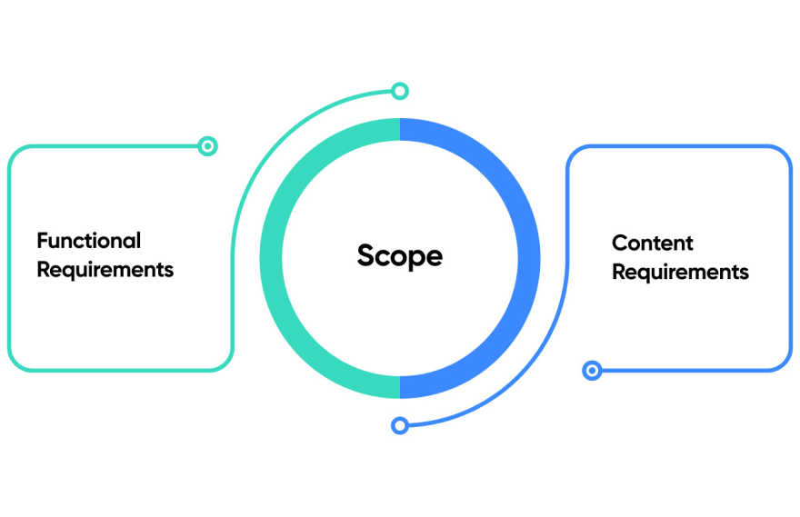
The next step of UX design is defining the functional and content requirements.
When working on KidiBoard, we created a list of features, and content contained on the website, and made sure that the requirements were fulfilled and aligned with our strategic goals.
Functional Requirements. There are requirements about the functional part of the app or its features. These requirements cover how the features work with each other and how they interrelate. These features are what users need to reach their goals.
Content Requirements. These include all the information that we need to provide value. This information includes text, images, video, audio, etc. it is important to define the content to be able to assess the size of the project and how much time it will take to complete it.
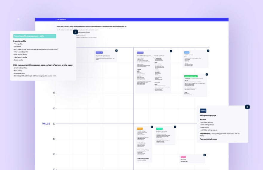
Here you can see the key MVP features we identified for KidiBoard:

This phase defines how users interact with the product, how the system behaves, and how everything is organized and prioritized.
There are two key components that define the structure of the product: Interaction Design and Information Architecture.
Interaction Design defines how users can interact with the product and how the system responds to these actions. It strives to create meaningful relationships between people and the products they are using.
A good Interaction design:
Communicates interactivity and functionality
Reveals simple and complex workflows
Informs users about state changes
Prevents errors
Interaction design has 4 main principles:
Consistency helps people use what they know
Visibility of opportunities promotes interaction
Learning becomes easier with accurate predictions
Feedback facilitates learning
Information Architecture defines the arrangement of content elements and the way they are organized to facilitate human understanding.
A good Information Architecture organizes, categorizes, and prioritizes the information based on people’s needs and business aims. It makes it easier to understand how to move through the presented information, it is appropriate for the audience, and it is flexible to accommodate growth.
Here are the different types of Information Architecture:
Hierarchical Tree – a standard structure with an index page and a series of sub-pages
Nested List – linear path for a person to navigate to more detailed content
Filtered View – allows people to create an alternative view from a specific information set
Hub & Spoke – users navigate from a Central Index
Bento Box – displays portions of related content on the main screen
During this phase, we created user and app flows:

The next element of user experience is the Skeleton. The Skeleton of your product is what the user sees on the screen: the presentation of the app or website, the arrangement of all its parts, and what makes the user interact with the functionality of the system.
This phase usually involves wireframing. It involves drawing overviews of the products and creating sketches that help understand what an app will look like.
A wireframe is a very simple sketch that is also called page architecture or a page schematic. It’s what your design will be based on.
Here is what a wireframe may look like:
 Skeleton is usually split into three components: Interface Design, Navigation Design, and Information Design.
Interface Design is about presenting and arranging all the elements to make the system highly functional and enable users to interact with it.
Navigation Design is about the ways to navigate through the data using the interface.
Information Design defines the presentation of information in a way that makes it easy to understand.
These are the questions that the Skeleton of your app should answer:
What will be presented on the screen and in what visual form
How all the interactions will be presented
How users will move around the app
How to present the content clearly
If you want to create a successful interface, you should pay attention to these core principles:
Predictability
A successful interface is highly predictable. What it means is that all buttons, icons, and images tell users what to do, what will happen next, and where the user should and can go next. As a result, a user can predict the outcome of any action and any interaction with the interface. The higher the predictability, the higher is user’s confidence to continue using the product.
Consistency
The ways of interaction with the interface should be similar across the whole application. They should stay consistent so as not to confuse the user and simplify usability. If interactions are not consistent, it can discourage people from using the app.
Progressive disclosure
It is essential to display only necessary or requested information and avoid noise at all costs. The user should receive only the most important information, and everything that is not relevant or requested should either be avoided or de-emphasized.
More choices – more time
The more choices there are, the more time a user needs to make a decision, and the higher possibility that a person will choose nothing. That is why it is important to use filters to narrow down a large number of options and personalize them based on people’s preferences.
Easy to learn and remember
Users should not spend hours trying to remember how to interact with content. All ways of interacting with the interface functionality should be easy to learn and easy to remember. Having a consistent layout that is predictable really helps.
During this phase, we have created an MVP mockup for KidiBoard to see what the app will look like:
According to Jesse James Garrett, this phase is about the graphic treatment of interface elements (the “look” in “look-and-feel”).
It is the sum total of all the work and decisions made during previous steps. The Surface of your product determined how it will look like and what typography, visual elements, colors, and layout to choose.
Everything created in Surface is meant to communicate and improve understanding of all the elements on the screen. This is achieved by choosing the right fonts, colors, visuals, etc.
The Surface is created by a number of graphical techniques: layout, typography, color, imagery, sequencing, and visual identity.
Moreover, this phase has a component called Visual Design. It is concerned with the visual appearance of content, and it is supposed to give users clues about what they can do and how they can interact with this content.
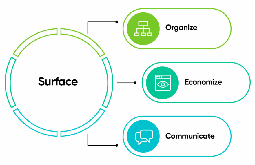
The great visual design has three purposes:
Organize. It provides users with a clear structure that indicates how the elements on the screen relate to each other. It improves navigation and makes the app/website more intuitive to use.
Economize. An effective visual design includes only necessary and relevant information. Anything that is not essential but still needed is de-emphasized.
Communicate. It communicates users’ expectations, their needs, and what information they value the most. It also considers users’ capabilities.
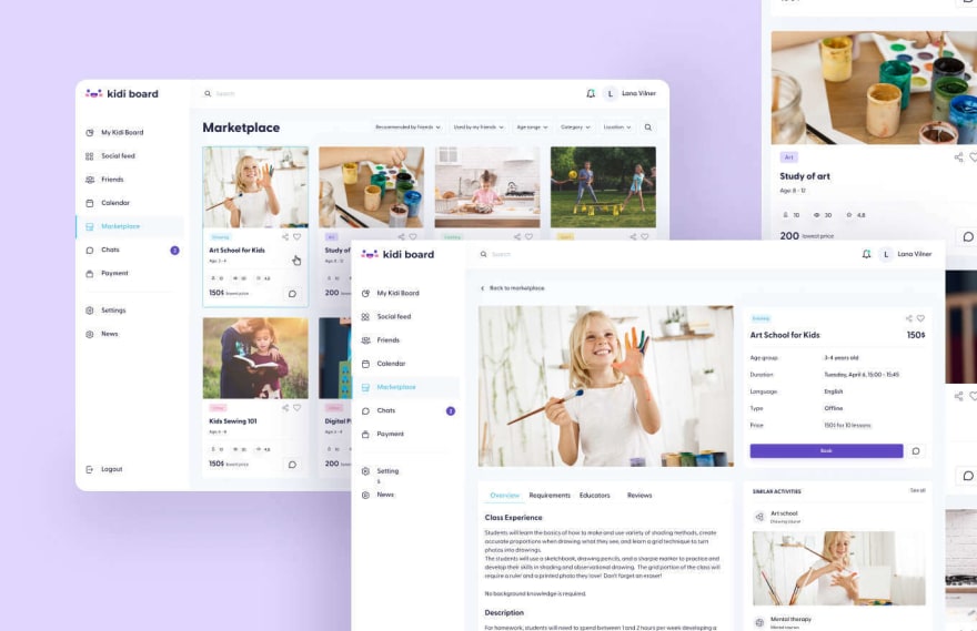
And here is the final look of our product:

How UX elements work together
In user experience design, all UX elements are interdependent. Each layer is dependent on the other UX layers below it. For example, if you make some mistakes during the Strategy phase, you will feel the consequences later in the process.
Thus, don’t consider decisions to be fixed. It is better to go back one step or two and make necessary changes than to create a product that no one wants. For instance, if you are currently in Surface but you need to enhance functionality, you can easily go back to Structure and do it.
To understand how the five elements of UX design work together, we start with Strategy. It is the foundation of any successful UX. Once the user and business needs are translated to requirements for functionality and content, Strategy becomes Scope.
Then, when we define the ways of interaction with this functionality, the system response, and data organization, Scope is given as Structure.
The product receives its Skeleton once each screen of the system is sketched and we can see how people will interact with the content and how the information will be presented.
Finally, in Surface, all the work done and decisions are transformed into the final presentation.
UX best practices
Designing the way you like is not the key to great design. In fact, successful UX design has nothing to do with the designer and everything to do with the audience. Thus, all decisions made during the design process should be based on what would be better for the user.
Let’s talk about the best UX practices that will help you ensure that your design is user-friendly, functional, and competitive on the market.
Put yourself in the users’ shoes
Perhaps one of the most important principles. If you want to create a website or an app with the ideal user experience, you have to have a deep understanding of your audience. You should think about the user throughout the entire process. What do they need from your product? Why would they use it? How are they feeling at each touchpoint?
The great idea is to create a customer journey map. It’s a great tool to help you imagine the experience your future customers will have. Moreover, these maps present your user research in an accessible way.

Make it accessible
Great design can be used by everyone, including people who experience sight and hearing disabilities. For example, color blindness affects about 7-8% of the population, which is more than 350 million colorblind people in the world. When working on the design of your product, make sure that 8% of people can also use it.
By doing that, you will increase the number of people who can interact with your product. To ensure that your website or app is accessible, you can use online evaluation tools.
Keep it consistent
Consistency is the key. You don’t want your website or app design to be all over the place, with different photos on one page and, suddenly, illustrations on the next page.
The consistent design makes your product feels cohesive and positively influences your brand image.
Make a sitemap
A site map is an essential tool for good UX design. It helps categorize content and create a cohesive hierarchy. This way, using your website becomes more intuitive and users can easily find the right information there.
Test and test again
Before you launch your website, test it a couple of times in a staging environment so you’re not making changes to a live site. Then, you can use data to improve your design. You can collect live feedback from users as they interact with the product. Then, adjust according to the collected feedback and test again. Keep in mind that your design can evolve and improve, so don’t let it remain stagnant.
Keep it simple
The simpler your design is – the better. White space helps people’s brains better process information and it decreases cognitive load. We get it, it might be tempting to create complex designs with a lot of colors, animations, and other elements, but it’s better to keep it simple.
Avoid colored backgrounds, a lot of different fonts and images, and cluttered text boxes. Keep everything minimal. Consider creating low-fidelity mockups at the early stages of design to see what the most important design elements are.

Practice a UX Audit
What is a UX Audit? It is the way to see the parts of your digital product that needs to be changed, improved, or eliminated. A UX audit uses empirical methods to expand an existing situation, and it offers recommendations for improvements.
What exactly happens during a UX audit? An auditor uses different methods to see where the product is going wrong or right:
Conversion metrics
Mental modeling
Sales data
Consumer customer data
Review of business and user objectives
Wireframing
Prototyping
Traffic/engagement
A Ux audit can tell you about what is working and what isn’t, which metrics are already collected and which should be collected, what the data tells you about your needs, what has already been tried, and what should be tried next.
F.A.Q
What are extreme cases in design?
Extreme, or edge cases in design, are occurrences that fall outside of the primary function of the product. For example, when some group of people is underrepresented in the build of the product or people who need some additional technology to access the product are ignored. To ensure that there are no edge cases when using your product, make sure that it is highly accessible and can be used even by users with low-quality access tools.
What is mapping the user experience journey?
A user journey map is a diagram that visually illustrates user flow through the site, the decisions made by the user, and all the steps they take to make a certain action. It identifies key interactions and touchpoints with your product and describes customers’ needs, goals, and expectations.
How long does user experience analysis take?
The timeline of UX research depends on your product and your research methodology. You can use both qualitative and quantitative research. With data-driven UX research and implementation, you can complete the research process in less than 3 months.
Summary
When developing any digital product, it is essential to keep in mind that its design is the face of your company, of your brand. And the clients’ desire to keep using your product depends on its design.
However, some business owners may think that design is only the visual part of the product. Even though the looks are important, too, the functionality should be your first priority when developing a website or an app.
That is why there are five key elements of user experience that all designers know about and use to make their designs flawless.
The success of every digital product is in how customer-oriented it is. Thus, these elements help designers to put themselves into users’ shoes, map out their user journey, and understand their goals, motivation and needs better.
UX is not as complicated as it may sound. If you know its five key elements and follow these steps, the final product will pleasantly surprise you!
If you want to create your own digital product and make sure that each element of UX is thought through perfectly and works without any issues, it is high time to look for a team of designers who will help you with that.
With the right team, you will have a product that will be incredibly competitive on the market that is packed with thousands of different products, you will attract new customers and increase customer loyalty, and you will save both time and resources.
If you have questions or need a consultation, contact us.





Top comments (0)