
I want to start by saying that I found Bootstrap to be an extremely helpful tool while building my project for Flatiron School - a single page application that uses data from a RESTful API to display curated menus and recipes. I chose to incorporate Bootstrap so I could focus on the Javascript functionality while also creating a finished project that was nice to look at. This was my first time creating a React app from scratch and I enjoyed getting to learn and use different Bootstrap components.
While experimenting with Bootstrap in the context of my project I encountered three challenges (and found three solutions!) that I wanted to detail for others who might be new to React Bootstrap.
First, a little about Bootstrap and why I chose to use it for a simple React app
Bootstrap, or React Bootstrap in particular, is a library of styled components that is easy to learn and use in simple react application. It also looks very clean, streamlined, and professional.
When faced with a totally blank slate for my second project for Flatiron School and a looming deadline, I researched some UI options that could help me with the styling so I could showcase my understanding (and passion for) the JSX side of things. I decided on Bootstrap after reading the documentation and looking through all the components. In particular, I liked the Carousel component for my homepage so that I could showcase featured images.
After I decided on Bootstrap, I got started by watching this awesome YouTube video by Adrian Twarog.
After getting everything up and running, I needed to figure out how to make React Bootstrap work for what I was trying to do. This brought me to challenge No. 1:
Using the React Router tag negates the Bootstrap CSS
This challenge turned out to be a simple fix. Here is a helpful blog post by a React Developer on the subject.
If you want to use react router with the Bootstrap styling, you need to install react-router-bootstrap in addition to react-router-dom. After, installing you can then import { LinkContainer } from react-router-bootstrap.
The key here is that you can now use the <LinkContainer> component to wrap the component you are trying to route to (instead of the react-router-dom <Link>. The result will be a router link that is styled nicely like the rest of your Bootstrap component.
Here is an example from my simple Menu Makr project:
import React from "react";
import { Container, Nav, Navbar, NavDropdown } from 'react-bootstrap';
import { LinkContainer } from 'react-router-bootstrap';
function NavBar({ handleNavClick }) {
return (
<div>
<Navbar bg="light" fixed="top" variant="light">
<Container>
<LinkContainer exact to="/">
<Navbar.Brand>MENU MAKr</Navbar.Brand>
</LinkContainer>
<Navbar.Toggle aria-controls="basic-navbar-nav" />
<Navbar.Collapse id="basic-navbar-nav">
<Nav className="me-auto">
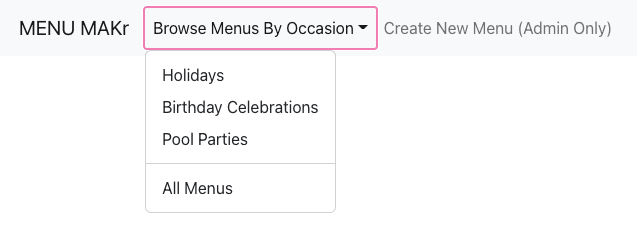
<NavDropdown title="Browse Menus By Occasion" id="basic-nav-dropdown">
<LinkContainer to="/menus">
<NavDropdown.Item onClick={e => handleNavClick(e.target.innerText)}>Holidays</NavDropdown.Item>
</LinkContainer>
<LinkContainer to="/menus">
<NavDropdown.Item onClick={e => handleNavClick(e.target.innerText)}>Birthday Celebrations</NavDropdown.Item>
</LinkContainer>
<LinkContainer to="/menus">
<NavDropdown.Item onClick={e => handleNavClick(e.target.innerText)}>Pool Parties</NavDropdown.Item>
</LinkContainer>
<NavDropdown.Divider />
<LinkContainer to="/menus">
<NavDropdown.Item onClick={e => handleNavClick("")}>All Menus</NavDropdown.Item>
</LinkContainer>
</NavDropdown>
<LinkContainer to="/new">
<Nav.Link>Create New Menu (Admin Only)</Nav.Link>
</LinkContainer>
</Nav>
</Navbar.Collapse>
</Container>
</Navbar>
</div>
)
}
export default NavBar;
The resulting Nav bar will look like this. Styling still in tact!
The next challenge I encountered was that I thought I couldn't add any CSS rules of my own. I was wrong.
Using custom CSS in conjunction with built-in bootstrap CSS
This challenge was a classic case of me over thinking something. After, reading the documentation on customizing Bootstrap CSS, I walked away from it thinking that I would have to use SASS to style my custom components. This was not the case.
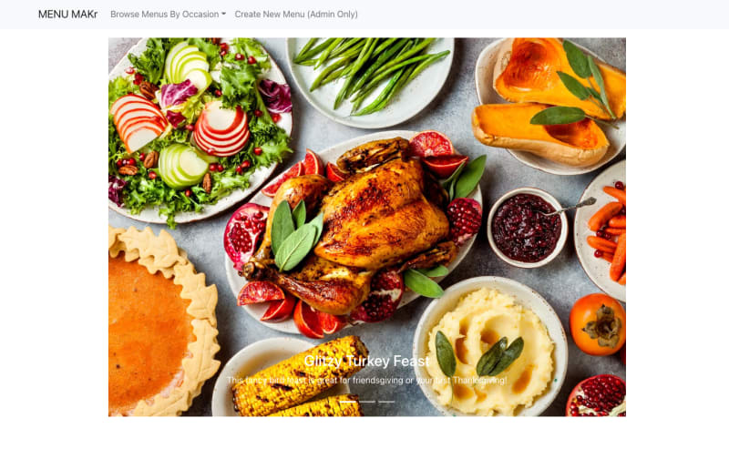
About halfway through the project, I became frustrated by the positioning of my main Carousel component. I decided to try grabbing the element in my index.css file and see what happens. Sure enough, after grabbing the Carousel by it's class name, I was able to position the component exactly where I wanted it:
.carousel {
  position: absolute;
  top: 5%;
  left: 10%;
}
Much better!
Disclaimer: I am still so new to Bootstrap that I do feel like some of the solutions I came up with are work arounds for me not knowing something. Suggestions of other solutions are VERY welcome!
The last challenge I encountered was understanding the React Bootstrap grid system.
Making the React Bootstrap Grid System Make Sense
On it's most basic level, the React Bootstrap grid system is made up of two separate components: <Row/> and <Col/>. Building a simple 2 x 3 grid would look like this:
<Row>
  <Col/>
  <Col/>
  <Col/>
</Row>
<Row>
  <Col/>
  <Col/>
  <Col/>
</Row>
Easy! But what happens if you don't know how many things there are? In my case, I was trying to arrange separate cards into nice rows and columns. My data was fetched from an API that could have X number of menus that needed to be displayed. After trying to squeeze <Col/> components inside my .map() that renders my menu cards (and subsequently struggling with trying to come up with a unique key for each column), the solution turned out to be the simplest one: just leave the number of columns up to the browser/React.
This was a live and let Bootstrap moment for me. Bootstrap is a wonderfully responsive UI system, one of the props of the <Row/> component let's you dictate that you want the widths of the columns to be "auto". It even let's you specify what you would like the grid to look like in different size browsers. (I specified only for medium (md) windows.)
Here is what that code looks like in the wild:
<Row md="auto" >
  {menus.map(menu => <MenuCard key={menu.id} menu={menu} />)}
</Row>


I was very happy with my decision to integrate Bootstrap with this project. My biggest takeaway from this was learning that there is no one-size fits all version of Bootstrap, but there are tricks to making this library do the work for you.
I think the result for me at this stage in my learning process was a cleaner, more streamlined and responsive front end in less time than it would take me to write custom CSS.
Plus, I really enjoyed the process of learning a new skill to complement what I have learned in my school curriculum.

Top comments (0)