
Are you a newbie when it comes to Data Analysis and Data modelling? If yes, then you are in the right place.
In this blog, we are going to be performing some Exploratory Data Analysis on the HR Dataset available in Kaggle. We’ll also be using RandomForest to predict who left their company. This is a beginner-friendly dataset and it is easy to work with. With that out of the box, let’s get into the juicy stuff.
IMPORTING
The first thing we always do when we start with our work is to import the libraries. You don’t need to import every single library that you’ll be using in the notebook right at the beginning itself. You can start with the bare minimum and those include:
import pandas as pd
import numpy as np
import matplotlib.pyplot as plt
import seaborn as sns
%matplotlib inline
Just the above are enough when you start working on a problem. From then on you can just add them at the start or you can just import them where ever you are in the notebook.
Now that we are done with importing let’s load the data.
df = pd.read_csv("../input/hr-analytics/HR_comma_sep.csv")
df.head()

CHECKING FOR THE NEATNESS OF THE DATA
Now that the data is loaded. Let’s take a look at how the data is, i.e, the data types, the no of NaN values etc., We can do that by using the .info() method
df.info()
As you can see above, all the cols are filled with no NaN values. float, int and object are the data types of the columns.
for col in df.columns:
    print(f"{col} - ", df[col].unique())
    print()

There seem to be no weird values in the data, which is very good. Let’s look at the metrics.
df.describe()

Now that we took a look at the data, Let’s get into my favourite part, EDA.
EXPLORATORY DATA ANALYSIS (EDA)
In this, we will be visualizing the data. By doing this we will be able to further understand how the data is and if there is any work that is to be done.
sns.set()#sets the style of the plot.
fig = plt.figure(figsize=(12,6))#Used to display the plot
sns.barplot(x='Department', y='satisfaction_level', hue='salary', data=df, ci=None)
plt.title("Satisfaction_level Vs Department", size=15)
plt.show()

The ones with higher salaries are more satisfied. But product_mng said hold my cup. It seems like the ones with low salaries are more satisfied than the ones with high salaries. The same is for the land.
fig = plt.figure(figsize=(12,6))
g = sns.barplot(x='Department', y='last_evaluation', data=df, ci=None)
g.bar_label(g.containers[0])
plt.title("Last Evaluation Vs Department", size=15)
plt.show()

Everybody has a similar level of evaluation done.
fig = plt.figure(figsize=(12,6))
sns.barplot(x='Department', y='number_project', data=df, ci=None)
plt.title("Number Project Vs Department", size=15)
plt.show()

fig = plt.figure(figsize=(12,6))
g = sns.barplot(x='Department', y='Work_accident', data=df, ci=None)
g.bar_label(g.containers[0])
plt.title("Work Accident Vs Department", size=15)
plt.show()

fig = plt.figure(figsize=(12,6))
g = sns.barplot(x='Department', y='satisfaction_level', hue='left', data=df, ci=None)
g.bar_label(g.containers[0])
g.bar_label(g.containers[1], rotation=90)
plt.title("Left Vs Department with satisfaction level", size=15)
plt.show()

fig = plt.figure(figsize=(12,6))
sns.lineplot(x='Department', y='time_spend_company', data=df, ci=None, color='r', marker='o')
plt.title("Time spent per each Department", size=15)
plt.show()

fig = plt.figure(figsize=(12,6))
sns.lineplot(x='Department', y='average_montly_hours', data=df, ci=None, color='g', marker='o')
plt.title("Avg Hours spent in the company per Department", size=15)
plt.show()

The chart looks hilarious lol🤣 Don’t know why🤷♂️
fig = plt.figure(figsize=(12,6))
sns.lineplot(x='Department', y='promotion_last_5years', data=df, ci=None, color='black', marker='o')
plt.title("Promotions of Last 5 years in the company per Department", size=15)
plt.show()
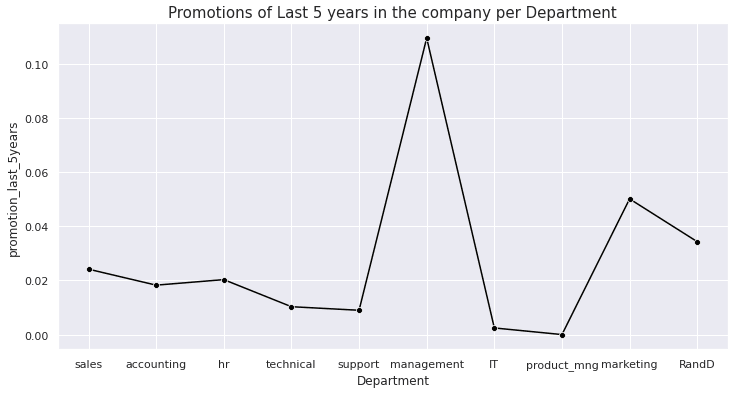
The management and the marketing department have more promotions when compared to the others.
fig = plt.figure(figsize=(12,6))
salary = df['salary'].value_counts()
sns.lineplot(x=salary.values, y=salary.index, ci=None, color='orange', marker='o')
plt.title("Salary (Counts) in the company", size=15)
plt.show()

Now that we’ve seen how the data is let’s get into modelling.
Before getting into that let’s take a look at the correlation.
sns.heatmap(df.corr(), center=0, linewidth=1, annot=True, fmt='.2f')
plt.show()

Here if we observe we can see that satisfaction_level and left columns are highly negatively correlated, which I think is quite obvious.
MODELLING
We need to split our data into a training set and test set so that the model doesn’t remember the data by heart. Before doing that let us drop the categorical columns ‘Development’ and ‘salary’.
df = df.drop(['Department', 'salary'], axis=1)
Here we are passing in a list of col names that we want to drop. By specifying axis=1 we are telling it to remove the column.
You can do it like this as well
df.drop(['Department', 'salary'], axis=1, inplace=True)
By doing this you don’t need to specifically assign it df, since it is going to do it in place.
Now that we got rid of them let's split our data.
First, separate the target var(the one we want to predict) and the rest of the data.
X = df.drop('left', axis=1) # we will predict who left
y = df['left']
Then we pass the X, y into the following function.
from sklearn.model_selection import train_test_split
X_train, X_test, y_train, y_test = train_test_split(X, y, test_size=0.3)
From the name of the function, we can say that it is going to be splitting our data into training and test sets.
Now we just need to fit the training data to the model of our choice. Since we are trying to predict we can go with RandomForest.
RandomForest can do both prediction and regression.
we are also going to be using GridSearchCV to find the best params for our model.
from sklearn.ensemble import RandomForestClassifier
from sklearn.model_selection import GridSearchCV
param = [
    {'n_estimators': [100, 200, 300, 400, 450, 500],
     'max_depth': [3, 4, 6, 8, 10, 12],
     'max_leaf_nodes': [15, 20, 25]},
]
rf = RandomForestClassifier()
gs_rf = GridSearchCV(rf, param, cv = 5, n_jobs = -1, verbose = 1)
gs_rf.fit(X_train, y_train)
rf_best = gs_rf.best_estimator_
pred = gs_rf.predict(X_test)
gs_rf.best_estimator_
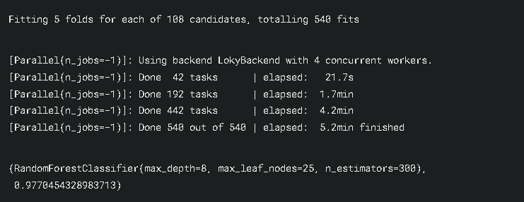
So finally we are finished with the modelling. The RandomForest gave us 98% accuracy. Wow really nice. Well done if you followed until the end.
CONCLUSION
In this blog we have seen:
- A basic workflow of things
- How to implement RandomForest
- How to implement GridSearchCV
You can check out my Kaggle notebook here and give it an upvote if you found it helpful
I really hope that you found this analysis helpful and interesting. If you liked my work then don’t forget to follow me on Medium and YouTube, for more content on productivity, self-improvement, Coding, and Tech. Also, check out my works on Kaggle and follow me on LinkedIn. I also write in HackerNoon, you can check that out as well.

Top comments (0)