
A little background
While working I was asked to develop a static gauge like the one below.

At first I thought I can do this by using some library. So, I started looking for libraries in react. After a few hours of trying a bunch of libraries, I wasn't able to get the gauge exactly as given in the design. Though some came pretty close, there was one big catch in all of them. The indicator blob. I couldn't find a single library that had an indicator blob along the circumference.
After a few more hours of unsuccessful Googling, I decided to make my own gauge (I had no other way).
D3 to the rescue.
Now with different goal, I started searching again and stumbled upon this mind blowing blog by Amelia wattenberger. This had everything I needed to make the gauge. She had used D3 library to make a gauge. After going through the blog and getting some basic understanding of SVGs and D3, I finally managed to draw the gauge as per the requirement and I'll be sharing how I did it.
Before proceeding further, it is MANDATORY to go through Amelia's blog first, as the code that I'm about to write is just a tweaked version of Amelia's code. About 80% of the code will be in her blog. I will only include my changes. So, keep this in mind and continue.
Drawing the arcs
Since the gauge is split into 4 parts, we need to draw 4 arcs along the semicircle. We'll be using d3's arc() function. In gauges, the left and right side values are the minimum and maximum values respectively. This means the the value increases in clockwise direction. In d3, the degree value is measured in Radians. So keeping all these in mind we have to give the startAngle() and endAngle() for each arc to complete the semicircle, which has it's range between -pi/2 (left) to pi/2 (right).
- Red and orange arcs They come inside the left part (negative) of the semicircle, between -pi/2 and 0. So the red arc will be between -pi/2 and -pi/4. Orange arc will be between -pi/4 and 0. ```javascript
const redArc = arc()
.innerRadius(1)
.outerRadius(0.9)
.startAngle(-Math.PI/2)
.endAngle(-Math.PI/4)
.padAngle(0)
.cornerRadius(2)();
const orangeArc = arc()
.innerRadius(1)
.outerRadius(0.9)
.startAngle(-Math.PI/4)
.endAngle(0)
.padAngle(0)
.cornerRadius(2)();
* Green and blue arcs
They come inside the right part (positive) of the semicircle, between 0 and pi/2. So the code will be:
```javascript


  const greenArc = arc()
    .innerRadius(1)
    .outerRadius(0.9)
    .startAngle(0)
    .endAngle(Math.PI/4)
    .padAngle(0)
    .cornerRadius(2)();

  const blueArc = arc()
    .innerRadius(1)
    .outerRadius(0.9)
    .startAngle(Math.PI/4)
    .endAngle(Math.PI / 2)
    .padAngle(0)
    .cornerRadius(2)();
- Now that we have generated the required path values for the arcs, lets actually draw them. ```javascript
return(
)
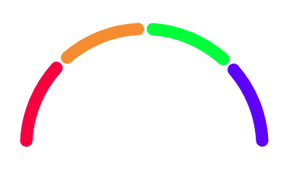
The above code generates a semicircle like this:
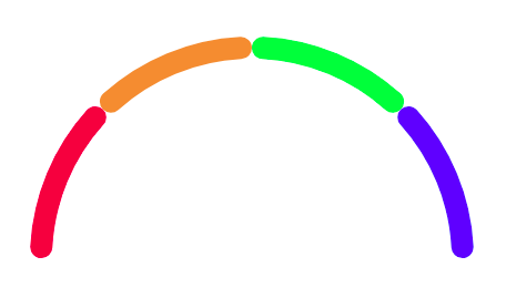
Notice there's no gap between the arcs. To provide this gap, we need to offset the `startAngle` a bit for the orange, green and blue arcs. For me the following offset values gave the best appearance.
orange: -Math.PI/4.15
green: -0.04
blue: Math.PI/4.2
Now we have our main gauge
#### Setting up the blob, value and label
The code for the blob, value and label is exactly same as the one in Amelia's blog. Additionally, I changed the blob and value colour based on the arc. This is the only tweak I did. I just created a simple function that returns the colour code based on the value given to the gauge and used it for the blob and value:
```javascript
const getBlobColor = value => {
if (value >= 0 && value <= 25) return "#e81246";
if (value > 25 && value <= 50) return "#ee8d41";
if (value > 50 && value <= 75) return "#4dff4d";
if (value >= 75) return "#2e5bff";
};
This is the code for the final gauge without value and label in the centre:
   <svg viewBox={[-1, -1, 2, 1].join(" ")}>
     <path d={redArc} fill="#e81246" />
     <path d={orangeArc} fill="#ee8d41" />
     <path d={greenArc} fill="#4dff4d" />
     <path d={blueArc} fill="#2e5bff" />
     <circle
       cx={markerLocation[0]}
       cy={markerLocation[1]}
       r="0.07"
       strokeWidth="0.04"
       fill="white"
       stroke={getBlobColor(value)}
     />
   </svg>
This is pretty much it. I have only written the changes that I did for my requirement. The main code is in Amelia's blog. Please check that first.
Thanks

Top comments (1)
Thanks! I was able to alter this to use with Vanilla JavaScript. The main difference is that I didn't use JSX and simply created the SVG elements in JS and appended them. I also made it modular so that I could have gauges of different sizes and number of segments by supplying different parameters. Thanks for showing me the way.