Finding out about the styled-components library was a game changer for me. Although I had used CSS, SASS, Bootstrap and a retinue of other ways to style my applications, Styled just made sense for a React application.
First of all, when you build with the styled library, you break your styling up into components (sound familiar?). Each component can then be styled individually.
Why Styled-Components?
Learning CSS is a given for web development, but it’s sometimes not as intuitive. When I was first starting out, I used style libraries like Bootstrap to do a lot of the heavy lifting for me in order to get a web app up and running as quickly as possible. Of course, I knew that I’d eventually have to learn CSS.
The good thing about Styled is that it doesn’t take away the CSS, like Bootstrap or MaterialUI might do. What it does do is organize components in a way that makes sense for React.
Creating a new styled component is as simple as declaring a component.
const Title = styled.h1`
    font-size: 1.5em;
    text-align: center;
    color: palevioletred;
    padding: 8px;
`
Getting Started
To get started, install the styled library.
npm install --save styled-components
Then, add styled-components to the top of your file.
import styled from 'styled-components'
The components themselves are just, well, components.
const Div = styled.div`
    padding: 8px;
`
From there, there’s two ways to generally go about styling your application. Either, you can make a separate filed (or files) to store style information, or you can write the styles directory onto the files you’re styling.
Depending on how large your application is, you’ll want to choose the organizational strategy that works best for you.
I’ve found that declaring the styled components directly on the components makes sense for my smaller applications or when you’re just getting started. If you find that you’re repeating components, then it’s time to create a separate file for those.
Refactoring
I’ll be using the writing application I’ve built as an example. Currently, there are three articles for getting started if you’d like to build it yourself and follow along. Feel free to take a look at the repo as well.
Currently there’s a lot of repeated components in this application.

See anything familiar?
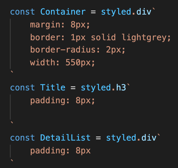
In order to clean up some of this, I’m going to create a new file named Styles.js.
I’ll import styled from ‘styled-components’ at the top and then export each component.
Then, I’ll export the components.
export const Title = styled.h3`
    padding: 8px;

`
Now, instead of declaring each styled component at the top level of the app, I can import the components.
import {Title} from './Styles'
The Title component is preserved and the code is cleaner!
What to Refactor
There were a few components in my application that were unlikely to be repeated elsewhere. For instance, the timer function:

Ultimately I decided to keep these functions and components where they originated from. Why? It’s obvious what these things do when you are looking at the component they originated in. Containing them in a separate file may lead having to hunt down these styles unnecessarily.
Summary
Styled-components is a library that utilizes CSS and with React component ideologies. It's a great resource to work with if you're transitioning from libraries like Bootstrap to CSS. It is also flexible enough to be used throughout an application or as its own separate file. Want to learn more CSS but need a more intuitive way of doing so? Styled-components may be for you.

Top comments (0)