![Cover image for [Performance] Drawing 300 stacked series with 60 000 points in Highcharts’s Highstock charts](https://media.dev.to/cdn-cgi/image/width=1000,height=420,fit=cover,gravity=auto,format=auto/https%3A%2F%2Fdev-to-uploads.s3.amazonaws.com%2Fuploads%2Farticles%2F5vbs4k5ei842scriq9qz.png)
Intro
Highcharts is a charting library for JavaScript projects ( see more ). It offers various types of charts, the API is very intuitive to use, the documentation is also clear and the Highcharts Team is always ready to help.
Although, working with huge data sets can be quite demanding. In this article, let me introduce some general performance improvement solutions and one for Highstock stacked charts.
General performance improvement solutions
Performance can be improved by:
- Switching off animations
- Switching off series in navigator
- Using Data grouping
- Using Boost module
For React users, don’t forget to control re-rendering - use shouldComponentUpdate / useMemo / useEffect etc. Re-rendering the whole chart with a huge data set can be quite time consuming 🙂
Highstock stacked AREA chart performance problem
Requirements
My task was to create a chart with following requirements:
- Use Highcharts stock stacked chart
- Display about 300 series (about 60 000 points)
- Series with various lengths (some series have about 4 000 data points, some can have about 10)
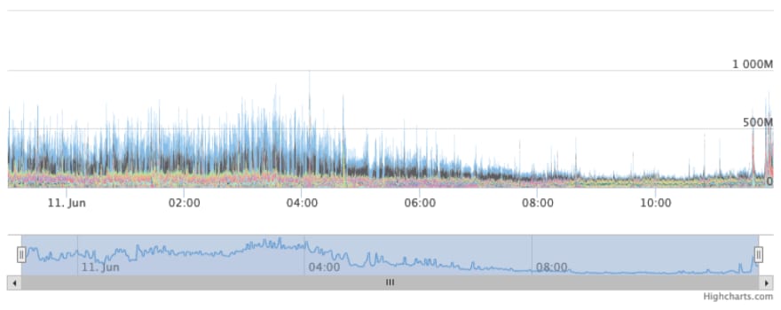
I was quite sad to find out it’s barely usable - it takes about 10 seconds to navigate in the bottom navigation bar ( Live demo ).
Data Grouping
Data grouping replaces a sequence of data points in a series with one grouped point.
I tried to improve the performance with data grouping but I wasn't satisfied with the results. Here's why ( Live demo ) :
- Navigation with the bottom navigation bar works much faster but it still freezes for about 2 seconds.
- The data is flatter which leads to hiding spikes in data.
Exemple 1: Before - without data grouping:
 Exemple 1: After - with data grouping:
 Example 2 (data spike): Before - without data grouping - the spike is at about 1000M
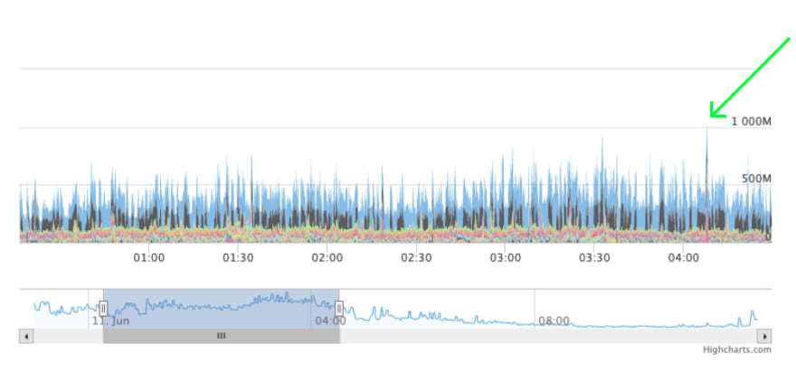 Example 2 (data spike): After - with data grouping - the spike doesn’t reach 1000M

- Also, with data grouping I have observed weird shapes that didn’t stack properly, but I didn’t dig into it further.
I needed some faster and more precise visualization so I gave up on data grouping and tried out the Boost module.
Boost module
focuses on handling and rendering as many data points as possible as quickly as possible
Also boost module didn't fit my data set:
- The rendering time was’t perfect as well, as you can see in the Live example
- Sadly, as you read in the documentation
The area of area and areaspline series are drawn as 1px columns.
It’s not perfectly suited to area charts. In short - my data set looked like that:

- Because my series had various lengths it was hard to adjust the boost parameters. There are two parameters to do so:
seriesThreshold- a threshold which describe the minimal number of series to start rendering in boost mode, eg. if you have it set to 20 and you have 10 series the chart will never render with the boost module (it seems like it also counts series in navigator).
boostThreshold - a threshold which for a single series describes when to enter the boost mode. For example if you have displayed a part of series a with 100 points, second series b with 10 points, and boostThreshold = 50, the boost mode will be active only for the series with a with 100 points.
In my case most of the series were short, so I had to use a low value of boostThreshold to enable it on the short series and increase performance. This way, when I zoomed in the chart with the navigator, the boost mode was enabled constantly (because the displayed part of the series always had more than the boostThreshold number) showing the 1px width columns with a lot of blank space.

For my dataset it was a useless module but it works great with line charts.
Final solution - switching to stacked LINE chart
I decided to change the approach. I changed the area chart to a line chart and the performance problem was fixed (Live demo)!
But… another problem approached me 🙂
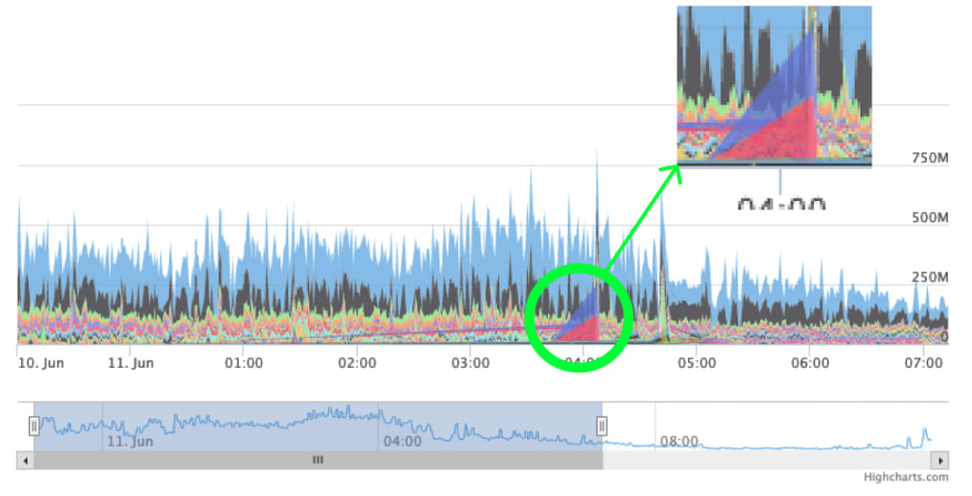
Disorder of series problem

As you can see in the live demo and the picture above, the order of series is wrong (it's changed) at Jun 10, 14:15:18 - green series with name “b” goes under yellow series “c” instead of stacking on the top of them giving an illusion that the value drops suddenly.
Why is it happening? Because of a lack of a data point in series “a” at Jun 10, 14:15:18.
Solution: add a point that has a null value at Jun 10, 14:15:18. This will prevent the series from changing order ( Live demo ).
Final word
Note about initial loading time of each chart type
- Stacked Area chart without improvements: about 7 468 ms (7s is way too long!)
- Stacked Area chart with Data Grouping: 885 ms
- Stacked Area chart with Boost Module: 745 ms
- Stacked Line chart without improvements: 716 ms
The fastest is definitely the Line chart, also it's visible that navigating on this chart is the fastest.
Performance is a very important matter and it was worth spending some time on investigating possible improvement methods. I hope you can find some hints for your data visualizations here!
Also, I would like to thank the Highcharts Team for their support in resolving the issue with wrong series ordering in stacked line chart.


Top comments (0)