
Delight is a free, hosted, cross-platform monitoring dashboard for Apache Spark with memory and CPU metrics that will hopefully delight you!
A year ago, we released a widely shared blog post: We’re building a better Spark UI!
After a lot of engineering work, we’re proud to finally release Delight, our free, hosted, cross-platform monitoring dashboard for Apache Spark.
It works on top of Databricks, EMR, Dataproc, HDInsight, HDP/CDP, and open-source platforms too (anything spark-submit, or using the spark-on-kubernetes operator, or using Apache Livy).
Delight helps you understand and improve the performance of your Spark applications. It provides:
Spark-centric CPU & memory metrics that we hope will delight you!
The Spark UI — so you don’t need to run the Spark History Server yourself.
What we’ll cover in this article:
- The motivation and timeline of the project
- Its high-level architecture
- A tour of the main screens and how they can help you in your day-to-day work
Our vision and motivations for Delight
It’s difficult to troubleshoot the performance of an application for the Spark UI. There’s useful information in the UI, but it’s buried under a lot of noise, and there’s a lot of tribal knowledge involved in understanding it. Moreover, the Spark UI does not show critical system metrics such as CPU Usage, Memory Usage, and I/O.
For this, you have to use a general purpose observability tool (such as Ganglia). The problem with these tools is that they were not built for Spark. You’ll need to jump between metrics for each node, to try to get a rough estimate in your head, and then look at the timestamps to jump back and forth between them and the Spark UI.
Our mission at Data Mechanics is to make Apache Spark much more developer-friendly and cost-effective. This is why we built our managed Spark-on-Kubernetes platform (available on AWS, GCP, and Azure), which automates the infrastructure parameters and Spark configurations to make our customers pipelines stable and performant.
We also wanted to simplify the developer experience of data scientists and engineers, and the observability layer is a critical piece of this puzzle. We want to make it easy for anyone to understand the performance of their Spark code.
This is why we set out to build Delight, an open-source monitoring dashboard for Spark. In June 2020, we shared our vision for Delight in a widely shared blog post featuring the GIF below:
 Our Delight design prototype, published in June 2020. Image by Author.
Encouraged by hundreds of sign-ups and comments on our announcement, we set out to build Delight, which turned out to be a large-scale engineering effort.
In November 2020, we released an MVP consisting of a hosted dashboard giving you access to the Spark UI for your terminated applications (avoiding you the trouble to run and maintain your own Spark History Server).
In Q1 2021, we released Delight internally to our customers, and iterated on the feedback they gave, fixing many bugs and stability issues as we uncovered them.
Today there still remains a lot of work to achieve our final vision. But Delight has already proven valuable to many, and so we’re excited to open it up to the Spark community!
Architecture: Open-Source Agent + Hosted Backend
Delight works for free on top of any Spark platform, including Databricks, Amazon EMR, Google Dataproc, or an open-source Spark-on-Kubernetes or Spark-on-YARN setup. It is compatible with running Spark applications using spark-submit, Apache Livy, or the Spark-on-Kubernetes operator.
Delight consists of:
An open-sourced agent running inside your Spark applications, streaming Spark event metrics to the Delight backend.
A hosted backend responsible for collecting these metrics, parsing them, and hosting the dashboard at https://delight.datamechanics.co
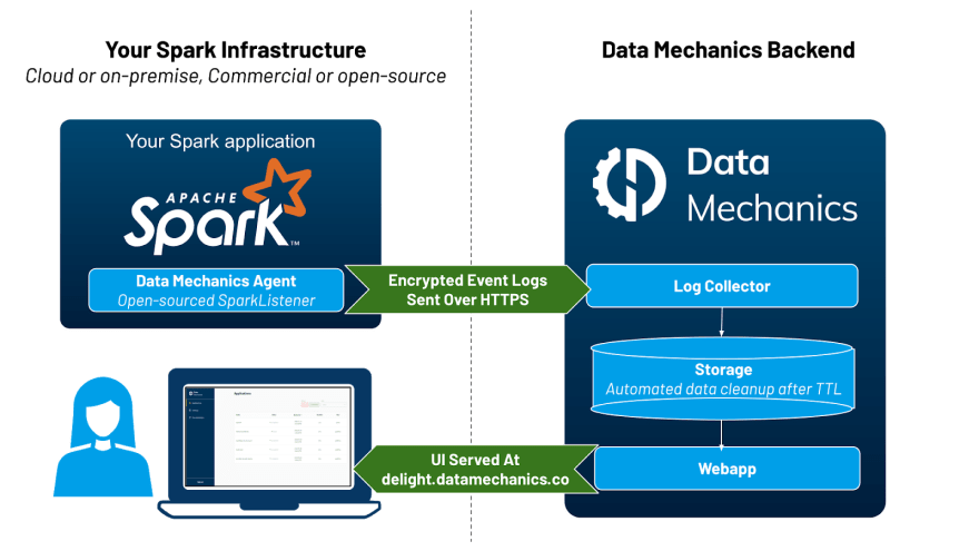 High-level architecture: an open-source agent & a hosted backend. Image by Author.
The metrics collected by Delight contain low-level metadata about your Spark application execution, like how much data is read/written by each task, how much memory & cpu is used. These metrics are called Spark event logs ( view an example), and they’re the same information that lets the Spark History Server play back the Spark UI of completed applications.
These metrics are protected using a secret access token you can generate in our dashboard, which uniquely identifies you. They are not shared with any third party, and they are automatically deleted from our servers after 30 days. An additional limit of 1,000 applications stored per organization applies (if you run more than 1,000 applications within 30 days, we’ll start deleting the oldest ones).
Taking a tour of the main screens
1. The Main Dashboard
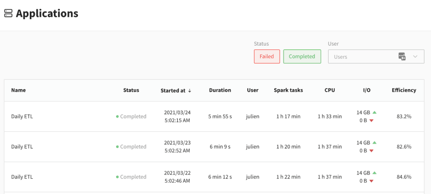 The main dashboard of Delight lists all your recently completed Spark applications. Image by Author.
When you log in to Delight, you see this table of the most recent Spark applications you ran. Note that live applications are not visible yet, they only appear a couple of minutes after their completion. Most of the information in this screen should be self-explanatory, except 3 columns: Spark tasks, CPU, and Efficiency. Before explaining them, here’s a quick reminder of how Spark distributed execution works.
In a Spark **application, you have a single **driver* process (the “brain” of your application), and many executor processes. The driver is responsible for understanding your code and splitting it into jobs, stages and tasks. A stage is a set of tasks which can be executed in parallel on your executors. One executor core can run (at most) one Spark task at a time ; in other words, a Spark executor with 4 CPUs can run up to 4 tasks in parallel.*
Let’s now define three columns:
Spark Tasks. This is the sum of the duration of all the tasks in your application. Side-note: This is the metric that the Data Mechanics platform pricing is based on.
CPU. This is the sum of the lifetime duration of your Spark executors, multiplied by how many cores are allocated to each executors. In other words, this is your “Executor Cores uptime”. This metric is generally proportional to your infrastructure costs.
Efficiency. This is the ratio Spark Tasks divided by CPU, expressed as a percentage. This represents the fraction of the time that your CPU resources are effectively used to run Spark tasks. 100% is ideal (perfect parallelism), 0% means your compute resources are wasted (you have containers running, but they’re idle).
This is one of the key metric we look at at Data Mechanics, as our platform has automation features (autoscaling, autotuning, …) to increase our customers efficiency, and therefore reduce their cloud costs (check this story of a customer who migrated away from EMR to learn more about this).
2. Executor Cores Usage
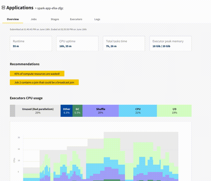
Once you click on a specific application, you get to an app overview page with high-level statistics and a link to the Spark UI at the top. The next information you will find is the executor cores usage graph.
 The executor cores usage graph gives a high-level view of your application’s performance. Image by Author.
The executor cores usage graph aggregates low-level CPU metrics measured by Spark during your application execution, into a simple visual overview. You first get a summary of your executor cores usage, broken down by the main categories (click the ℹ️ icon to read their definitions):
CPU — Time spent actually computing the Spark task.
I/O — Time spent waiting for data to be read or written (usually from network). Note: Spark currently treats work done in a Python process as I/O (from the JVM point of view, this is I/O waiting for python to provide data). This happens for example when you execute python User-Defined Functions. Check this StackOverflow post to better understand how the JVM and Python work together in PySpark.
Shuffle — Time spent waiting for data blocks to be written or fetched during shuffle (data exchange phases across your Spark executors).
Garbage Collection — Time spent doing by the JVM doing GC. For most (healthy) applications, this shouldn’t be more than a few percentage points.
Spark Internals — Time spent by Spark on overhead operations such as scheduler delay, task serialization and deserialization. Again, this should be small for most apps.
*Some Cores Idle *— Time during which tasks are executed, but only on a portion of your executor cores. A high value there is the sign of imperfect parallelism.
All Cores Idle — Time during which no Spark tasks are running. This could be full idleness, which happens often e.g. when you use Spark in an interactive way, then take a break. Or this could mean that some non-Spark work is happening, for example you may be executing pure Python or Scala code on the driver, so all the executors are idle.
This information is then visible on a graph where the X-Axis is the timeline of your app, the Y-axis is the number of executor cores you have (which may vary over time if you enable dynamic allocation). Under this graph, you can see a timeline of your Spark jobs and stages.
The main benefit of this graph is that you can very quickly focus your attention on the main performance bottleneck of your application. In this example, it’s clear that job-1/stage-1 take up most of the application time. The large gray area indicates that most of the cores are idle during this time. If you click on “stage-1”, you will be taken to the Spark UI, so you can troubleshoot this further (in this example, the problem is that the stage only has 2 tasks).
3. Executors Peak Memory Usage
This graph is only visible if you use Spark 3.0 or later, as it depends on new capabilities introduced in Spark 3.0 ( SPARK-23429 and SPARK-27189).
 The executors peak memory usage graphs shops the memory usage breakdown of your Spark executors, at the time they reached their maximum memory usage. Image by Author.
While your app is running, Spark measures the memory usage of each executor. This graph reports the peak memory usage observed for your top 5 executors, broken down between different categories:
Memory used by the JVM (this is your maximum heap size)
Memory used by Python processes (if you’re using PySpark)
Memory used by other processes (if you’re using R, then R is currently listed as “Others”)
This graph should be particularly useful to PySpark users, who currently have no simple way of knowing how much memory their python processes consume. This graph could help you decide whether it’s safe to use a different type of instance / size of container than you currently use. It could also warn you that you are flirting with the maximum allowed memory usage. As a reminder, if your Python processes use too much memory, then your resource manager will kill your Spark executor (for example on Kubernetes, you will get the docker exit code 137).
Conclusion: Try it out, and let us know your feedback!
We hope Delight will be true to its word and help you have a delightful developer experience with Spark.
We encourage you to try it out! Sign up, follow the installation instructions on our github page, and let us know your feedback over email (by replying to the welcome email) or using the live chat window in the product.
We have ambitious plans for Delight. Our future roadmap includes:
A page for each executor, and for the driver, to track their memory usage over time, with more detailed breakdown (Offheap memory usage)
Automated performance tuning recommendations (e.g. alerts on data skew / inefficient data partitioning, …)
Making Delight accessible in real-time while the app is running
And much more based on your feedback: let us know what’s your priority!
We will soon be publishing follow-up articles with concrete troubleshooting steps and Spark performance tuning sessions using Delight. We will also be giving meetups and conferences about it, including at the upcoming Data + AI Summit). So stay tuned, and thank you for your support!
Originally published at https://www.datamechanics.co.

Top comments (0)