
Note: This post was originally posted on marmelab.com.
In this post, we will define what StencilJS is and how we can use it to build a Design System. As a pre-requisite, you should know that StencilJS is not a framework. It's a compiler that produces reusable Web Components that can be embedded anywhere else.
What is a Design System?
Many publishers have a graphic charter defining a set of rules about their visual identity.
Given the technological developments in our societies, these rules increasingly and largely concern digital media, particularly the web.
In the last few years, a consensus has emerged in the world of web development. Indeed, most javascript frameworks are largely based on components. Components offer many advantages such as logic reusability, centralized style and easy testing. Their use provides a rich and uniform browsing experience far away from the early 21th century.
As a result, a new trend has emerged, merging the principles of graphical charter and standalone UI components: that's the Design System.

What Is StencilJS?
As previously said, StencilJS is not another web framework such as ReactJS or VueJS. StencilJS is a toolchain that facilitates the building of reusable and scalable Design Systems based on the Web Component standard. It was created by the Ionic Framework team especially for this purpose.
Although totally different from a frontend framework, StencilJS uses many well-known concepts and technologies from frontend development - and that's often confusing for a developer. So, StencilJS provides:
- A virtual DOM
- JSX (like in ReactJS)
- Reactive Data (like AngularJS $watch)
- Async rendering (inspired by React Fiber)
- TypeScript support
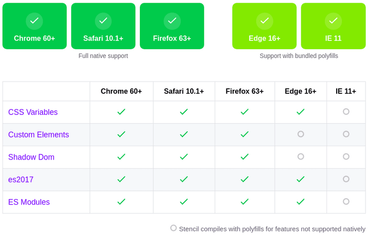
By combining all these features, StencilJS is able to generate standard-compliant components. Moreover, StencilJS automatically adds the polyfill required to support older browsers. Here is the browser support grid provided by the StencilJS website.
So, to sum up, using StencilJS allows you to build a Design System that is ready for the future thanks to its compliance with upcoming standards, its automatic polyfill and its advanced API.
A Simple Case Study
In this section, I will detail the creation of a Design System from scratch using StencilJS. For the example, I will create a design system for Marmelab called mml. Here is the initialisation process below.

Create a component
Once our project is set up, we can create our first component, in our case a "Github Card". StencilJS provides a special npm script command for that purpose, generate.
julien@julien-P553UA:~/Projets/marmelab/mml$ npm run generate
> mml@0.0.1 generate /home/julien/Projets/marmelab/mml
> stencil generate

✔ Component tag name (dash-case): … github-card
✔ Which additional files do you want to generate? › Stylesheet, Spec Test, E2E Test

$ stencil generate github-card

The following files have been generated:
 - src/components/github-card/github-card.tsx
 - src/components/github-card/github-card.css
 - src/components/github-card/github-card.spec.ts
 - src/components/github-card/github-card.e2e.ts
StencilJS has generated all the required files to create our component, even the test files! Here are the generated files from that command (excluding tests).
// ./src/components/github-card/github-card.css

:host {
  display: block;
}

// ./src/components/github-card/github-card.tsx

import { Component, Host, h } from '@stencil/core';

@Component({
  tag: 'github-card',
  styleUrl: 'github-card.css',
  shadow: true
})
export class GithubCard {
  render() {
    return (
      <Host>
        <slot></slot>
      </Host>
    );
  }
}
Now you might think: We're supposed to use StencilJS, how come this command has generated Angular code? Well, although it looks like Angular code, it's actually StencilJS. And I agree, the annotations at the beginning of the module can be confusing. But don't worry, you're on the right track ;)
So, the @Component annotation allows us to declare a StencilJS component, which can be configured using several options:
-
tag: name of the tag on which our component will be registered. -
styleUrl: relative url to the corresponding style file -
shadow: enable the browser Shadow DOM encapsulation - other options...
In the render method, the Host component represents the root of the component, the tag itself. Within it, the slot allows to inject children in our custom element as described below.
<github-card>
   <div>I'm a children, and i'll replace the <!-- <slot>--></div>
</github-card>
Since we use Shadow DOM, only the styles inside our github-card.css tag will have an impact on the display of our github-card. The special :host selector refers to the tag itself (aka Host).
Then, our component exists and we're able to see it (not much at the moment) in the browser using yarn start (aka stencil build --dev --watch --serve).
If we inspects the DOM using chrome devtools, this is what we'll see.

After a few minutes in the shoes of an integrator, here is what I get from some html and css. Sadly, everything is static for the moment, and I have much less than 42 followers in real-life ^^.

In the next chapter, I'll explain how to configure which user is displayed using a special login attribute on our custom element.
<github-card login="jdemangeon"></github-card>
Passing Props To A Component
Like ReactJS, StencilJS provides state, props and lifecycle hooks. So, the first step is to declare a login prop and an user state in our component. Whereas login will receive the name of the GitHub user, user will receive the user object coming from the GitHub API.
- import { Component, Host, h } from "@stencil/core";
+ import { Component, Host, h, Prop, State } from "@stencil/core";


@Component({
  tag: "github-card",
  styleUrl: "github-card.css",
  shadow: true
})
export class GithubCard {
+  @Prop() login: string;
+  @State() user: any;

  render() {
    ...
-     <a class="avatar" href={`https://github.com/jdemangeon`}>
+     <a class="avatar" href={`https://github.com/${this.login}`}>
    ...
  }
}
Contrary to React, there's no this.props object to access props with StencilJS. Prop values are directly attached to the this instance. So we can access login using this.login.
So, our links are up to date, and point to the right profile according to the login prop. Other data such as the number of followers, repositories, etc... are not dynamic and require a call to the Github API.
External And Internal APIs
I don't really want to expose my GitHub popularity in the spotlight... But it's the lottery, honey! So, in this section we'll explore how to call the GitHub API from the component, and display real values based on the response.
First, we will declare a function that calls Github and assigns values to our user. And in a second step, we will call this function when mounting the component.
export class GithubCard {
  @Prop() login: string;
  @State() user: any;

+ async componentWillLoad() {
+   return this.fetchUser(this.login);
+ }

+ async fetchUser(login: string) {
+   const response = await fetch(`https://api.github.com/users/${login}`);
+
+   if (response.status === 200) {
+     this.user = await response.json();
+   } else {
+     this.user = null;
+   }
+ }
Then, we are able to use the user information inside the render() method. If the user doesn't exist or is not retrieved yet, we'll return null.
  render() {
+   if (!this.user) {
+     return null;
+   }

    return (
      <Host>
        <div class="card">
          <div class="header" />
          <a class="avatar" href={`https://github.com/${this.login}`}>
-           <img src="https://avatars0.githubusercontent.com/u/1064780" alt={this.login} />
+           <img src={this.user.avatar_url} alt={this.login} />
          </a>
          <div>
-           <h1>Julien Demangeon</h1>
+           <h1>{this.user.name}</h1>
            <ul>
              <li>
                <a
                  target="_blank"
                  href={`https://github.com/${this.login}?tab=repositories`}
                >
-                 <strong>42</strong>Repos
+                 <strong>{this.user.public_repos}</strong>Repos
                </a>
              </li>
              ...
Just like props, state attributes are directly attached to the instance through this. So you have to be very careful with naming to avoid conflicts between state and props.
So yeah, it works. But what happens if I update the login attribute?
- <github-card login="jdemangeon"></github-card>
+ <github-card login="marmelab"></github-card>
Well, my component doesn't change... but why? Because the componentWillLoad lifecycle method which is used is called only once, just before the component mounts to the DOM. To reflect prop (and state) changes, we must implement componentWillUpdate, too.
export class GithubCard {
  @Prop() login: string;
  @State() user: any;

  async componentWillLoad() {
    return this.fetchUser(this.login);
  }

+ async componentWillUpdate() {
+   return this.fetchUser(this.login);
+ }
componentWillLoad, componentWillUpdate and componentWillRender lifecycle methods are special. They can return a Promise that can be used to wait for the next render.
YES! Our component no shows user information, and changes when the login prop changes. What if we want to allow developers to display other information? To achieve this goal, we'll use a slot.
   return (
      <Host>
        <div class="card">
          <div class="header" />
          <a class="avatar" href={`https://github.com/${this.login}`}>
            <img src={this.user.avatar_url} alt={this.login} />
          </a>
          <div>
            <h1>{this.user.name}</h1>
+           <slot />
            <ul>
              <li>
              ...
A little change in the html...
- <github-card login="jdemangeon"></github-card>
+ <github-card login="jdemangeon">
+   <span>I like Pastis!</span>
+ </github-card>
And tada! Isn't life beautiful? In this case there's only one slot, but you need to be aware that multiple slots can be used thanks to named slots.

In reality, if you apply the example as it is, you will see the text "I like pastis" blinking before the rest of the component. This is quite normal, since we use "normal" html tags and because the browser will show the text before javascript execution.

To avoid this problem, StencilJS will apply an hydrated class on the components once they are mounted. So it's necessary to declare the style below to avoid the problem.
    <style type="text/css">
      github-card {
        display: none;
      }
      github-card.hydrated {
        display: block;
      }
    </style>
If you've already used VueJS, you probably already known the v-cloak attribute, which is based on the same principle. The same applies to AngularJS with ng-cloak.
The StencilJS API provides a lot of features that would be difficult to cover completely here. I can't recommend enough that you take a look at the official documentation, which is very extensive.
Composing Components
We have built a standalone component. How can we interact with it from other components? We're going to create a user selector, which allows us to change the user in the card.
So, we use the same generate command with a github-card-selector this time. And here is the finalized component below.
// src/components/github-card-selector/github-card-selector.tsx

import { Component, Host, h, State } from "@stencil/core";

@Component({
  tag: "github-card-selector",
  styleUrl: "github-card-selector.css",
  shadow: true
})
export class GithubSelector {
  @State() login: string;

  handleLoginChange(e: UIEvent) {
    const target = e.target as HTMLInputElement;
    this.login = target.value;
  }

  render() {
    return (
      <Host>
        <input
          onChange={this.handleLoginChange.bind(this)}
          placeholder="Github username"
        />
        {this.login && <github-card login={this.login} />}
      </Host>
    );
  }
}
As we can see, the code is simple enough to be readable. However, it presupposes that the github-card html tag is already registered on the browser (thankfully, StencilJS takes care of that when the mml library is loaded). There is no explicit import. Of course, since we use TypeScript, everything is typed, even UIEvent and HTMLInputElement browser events.

You can find the project sources at the following address: https://github.com/marmelab/mml.
Component Testing
There are 2 different test types in StencilJS: Unit Tests and End-To-End (e2e). StencilJS uses Jest for unit tests and Puppeteer for e2e tests. If you already know these two excellent tools, you won't be lost.

Thanks to Puppeteer, it is possible to fine-tune the configuration of browser tests. This includes touch management, or landscape mode, up to viewport emulation. Using unit tests, it is also possible to mock many features such as HTTP Referer, Cookies, Url, and so on.
In fact, I didn't find any significant difference between these two test modes. One is just slower because it passes through Puppeteer, but does not bring any added value. I think it's better to focus on e2e tests once the component is integrated into the final application.
For more information on testing with StencilJS, the documentation can be found here.
Framework interoperability
As already explained, StencilJS is not a framework, it's just a web-components compiler. Although dedicated to this unique task, StencilJS's underlying objective is to enable end-to-end development of web applications based on the new standards.
It's still difficult to build a complex application entirely with StencilJS. For this reason, StencilJS provides a set of functions that allow components to be injected directly into existing web applications. Here is an example with ReactJS below.
import React from 'react';
import ReactDOM from 'react-dom';
import App from './App';

import { applyPolyfills, defineCustomElements } from '<your-design-system-lib>/loader';

ReactDOM.render(<App />, document.getElementById('root'));

applyPolyfills().then(() => {
  defineCustomElements(window);
});
Not all frameworks allow easy integration of custom elements (web-components). A website lists the compatibility rate for each of them.
Design System Target
One of the greatest feature of StencilJS is that it can generate various builds at the same time to cover all expected needs and targets.
So, StencilJS can generate both the ES5 and ECMAScript Modules (esm) versions for each component. It can also generate the corresponding documentation in markdown or json.
We can configure that targets through the stencil.config.js this way.
import { Config } from '@stencil/core';

export const config: Config = {
  namespace: 'mml',
  outputTargets: [
    {
      type: 'dist',
      esmLoaderPath: '../loader'
    },
    {
      type: 'docs-readme'
    },
    {
      type: 'www',
    }
  ]
};
From the www output target folder, we can directly test our component by serving it. You can test it directly in the original blog post. Type your Github username, press Enter, and Voilà!
Here is the output target documentation.
Conclusion
StencilJS cannot replace web frameworks such as ReactJS or VueJS. Indeed, Web Components are unable to receive complex attribute data (aka prop in component terms). Like any html tag, they can only receive scalar / textual data (aka attribute). This makes their use very limited.
Some have used hacks to get around this limitation, but I'm not sure the game is worth it.
Therefore, StencilJS is a very good choice if you want to create graphical components without logic (dumb components) in an application or if you want to create widgets that can be integrated out of context everywhere.


Top comments (1)
Well written tutorial / example of Stencil, I wanted to try it out very soon and this will help :D