While I was working with my previous employer, I was developing a system to help manage and optimize the dependencies for about 1000 repositories, projects, and services. They were giving us some trouble with inter-linked dependencies and constant breakage that I describe in this Dev.to post.
To make sure the project was a success, I needed to ensure that we were testing any new systems against a subset of projects that best represented all of the systems running in the company. However, with about 1000 services, no one knew enough about all of them to accurately identify patterns, and no one knew of all the emerging trends in the company, even within a single department.
To combat this, I turned to an experiment involving data analysis of the projects. I theorized that if I graphed all of the shared dependencies between applications, I'd find natural clusters which would indicate the different types of technologies in use at the company.
The experiment
Each project uses a file called dev.yml to specify several of dependencies. Of those dependencies, a good portion were installed using Homebrew (the company uses only Mac computers for development). These dependencies were the key data points used in this experiment.
Each dev.yml file was parsed to extract the declared homebrew dependencies and used to create this graph.
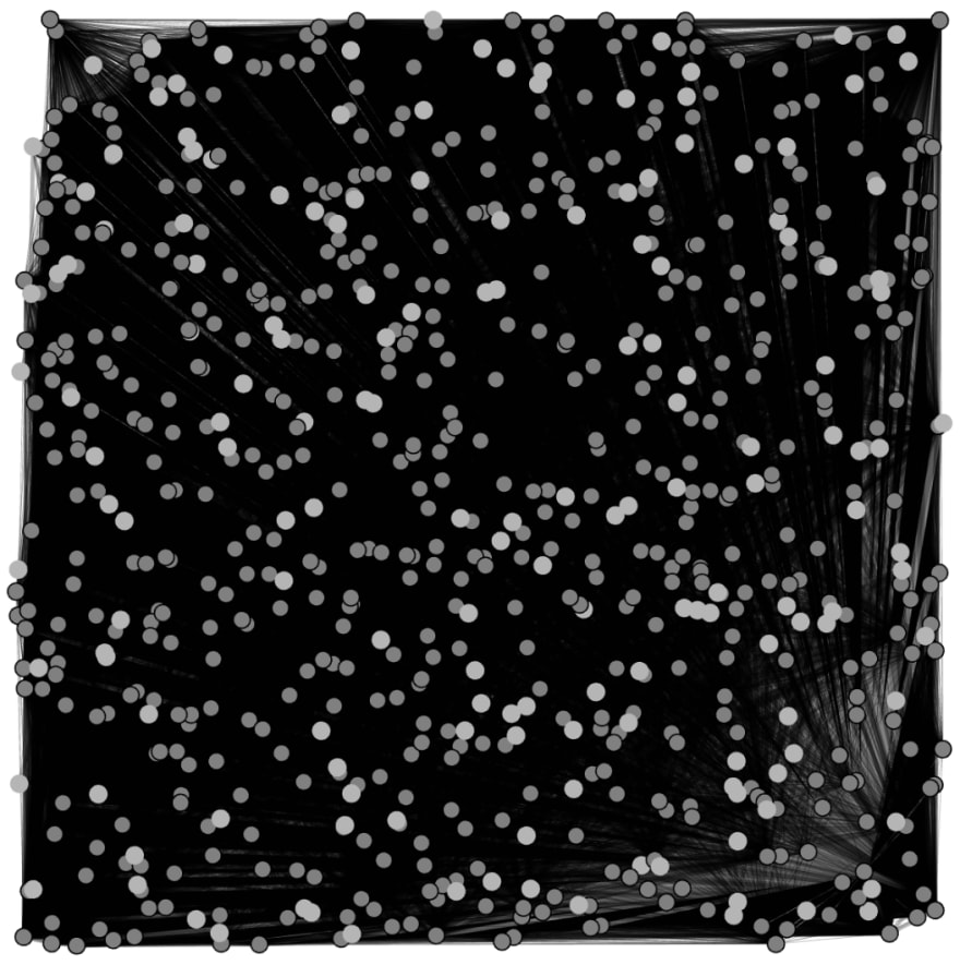
This graph was created by plotting each repository as a node. The edges between the nodes/repos denote a shared dependency, with the weight of the edge equalling the number of shared dependencies.
Modularity
The graph above is quite dense and not very useful. It can pretty much only be used to show that there's a lot of connections (almost 200,000 between approximately 700-1000 repos!).
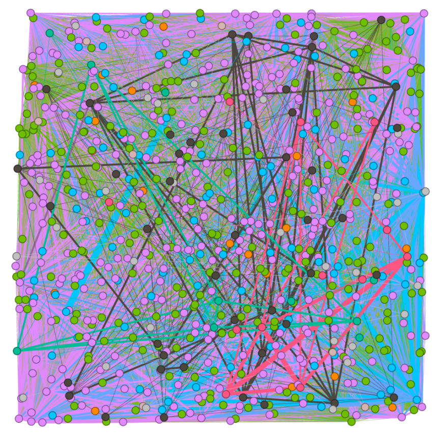
To make the graph more useful, I applied a modularity algorithm on the network of nodes. This algorithm generates an attribute called the "modularity class" which is a classification used to help determine communities, which is a fancy way of saying "these repos are densely connected." In other words, this determines how related a repo is to another repo.
In applying the modularity algorithm and colour coding the graph based on the results, a new graph was created.
 .
.
Layout of the Graph
The resulting colour coded graph is much more helpful to look at than the first one. You can start to piece together some information visually, but it is still difficult to understand.
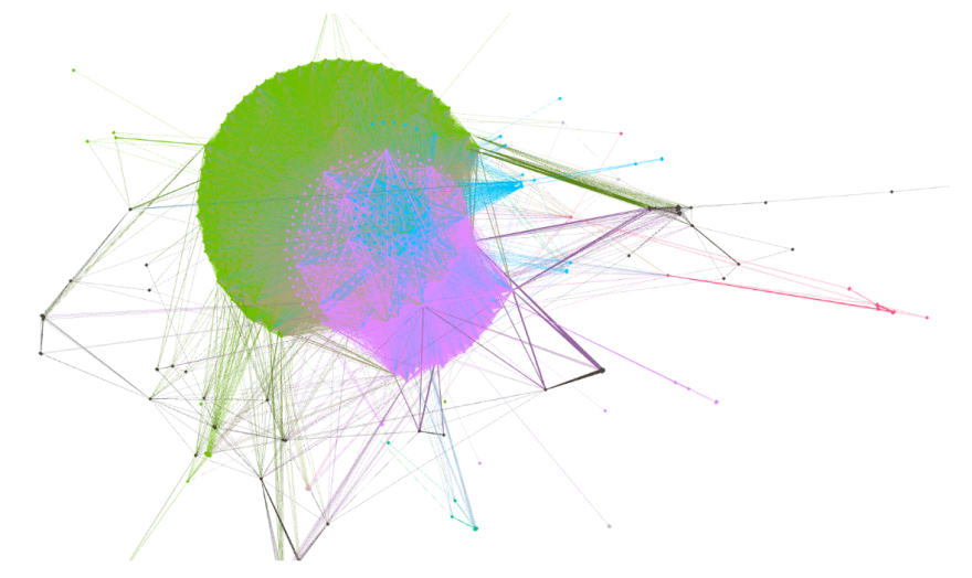
To try and improve the visual aspects a little bit more, I further applied a ForceAtlas 2 layout algorithm to try and give some semblance to a coherent and understandable graph. The result allowed me to start to identify some clusters, which you can see below.
Grouping the data
The properly laid out graph is much better and provides us with some visuals to help explain what we see in the data. However, we still have no actual data to share.
To determine some concrete facts, we can use the modularity class from before to partition the nodes. Each partition of nodes, based on the modularity class, represents a highly connected group of repos. The modularity class derives from the edges between nodes, which represent the number of shared dependencies. Therefore, a modularity class also represents groups of concurring dependencies - or in more simple terms "repos that share many dependencies."
I used these classes to group the repositories, then recursively applied the same modularity algorithm within each group. This method resulted in approximately 5 groups of apps represented by Homebrew dependencies.
I exported each of these groups and determined their commonly occurring dependencies, which I graphed. The following graph is what resulted from the experiment. It was created, based on the results from the clustering, and combined with some simple calculations based on the commonly occurring dependencies of apps (For example, 74.44% of apps used OpenSSL as a dependency, and 15.11% of that 74.44% used PhantomJS). The graph was further colour coded to show the groups, which were labelled based on a technology that commonly occurred in that group (I determined the technology label by experience and expertise in the systems).
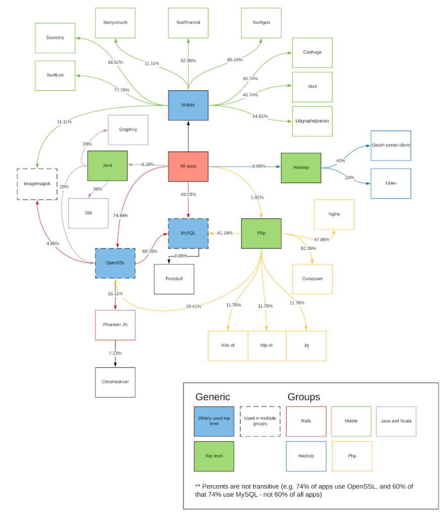
To note: Javascript and Golang groups did not end up with representation here, but were two groups identified outside of this experiment. This missed representation was caused by the fact that these 2 technologies did not often include Homebrew dependencies. The groups were known to exist, however, due to expertise in the system.
This final graph provided the critical information I needed to identify areas on which to focus. From this graph, I was able to find lists of application against which to test any significant changes. Overall, the graph and experiment put the team into a position of confidence to start a much larger project.

Top comments (0)