Search filters are one of the most important aspects of eCommerce websites, allowing our customers to refine their results and find what they are really looking for. In order to do that, we usually try to make these filters as useful and usable as possible, since we want them to be really helpful and provide a great experience for our customers. From a frontend technical perspective, the filters design can turn into a complex problem to resolve, which can impact both usability, maintainability and performance of our search result pages.
Our contestants
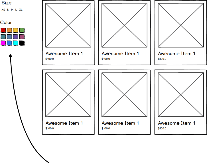
After doing some research through the most popular eCommerce websites, I was able to categorize those implementations into these groups:
- Sprites with dynamic styles: images are used to display colors, which are located on a sprite and later each color rendered has an inline style that sets the background-position to the corresponding color.
- Inline styles: background color for each option is set via inline styles with a background-color property to the corresponding HEX or RGB color
- Css class based: css classes are defined for each specific color, with a specific naming convention. On rendering, that class is added to each color filter option, which then links to the css class, and their respective RGB or HEX color.
Once I got the the most popular implementations, I decided to recreate them in a simple environment, with the idea to evaluate the following:
- Performance: How each alternative affects the size of each dependency of the page, as well as the time for the page to complete load, doing a specific focus on the Critical Rendering Path
- Maintainability and scalability: we need to consider how the implementation will affect us in the future, in case we need to edit the colors in any way, or maybe change the entire filter
- User experience: It is very important that we take into consideration how the final version affects our users and how they will use our filter, and how the interaction with this filter can increase conversion and return rates.
For the implementation itself, I wanted to create a free external dependencies scenarios, in order to have a website where there would only be the html, with the css and images dependencies, with no js on the client side. In order to achieve that, I created three separate html files which each alternative.
To test this, I created a repository on GitHub with these three html files, and I accessed them via GitHub pages:
Also, to evaluate all these aspects and try to determine a difference between the alternatives, I used Lighthouse Audits with Throttling Applied Fast 3G, 4X CPU Slowdown from the Google Developer Tools, for evaluating the performance and cost of each implementation.
Fight Highlights
Without further delay, here's the results for each alternative.
Sprites
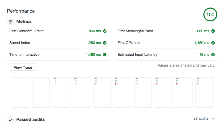
So in rendering terms, the sprites alternative took 860 ms to render the first content on the browser. In this case, it would be the texts for each color and also the title. Since we are showing these colors using an image, the request to retrieve that image does not block our rendering, so the browser can show the names of each color before showing the actual block with the color.
This is actually a good thing, since this approach allows us to render something meaningful (like the audit said) to the user, which ends up enhancing the experience that they have. See the below example, which one would you say that includes the red you are looking for?
Plus, with images you can provide a filter that is more detailed and precise, and represents what they are really searching. Imagine searching for a red shirt, but you are not quite sure what specific tone of red you want. Maybe an image displaying a palette of reds will make you as a user more confident that what you are looking for is in that area.
On the other hand, we obviously need to fetch the sprite containing all these images for each color and that adds loading time and costs. And that affects the load event been triggered, since this won’t happen until that image is downloaded, which ends up making the crazy spinner that you see (and every user sees and worries about) on your browser’s tab spin a little big longer. That’s why the Speed Index (how fast the page is visible) and Time to Interactive (time when page is fully interactive) happen 400ms after First Contentful Paint, because the page is not fully loaded yet. However on the next request, you will have this image cached by your browser.
Furthermore, taking this approach without considering what colors are really shown when searching on a specific category or filtered list can result on sending really big sprites to the frontend, and maybe end up using 2 or 3 of those colors, since the items that you are displaying do not have all the colors on your sprite.
Plus, if you have a different image for different states (hover, selected), that sprite will duplicate in size, which will add up to the overall size of your application. You can definitely create several sprites for different scenarios (maybe by category) but it will take some operation time to do this and maintainability for this scenarios will be some hard work.
Dynamic Styles
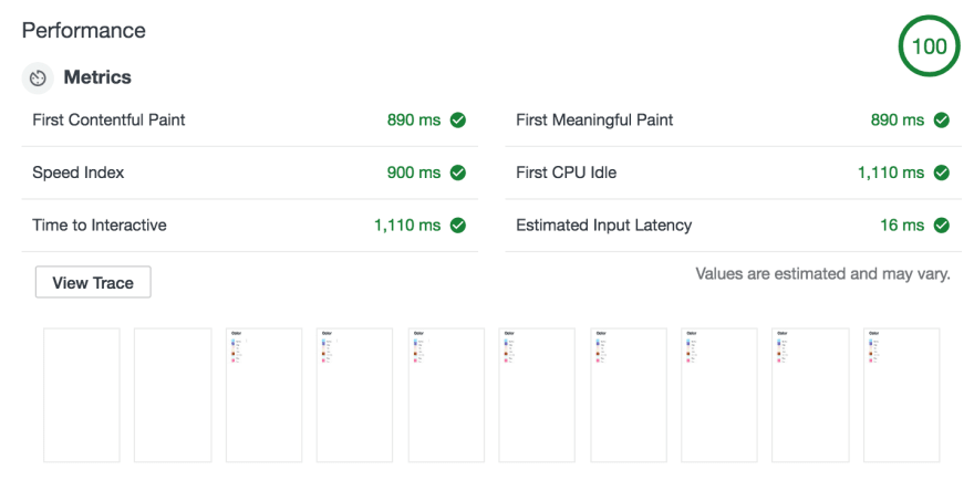
With dynamic styles, we can see that the First Contentful Paint takes around the same time as using sprites. However, when we show the user content, we automatically display the names of each color with their corresponding RGB. We can see this by analyzing the Speed Index and Time to Interactive ms, which are faster than the sprite scenario. This means that the site could be considered more interactive, since the time that the browser takes to display the full content of the page is faster, and we allow the user to interact with it in less time.
The size of the HTML is a little bit smaller for this alternative, since the css needed to set a background-position is longer that setting a background-color. But the difference here is less than 1KB, so it would not be a big impact. Plus, since you are only bringing to the frontend the colors that you are going to use, the more specific the filter is, the more bytes you will save, because that color list will probably get smaller and smaller. However, this approach does not scale when you have several color filters on your website, like primary and secondary colors. This is because each filter will be rendered with its own inline css, which will make some css to repeat itself.
Static Styles
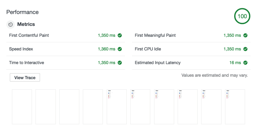
As we can see for this alternative, all metrics take considerably more time than sprites and dynamic styles. This is due to the fact of the presence of the stylesheet, which blocks the rendering of the page until it is loaded. We even have a note from Lighthouse regarding that stylesheet:
In this scenario, not only did we have to download the HTML to render the page, but also wait for the css to be downloaded so then they can be processed and rendered. Moreover, the stylesheet used will potentially have all the colors that you need, which will result in the browser not using a percentage of that file, since not all the colors could be present. On the other side, the file will be cached by the browser, so the next request will be much smoother. And also if you have several color filters on your site, it will be useful to have all colors centralized in one file.
From a maintainability stand point, adding new or changing colors will result in generating a new stylesheet and deploying, as well as adding or changing the classes that we have created to map colors to their rgbs. Plus, this creates a new dependency, since the way that we have to associate colors to their rgbs is by naming convention, which usually ends up being the ID of the color. If that ID also changes, we need to update the stylesheet as well.
And the winner is…
Taking a look at the options, we can say that there is actually no winner, but a more suitable approach for a specific scenario.
If you are very focused on how the user perceives your website and want to provide a very customized experience, with different color flavors and patterns depending on what you are seeing, definitely using sprites is the option for you. But beware, you will need to take into consideration that creating those sprites and the css to set the background position could take some time!
If your website targets mainly mobile devices and you want to deliver as little as possible to the end user, then dynamic styles will definitely fit your scenario. It will allow you to download only what is needed, which will save both processing and loading time, as well as overall costs for your application. Also you can leverage this possibility by displaying a small set of colors on your filter, maybe the most popular ones, and then allow the user to see more. Once that happens, you can do an AJAX request to retrieve the full list of colors, which will come directly on the HTML.
And to finish up, if you have a simple scenario where you only would like to show a simple color filter with no custom logic or different flavors, going with the static alternative will suffice for the moment. You can also leverage this technique when building Single Page Applications, since styles will be downloaded only once and will be useful during the entire time the user is navigating your application. However do take into consideration that this alternative can bring some headaches in the future if your application grows.
Hope you enjoyed this article! If you liked it, leave a clap or a comment, I would love to hear some feedback!
If you want to learn more about Critical Rendering Path, I suggest you take a look at the free course in Udacity about Web Performance Optimization. I took it to have a little bit more background for this article and loved it!


Top comments (1)
Great post! 👏🏼