This is an ongoing series where I am starting over learning modern CSS. You can find other posts in this series below:
TL;DR - Styling cards used to be a pain. With Flexbox it's pretty easy!
CSS is tough. When I started professionally developing websites about five years ago, there was zero incentive to develop CSS knowledge; even basic layouts seemed hacky, with prolific use of float: right; this and margin: 0 auto; that. It didn't intrinsically make sense and only added to the mystique and inapproachability that was CSS at the time.
I often dreaded styling anything beyond minor tweaks. If I had to create a card, for example, I'd reach for Bootstrap or Bulma or Material Design. But with Flexbox there's no need! Let's start with a super simple example.
Card 1: Simple and centred
Let's say you want a very basic card that has one piece of child content in it, and that content is centred vertically and horizontally. For the sake of this example, let's say it's holiday destinations. Here's some simple code to get started:
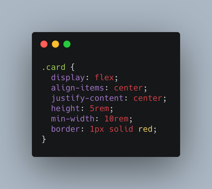
Each card is an article element. The cards are inside a section element, where I applied some basic Grid styles. The important part for this example is inside the .card class:
Flex, like grid, are known as 'display-inside' keywords that can be assigned to the display property. 'Display-inside' keywords change how the element's inner content is displayed. This is in contrast to 'display-outside' keywords that change the element's outer display type, or the role the element has in the layout flow. Some 'display-outside' keywords are block or inline.
Within an element where the display: flex; property/keyword is assigned, child elements are centred vertically with align-items: center; and horizontally with justify-content: center;.
While this card layout is pretty simple, it's not all that useful. Let's move on to something we could more realistically use.
Card 2: Centred with sections
Building on the last example; we need a little more for your holiday cards. Just saying the destination name doesn't really do much. Let's add a photo, and the date visited:
Now each card's content is horizontally centre-aligned, and it has three sections: one for the header, one for the main content (a photo for this example), and one for the footer.
I made some changes to the card's max and min width and height, and added some basic styles to each section and the img elements, but those changes aren't that interesting, and you can check them out in the Pen above. The most interesting line of code for this example, at least that relates to Flexbox, is: flex-direction: column;
This one line transposes the contents of our three new section elements to display vertically instead of horizontally, similar to the old-school display: block; versus display: inline-block;.
Ok! Our cards are starting to look pretty decent, but I think they could be better. Let's stick with the three sections we have for each card, but add some extra styling for functionality we might add later.
Card 3: Handling complex sections
The final example has the card's title and date in the 'header' section aligned to the left, and changes the footer to a 'card-action-area' where there are 'open' and 'edit' buttons.
In the new header element we have a card-title and card-date, each with styles specific to them. The header element has the style align-self: flex-start; applied, which pull the child sections to the beginning (the flex start) of the element.
The new footer element also has two children, open and edit buttons, but we want these to be displayed horizontally rather than vertically. With flex that's easy! Simply set the card-action-area class to display: flex;, which will apply to all it's child elements, and reset the flex-direction to its default row!
Wrapping up
Flexbox makes styling components like cards a breeze. It's powerful and applicable for simple or more complex components. I wish I had it when I started web development!


Top comments (0)