
Apple and Google have both released regularly updated mobility datasets. Previously used internally for traffic and mapping applications, this anonymized data now offers researchers, epidemiologists and the general public insights into how disease progression responds to changes in mobility.
iOS vs Android Data
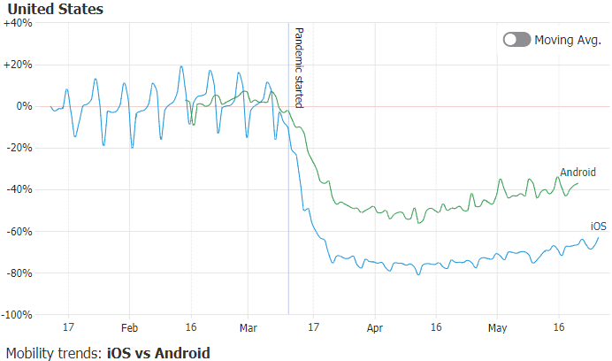
These datasets also offer a small, yet imperfect, insight into the relative differences between iOS and Android users stringency to mobility measures throughout the world, by comparing Apple's Transit and Google's transit station statistics.
COVID-19 Mobility Dashboard Goals

The JSCharting team created an interactive JavaScript COVID-19 Mobility Dashboard to help citizens visualize mobility data for their own countries and compare results to countries with different policies as the world unites to fight COVID-19. We also hope that visualizing mobility data along with active case data will help illustrate how mobility impacts the spread of coronavirus.
Mobility Data Categories
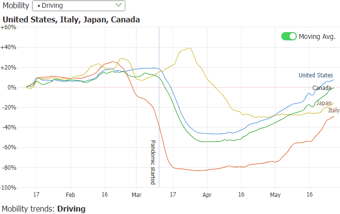
The Apple dataset includes categories for driving, walking and transit, while Google's data reports mobility changes in retail, grocery & pharmacy, parks, transit stations, work and residential locations. Both report daily data relative to a pre-COVID baseline. You can now see how driving increased or decreased as a result of mobility measures in various countries, how people stayed at home and away from work, or increased time spent in parks rather than retail establishments.
Mobility Data Insights
Interacting with the dashboard directly, tap or click specific countries of interest and see how each took action at different times. The "last selected summary" shows a line series for every mobility category in the last selected country along with active cases over time.
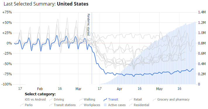
Charting daily country statistics on active cases helps illustrate how mobility policies impact the spread. To keep the chart legible with so much data, the selected category is highlighted and others muted; select any category of interest from the legend and hover legend entries to preview your selections within a given country. Select multiple countries to compare them for a single mobility category and then change the category with the drop-down menu to see the selected group update in real-time.
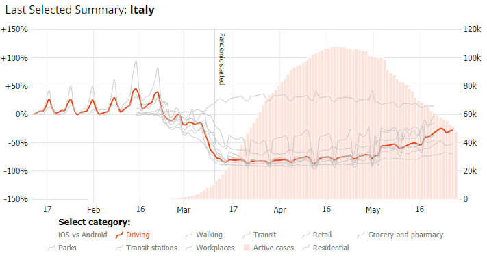
Italy was hit hard and early, and we can see mobility drop over 75% in the second week of March after extreme measures were taken resulting in an eventual decline in active cases. Similar trends are visible with France and Spain, while countries like Sweden implemented a different policy and some mobility measures only dropped 20% increasing to greater than baseline as the end of May, 2020.
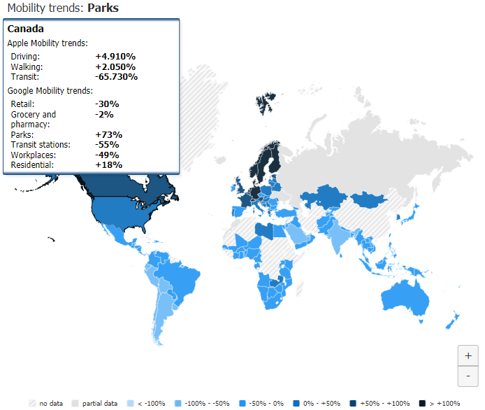
Policy events such as Canada's recent reopening of many of its parks are also clearly visible as usage spiked over 70 percent above baseline.
We would love to hear from you!
Do you have any feedback or suggestions for the live dashboard or do you have a topic of interest you would like to see visualized? Please let us know in the comments below.


Top comments (0)