Constraints in Figma tells Figma how layers should respond when you resize their frames. This should help you control how designs look across different screen sizes and devices.
In this tutorial, we will learn how to use simple tools to design our UI, create responsive and adaptive layout using constraints, design simple icons and make sticky navigation bar.
Before we get practical, let's talk more about how constraints work.
How Does It Work
constraints work Horizontally and vertically. You can apply constraints along the X (horizontal) and Y (Vertical) axis.
Horizontal
The horizontal constraints are defined by how a layer should behave as you resize the frame along the x-axis.
- Left: maintains the positions of the layer relative to the left side of the frame.
- Right: maintains the positions of the layer relative to the right side of the frame.
- Left and Right: this will maintain the layer size and position relative to both sides of the frame, and may cause layers to grow or shrink along the x-axis when resized.
- Centre: maintains the position of the layer, relative to the horizontal center of the frame.
- Scale: will define the size and position of the layer as a percentage of the dimension of the frame and will then maintain those proportions as you resize it.
Vertical
The vertical constraints define how a layer should behave as you resize the frame along the Y-axis.
- Top: Maintains the positions of the layer relative to the top of the frame.
- Bottom: maintains the positions of the layer relative to the bottom of the frame.
- Top and Bottom: Maintains the layer size and positions relative to the top and bottom of the frame. It May cause layers to grow or shrink along the Y-axis when resized.
- Scale: Will define the layer size and position as a percentage of the frame dimension, it will then maintain those proportions as you resize it.
NOTE: Depending on the positions of the layer, more than one constraint may achieve the same result.
How to apply constraints to a layer
You can apply constraints to any layer within a frame, it will not be possible to use constraints on layers outside of a frame or layers in an auto-layout frame.
- You can also apply constraints to the frame you have nested within other frames.
- Constraints can be applied to layers horizontally and vertically.
- You can use constraints to define how layers should respond in scrolling prototypes.
- You can not apply constraints to groups, a group will inherit its bounds from the layers contained within it, and the group is considered a single layer with bounds.
NOTE: If you apply constraints to a group, Figma applies constraints to the individual layers or elements inside the group.
Let us set the constraints for a layer.
1) Select the layer or parent within the frame, the blue dotted line on the canvas shows which constraints are currently applied
2) Adjust the vertical and horizontal constraints in the constraints settings in the properties panel.
- Use the drop-down menu to set the layers constraints or click on the lines in the interactive diagram to select a constraint 3) If you want the layer to stay in the same position, even when scrolling, check the box next to FIX POSITION WHEN SCROLLING
TIP: Hold SHIFT to select or apply more than one constraint. For instance, left and right constraints.
Sometimes you may want to resize a frame or layer without using the constraints applied to a layer by holding down a modifier key;
- MAC: Press down COMMAND when you resize
- WINDOWS: Press down CTRL when you resize
Constraints and layout grids
Constraints give you a primary framework for positioning layers within a frame. When it comes to more complex designs, we need more precise control and flexibility, Constraints ensure how our designs behave when resized. That’s where grids come into play when you use a grid within a frame, Figma aligns any layers within the frame to that grid.
Now lets get practical.
STEP 1
Let us design this UI below.
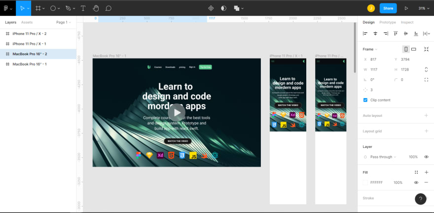
Background Image: Unsplash, https://unsplash.com/photos/bTxMLuJOff4
Font: Roboto, H1 Font size: 96 bold, H2 40 regular.
Icon color : 5DCB90.
Font color: FFFFFF.
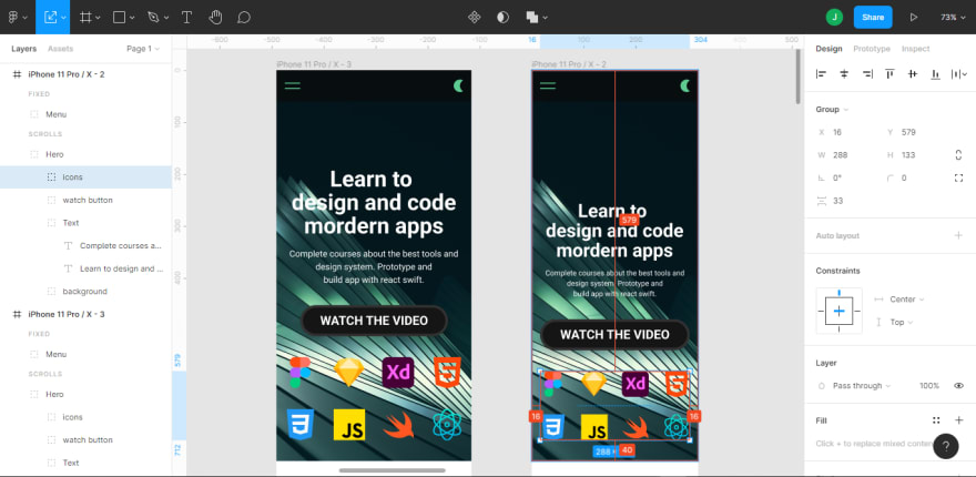
Working with constraints is a crucial part of our workflow. as we design for several screens, elements, groups, and components need to be flexible enough to react to any content or screen change, so we can select a frame and switch between landscape and portrait.

Components are always left and top by default, and when you try to resize your components, they do not resize proportionately, This is why we need to change the constraints of each element, from the default top and left to center and top because we want all components centered.

STEP 2
Be sure all elements and groups constraints are assigned to the top and center from the icon group to the navigation group, except for the background, which will be set to top and left and right holding shift or selecting from the drop-down on the constraints panel.
Now try switching from landscape to portrait, I believe our layers are adaptive already, and yes, it is that simple.
It is nice we can change from landscape to portrait, Yet not all components can resize to an extent. For example, our navigation menu, and contents are too many to fit in smaller devices such as phones.

STEP 3
Let us create our first mobile screen. Press F on your keyboard, Go to phone, select the iPhone x
NOTE: When designing mobile screens use a layout grid, which will help in snapping items to the proper position.
In this case, set the layout grid to 8

Copy and paste all contents from the web screen to mobile. Elements should be too big for our mobile screen, we will need to resize all components one after the other to fit the screen of our mobile screen.
Let’s resize our background image, resize it to fit the screen of the iPhone x frame, and set the height of the background to be 752dp, Next is our text. Press K on the keyboard to change to scale(this helps to resize a component proportionately, and resize out text with a space of 16dp from the left and right.

Select all elements, including the background, group them and call it HERO. for the icons, they will not fit as they are longer and bigger. So we will have to split them into two groups, select the first, 4, and group and the next 4 do the same still inside the original group called logos, stack them on each other with a distance of 40dp, the logo group should be 40dp distance from the bottom of the background.
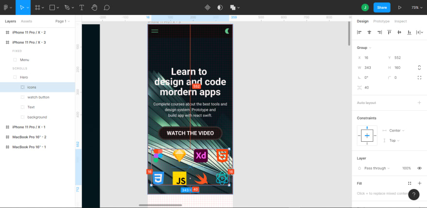
Move text and watch button 40dp upwards from the logos, and make sure all elements are centered.
NOTE: the play button we have on the web will not be needed on the mobile, as this should be on a hover state which we do not have on our mobile screen. Hide it by clicking the eye icon on the layer panel.
STEP 4
Creating a mobile navigation bar
At the top, away from our hero group on the layer panel, we should create a sticky mobile navigation bar, using the rectangle tool to create a height of 60dp and width of 375dp, and this will span from left to right of our iPhone x screen. Change our color to black with 70% opacity, and add an effect of a background blur of 40%.

This menu will be handled differently, as it is not a native app, so we will not have it at the bottom, it's best we use the hamburger menu since our navigations are many.
To create the hamburger menu, Draw a simple rectangle with a width of 30dp, and make the height 2dp with a corner radius of 1dp, duplicate this with a distance of 8 between, make it a group, and name it a hamburger, make the top and bottom 24dp and move it 16dp from the left inside the rectangle.
TIP: one cool feature in Figma, you can color group elements placed in a group.
So select the group and add color to it.
Let's create our light and dark mode icon, grab our ellipse tool make a perfect circle holding SHIFT, 24dp height and width, duplicate the Circle with a distance of 12dp, select both and go to our boolean select subtract selection. Make the color the same as the hamburger icon, and move it 16dp from the right and center horizontally.
Select all the three components created, group them and name the group MENU, set the constraints of the hamburger to top and left, and the moon icon to top and right. for our rectangle, it should be set to top, double select left and right holding shift for its adaptiveness. The navigation should be made fixed by clicking on the dialogue box below, which states FIXED POSITION WHEN SCROLLING before this will work, make sure the height of the frame is longer than the screen, then set the height to 1500dp. You can test this out by clicking on presentation and then try scrolling.
NOTE: when you resize a text using a scale, it could add an extra decimal to the font size, it's best to change this to a whole number so your developers can understand better.
STEP 5
Designing for the smallest screen
For the smallest screen, we will be using the iPhone SE which has a width of 320dp. Duplicate our mobile screen, hit F on your keyboard, go to our design panel, click on the drop-down FRAME, and select iPhone SE.
We will need to make some adjustments as we did on our icons and text on the previous mobile screen. Every other thing remains the same aside from the logos and text.
For our logos, hold OPTION for MAC or ALT for WINDOWS resize from the side, this should affect both left and right simultaneously, make sure this has 16dp spacing left and right also scale or text down by hitting K on our keyboard using the scale, we should also have 16dp spacing on both left and right, remember to look at font size as scaling may add an extra decimal point to font size.
Conclusion
All our screens are fully adaptive to every screen size, We’ve now reached the end of this tutorial. You have been able to learn how to use constraints to make your layout adaptive, how to create simple icons like that of the hamburger and dark and light mode icon using the boolean tool, and learned how to make a sticky navigation bar. If you didn’t follow along with the tutorial, click on the DESIGN where you can test the final result.


Top comments (0)