I have recently been obsessed with the T3 stack (Next.js, TypeScript, Tailwind CSS, Prisma, and tRPC). As part of that I have been using Tailwind CSS to quickly layout the format of every project I have been working on for the past month. It makes styling as symbol as writing classes into your JSX or HTML.
But I wanted more options. The default colors provided by the Tailwind team are wonderful, but I’ve started too many projects with ‘bg-slate-700’. I decided it was time for me to change something. And what better way to do that than to make my own tool.
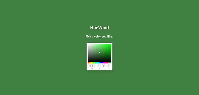
HueWind is a site devoted to making cohesive Tailwind CSS themes as easy as possible. Drawing inspiration from pixel art palette creators, I placed a heavy emphasis on clean blending between a theme’s lightest value, primary colors, and darkest value.
Try it out here, huewind.jordantwells.com , and as always the source code can be found on my GitHub at github.com/jordantwells42/huewind.
Why use this over any other palette generator?
The key behind this project is its awareness of all the colors on your site. Typical color swatches are generated in a vacuum, where base colors are unaware of their relationship to other base colors, and the entire swatch is unaware of its relationship to the lightest and darkest tones on the website.
HueWind automatically generates complementary theme colors for you as part of a tetradic color scheme. This ensures a clear relationship between your primary theme color and the ones that support it.
More importantly, color swatches are generated with respect to the lightest and darkest tones on your site.
Typical autogenerated color swatches will transition your target color towards a pure white (#FFFFFF) to generate lighter shades and a pure black (#000000) to generate darker ones. While this design can look modern, it also lacks a lot of the soul that hand-picked artistic palettes have.
HueWind instead looks to your chosen lightest shade and darkest shade to create its swatches. A simple change from a pure black to a deep purple or a blinding white to a pale yellow can have wonderful changes to the aesthetic and feel of a website.
How does it work?
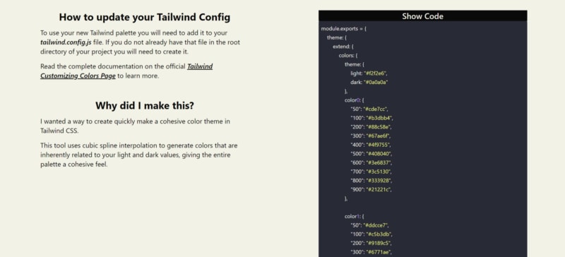
HueWind uses spline interpolation to seamlessly transition between the hues, saturations, and values of your light, dark, and base shades.
This uses the 3 points of your light, base, and dark shades to uniquely determine a curve that passes through all of them, setting the X value of the shades to 0, 500, and 1000 respecitvely. It then evaluates this curve at the classic 50–900 values of Tailwind CSS, giving the final output values.
Importantly, for accessibility I automatically choose an accessible text color all across the site using tinycolor. This includes a fallback to using pure black and pure white in case that user decides that their favorite light shade is white and their favorite dark shade is white.
Try it out!
It takes less than a minute to have a palette generated! Use it here at huewind.jordantwells.com ! And I’m sure you’ll see me using it on my future projects on jordantwells.com .
Jordan


Top comments (1)
Ty for sharing