
This article covers designing and developing a Weather App webpage using Responsive Web Design (RWD) techniques.
This article will cover creating wireframes for our page so we can visually see how the app will be laid out on different devices and then we'll create some high-fidelity designs. Next we'll develop the responsive webpage making use of CSS media queries to alter the layout and design to fit any device screen size from a mobile phone to a large desktop.

The code for this article is available on GitHub:
https://github.com/JonUK/responsive-web-weather-app
Project Brief
Before we start, let's review the fictitious brief for our Weather App page so we have a clear idea of what we want to achieve.
Requirements
- Current weather conditions are displayed at a large size
- Weather conditions for the next 5 days are displayed
- Weather conditions at different times throughout the current day are displayed (if space available)
- The location of the weather conditions is displayed
- The page looks good on all devices from mobile phones through to large desktops
- Ideally no scrolling is required on mobile phones and tablets in portrait orientation
Creating Wireframes
A great starting point for a web page that is highly visual is to create wireframes. This is especially true for pages that need to work across different device sizes.
We'll take a mobile first design approach where we create wireframes for a mobile phone and then work up to tablets and desktops. In many ways, a mobile phone is the hardest device to design for due to the limited space available so will force us to consider the essential features and content.
I created the wireframes using Adobe XD (a free version is available).
Mobile Phone — 375 x 667 pixels

Tablet — 768 x 1024 pixels
Desktop — 1920 x 1080 pixels

As you'll notice, there are no colors or icons on the wireframes and they look very plain. That's intentional and later we'll come back and create high-fidelity designs. The purpose of these wireframes is to understand the layout and content for our page on different devices.
On a mobile phone, we won't show the "Weather by hour" section as there's not enough space (without introducing vertical scrolling) and we show a condensed version of the "Next 5 days" section.
On a tablet, we'll move the "Current stats" section up and to the right the "Current temperature" section and we show a extended table version of the "Next 5 days" section.
On a desktop, we essentially have the same version as the tablet but with more spacing and some larger font sizes.
Although our wireframes have been created at typical mobile phone (375 x 667), tablet (768 x 1024) and desktop (1920 x 1080) sizes, these won't necessarily be the breakpoints we'll use to swap layouts. Later when we're developing our page, we'll review the breakpoints to use based on the space our content needs to show.
Creating High-Fidelity Designs
Now we understand the page layout for each device and we understand what content we want to show, we can move on to creating high-fidelity designs. These designs will let us explore exactly how we want to present the UI to our users.
A caveat to add at this point is that I'm a developer rather than designer, so I'll give this my best shot!
Mobile Phone — 375 x 667 pixels

Tablet — 768 x 1024 pixels

I used the free 25 Outline Weather Icons from Emske.com which look fantastic and really help give a nice "clean" look.
Developing The Page Layout
Now we've created the wireframes and designs, we're ready to get our hands dirty and start developing the Weather App page. As we've seen, there's 2 main layouts we need to support.
Mobile And Tablet / Desktop Layouts

We'll take a mobile first development approach to creating our web page which means we'll initially create CSS just to support mobile phone devices and then add media queries to adjust these styles for larger devices.
Let's start development with the HTML page. Create the HTML file index.html with the following content:
<!DOCTYPE html>
<html lang="en">
<head>
  <meta charset="utf-8">
  <meta name="viewport" content="width=device-width, initial-scale=1">
  <title>Weather App</title>
  <link href="https://fonts.googleapis.com/css?family=Open+Sans:300,400,600,700&display=swap" rel="stylesheet">
  <link href="index.css" rel="stylesheet">
</head>
<body>

<main class="main-container">

  <div class="location-and-date">
    A) Location and date
  </div>

  <div class="current-temperature">
    B) Current temperature
  </div>

  <div class="current-stats">
    C) Current stats
  </div>

  <div class="weather-by-hour">
    D) Weather by hour
  </div>
  <div class="next-5-days">
    E) Next 5 days
  </div>

</main>

</body>
</html>
Next create the file site.css with the following content:
* {
  -webkit-font-smoothing: antialiased;
  -moz-osx-font-smoothing: grayscale;
  box-sizing: border-box;
}

body {
  margin: 16px;
  font-size: 100%;
  background-color: gray;
  font-family: 'Open Sans', sans-serif;
}

.main-container {
  display: flex;
  flex-wrap: wrap;
}

.location-and-date {
  width: 100%;
  border: 3px solid blue;
}

.current-temperature {
  width: 100%;
  border: 3px solid yellow;
}

.current-stats {
  width: 100%;
  border: 3px solid red;
}

.weather-by-hour {
  display: none;
  width: 100%;
  border: 3px solid blue;
}

.next-5-days {
  width: 100%;
  border: 3px solid yellow;
}
We're using flexbox on the <main> element via the use of the attribute display: flex; on the class main-container and this element is acting as the flexbox parent. Each flexbox child item (each <div> element) is set to a width of 100% and the items are allowed to wrap because of the parent's attribute flex-wrap: wrap;. The end result is that each <div> element is displayed at full width one below the other which is what we want on a mobile phone device.
The "Weather by hour" section is hidden due to the attribute display: none;. As we saw in our designs, only on viewports larger than a mobile phone is this section displayed.
The HTML contains a <link> element to load the Google Fonts "Open Sans" font which we then apply to all elements via the body selector in the CSS.
Adjusting The Layout For A Tablet
We do want to show the "Weather by hour" section on a tablet device or any device larger than a tablet. A typical tablet in portrait orientation is 768 pixels wide so we'll use a media query to apply different styles to the "Weather by hour" section when the screen is 768 pixels or greater.
Add the following CSS below the .weather-by-hour selector:
@media screen and (min-width: 768px) {
  .weather-by-hour {
    display: block;
  }
}
Now as you resize the browser wider and narrower than 768 pixels, the "Weather by hour" section will show and hide.
The other change we want on a tablet device or any device larger than a tablet is to show the "Current temperature" and "Current stats" sections next to each other. To achieve this, we'll use another media query to set the width of the 2 <div> elements to 50% when the screen is 768 pixels or greater.
Add the following CSS under the .current-stats selector:
@media screen and (min-width: 768px) {
  .current-temperature,
  .current-stats {
    width: 50%;
  }
}
To test how your webpage looks on different devices, most modern browsers have developer tools where you can view your site at different viewport sizes. You can read about how to do this with Chrome on the
Google Developers website article Simulate Mobile Devices with Device Mode in Chrome DevTools.
Adjusting The Layout For A Desktop
On a desktop, we'll increase the text size slightly and restrict the maximum width of the <main> element to 1120 pixels. Add the following CSS below the .main-container selector:
@media screen and (min-width: 1140px) {
  .main-container {
    width: 1120px;
    margin: 16px auto;
    font-size: 1.1em;
  }
}
By setting the width to 1120 pixels and setting the left and right margins to auto ensures the <main> element is centered in the viewport when the screen is wider than 1140 pixels. A 20 pixel (1140 - 1120) tolerance has been used in case a browser scrollbar is being displayed.
Setting The Background Gradient
In our high-fidelity designs, we have a nice blue gradient background. To achieve this, we'll apply a linear-gradient to the <body> element. As the blue gradient is quite dark, we'll swap the foreground color to white so text is legible.
body {
  margin: 16px;
  font-size: 100%;
  font-family: 'Open Sans', sans-serif;
  color: white;
  height: 100%;
  background: linear-gradient(to bottom, rgb(43,50,178) 0%, rgb(20,136,204) 100%);
  background-repeat: no-repeat;
  background-attachment: fixed;
}
Location And Date Section
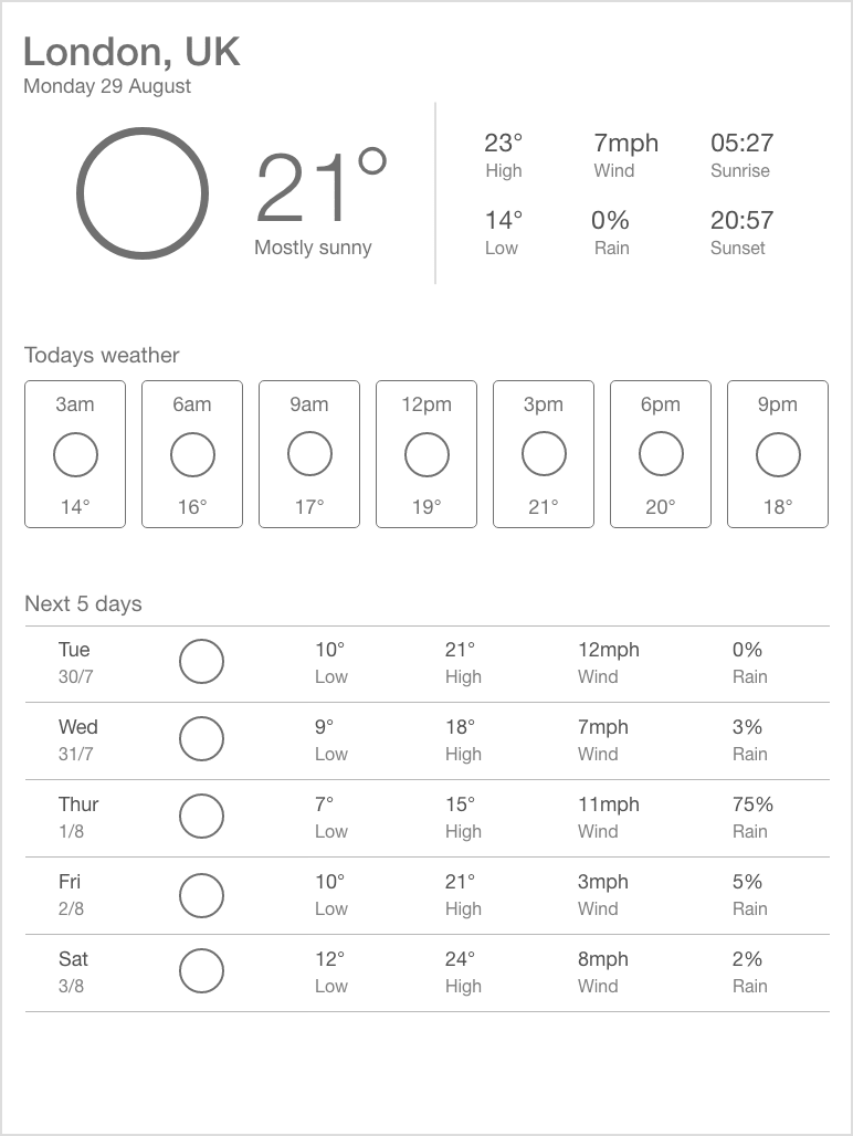
The first section on the webpage we'll tackle is the "Location And Date" section. In the HTML, swap the existing <div> with the class location-and-date with the following:
<div class="location-and-date">
  <h1 class="location-and-date__location">London, UK</h1>
  <div>Sunday 4th August</div>
</div>
Then in the CSS, swap the location-and-date class style with the following:
.location-and-date {
  width: 100%;
}

.location-and-date__location {
  margin: 0;
  font-size: 2em;
  font-weight: 600;
}
To give our webpage some semantic meaning, we've used a level 1 heading for the location text and styled the text to the size and weight we require.
The CSS class names used follow a Block, Element, Modifier (BEM) naming approach to help isolate styles and make the CSS more maintainable.
You can read more about BEM on the Smashing website article BEM For Beginners: Why You Need BEM.
Current Temperature Section
The current temperature section consists of a large weather icon, the temperature and a short summary (e.g. "Mostly Cloudy"). Let's change the HTML to add these elements and then via CSS we'll style them.
In index.html replace the <div> with the class current-temperature with the following:
<div class="current-temperature">
  <div class="current-temperature__icon-container">
    <img src="icons/mostly-sunny.svg" class="current-temperature__icon" alt="">
  </div>
  <div class="current-temperature__content-container">
    <div class="current-temperature__value">21°</div>
    <div class="current-temperature__summary">Mostly Sunny</div>
  </div>
</div>
As the image is a visual representation of the short summary text, we don't need this to be announced separately by a screen reader. We can safely add an alt attribute with an empty string so screens reader won't announce anything for this image.
Next replace the existing current-temperature class and add the other new classes to site.css:
.current-temperature {
  display: flex;
  margin-top: 0.25em;
  width: 100%;
}

.current-temperature__icon-container {
  flex-grow: 1.25;
  text-align: center;
}

.current-temperature__content-container {
  flex-grow: 1;
  text-align: center;
}

.current-temperature__icon {
  width: 10.5em;
}

.current-temperature__value {
  font-size: 5.25em;
  font-weight: 300;
}

.current-temperature__summary {
  margin-top: -0.5em;
  margin-left: -0.6em;
  font-size: 1.125em;
}
The <div> with the class current-temperature is now acting as a flexbox child of the <main> element as well as a flexbox parent for the <div> elements with the classes current-temperature__icon-container and current-temperature__content-container.
The 2 child container <divs> have a flex-grow attribute which controls how much space they will take up as the available width increases. The current-temperature__icon-container has a grow factor of 1.25 so will take up slightly more width than the current-temperature__content-container which has a grow factor of 1.
Some custom margins have been added to the temperature summary text to pull the text up closer to the temperature value text and to help align the text horizontally.
Screenshot On A Mobile Phone

Well done! You've made some great progress. Come back soon for part 2 where we'll develop the rest of sections of the webpage including the "Next 5 days" section which will involve some much more advanced responsive techniques.
The code for this article is available on GitHub:
https://github.com/JonUK/responsive-web-weather-app


Top comments (0)