
Originally published in 2019 as DevOps Intelligence in the Jupyter Blog.
DevOps Intelligence turns data from software development and delivery processes into actionable insight, just like BI does for the business side. Jupyter is the ideal instrument for that, with its combination of powerful coding environments and a user interface facilitating experimentation with ultra-short feedback cycles.
A Jupyter-based setup supports risk analysis and decision making within development and operations processes – typical business intelligence / data science procedures can be applied to the ‘business of making and running software’. The idea is to create feedback loops, and facilitate human decision making by automatically providing reliable input in form of up-to-date facts. After all development is our business — so let's have KPIs for developing, releasing, and operating software.
Typical Use-Cases
Here are some obvious application areas where data analysis can be helpful on the technical side.
- Migration processes of all kinds (current state, progress tracking, achievement of objectives)
- Inventory reporting for increased transparency and support of operational decisions
- Automate internal reporting processes to free up scarce assets and human expertise
Platform Architecture
A simple JupyterHub setup can enable you to do analysis on your already available but under-used and hardly understood data, without any great investment of effort or capital. By adding a single JupyterHub host, you can use the built-in Python3 kernel to access existing internal data sources.
The following diagram shows what role JupyterHub can play in an existing environment.

To make such a deployment easy, the 1and1/debianized-jupyterhub project provides a JupyterHub service including a fully equipped Python3 kernel as a single Debian package – only Python3, NodeJS, and Chromium packages must be installed in addition to the jupyterhub one. If you raised an eyebrow on Chromium being in that list, it's used by JavaScript-based visualization frameworks to render PNG images.
Including a NginX-powered SSL off-loader, the complete setup can be done in under an hour.
Use-Case: Migration Reporting
At the time of this writing (early 2019), a widespread challenge is migration from Oracle Java to other vendors, and also to start migration from Java 8 to newer versions (Java 11). If you do that at scale across many machines and teams, you definitely need some kind of governance, and constant feedback on the current status and the rate of progress.
What follows is an excerpt from a productive notebook, with anonymized data about AdoptOpenJDK deployments. That data was originally retrieved from a system called “Patch Management Reporting”, which collects information about installed packages for all hosts in the data center. We're in the yellow “Data Sources” box of the above figure here.
First off, we read the data and show the value sets of categorical columns, plus a sample.
import numpy as np
import pandas as pd

raw_data = pd.read_csv("../_data/cmdb-aoj.csv", sep=',')
print('♯ of Records: {}\n'.format(len(raw_data)))

for name in raw_data.columns[1:]:
    if not name.startswith('Last '):
        print(name, '=', list(sorted(set(raw_data[name].fillna('')))))

print(); print(raw_data.head(3).transpose())
♯ of Records: 104

Distribution = ['Debian 8.10', 'Debian 8.11', 'Debian 8.6', 'Debian 8.9',
                'Debian 9.6', 'Debian 9.7', 'Debian 9.8']
Architecture = ['amd64']
Environment = ['--', 'DEV', 'LIVE', 'QA']
Team = ['Team Blue', 'Team Green', 'Team Red', 'Team Yellow']
Installed version = ['11.0.2.9-83(amd64)', '11.0.2.9-85(amd64)', '8.202.b08-66(amd64)',
                     '8.202.b08-83(amd64)', '8.202.b08-85(amd64)']

                                    0                   1                   2
CMDB_Id                     108380195           298205230           220678839
Distribution              Debian 8.11          Debian 9.6         Debian 8.11
Architecture                    amd64               amd64               amd64
Environment                       DEV                  --                 DEV
Team                         Team Red            Team Red            Team Red
Last seen            2019-03-18 06:42    2019-03-18 06:42    2019-03-18 06:42
Last modified        2019-03-18 06:42    2019-03-18 06:42    2019-03-18 06:42
Installed version  11.0.2.9-83(amd64)  11.0.2.9-83(amd64)  11.0.2.9-83(amd64)
Next comes the usual data cleanup. The Distribution column is a bit diverse, and not everyone has Debian codenames and associated major versions memorized. The map_distro function fixes that.
def map_distro(name):
    """Helper to create canonical OS names."""
    return (name.split('.', 1)[0]
        .replace('Debian 7', 'wheezy')
        .replace('Debian 8', 'jessie')
        .replace('Debian 9', 'stretch')
        .replace('Debian 10', 'buster')
        .replace('squeeze', 'Squeeze [6]')
        .replace('wheezy', 'Wheezy [7]')
        .replace('jessie', 'Jessie [8]')
        .replace('stretch', 'Stretch [9]')
        .replace('buster', 'Buster [10]')
    )
Together with other cleanup steps, the mapper function is applied in a dfply pipeline. The result can be controlled by showing a sample of data points with unique version numbers.
from dfply import *

cleaned = (raw_data
    >> mutate(Version=X['Installed version'].str.split('[()]', 1, expand=True)[0])
    >> mutate(Environment=X.Environment
              .fillna('--').str.replace('--', 'N/A').str.upper())
    >> mutate(Distribution=X.Distribution.apply(map_distro))
    >> drop(X.CMDB_Id, X['Last seen'], X['Last modified'], X['Installed version'])
)

print((cleaned >> distinct(X.Version)).transpose())
                       0            13            14            62  \
Distribution   Jessie [8]  Stretch [9]    Jessie [8]   Stretch [9]
Architecture        amd64        amd64         amd64         amd64
Environment           DEV          N/A           DEV           DEV
Team             Team Red    Team Blue      Team Red     Team Blue
Version       11.0.2.9-83  11.0.2.9-85  8.202.b08-83  8.202.b08-85

                        68
Distribution    Jessie [8]
Architecture         amd64
Environment            DEV
Team             Team Blue
Version       8.202.b08-66
Time to present the cleaned up data, starting with a table of teams and their number of installed packages. In the production notebook, an API of the corporate identity management is used to enrich the table with contact data of the team leads. Having the organizational data available also makes it possible to filter or aggregate the data by business units.
counts = cleaned.groupby(['Team']).size()
print(counts.reset_index(name='Count'))
          Team  Count
0    Team Blue     42
1   Team Green     16
2     Team Red     45
3  Team Yellow      1
To create a heatmap of how diverse a team's version spectrum is, we calculate percentages of versions per team.
percentage = cleaned.groupby(['Team', 'Version']).size().reset_index(name='Count')
percentage = percentage.assign(Percent=
    percentage.apply(lambda x: 100.0 * x[-1] / counts[x[0]], axis=1))
print(percentage.head(3))
        Team       Version  Count    Percent
0  Team Blue   11.0.2.9-85      1   2.380952
1  Team Blue  8.202.b08-66      1   2.380952
2  Team Blue  8.202.b08-85     40  95.238095
HoloViews makes creating the heatmap including a label overlay a breeze.
import holoviews as hv
hv.extension('bokeh')
publish = 1  # publishing or interactive mode?

heatmap = hv.HeatMap(percentage[['Version', 'Team', 'Percent', 'Count']]).opts(
    hv.opts.HeatMap(
        title='Version Distribution by Team',
        width=480, xrotation=25,
        zlim=(0, 100), cmap='kbc_r', clipping_colors=dict(NaN='#ffffe0'),
        colorbar=True, tools=['hover'], toolbar=None if publish else 'right',
    )
).sort()

label_dimension = hv.Dimension('Percent', value_format=lambda x: '%.1f' % x)
labels = hv.Labels(heatmap, vdims=label_dimension).opts(
    hv.opts.Labels(
        text_color='Percent',
        text_font_size='10pt',
        text_font_style='bold',
    )
)

chart = heatmap * labels

if publish:
    import time
    import phantomjs_bin
    from IPython.display import HTML, clear_output

    %env BOKEH_PHANTOMJS_PATH={phantomjs_bin.executable_path}
    chart_img = 'img/devops/aoj-heatmap.png'
    hv.save(chart, chart_img)
    chart = HTML('<img src="{}?{}"></img>'.format(chart_img, time.time()))
    clear_output()

chart
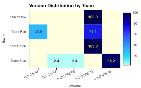
From the heatmap, you can easily glance whether a team uses predominantly one version, and how recent the used versions are.
Conclusion
Using a platform powered by Project Jupyter and a big chunk of the scientific Python stack lets you easily mold your data into the shape you need, and then choose from a wide range of visualization options to bring your message across.
👍 Image credits: Devops-toolchain

Latest comments (0)