
If you follow new developments in CSS, you've likely heard of the impending arrival of container queries. We’re going to look at the basics here, but if you’d like another look, check out Una’s "Next Gen CSS: @container” article. After we have a poke at the basics ourselves, we’re going to build something super fun with them: a fresh take on the classic CSS meme featuring Peter Griffin fussing with window blinds. ;)
So, what is a container query? It's… exactly that. Much like we have media queries for querying things such as the viewport size, a container query allows us to query the size of a container. Based on that, we can then apply different styles to the children of said container.
What does it look like? Well, the exact standards are being worked out. Currently, though, it’s something like this:
.container {
  contain: layout size;
  /* Or... */
  contain: layout inline-size;
}

@container (min-width: 768px) {
  .child { background: hotpink; }
}
The layout keyword turns on layout-containment for an element. inline-size allows users to be more specific about containment. This currently means we can only query the container’s width. With size, we are able to query the container’s height.
Again, we things could still change. At the time of writing, the only way to use container queries (without a polyfill) is behind a flag in Chrome Canary (chrome://flags). I would definitely recommend having a quick read through the drafts over on csswg.org.
The easiest way to start playing would be to whip up a quick demo that sports a resizable container element.
Try changing the contain values (in Chrome Canary) and see how the demo responds. This demo uses contain: layout size which doesn’t restrict the axis. When both the height and width of the container meet certain thresholds, the shirt sizing adjusts.
@container (min-width: 400px) and (min-height: 400px) {
  .t-shirt__container {
    --size: "L";
    --scale: 2;
  }
}
That’s what you need to know to about container queries for now. It's really just a few new lines of CSS.
The only thing is: most demos for container queries I’ve seen so far use a pretty standard "card" example to demonstrate the concept. Don't get me wrong, because cards are a great use case for container queries. A card component is practically the poster child of container queries. Consider a generic card design and how it could get affected when used in different layouts. This is a common problem. Many of us have worked on projects where we wind up making various card variations, all catering to the different layouts that use them.
But cards don't inspire much to start playing with container queries. I want to see them pushed to greater limits to do interesting things. I've played with them a little in that t-shirt sizing demo. And I was going to wait until there was better browser support until I started digging in further (I'm a Brave user currently). But then Bramus shared there was a container query polyfill!
 Jhey 🐻🛠@jh3yy
 Shout out to @bramus for sharing the Container Queries polyfill by @jon_neal the other day 👏
This prompted me to get "hacking"! 😅
twitter.com/bramusblog/sta…22:22 PM - 30 Apr 2021Bram.us @bramusblogA first look at CQFill, a Polyfill for CSS Container Queries (by @jon_neal) 🔗 https://t.co/koWPzUccMk 🏷 #ContainerQueries #css #polyfill https://t.co/jVxGdSMuzO


And this got me thinking about ways to “hack” container queries.
⚠️ Spoiler alert : My hack didn’t work. It did momentarily, or at least I thought it did. But, this was actually a blessing because it prompted more conversation around container queries.
What was my idea? I wanted to create something sort of like the "Checkbox Hack" but for container queries.
<div class="container">
  <div class="container__resizer"></div>
  <div class="container__fixed-content"></div>
</div>
The idea is that you could have a container with a resizable element inside it, and then another element that gets fixed positioning outside of the container. Resizing containers could trigger container queries and restyle the fixed elements.
.container {
  contain: layout size;
}

.container__resize {
  resize: vertical;
  overflow: hidden;
  width: 200px;
  min-height: 100px;
  max-height: 500px;
}

.container__fixed-content {
  position: fixed;
  left: 200%;
  top: 0;
  background: red;
}

@container(min-height: 300px) {
  .container__fixed-content {
    background: blue;
  }
}
Try resizing the red box in this demo. It will change the color of the purple box.
Can we debunk a classic CSS meme with container queries?
Seeing this work excited me a bunch. Finally, an opportunity to create a version of the Peter Griffin CSS meme with CSS and debunk it!
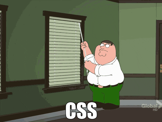
You’ve probably seen the meme. It’s a knock on the Cascade and how difficult it is to manage it. I created the demo using cqfill@0.5.0… with my own little touches, of course. 😅
Moving the cord handle, resizes an element which in turn affects the container size. Different container breakpoints would update a CSS variable, --open, from 0 to 1, where 1 is equal to an “open” and 0 is equal to a “closed” state.
@container (min-height: 54px) {
  .blinds__blinds {
    --open: 0.1;
  }
}
@media --css-container and (min-height: 54px) {
  .blinds__blinds {
    --open: 0.1;
  }
}
@container (min-height: 58px) {
  .blinds__blinds {
    --open: 0.2;
  }
}
@media --css-container and (min-height: 58px) {
  .blinds__blinds {
    --open: 0.2;
  }
}
@container (min-height: 62px) {
  .blinds__blinds {
    --open: 0.3;
  }
}
@media --css-container and (min-height: 62px) {
  .blinds__blinds {
    --open: 0.3;
  }
}
But…. as I mentioned, this hack isn’t possible.

What’s great here is that it prompted conversation around how container queries work. It also highlighted a bug with the container query polyfill which is now fixed. I would love to see this “hack” work though.
Miriam Suzanne has been creating some fantastic content around container queries. The capabilities have been changing a bunch. That's the risk of living on the bleeding edge. One of her latest articles sums up the current status.
 Jonathan Neal@jon_neal@jh3yy @MiriSuzanne @CodePen I’ll get this fixed soon. Following the spec is CRITICAL.
BTW, I’m kinda worried about how many videos & demos already rely on the "export" behavior. The yet-published code on main drops this requirement, so `import '/path/to/cqfill.js'` will be all that is needed.03:12 AM - 02 May 2021
Although my original demo/hack didn't work, we can still kinda use a "resize" hack to create those blinds. Again, we can query height if we use contain: layout size. Side note: it’s interesting how we’re currently unable to use contain to query a container’s height based on resizing its child elements.
Anyway. Consider this demo:
The arrow rotates as the container is resized. The trick here is to use a container query to update a scoped CSS custom property.
.container {
  contain: layout size;
}

.arrow {
  transform: rotate(var(--rotate, 0deg));
}

@container(min-height: 200px) {
  .arrow {
    --rotate: 90deg;
  }
}
We've kinda got a container query trick here then. The drawback with not being able to use the first hack concept is that we can't go completely 3D. Overflow hidden will stop that. We also need the cord to go beneath the window which means the windowsill would get in the way.
But, we can almost get there.
This demo uses a preprocessor to generate the container query steps. At each step, a scoped custom property gets updated. This reveals Peter and opens the blinds.
The trick here is to scale up the container to make the resize handle bigger. Then I scale down the content to fit back where it's meant to.
This fun demo “debunking the meme” isn’t 100% there yet, but, we’re getting closer. Container queries are an exciting prospect. And it’ll be interesting to see how they change as browser support evolves. It’ll also be exciting to see how people push the limits with them or use them in different ways.
Who knows? The “resize hack” might fit in nicely alongside the infamous “checkbox hack” one day.
Stay Awesome! ʕ •ᴥ•ʔ

Top comments (3)
Nice hack, just that BEM thing
container__fixed-content, no thanks ;)Wow!! Very amazing article and concept!!
Thanks – Glad you enjoyed it! \ʕ •ᴥ•ʔ/