
A well-designed website is a must-have for your business these days. Whenever a visitor comes to your website, the website design will make or break your business immediately. Looking at your website for the first time, your audience will judge the company. CSS Grid Layout is used in a modern website for a better user experience with a great impact on your business. Design elements are everywhere, and they move in different ways.
But as responsive web designs increase, grids remind us of their importance and usage in modern websites. Is Grid Layout relevant yet in website design? There are several projects designed off a grid. Why do the designers feel that grids in graphic design are not necessary? Are there any fundamental changes in the process? Let's delve into further details.
What are Grids?
If you are acquainted with graphic design, you must know that grids are an old concept. The concept of a Grid system in graphic design is the system of adding horizontal and vertical lines to ease readability. Web designers have the potential to transform businesses with the help of Grid. In past years, the traditional 12-column layout has been commonly used for every site. Only a few CSS lines can help you achieve layouts.
With the CSS feature Grid, it is easy to create a two-dimensional layout. When you can define columns and rows, you can change them into a layout without rows and columns. Apart from other benefits you can derive from using a CSS grid layout, we have a better one. Following the same HTML structure, it is easy to create two different layouts. You won't have to incorporate unnecessary HTML, additional CSS solutions, or positioned elements.
Types of Grids in Web Design
At the beginning of website design, the print design grids were transformed into web designing, and a few types of grids are commonly used in several visual layouts. These are the Column grid, Modular Grid, Masonry grid, Baseline grid, Manuscript grid, Pixel grid, and Hierarchical Grid.
Column grid:
Column grids are referred to as vertical sections to divide pages for alignment. The traditional and popular Grid is the 12-column Grid subdivided into 12, 6, 4, 3, 2 or evenly spaced 1-column sections.

Image Credit: Eleken
Modular grid:
A modular grid is created with vertical and horizontal columns to do modules for elements. When you are looking forward to sorting card elements on a webpage, modular grids are commonly used.
Manuscript grid:
A manuscript grid is also known as a Reading grid. It is more like a text column on a blog. At times, you will find equal margins on the left and right.
Masonry grid:
A Masonry grid is more like an extended modular grid where you can use elements of different sizes and shapes. For example, if you have a card capturing the size of two rows or columns, it will fit into the Grid.
Hierarchical grid:
A hierarchical grid is more common to designers as it refers to the irregular Grid creating a hierarchy of elements. If you ask about the future of grid layout, a Hierarchical grid can be the only answer to the question.
Baseline grid:
A Baseline grid includes Horizontal lines where you have columns with aligned text. This will bring you the feeling that you are writing on ruled paper.
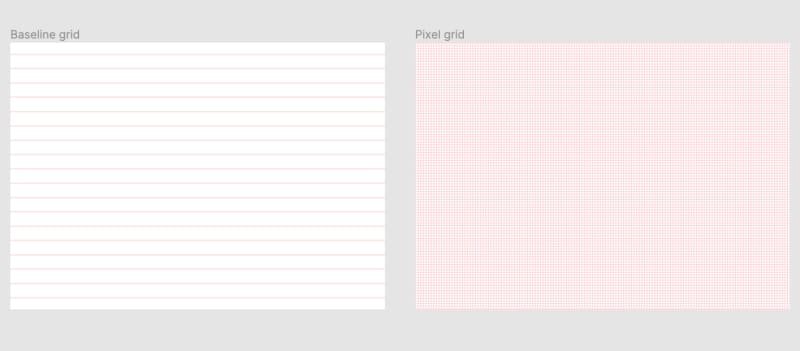
Image Credit: Eleken
Pixel grid:
You must have seen the tiny square grids if you have ever noticed the icon designs. Each of the tiny grids measures one pixel.
Why is Traditional Grid Layout Losing its Popularity?
There are some major reasons why traditional grid layout is losing its popularity.
Designers are not finding Grid Layout a better option for a page layout when compared with responsive designs to create layouts matching several screen sizes.
With the all-new CSS features, it is easier to create complex layouts other than using the older grid system.
Professionals find that using grid systems has curbed their creativity, as they are restrictive.
Are Grids Dead or Evolving? How?
So, the next question arises: Is Grid layout dead in website design? No, it is not. But the entire grid system is evolving with time. Since the latest CSS features and responsive design keep changing their way in web design, the grid layouts will have to adapt for relevance.
Because of Responsiveness, website sizes, and aspect ratios, grids must shrink or expand depending on the viewport, the size of the device, and the content itself.
You may not find a visual grid layout, but some typical grids are used in website design. For instance, modular and masonry grids are everywhere, from your photo gallery to your website. The baseline grid works well for multi-column text elements, while the Pixel grids are tiny that a web designer can get caught up in.
Now comes hierarchical grids, a dominant element in website design. The interesting part is that you may have to check the whole page at a time to see hierarchical grids. You can expect to set up a hierarchical grid in freestyle as well as a modular grid.
Most of the Websites are Not Using Grids - Is it a Myth?
You cannot see the grids all over the websites, which is why you think the Grid layout is dead. However, the reality is different. In most websites, grids are used in the repeated style.
Image Credit: Design Shack
The process includes a hero area looking like a column. It is followed by two columns, a screen with three columns, with another one-column area. The combination seems too complicated, but they belong to the same Grid.
If it is observed from a hierarchical perspective, the designer creates rows, blocks, and content columns suitable for all screen sizes. In spite of being a part of a grid, on small screens, multi-column elements are divided into single columns. A website with grids is normal even if there is no visual grid with some hierarchy elements and alignment.
If you want to design with no grid at all, some grids will always be there. Finding similarities and groupings for the visual organization is natural to the human eyes. In case you decide to work against the perception of the Grid, the outcome will be a disorganized website. Nobody wants a poorly designed site that keeps the users away. So, working with grids will help you create visual harmony.
Final Words
Grid systems offer constraints for the visual organization as well as the layout. Thus, it reduces a designer's options but has several possibilities. Grids, as a design element, play an important role in organizing layouts and presentation of websites that give meaning to your brand design. Even a simple modular grid can have thousands of layout options. Therefore, the Grid layout is not dead in website design; it is evolving with time. If you are hiring a well-known web design company, make sure that you narrate all your needs to the professionals and coordinate with them accordingly.

Top comments (0)