
If you were like me, you'd have experienced the frustration when using password inputs with an eye indicating whether your password would be displayed or hidden. I find such inputs annoying because the messages the variations of the eye attempt to convey are confusing.
Table of Contents
- The UX Problem of Password Inputs
- A Better Design
- (Perhaps) The Best Design
- Is No Option a Better Option?
- Takeaways
The UX Problem of Password Inputs
To illustrate the problem, imagine you're about to input your passwords to the following two sign-in forms with another person standing beside watching (so you don't want your passwords displayed).
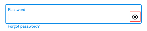
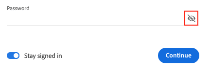
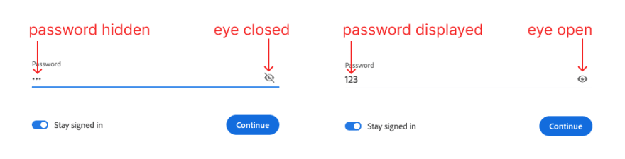
The eye is open in Twitter input while it is closed in Adobe input, but it turns out that both of them indicate your passwords would be hidden!

We can find the inconsistency in many other web services too.

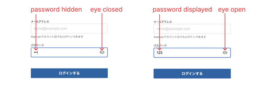
Are you not confused? At least I am and I think the designers who made those UIs were too. The problem is the MEANING of the variations of the element is not agreed nor established. An opened eye, for example, can mean the password is visible or the password can be displayed, depending on how you interpret it.
But how do users know which message the UI is trying to deliver? The answer is we don't. So we have to stop for a second, try to figure out ourselves and probably just take a guess that is wrong 50% of the time.
A Better Design
The sign-in form of Netflix delivers better user experience by replacing the confusing eye with explicit text which is more straightforward.

For non-native English speaker users, however, there still can be a caveat: SHOW might be mistakingly interpreted as being displayed while HIDE as being hidden.
(Perhaps) The Best Design
Google made the user flow of its sign-in experience a smooth one by using something too mundane for some designers to give a sh*t: a checkbox.

There are at least 4 advantages of this design over the others introduced above:
- Users are more familiar with checkboxes than the eye element and thus are likely to feel more comfortable using a checkbox.
- The message the element convey is so self-explanatory and unambiguous that it's almost impossible to interpret otherwise.
- The checked/unchecked status and the checking/unchecking action of the checkbox convey both what status (hidden or displayed) the password is in AND what action (hide or display the password) users can perform in one message. This reduces the mental efforts required on users even further.
- Developers would be happier as handling a checkbox with two states is easier than keeping two eye svgs and conditionally rendering one based on the displayed/hidden state.
Is No Option a Better Option?
You may have noticed that many services, like Github and AWS shown below, opted out of the option to show the password.
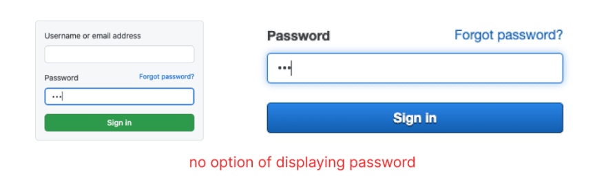
It's hard to say if no option is a better option but personally, I think allowing users reasonable options generally contributes to better user experience.
Takeaways
The sign-in form design by Google is a good example of simple and basic design delivering excellent user experience. Am I suggesting we give up all the fancy design? Certainly not. The key to creating good UIs is to empathize with your users. And it usually only takes a casual user test to see what contributes to good user experience. If you happen to find out a fancy-looking design makes your users the happiest, then let it be.
But the little eye beside your password is obviously a big no-no. Get rid of it and find an alternative.

Top comments (0)