
One of the least exhilarating but common development tasks are building forms, and form validations. While important, they're often over-designed and easy to over-engineer as a result.
I believe we've gone too far with trying to accomodate all kinds of form validation while building reusable input fields –– especially for component libraries and design systems.
The Browser Already Handles It
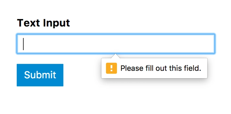
checkValidity() on ElementInternals or form.validate() methods.The most basic validation happens on submit, when the user hits a "submit" button associated with a form element.
It's not styled nicely. It doesn't look or feel consistent across browsers, but IT JUST WORKS.
Form input elements have built-in validation attributes for min, max,step, minlength, maxlength values, and regex matching on the pattern attribute for things like phone number format masking.
If you stick to validating on submit, could very well validate a form without using Javascript! 1
The drawback: errors that show up from failed submission attempts won't disappear til the user retries submitting the form.
All the ways to validate
Each type requires invoking validation on the form field at different moments of the user journey.
- Validation as the user interacts with a field (
oninput,onchange,onkeypress). Also called "live validation".
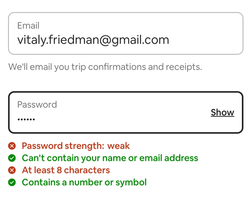
Validation that runs when the user pauses, or has finished typing in a field (onkeyup with debounce) is less common besides finding them on username and password fields. I don't think it's necessary to including such behaviour on regular input fields in component libraries.
Validation that runs on submission (
onsubmit) - and should prevent any erroneous data being posted if there are errors in any form field.-
Validation that shows on fields after form submission due to responses from the server
One would expect that post-submission, server-side errors are reflected on the form, under corresponding fields that had incorrect content.
-
Validation that runs right after the user has interacted with the field (
onblur) - otherwise called "late validation"Unpopular opinion: I recommend sticking to this when there is a need to build ultra-fast. You will dig your own grave otherwise.
Agreeing to implement live validation, if not scoped carefully, will result in hellfire from all directions since:
validation can run prematurely and aggressively, especially on fields that are required but incomplete.
you'll be playing whackamole to remove validation errors whenever they're corrected, which means detecting change
oninputoronkeypressand removing the error message when the field is valid again, particularly on fields that are dependent on each other.you end up tempted to add more feedback mechanisms like toasts to prove the form submitted
Treacherous Variants
Let's look at some well-intentioned UX patterns that explode the combinatories of visual and accessiblity testing since form layouts are so varied.
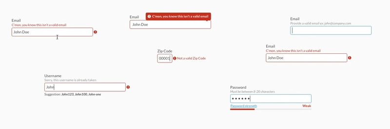
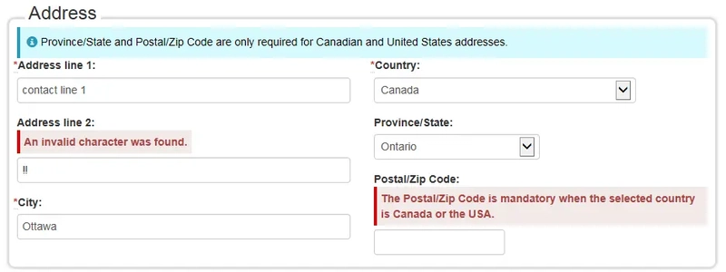
- The option to show validation messages above, below, or adjacent to a form field
Showing validation errors inside a tooltip or popover
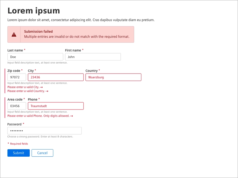
Showing multiple validation messages above, below, adjacent to any form field 😱
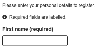
The heavily debated best practice of indicating required inputs with an asterisk, OR appending "(required)" to the field label, OR only showing "(optional)" next to optional field labels.
Showing a summary of form errors at the top or bottom of the form on-submission
W3C, "Easy Checks - A First Review of Web Accessibility", 2023
"Form Validation", Siemens UI Design and Patterns, User Experience Toolkit
To Make a River Flow Backwards
Developers easily do more absurd work to make validation possible.
2 examples of how garden-variety form fields grow more complex than they should be:
Live validation, all the time.
Until a year ago, developers had to deliberately prevent live validation from running on page load if it was a requirement.
When the form is first rendered, the fields are empty, and immediate check on validation by browser APIs will show the :invalid styles on the fields with the required attribute set.
We'd have to tell the form not to display invalid styles, especially those with the required attribute set while validating empty fields on initial page load. Alternately, we might opt to prevent live validation from happening until the user interacts with a field after initial page load.
Luckily, the :user-valid and :user-invalid pseudo-class CSS selectors just reached baseline status in 2023, so we can style the form fields based on user interaction instead of :invalid, which reflects field element's validity.
Showing multiple messages above and below a form field
We'll just conditionally render more icon-message molecules as they arise 😛
Displaying multiple inline validations on columned form layouts with multiple fields in a row causes layout shifts and misalignment when space the element occupies dynamically changes whenever the validation message appears.
Avoid all-in-one solutions
Can you imagine a text input component that on top of its usual props, includes a littany of optional props or attributes like validationMessagePosition, isContentVisible, showValidationInTooltip, validationTooltipPosition? Yuck. (I recall this AirBnB talk about how a button component festered in attempt to support all variants.)
If you're working on a design system, developer adoption of form elements will require clear working examples of how inputs will interact with form elements to show validation - especially if you're supporting multiple frameworks.
Before you build, clarify base cases that you're supporting with and spend time solutioning for how users can extend form elements.
It may look smart to build the all-knowing form element that will alternate between displaying the correct visual features for numeric, text, currency types in a single field, and conditionally render the right input... right?
IT'S A TRAP – even if many attributes between number and text inputs are similar.
Be Skeptical of New Wheels
Sometimes people think they're being clever by designing or building the world's most usable datepicker.
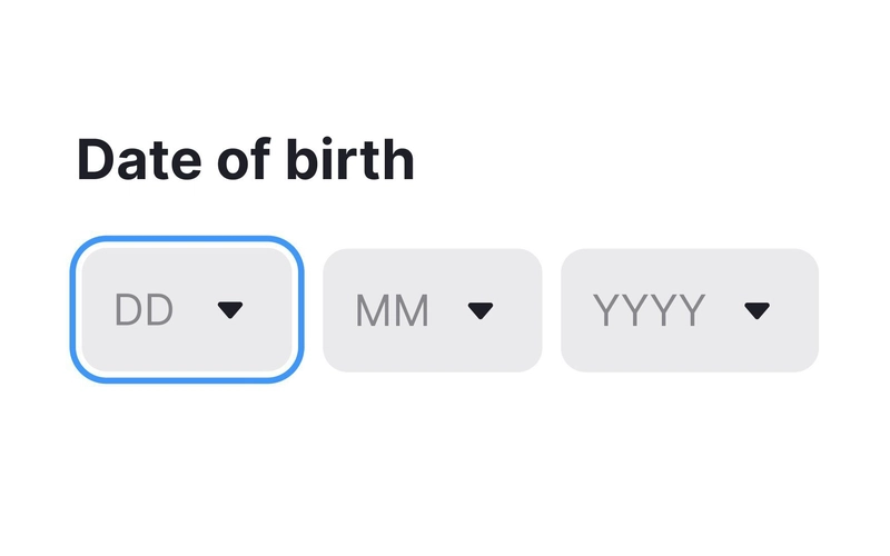
Any efforts to reinvent this pattern is signing yourself up for 4 times the work and even more errors.
There's a reason why <input type="date"/> exists.
The value it gathers is an ISO 8601 "YYYY-MM-DD" string but it comes with inherent APIs, valueAsNumber and valueAsDate that returns an easily transformable Unix epoch timestamp and Date object respectively to make date and time calculations easier.
Creating multi-input datepickers from scratch sets you up for exponential efforts with testing and maintenance as you'll have to account for differences in leap years, locale, daylight savings time, and more. You'll acheive more reliable input and validation with an HTML5 native date input.

Custom validation: the developer's dilemma
Careful separation between the presentational and functional responsibilities of different input fields, building mechanisms to accept validation rules, and offering users mental models of how to achieve custom validation with abstractions is vital to developer adoption of form elements.
The best kind of validation you're going to offer is the kind that you won't have to write.
Most developers who have to cram-build forms have a stack-based favorite for runtime validation. And most libraries do this with a config object or wrapping the native ConstraintValidation properties.
Angular's forms has the
dirtyandtouchedflags to indicate if a field has been interacted with. Inputs can extended byValidatorsto manage validation rules, whileFormControltracks the validation state of the field.For Vue or Nuxt, Formkit offers
validation-configprops for declaring validation type on the<form>and<input>level. It accepts an object of ids and errors which can be reactively updated to include any errors that are pertinent to the form state. The@formkit/zodplugin allows Zod to be used for runtime validation.React Hook Form uses
useFormanduseFieldhooks to manage form state and validation.
For cases that require showing multiple validations, publishing examples of how users can customize and extend existing components to achieve their goals while integrating with their stack's ecosystem would be a path of lesser resistance than ensuring every field packs in all possible validation scenarios.
Web components: The special snowflake
Implementing Form Associated Custom Elements (aka. form element web components) can be frustrating when there are no dominant patterns established on writing web components for reuse, particularly when there is a need to expose the ValidityState API to enable the display of multiple, conditional errors.
Look at how much vanilla code you'd have to write to make an input field that shows a custom error message when a required field isn't populated!
Make it harder for users to screw up
Data entry is a means to an end: collecting data allows teams to improve the product or enable users to acheive their goals.
The sooner and more validation errors you show, the more punishing it is for the user, the higher the abandonment rate. 2
Next time you're approached to build custom form fields with validation or interactions, consider where your work fits within the org. If you're working on a design system for a product that deals with time, it might be a worthy effort to reinvent a better datepicking experience. But if you're at another run-of-the-mill startup where your work should have been done yesterday, then using tried and true component libraries will save you teeth-gnashing and heartbreak.
-
Gerardo Rodriguez. "Progressively Enhanced Form Validation, Part 1: HTML and CSS", CloudFour. August 7, 2023
Marco Campos. "Form validation with (almost) no JS". 2023 ↩ -
Edward Scott. "Usability Testing of Inline Form Validation: 31% Don’t Have It, 4% Get It Wrong", Baymard Institute, Jan 9, 2024. ↩


Top comments (2)
I want to position this differently - the built-in validation doesn't look the same from one browser to another, but so what?
It looks the same to the same person when they navigate between websites, because the same person is unlikely to be skipping between Chrome and Firefox or whatever on a regular basis. Normal users will see something familiar, which is valuable in itself.
That's real user behaviour right there! I also make this argument about those who complain things are not responsive by resizing the browser... that is literally not how users experience problems with responsiveness XD