As more and more content is loaded dynamically via JavaScript, it has become more noticable and can disturb the user experience, even jarring the user's sense of location.
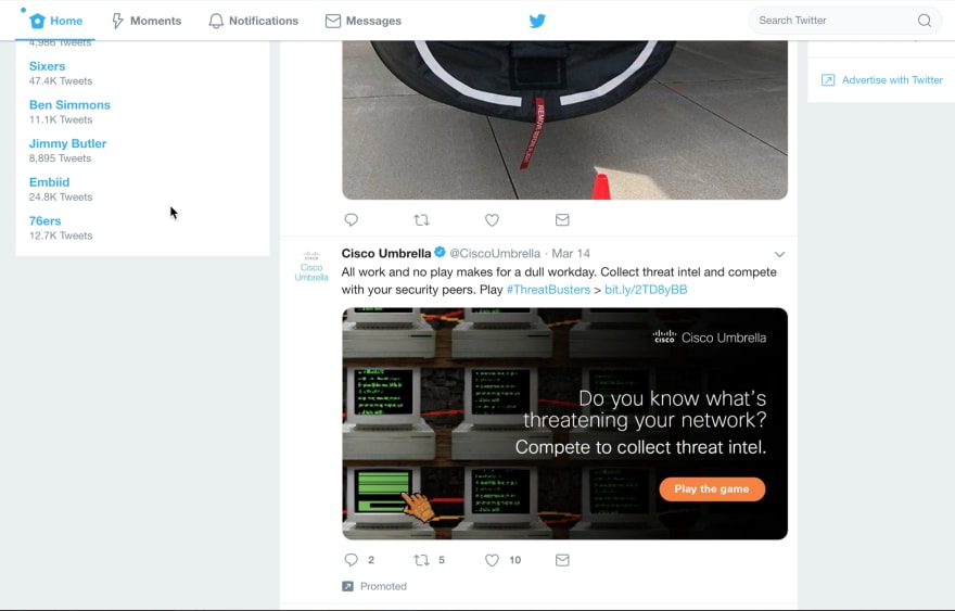
For example, I was browsing the Twitter timeline and clicked a link that took me away from the timeline. I might have had a lapse in brain activity, but I glimpsed something else on the timeline that got my interest as the browser loaded my first click. I quickly pressed the back button, apparently more invested in what I had seen than where I was going. Alas, the content was no longer there.
In the screenshot below, the ad is dynamically loaded and changed whenever the page is rendered.
So I looked a little closer and thought about the user experience I had just experienced. The back button on a browser means (or perhaps, used to mean) that I should be able to go back to where I was and presumably continue where I left off. But, this is a flawed expectation for several reasons. First, let's talk about time. Depending on how quickly I click back (now versus say an hour from now), there may be new content that is added to the timeline. The perils of dynamic content. This might shift the content or the position of where I am on the page, bringing the experience out of sync.
Another experience with the timeline is automatic pagination. This is where you can scroll down the page and new content is automatically appended, creating a never-ending list/stream of content. Great for those who are too lazy to click the next button and wait. However, the back button breaks this experience as well. If you're well on your way back into history (err, down the page of lots of pages of content), how does that page cope with reloading perhaps hundreds of items into the list and magically getting you back to exactly where you left off?
Oh, my brain hurts thinking about this. I think we've reached the moment the universe collapses into itself.
The last thing I am disturbed with is that we still haven't instilled in web developers the art of distraction. With 200mbp internet connections at work where they build and test web experiences, web developers think things load so fast that they don't need to build in transitions for slower connections. Transitions are like the spinning wheels that visually show that something is (hopefully) happening, such as the computer is thinking. This was in fact the case back in the day, but today, well, we have fast enough computers so we don't need to worry about that right?
Wrong. If you visit a location where internet access is spotty, you'll soon realize there's quite a population who doesn't have fast (or even a reliable) internet connection. And you don't have to leave your Silicon Valley bubble. Take a ride on a Caltrain bullet express train and try to use a mobile hotspot. The spotty coverage (surprising Palo Alto has such a problem) will make browsing even the simplest website a frustrating experience. We unfortunately don't have a solid connection to the internet in the United States and web developers should understand that fact.
Now, I'll admit I'm throwing a lot of blame on something I will admit I've been guilty of as well in the past. Time, effort, and other factors make these small UX issues a low priority for developers. But here are some things that can be done to mitigate the experience.
First, the spinning wheel. Wait for it. Yep, give the user a visual cue that the process is taking longer than expected, but that something is still being done.
Add a target="_blank" to links. This will open a new browser window or tab. It's easy for the user to close that tab and return right back to where they came from. No need to load any content or figure out where they are. This is like a zero reengineering effort that it is surprising this trick isn't used more often.
This last one is going to be tricky, but try to cache content. For example, add a HTTP header for the browser to keep the content longer. Or store it in local storage.
Avoid jarring the user with experiences that cause them to stop doing what they were doing. Maybe we'll have this solved in another two decades.


Top comments (0)