Some recent additions to CSS media queries include new ways to personalize a users experience based on their preferences. Because you are using CSS, whenever a user changes a preference on their machine, your page can update instant - if you add a touch of code. Seems cool, and accommodating, but it is far more than that.
Much of the web is designed to grab your attention, but some of that attention grabbing is harmful, or at least irritating. Utilizing these new media queries, developers can now accommodate situations where users prefer dark mode, high contrast, or reduced motion.
If you'd like to understand some reasons behind these new preferences I recommend Your Interactive Makes Me Sick by Eileen Webb. She explains:
“The issue usually isn’t the motion itself, or the existence of animation. The problem is a mismatch between my expectations for what I’m going to encounter on a webpage and what actually displays on that page”
I will focus on one of these new media queries, prefers-reduced-motion. With the prefers-reduced-motion media query, users can request to minimize the amount of non-essential motion the page uses.
Transitions
<body>
   <h1>Prefers Reduced Motion</h1>
</body>
h1{
   background: #202020;
   color: #ffffff;
   padding: 5vh 0;
   text-align: center;
   transition: 1s;
}
h1:hover {
   background: #008888;
}
@media (prefers-reduced-motion) {
   h1 {
       transition: none;
   }
}

In our first example, we have an example of disabling a simple hover transition based on user preference. That is simple enough.
Smooth Scrolling
We are all familiar with smooth scrolling, and it’s super common on single page sites where all the content is stacked for easy scrolling through content. Personally, I like the smooth scroll for orienting me on the page, but lots of people don’t, so let’s adjust our code for them too.
<h1 id="home">Prefers Reduced Motion</h1>
   <ul>
       <li><a href="#one">One</a></li>
       <li><a href="#two">Two</a></li>
       <li><a href="#three">Three</a></li>
   </ul>
   <div id="one">
       <a href="#home">Home</a>
       <a href="#two">Two</a>
       <a href="#three">Three</a>
   </div>
   <div id="two">
       <a href="#home">Home</a>
       <a href="#one">One</a>
       <a href="#three">Three</a>
   </div>
   <div id="three">
       <a href="#home">Home</a>
       <a href="#one">One</a>
       <a href="#two">Two</a>
   </div>
* {
 scroll-behavior: smooth;
}

a {
 color: #008888;
}

@media (prefers-reduced-motion) {
 * {
   scroll-behavior: auto;
 }
}
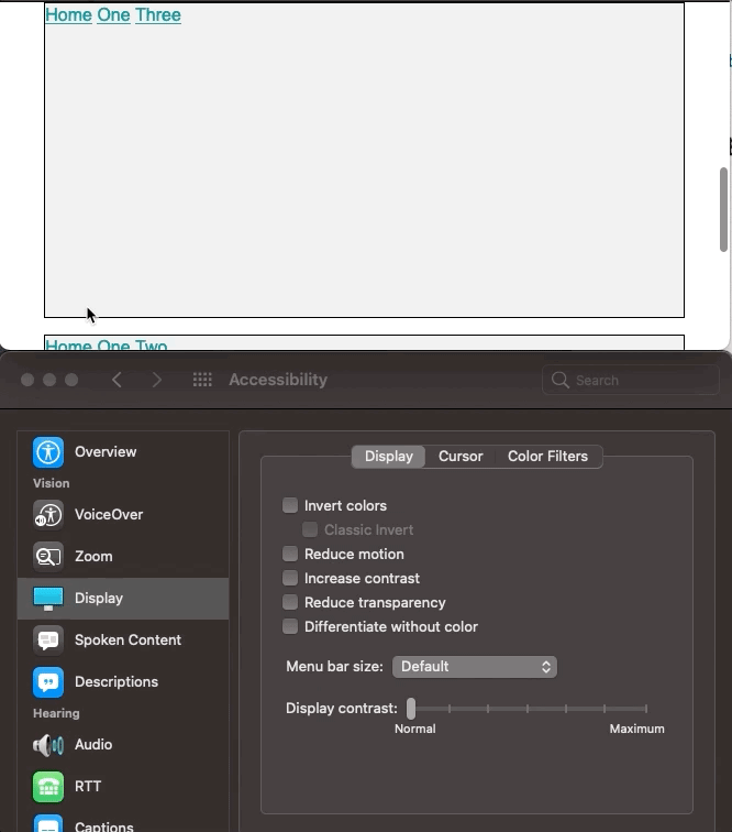
Here I prepared a demo page of different menu sections that we can jump between to examine the smooth scroll behavior vs auto behavior. We can see a larger difference for our user here.
Full Animation
In the last example, we will look at a full animation example where the colors of our background change infinitely. The colors and rate are intentionally annoying to drive the point home.
@keyframes example {
 0%   {background-color:#ff80ff}
 25%  {background-color:#ffff80}
 50%  {background-color:#ff8080}
 75%  {background-color:#80ffff}
 100% {background-color:#ff80ff}
}

div {
 height: 90vh;
 background-color:#ff00ff;
 border: 1px solid;
 margin: 5vh 5vw;
 animation-name: example;
 animation-duration: 4s;
 animation-iteration-count: infinite;
}

@media (prefers-reduced-motion) {
 div {
   animation: none;
 }
}

Once again, only a few lines and this potentially harmful animation can be ignored by users.
It’s that easy to account for those who wish for a reduced motion experience, a few lines and we can allow more users to enjoy our content. Prefers Reduced Motion has good browser support - every major browser except, you guessed it IE11.
If you'd like to know more about preference media queries, I suggest
The CSS Podcast's episode on "Preference Media"
If you would like to understand more about motion sensitivities, Val Head wrote a great article Designing With Reduced Motion For Motion Sensitivities for Smashing Magazine.

Top comments (0)