Every delicious spread of food with friends, co-workers, and family is always preceded by complicated meal planning. I want to build an app to crowdsource planning large multifamily meals. Get away from 50 phone calls, text messages, and pings to learn who is bringing which meal. There's an app for that now.
I’m a firm believer in always Starting with the End Goal in Mind. Follow along as I build out the wireframes, user stories, and share teachable moments. The follow up blog posts will focus on development.
Wireframe: Landing Page
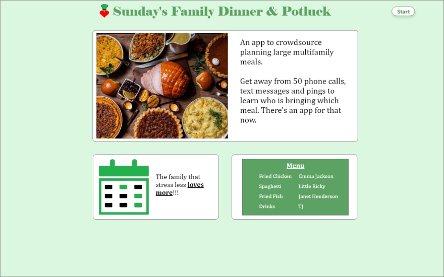
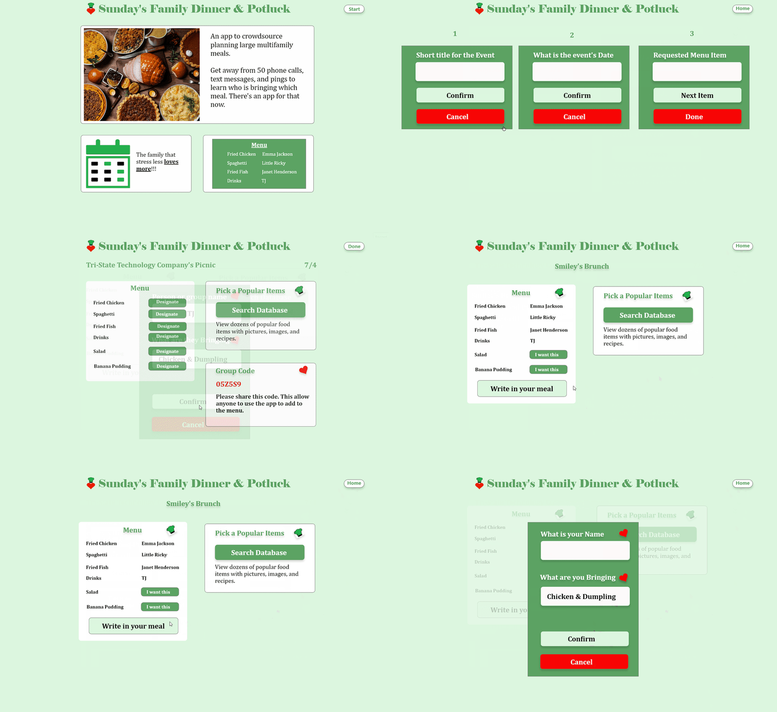
The user name is Grandma Irene and she lands on the landing page. She loves the calming colors and presses the "Start" button to begin planning a brunch for her family.
My Takeaway
I used Adobe XD to build the wireframes and basic UI concepts (like the importance of whitespace and hierarchy) to design the UI. Hands down, Adobe XD is one of the greatest free tools to wireframe projects and to practice UI design.
Teachable Moment
Keep the color palette simple. I researched Dribbble.com for examples of designs with colors I liked. Dribbble is an online community of digital designers for showcasing their artwork. I quickly made a stylesheet based on the green and white colors:
- Font family: Cambria
- Neutral light green: RGB 220 247 223
- Neutral white: RGB 253 253 253
- Primary Dark green: RGB 92 163 99
- Neutral bright red: RGB 249 6 6
Wireframe: Events page
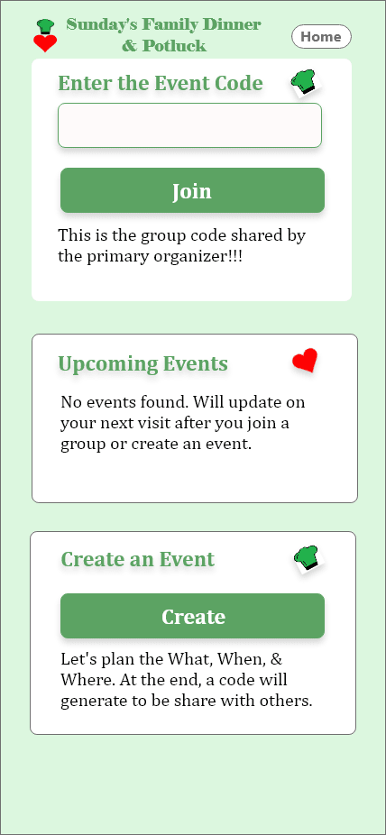
She sees the options to create an event, type in a code (for a previous created event), or to click on events if she is a prior user. She clicks the "Create Event" button.
Takeaway
As I write user stories, it's best to design both desktop and mobile versions of the wireframes.
Teachable Moment
After dozens of attempts on the first few wireframes, I've learned to keep the design as simple as possible. I asked myself, what are one to three benefits I need to highlight for someone to use this service.
Wireframe: Create Events
Designate who bring what food item
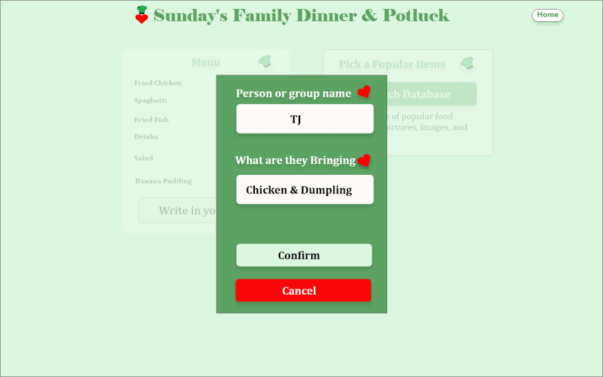
Grandma Irene completes each of three short planning wizards that saves the event's title & date, requested food items, and generates a shareable public group code.
Grandma Irene now has the option of designating who is bringing certain foods and can search a database of food items to add to the menu.
Takeaway
The wonderful thing about using a digital wireframe tool is that you can update it as you go. I have updated this wireframe over 100 times to reflect UI elements I didn't know I needed.
Teachable Moment
User stories help you determine the path of data, what data you need to collect, and how the UI should behave.
Wireframe: Planning
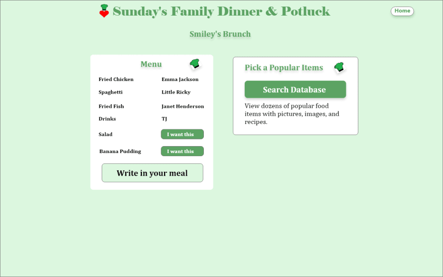
Grandma Irene shares the group code with Cousin Kyle. Cousin Kyle entered the code and is shown the planning page.
Cousin Kyle is shown options to choose previously requested food items by Grandma Irene, write in a food item, and search a database of items.
Takeaway
By this point I've developed several design patterns to reuse throughout the app. Examples are three styles of buttons, certain color patterns, and styled UI sections.
Teachable Moments
Strive for consistency in design. Similar to stop signs on the road for drivers, consistency guides the user in using the application correctly and quickly.
Wireframe: Search a database
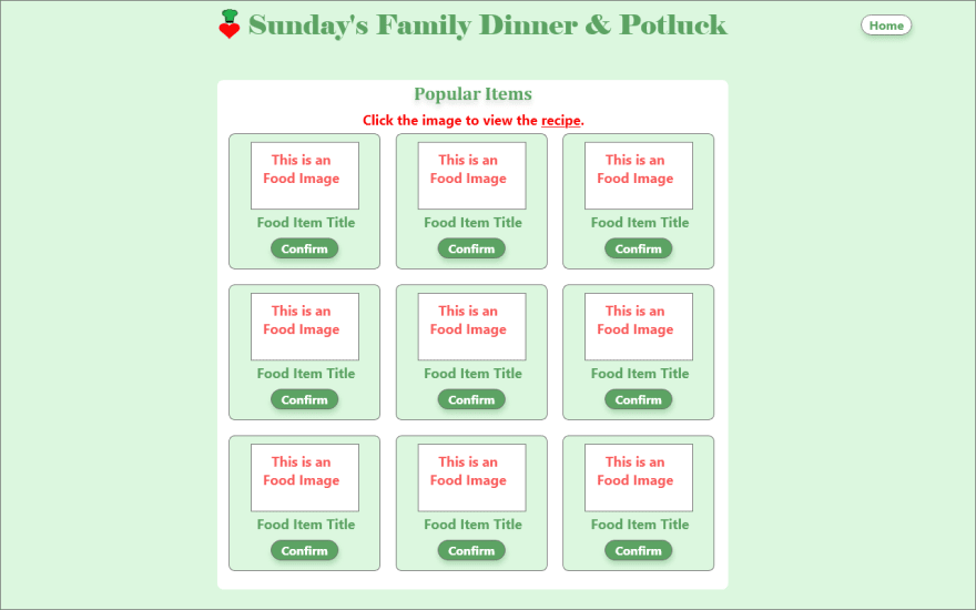
Cousin Kyle chooses to search a database of food items that show a picture, food tile, and show a recipe when clicked.
Demo of user walkthrough
Thank you for reading
As you notice, these are all wireframes. The next step is to develop the app step by step while learning along the way.
I want to give back to the community by "learning in public". If you have tips please leave notes in the comments or DM me on Twitter or LinkedIn.





Top comments (0)