
The IoT has incredible potential for changing the way we interact with the world around us. We all know that it’s a game-changer for home automation, sensor data acquisition/management, and industrial applications, but what about for the people using these systems?
When you think about it, the IoT is not just about building devices that communicate at a distance — it’s also about creating digital interfaces to the world around us. When built well, these interfaces can be used by anybody to interact remotely with objects that they may not be able to otherwise.
We hear a lot about the business and technical reasons why remote monitoring and management are helpful — maybe the devices are too far away, or in an extreme environment, or there are simply too many to keep track of any other way. But as it turns out, there are also all sorts of human reasons for remote access too!
Consider someone with low or no vision who wants to check their mailbox for mail, or find out how much time is left for a load of laundry, or see if their oven has reached a set temperature. While they more than likely have adaptive strategies for performing these tasks, those are usually very time-consuming and tedious. Imagine how much easier it would be if they could find out all of this information in just a matter of minutes using a web interface!
These situations are more common than you might realize. Nearly 1 in 5 people in the US experience some form of disability, and nearly everyone has experienced (or knows someone who has) temporary or situational impairments that make it hard to use our favorite “things” and digital interfaces. May you’ve experienced nausea or vertigo while recovering from a medical procedure, or needed to find answers fast during an emergency situation, or even just run out of power on your wireless mouse!
When we build accessible web interfaces we aren’t just tacking on specialized features for edge cases — we’re creating clean, intuitive experiences that we can all understand and use more easily with whatever devices, inputs, and skills are available to us!
A Dashboard for Everybody!
So what would a clean, intuitive, and accessible interface for an IoT project look like? As part of IoT Hack Day 2019, a full-day hackathon in Saint Paul, MN, I captained a team to create a speculative sample dashboard to demonstrate some design and development techniques that any IoT interface can use, which I hope helps answer that question.
In this article, we’ll dive into some of the most important accessibility features and techniques used in the dashboard, but if you’d like to dive right in you can play with it right now using randomized mock data here:
https://jasonwebb.github.io/dashboard-for-everybody/dashboard

Get the source code!
All of the code for this project is available for free over on Github under the MIT license. This means that you are completely free to use it, remix it, and integrate it into your project (even commercially).
Just keep in mind that it was built as part of a hackathon, and is mainly meant to be an educational resource and a proof-of-concept, not a production-ready package 😄
 jasonwebb
/
dashboard-for-everybody
jasonwebb
/
dashboard-for-everybody
Demo project of a real-time data dashboard showing effective design and dev techniques for making complex interfaces accessible for people with disabilities
And be sure to check out this sweet one-page documentation too: https://jasonwebb.github.io/dashboard-for-everybody/
Overview of accessibility features
A number of design and code techniques are used to make the dashboard experience easy and intuitive for most people, all based on the four guiding principles of the Web Content Accessibility Guidelines (WCAG).
Simply put, these principles (POUR) define four high-level criteria for how content on the web should be built to be considered accessible. All content should be perceivable, operable, understandable, and robust for all users using the tools and abilities available to them.
The main techniques and features that were implemented to meet these criteria include:
- Fully operable via keyboard using native elements as much as possible.
- Chart data is available to people using screen readers through visually-hidden tables.
- Semantic, valid HTML is used extensively to provide a great user experience for people using screen readers to navigate.
- Important asynchronous information (like the availability of input and output devices) is announced through live regions.
- All focusable and interactive elements have strong, consistent focus indicators.
- All panels have headings, even if they are visually hidden, so that people using screen readers can traverse the page quickly and easily.
- Conforms to WCAG 2.0 (level AA) guidance.
- Works great on mobile devices and tablets, which are very popular among people with mobility and visual conditions.
- The display of live data can be paused or slowed down so that people using screen readers or with cognitive conditions (like dyslexia) can take all the time they need.
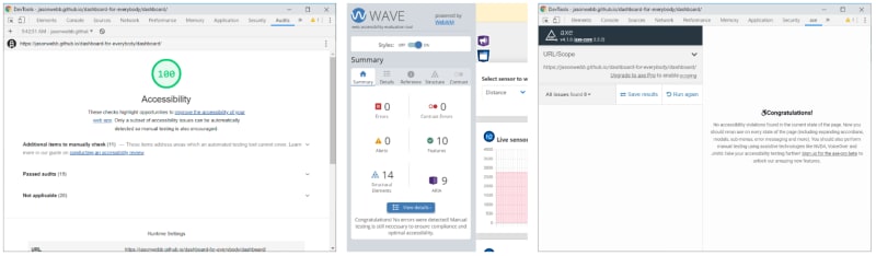
Automated scan reports
Although woefully imperfect, automated scanning tools can be used to get a very basic sense of accessibility and check for the most obvious of issues like invalid or inappropriate markup usage and (some) color contrast errors.
Automated tools do not, and arguably cannot, identify critical usability problems like how easy or pleasant your site is to use for people with disabilities. They are also not good at testing dynamic content or interaction states, or for checking for important best practices like the all-important “No ARIA is better than Bad ARIA” principle.
So use them, but don’t rely on them! Just because a page has a perfect audit score doesn’t mean it’s fully and perfectly accessible — it just means that some of the most obvious problems seem to be resolved.
For example, this dashboard passes all the major scanning tool with perfect scores (see the screenshots below), but there is almost certainly work to be done to improve overall user experience!
Accessibility techniques used
Now let’s take a closer look at the most important and helpful techniques used to make the dashboard accessible:
Focus indication
When designing and building any web project, don’t forget about the humble focus state! Great focus indicators make a world of difference for keyboard-only users and are absolutely essential for people with low vision (see WCAG S.C. 2.4.7).
Let’s be real. The default focus indicators provided by browsers are not always very effective or attractive, especially when different foreground and background colors or background images or videos are used. As a result, it's not uncommon for popular design frameworks, style resets, and normalizers to remove them entirely — not cool! If you’re going to remove the browser’s default focus indicators, you should provide an even better one!
In the sample dashboard project, the following techniques are used to improve focus indication for all users:
- Strong, consistent focus rings are added around all interactive elements, like buttons and input fields.
- Label text next to radio buttons change colors and gets bolder to make it extra clear when they receive focus.
- Panels (the white container boxes) get a stronger border when something inside of them receives focus. This is not really necessary, but I thought it might be helpful to subtly draw the eye to the general region of the page that is “active” — this is probably more speculative than functional.

Making charts accessible
Charts are notoriously difficult to make accessible, but there are a couple of effective strategies that can be used in nearly every situation.
First, take a good look at your chart and really think about whether all the features being used actually improve understanding for most users. Your charting library probably provides all sorts of cool, interactive doo-dads like hoverable content, animations, and quirky chart types — but how many of them are really facilitating a better understanding of the data, and how many are just fun to play with? Simpler charts are easier to grok for everyone — remember the KISS principle!

Second, remember that every chart is ultimately a visualization of tabular data. There may be a lot of data, and it may be spread across multiple sets and sources, but at the end of the day its all just a bunch of rows and columns. This is exactly what good old HTML <table>s are meant for, and they actually come with some really neat functionality for people using screen users! So rather than trying to make the charts themselves accessible (which may not be possible depending on the charting library), consider providing the same data in a visually-hidden table and hiding the visual chart using aria-hidden="true".
A word of caution, though: if your chart includes necessary custom keyboard or mouse functionality (like tooltips), a visually-hidden table won’t help keyboard-only users who have vision. Again, ask yourself, “Is this functionality really necessary?” If so, provide an alternative and obvious mechanism that can be used to activate that same functionality using only the keyboard.
Working with live data
Fast-moving live data, especially when it comes from real-time devices, can be overwhelming for people with certain visual or cognitive conditions. Many times we can’t slow down the actual data streams, but we can provide some control over how quickly this data is displayed in the UI.
In this dashboard we provide two mechanisms to help people control the rate of change of the UI for easier processing:
- Users can pause or resume the display of live data using a large, clearly-labeled button
- Users can choose the update interval of the UI using a dropdown, giving them more time between updates to process the changes.
Announcing important asynchronous events using live regions
When working with real-world systems, sometimes things happen that disrupt the “normal” user flow — servers go down, devices go offline, connections degrade or get throttled, and so on. For visual users, dashboards are fantastic for monitoring the status of many sub-systems all at once, but what about people who rely on inherently linear tools like screen readers?
When asynchronous events happen, the importance of the event is usually indicated by the “severity” of the notification. Minor events might just cause a change in a color or a word somewhere, whereas major events might trigger a prompt, an audio cue, or some sort of big, scary visual indication that draws the eye.
For people using screen readers, minor events can be indicated using clear changes in the text, which they will find organically as they traverse the page. Sometimes it’s tempting to keep this text visually-hidden while only display a change of color or shape for visual users, but this is not the best solution given how important visual text is for people with limited vision (like colorblindness) and people with cognitive conditions.
Major, disruptive events (like a device going offline) may be indicated to screen readers using ARIA live regions. These are DOM elements that have been marked in such a way that tells screen readers to “watch” for changes that occur to their inner content and be ready to read those changes out when they happen. This technique should be used very sparingly because it can interrupt and even surprise screen reader users as they are going about their business. But if the event is important enough, they’d rather be surprised when it happens than be frustrated when they realize the form they just filled out is pointless!
Live regions and how they are experienced are much easier to understand when you actually, well, experience them. This short demo video from Udacity does a good job of showing both how live regions are created, and how they are experienced through a screen reader:
Making dynamic UI updates
Not all changes to the UI need to interrupt the user flow. Often context and good content practices are enough to indicate to screen reader users that something is about to happen or can happen, and no special coding is required to guide users along.
For example, at the bottom of the dashboard users can set up “triggers”, which are simple conditionals that initiate pre-defined actions based on events in the data stream (“if [this] happens, then do [that] …”). When the user activates the “Add trigger” button, a UI change occurs in another part of the DOM — should this be announced to the users somehow?

As it turns out, screen reader announcements are not necessary in this case because of the abundance of contextual clues in this part of the page. First, the panel on the left with the form has the heading “Create a new trigger”, clearly indicating that the content that follows is used to do something.
Secondly, the action button itself has a clear label (“Add trigger”) that reaffirms the purpose of the form and sets an expectation that a trigger will be added when it’s activated. A generic label like “Submit” or “Add” would be less helpful for “low confidence” users who may reach the button and wonder, “Is this the right button?”
When any user activates the “Add trigger” button they have an expectation that one of two things will happen: either a trigger is added successfully, or there is an error. If successful, a trigger is added to the placeholder area, which is the next immediate element in the DOM. For people using screen readers, this means they will encounter it the moment they move past the “Add trigger” button.
By preselecting radio buttons and defining a default threshold value (displayed as a placeholder), its actually not possible to submit the form with errors. But if it were, we’d want to associate descriptive, visible error messages with each invalid field (using aria-describedy), then programmatically set focus on the first field with an error that people using screen readers don’t have to “figure out” where the problem is on their own.
Conclusion
If you’re building an IoT dashboard or some other real-time web interface, I hope this article has given you some practical tips for improving its accessibility.
To sum it all up, the most important takeaways I’d like to leave you with are:
- Every interactive element needs a focus indicator, and what is provided by browsers by default it not always the best.
- Make those charts accessible by simplifying interactivity and providing the data through visually-hidden tables.
- Let users slow down the refresh rate for live data so they can take more time to process it.
- Announce major events (like devices going online/offline) using ARIA live regions — but only sparingly!
- Use semantic, valid markup as much as possible — nearly every semantic tag means another bit of “free” functionality for people using screen readers!
And finally, when building out an accessible web project of any kind, nothing beats having it looked at by real, live users! Not only can this sort of feedback provide your team with personalized insights and guidance, but it is also essential in minimizing risk and defending against legal action. Reaching out to an accessibility consulting company like Accessible360 (where I work as a Developer Advocate) is always a great idea!

Top comments (0)