Introduction
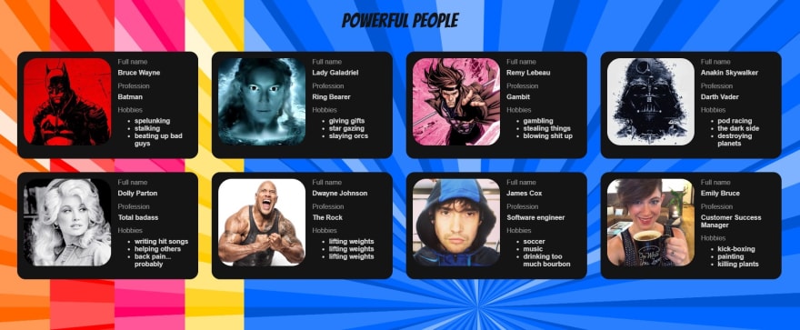
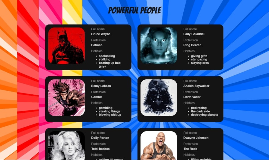
Yesterday I refactored a Codesandbox with Flexbox, which displays cards of "Powerful People", their names, roles, hobbies and a picture.
I wanted to accomplish two things.
- structure the card itself using flexbox.
- display all the cards in either a responsive row of cards on wider screens, or a single column of cards on narrow screens.
The cards in flexbox row on wider screen.
The cards in a flexbox column on narrower screen.

This post will attempt to breakdown not only how I did this with CSS and HTML, but also the process of designing the card beforehand.
Step One - Design
I use Excalidraw to mock up elements on a website. Excalidraw lets you quickly see your ideas on the screen and gives you a handy reference when you begin coding.
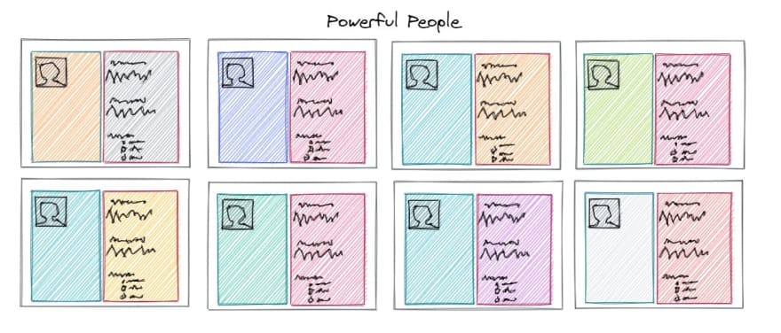
I came up with this mockup for the card.
And the layout for all the cards.
Looks pretty good. Now the hard hard part is making my cards look and behave like I want.
Flexbox resources
If you have never tried to use CSS flex properties before, I highly recommend playing around with Flexbox Froggy, which sort of makes learning flexbox a game. I promise if you go through the tutorial a couple times, you will have a much better idea of how to use flexbox.
Another great resource is CSS-Tricks' A Complete Guide to Flexbox.
Step Two - Understanding Your Design
I started to understand flexbox when I started to imagine every element on the screen as its own mini screen. For example, the card is its own contained environment. The inner contents of the card do not (have to) care about the elements outside of it. And the layout that ALL the cards live in is ITS own environment. It does not (have to) care about the other elements on the screen.
I think it helps to start with the outermost "environment" (represented by a <div> in your HTML) and work inwards. The outermost environment of my Powerful Person site is represented by the outermost <div> in my HTML.
<div className="App">
CSS
.App {
  text-align: center;
}
The property text-align: center; places the title "Powerful People" in the center.
Next I want to display all my cards in rows. I need to create another "environment" where I can apply the flex properties to my cards and display them in rows.
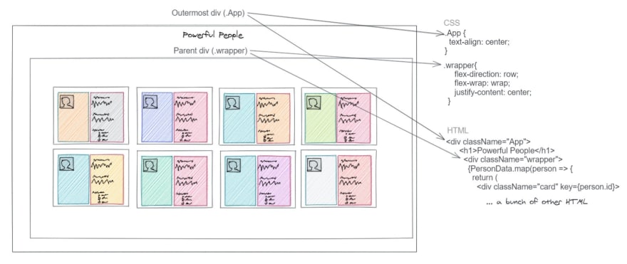
Take a look at this image to see how I broke down the CSS and HTML:
I create a new CSS class .wrapper that will "wrap" around all my cards and dictate their layout.
.wrapper{
    flex-direction: row;
    flex-wrap: wrap;
    justify-content: center;
 }
EDIT: It has been pointed out to me that row is the default value for the flex-direction property. Which makes including it in .wrapper redundant. I am going to keep it here so that others can learn from this and I can reference it later if I need to.
Flexbox has a lot of awesome properties, and one of those is flex-direction. You can do rows, columns, reverse rows, and reverse columns. flex-direction: row places the cards in a single, horizontal row.
What is flex-wrap: wrap?
To illustrate, I will comment out that line.
.wrapper{
    flex-direction: row;
    /* flex-wrap: wrap; */
    justify-content: center;
}
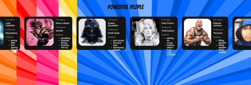
Yikes. The cards are over-flowing off the screen.
Well that is just not great. The wrap property sends the last off-screen element down to create a new row within the confines of the parent div.
justify-content: center; is pretty easy to understand. Let's take a look at examples with that line commented out and then when we add it back in.
.wrapper{
    flex-direction: row;
    flex-wrap: wrap;
    /* justify-content: center; */
}
With justify-content: center; back in.
Shifting Gears - Responsive CSS
This is about the point in time when I realized that I was creating "desktop-first" design, and I wanted to shift to "mobile-first" design practices.
Responsive web design makes websites adjust how they appear on the screen depending on the screen size. This is achieved with CSS "media queries" which the developer defines based on how they want their site to behave. If you are not familiar with CSS media queries, check out these examples from w3schools.com.
CSS media queries are outside the scope of this post (and once I write one, I'll link it here).
However, I must talk about how I refactored my .wrapper class to display my cards in a single column on a mobile device and added a second CSS file responsive.css with media query for my wrapper class to change the flex direction back to rows when the screen is wide enough.
First my refactored, mobile-first CSS .wrapper class.
.wrapper {
  display: flex;
  flex-direction: column;
}
Now all my cards are in a single, vertical column. Whatever the screen size is, my cards now will always be in a single, vertical column.
I want them still be displayed in rows on larger screens. I need a CSS media query.
(Don't forget to import responsive.css into your top-level component. For me that is App.js.)
/* responsive.css */

@media only screen and (min-width: 1100px) {
  .wrapper{
    flex-direction: row;
    flex-wrap: wrap;
    justify-content: center;
  }
}
EDIT: I mentioned above that having flex-direction: row; was redundant, but it is NOT redundant here. This media query is over-riding the flex-direction: column; that I refactored earlier.
I am telling my .wrapper class to change its flex direction back to rows whenever the screen device is 1100px or larger.
Confession
I actually created the cards first. Before I figured out how to display all the cards in rows or columns. Before I switched from a desktop-first design to mobile-first design.
There was a reason for that. At first I was using "dummy data" and only had one card on my screen. I had not yet created my local API. No need for defining a layout.
BUT. It made sense first to talk about the concepts of flex from the outermost environment to the innermost (my cards). If you were creating your own layout, you could easily replace the cards with CSS placeholders if you want to see how elements might appear on the screen.
You could do something like:
.card {
  align-self: center;
  background-color: rgb(20, 20, 20);
  margin: 1rem;
  width: 90%;
  height: 15rem;
}
And then your HTML:
<div className="wrapper">
    <div className="card" />
    <div className="card" />
    <div className="card" />
    <div className="card" />
    <div className="card" />
    <div className="card" />
    <div className="card" />
    <div className="card" />
</div>
This will simulate multiple cards mapped and rendered to your screen.
Step 3 (kind of) - Creating the Cards
Take a look at this Excalidraw sketch I made:
Remember my mental model that each element on your page can be considered its own "environment". Each card lives inside the .wrapper environment, but whatever is INSIDE the card will have no idea how to behave until we create a new environment that dictates how to look and act.
Each .card div has its own "wrapper" div called .row.
.row {
  display: flex;
  flex-direction: row;
}
Here we are telling the contents inside our card to display in a horizontal row, next to each other left to right.
Next, each element inside the .row class will be "wrapped" in a div called .column.
.column {
  display: flex;
  flex-direction: column;
  flex: 1;
}
Now any elements inside the .column class will displayed vertically due to flex-direction: column;.
What is flex: 1?
According to CSS Tricks
flex:
positive-number
Equivalent to flex: 1 0px. It makes the flex item flexible and sets the flex basis to zero, resulting in an item that receives the specified proportion of the remaining space.If all items in the flex container use this pattern, their sizes will be proportional to the specified flex factor.
Now anything inside the .column class will respond to display: flex; and we can use flex properties. Take a look at the rest of my CSS which dictates the layout of the card's contents:
.info {
  margin-top: .5rem;
  margin-left: 1rem;
}

h1 {
  align-self: center;
  font-family: 'Bangers', cursive;
  font-weight: lighter;
  font-size: 3rem;
  color: rgb(20, 20, 20);
}

h4 {
  text-align: left;
  color: rgba(255, 255, 255, 0.8);
  margin-top: -.5rem;
}

p {
  text-align: left;
  color: rgba(255, 255, 255, 0.5);
  margin-top: -.5rem;
}

ul {
  margin-top: -.5rem;
}

li {
  text-align: left;
  color: rgba(255, 255, 255, 0.8);
  font-weight: bold;
}

img {
  align-self: flex-start;
  border-radius: 2rem;
  object-fit: cover;
  height: 8rem;
    width: 8rem;
}
You will notice that each HTML element (h1, h4, li, p and img) is utilizing a flex property, text-align or align-self. Because they are inside the .column class, they are responding to the display: flex property.
And finally my full App.js component.
import React from "react";
import "./styles.css";
import "./responsive.css"
import PersonData from './data/personData'

export default function App() {
  return (
    <div className="App">
      <h1>Powerful People</h1>
        <div className="wrapper">
          {PersonData.map(person => {
            return (
              <div className="card" key={person.id}>
                <div className="row">
                  <div className="column">
                      <img src={person.url} alt={person.name} />
                  </div>
                  <div className="column">
                    <div className="info">
                      <p>Full name</p>
                      <h4>{person.name}</h4>
                      <p>Profession</p>
                      <h4>{person.role}</h4>
                      <p>Hobbies</p>
                      <ul>
                        {person.hobbies.map((hobby, i) => {
                          return(
                            <li key={i}>{hobby}</li>
                          )
                        })}
                      </ul>
                    </div>
                  </div>
              </div>
            </div>
          )
        })}
      </div>
    </div>
  )
}
Notice that the information about each person is an extra class called .info in order to add some extra alignment and spacing between my two columns.
Wrapping Up
Thank you for reading my breakdown of Flexbox and I hope that you walk away feeling a little more confident about how to use flex properties to improve your CSS layout and design skills!
As always, I would love feedback and constructive criticism. I am sure there are tons of things I can still learn and improve. If you see anything I can do or explain better, let me know in the comments!
Thanks again and HAPPY CODING!





Top comments (4)
Very informative article. Isn't
rowthe default value forflex-directionproperty?Ah. I see what/why you asked that. My bad!
So I thought for clarity sake it would be include flex-direction: row; even where it is the default property. But I think I will go back and update the article to explain that it is default and not required. Thank you for pointing that out!
Thank you!
And yes! But I need to change the flex direction from column back to row in my media query. Otherwise they stay in a single column.
Cool flexbox is so easy to learn. Gone are the days of floats and annoying clear fixes 🤣