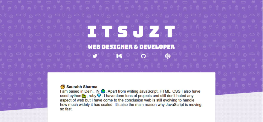
It was like a season of portfolios a while back and everyone was making a new one. This was the time for me to redesign my own portfolio which was hanging there from forever, with the bare minimum design you can think of.
Thinking of redesign.
Before redesigning I need to think about a design that can look good. I looked at @alispitel's portfolio It helped a little, actually It is a great design but I wasn't getting any way to make a personalized version of that design. I also saw @benharper's portfolio It's unique on its own. The thing to notice after looking at a lot of portfolios was most of the portfolios have at least 4 sections [About, contact, projects, social]. They were using GIFS, Animations, Canvas too.
Getting an Inspiring design.
After that, I looked at the landing pages of the website which are good at designing. They were heavily using illustrations and I liked them too. Soft colours, catchy headline fonts and having good illustration/image were the takes from them. I now have a blurred picture in mind of that is gonna to be but a lot was still unclear.
Coding & finding what really works.
At this time I clone my repo and started trying out new designs to find out what works. After making it in different ways and but I wasn't getting a catchy design. I have made the 4 sections in HTML and design was still ugly.Finally I came to https://cssgrid.io. If you don't know about it, It's a landing page for free CSS GRID course made by fabulous @wesbos. I took the idea of using SVG + colour for the hero. I even used the polygon for that image.
I used Hero patterns to find the right SVG and clippy for the polygon.
Tweaking and making it better.
I have made the design now and it just needed small tweaks and some animations. I used an animation on my name and used a custom font from google fonts.
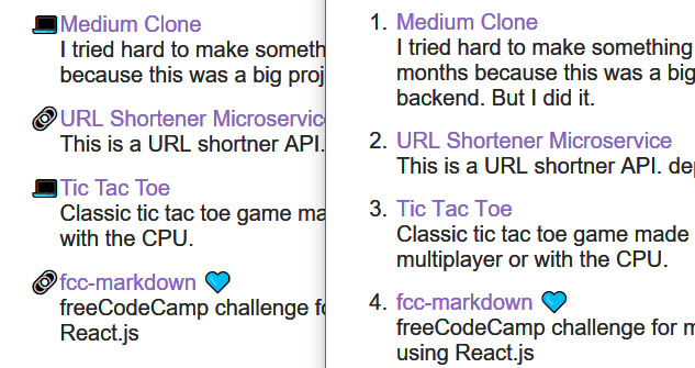
I used font awesome for social icons. Then I used custom list-style-type (😫 only firefox supports it.) rest get a good old numbered list.
Testing it on Mobile and different browsers
Finishing all that stuff I now need to get out of my primary browser and run the page on different hosts and browsers to see how it works across platforms. I tried it on chrome Android, Edge, Firefox and It seemed to work fine except to the polygon not supported in Edge. I reduced padding for smartphones.
Now its done and I wrote a commit message and pushed it. see it https://itsjzt.github.io/


Top comments (2)
they are probably cached.
nothing more than that