Let's explore the power of CSS custom variables when styling a customizable button component.
We are going to build a button component. Our button would support two color variants: primary and secondary. On top of that the button would also have these four common states: normal, hover, active and disabled.
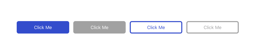
The color variant would be chosen by applying primary or secondary class on a button element. disabled attribute would be used to render the button in disabled state. For the hover and active state we will use :hover and :active CSS pseudo classes.
The HTML code for the button is very simple, here are examples of our button:
<button class="primary">Click Me</button>
<button class="primary" disabled>Click Me</button>

<button class="secondary">Click Me</button>
<button class="secondary" disabled>Click Me</button>
Now let's dig into the styling. As the article title says we will use CSS custom properties, a lot.
The styles for the button are divided in two parts:
- Generic button styles
- Styles for button color variants
Let's start with generic button styles:
button {
  color: var(--label-color);
  background-color: var(--background-color);
  border-color: var(--border-color);

  border-width: 4px;
  border-style: solid;

  padding: 10px 64px;
  border-radius: 8px;
  font-size: 18px;
}

button:hover {
  background-color: var(--background-hover-color);
}

button:active {
  background-color: var(--background-active-color);
}

button[disabled] {
  color: var(--label-disabled-color);
  background-color: var(--background-disabled-color);
  border-color: var(--border-disabled-color);
}
As you can see this part defines generic button features like padding or border-radius that are common for both color variants.
On the other hand, all the color properties like background-color or border-color should depend on specified color variant (primary or secondary) and therefore we define for them appropriate variables like —background-color or —border-color. We will specify actual colors for all these variables in the next part.
Now we can define actual color values for primary button variant
button.primary {
  --label-color: hsl(0, 0%, 100%);
  --background-color: hsl(230, 60%, 50%);
  --border-color: hsl(230, 60%, 50%);
}

button.primary:hover {
  --background-hover-color: hsl(230, 60%, 55%);
}

button.primary:active {
  --background-active-color: hsl(230, 60%, 60%);
}

button.primary[disabled] {
  --label-disabled-color: hsl(0, 0%, 100%);
  --background-disabled-color: hsl(0, 0%, 63%);
  --border-disabled-color: hsl(0, 0%, 63%);
}
And similarly for secondary button color variant:
button.secondary {
  --label-color: hsl(230, 60%, 50%);
  --background-color: hsl(0, 0%, 100%);
  --border-color: hsl(230, 60%, 50%);
}

button.secondary:hover {
  --background-hover-color: hsl(230, 55%, 80%);
}

button.secondary:active {
  --background-active-color: hsl(230, 55%, 85%);
}

button.secondary[disabled] {
  --label-disabled-color: hsl(0, 0%, 63%);
  --background-disabled-color-color: hsl(0, 0%, 100%);
  --border-disabled-color: hsl(0, 0%, 63%);
}
As you can see, the custom CSS variables can help us keep our cascading styles for components more structured and clear while still customizable enough. We can now easily add another color variant for our button just by defining an another set of colors.
Full code on Codepen:


Top comments (0)