Power BI dashboards provide us with a good way to analyze aggregated information. We can even choose time periods for aggregation (you can find more details regarding it in our article about drill down). However, we might still be interested in a detailed look at specific data points. With the right data filling, we can display detailed data for any column of the chart with all filters applied to that chart. For example, we can see what exact questions were asked on the site on a particular day, who their author was, how many views they received, etc, and all of that without going beyond our dashboard! The tool that allows you to do that is called drillthrough.
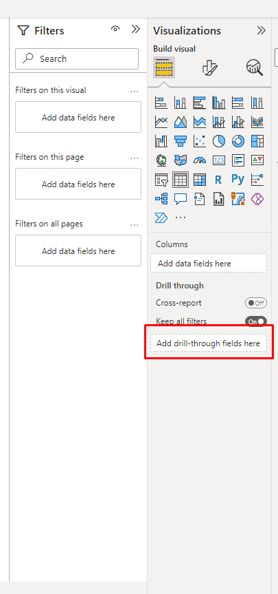
The implementation of drillthrough in Power BI itself is quite simple. On a separate page, we create a table or a chart, where we put all the fields of our interest from the data. In the case of a table about posts, the fields can include a post title, an author, a number of views, etc. In this article, to refer to such tables, I will use two titles: a “drillthrough” table and a "detail" table. In the special field “Drillthrough” we add all the fields that will be used as filters for this table - month, day, post type, etc.
When we drill through from a chart to detail table, , filters are applied, and only filtered data is shown. For example, when you put in the “Drillthrough'’ field a date column from the post table, after you drill through from a specific month column of the post chart, the filter ‘Date’ = specific_month is applied to the table. For each entity (like post, user, etc) we recommend creating a separate table with dates and connecting all tables related to this entity to it. We will use fields from this table to filter our “drillthrough” table.Otherwise, if you use a common table with dates (a common practice in Power BI, the implementation of which we described here(Showing dates in missing periods | InterSystems Developer Community |) ), any chart that contains dates will have access to all drill tables. It will not be clear to users why they can open a digitalization about new users from the post chart.
After creating the “drillthrough” table, we hide the page where it is located. Our users don’t need to see these pages without filters applied to them. Now on the X-axis and in the legend field of widgets, we use only fields which are presented in the “Drill through” field of the detail table. In this case, drillthrough becomes available to us on this widget. When we right-click on the column we are interested in, we will see the item named “drillthrough” on the menu. By clicking on this item, we will get to the table.Since filters will be applied, the table will display only the data that is related to the column we have selected. All other filters applied to the chart will also apply to the “drillthrough” table. In case when the chart has one filter which isn’t presented in the “Details'’ field of “drill through” table, the “drill through” option in the chart will not be active. For example, in DC we have different language communities, and we may want to create a chart that will show us the number of posts written every month. We may place it on a page with a filter by DC communities to have only data for a specific community displayed. We will not have a drill-through option in our chart while we place the month and the community fields in the “Drill through” field of our detail table.
As you have probably already understood, in terms of data, we need to have a table with all the fields that interest us. Most likely, there is no such table in Power BI yet, since previously we submitted only aggregated data here. Now we need to get data not just for some time periods, but for each unique representation of every entity.
First, we will need to create dimensions in AtScale for the appropriate data fields. Then we will have to make sure we retain a measure that can count the number of unique instances of an entity. Having all that, we can build a query in Power BI, getting all the dimensions and the measurements into the table. If we can seet a table with attributes of our entity and a field showing 1 for each row, then everything is done correctly. We recommend creating a separate query for detailed data. You need your previous query unmodified to be sure that all your previous work with thedashboard is safe since you may have some troubles with the new query.
The problem is that getting such a table requires a lot of data and a lot of calculations on the AtScale side if you have large amounts of data. For example, if you want to be able to show views of each post on a given date, it is necessary to disable or experimentally select all possible limits of update time, request duration, etc. Otherwise, you will encounter a timeout error while updating the data. To do this, go to Settings - Engine and look for the following settings using the built-in browser function by pressing the F3 button:
CONNECTION.POOL.MAXCONNECTIONOPENDURATION - the maximum time for a connection to be open, regardless of usage.
QUERY.RESULT.MAX_ROWS - the maximum number of rows that can be returned for a query
QUERY.TIMEOUT - the maximum amount of time to allow a query to run
VIRTUALIZATION.SUBQUERY.RESULT.MAX_ROWS - the maximum number of rows that can be returned for a virtualized subquery
CONNECTION.POOL.GROUP.MAXCONNECTIONS - the maximum number of connections for a group of connections. This is the maximum value for the entire connection pool.
After applying the settings, you will need to click the “save settings” button at the very bottom of the settings page and restart the engine. To do this, go to Settings - Service Management and click the restart button in the engine line.
You can reduce the amount of data by including only the ID of the entity in the detailed table and having the separate table with all its attributes. Connecting these two tables would provide us with both: all the detailed information and necessary attributes of the entity to visualize them in the “drillthrough” table. It isn’t convenient for dashboard development, but it saves you a lot of time while updating the data and allows you to provide more data in dashboards.
It is also worth monitoring the load on the server resources where AtScale is located. It is quite likely that the server capacity for this operation will not be enough (since it requires a lot more computing power compared with aggregated queries), and you will either have to increase the server capacity or make a less detailed dashboard. We should expect an increase in the percentage of CPU usage, while the consumption of RAM will not change.
In this article, we tried to mention all the problems we had met on our way and all solutions we found for them. I hope this information was helpful for you. If you have experienced other issues or discovered different solutions - leave us a comment. It will be useful to all of us.

Top comments (0)